Practice 2: Skeletal Elements (MS 9)

Practice 2

Conveying character through costume

I recently completed a research project for my other course on a topic of my choosing, and I ended up delving into the underlying meaning of character costume in games. The main takeaway was in just how important appearance is in conveying the personality, motives, background, and persona of a character; I analyzed several characters that were unnecessary sexualized or stereotyped in their dress and how it conflicted with their description/roles, ultimately lessening their impact as full-fledged people. Games simply aren’t extensive enough for players to dive into every character’s backstory through dialogue or interactions, and so players must often make snap judgements based on first impressions.

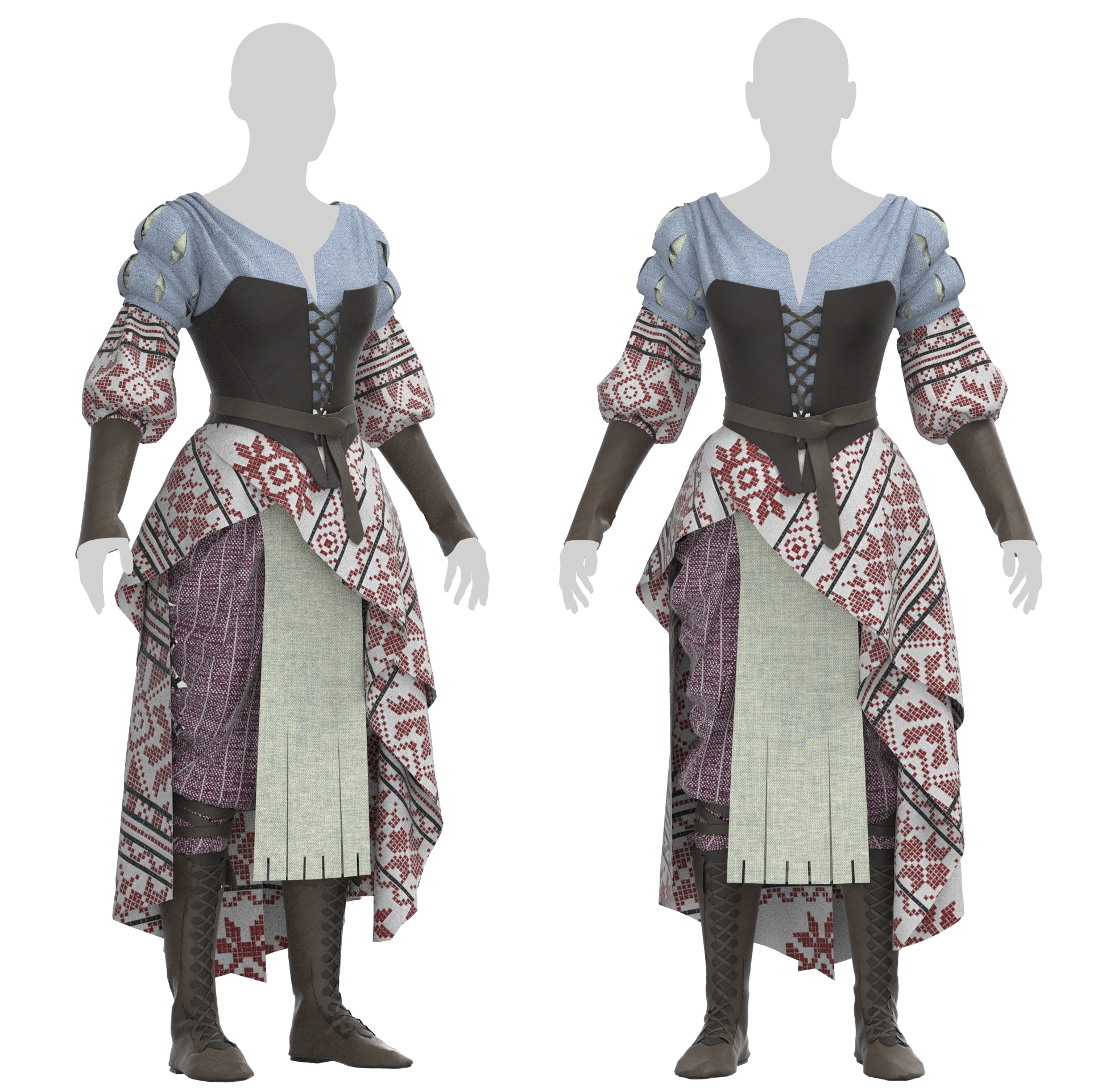
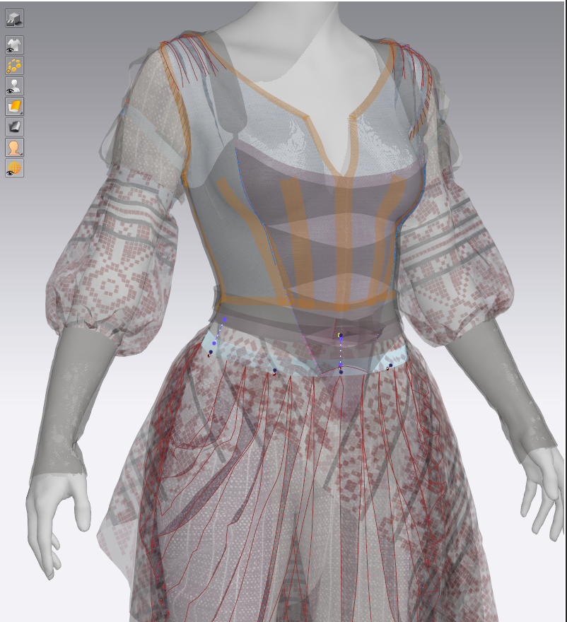
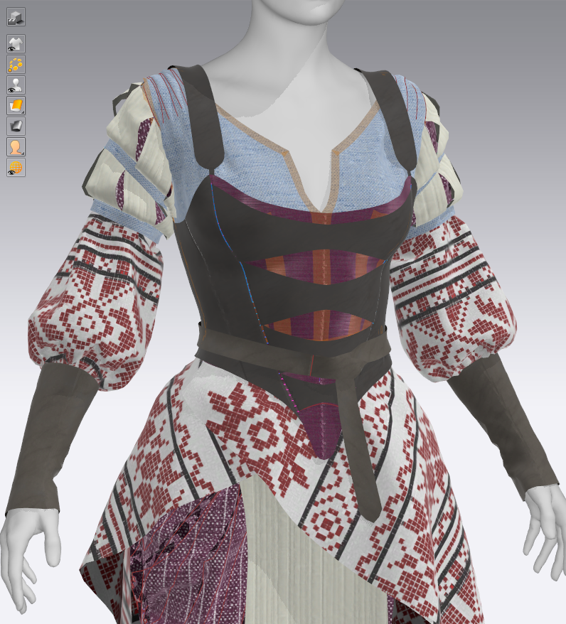
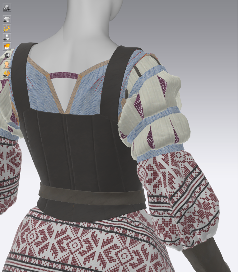
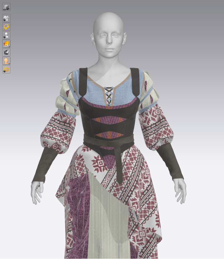
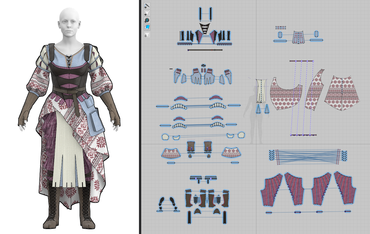
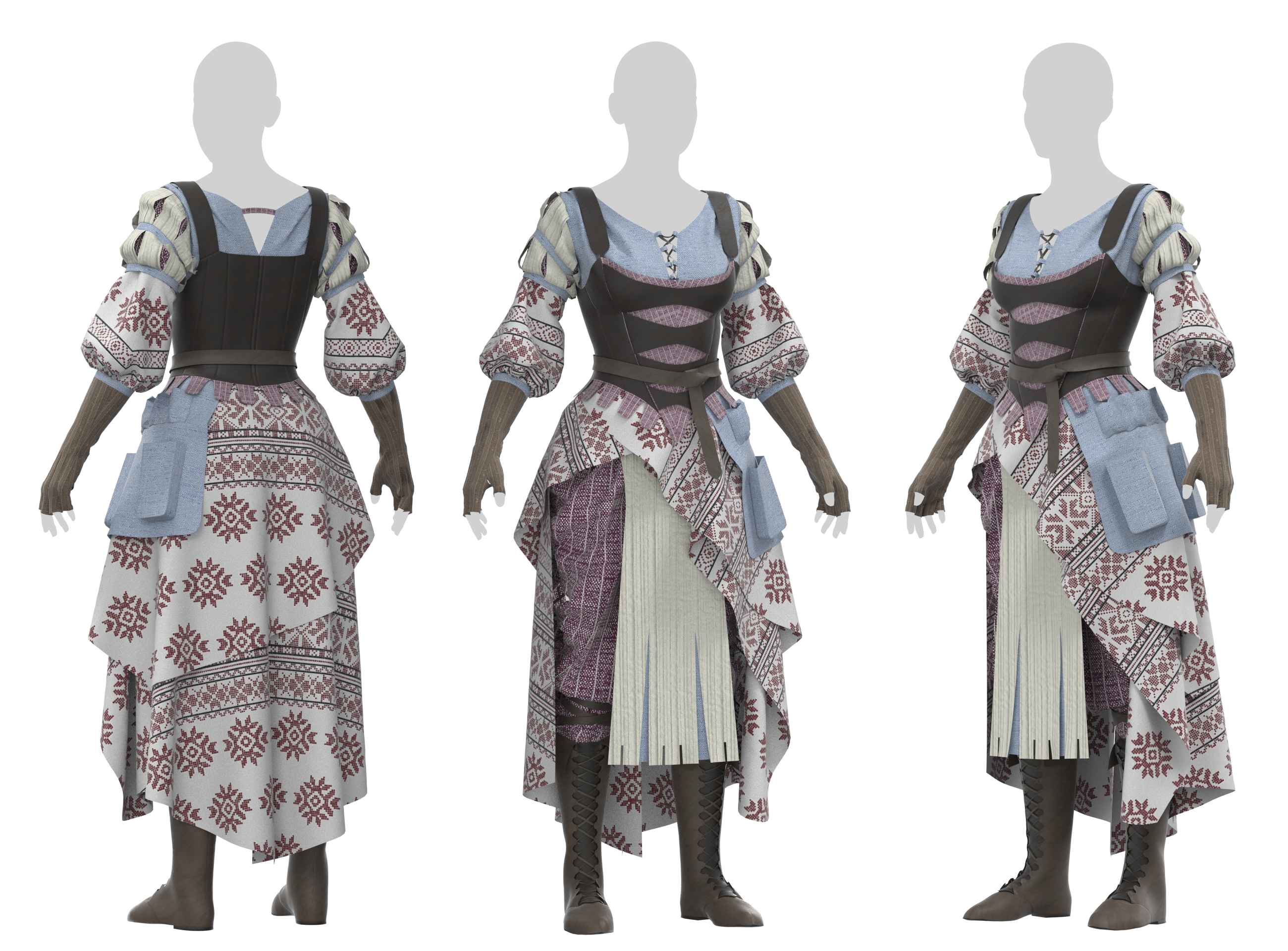
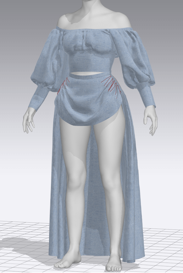
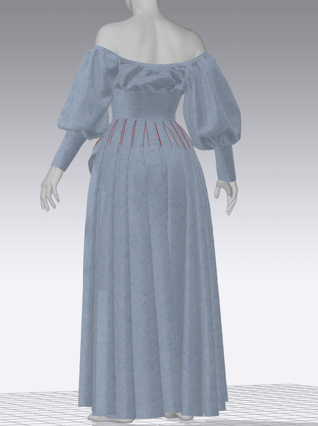
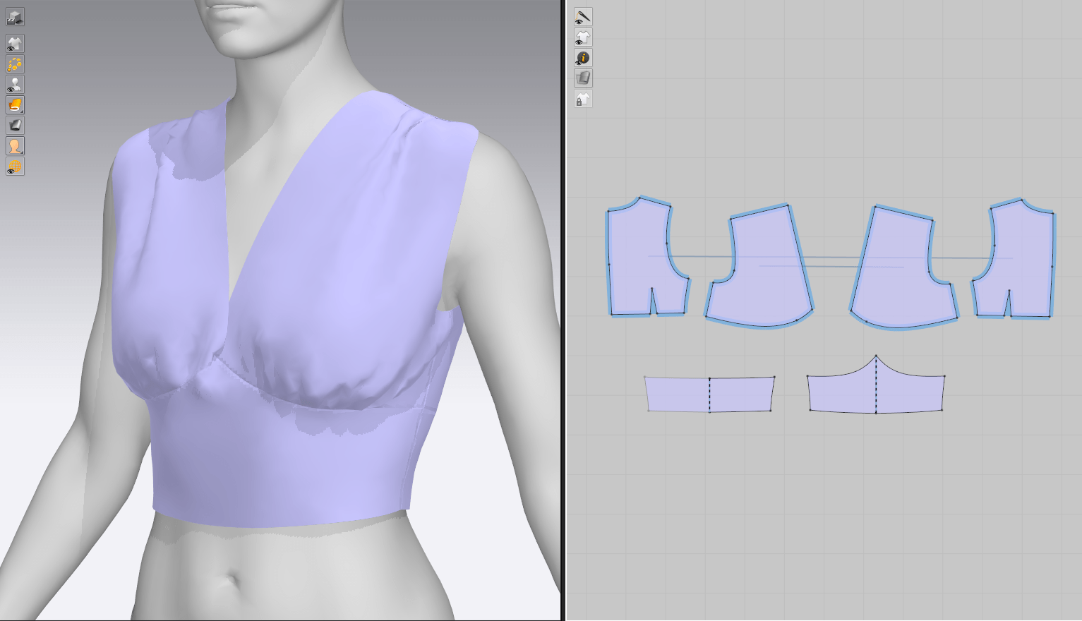
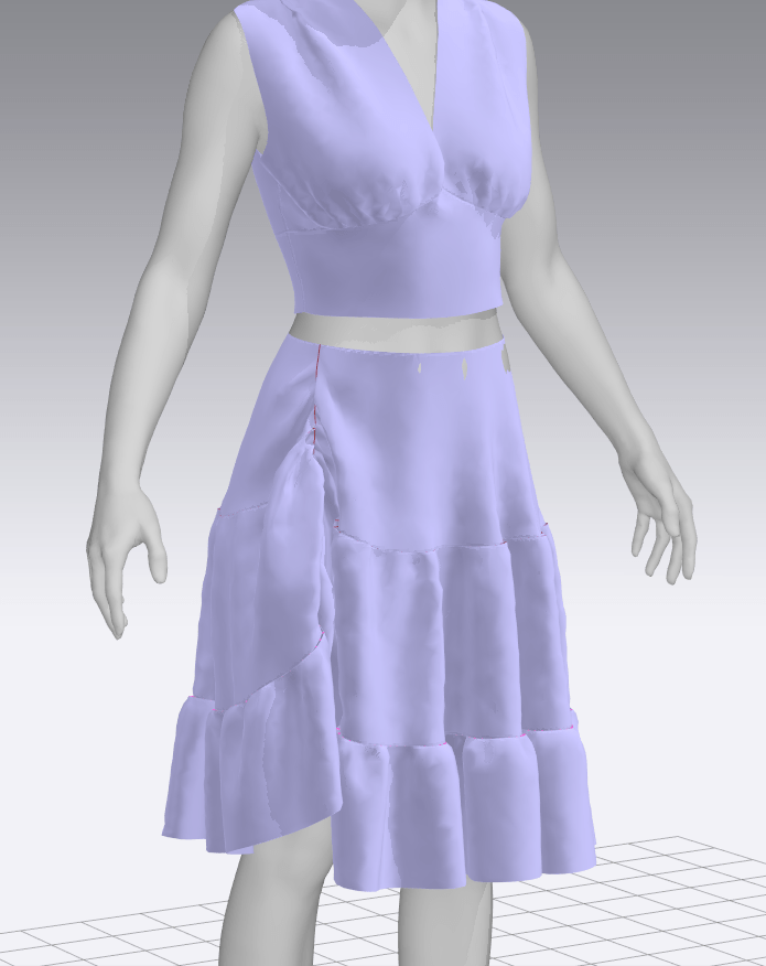
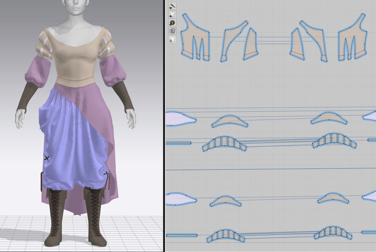
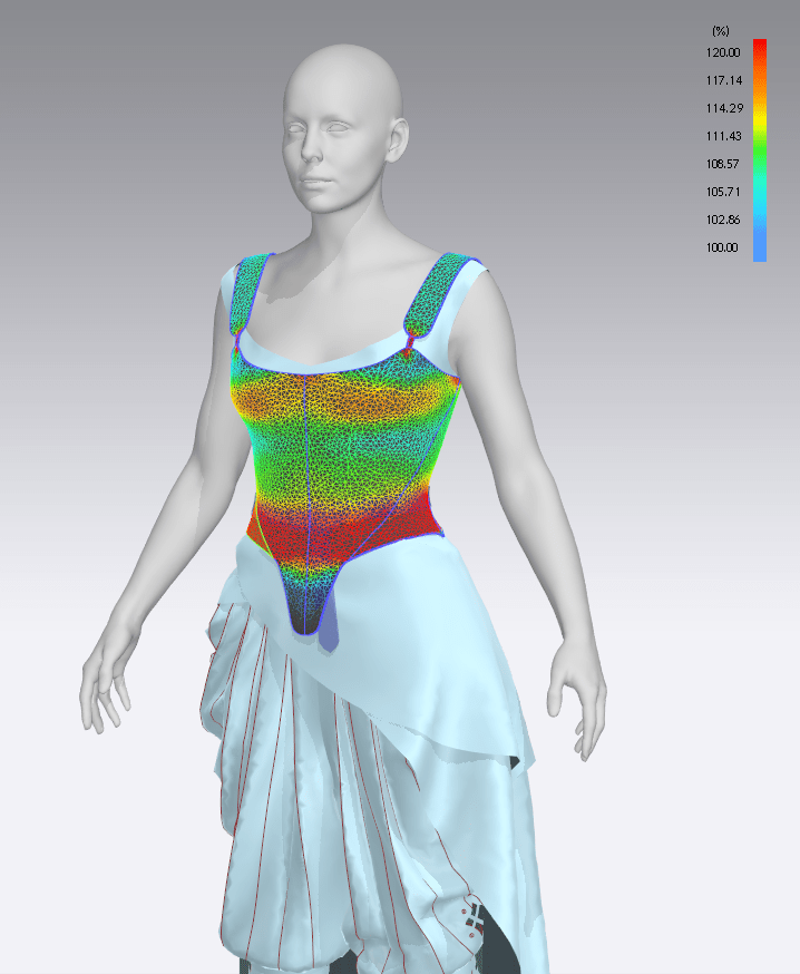
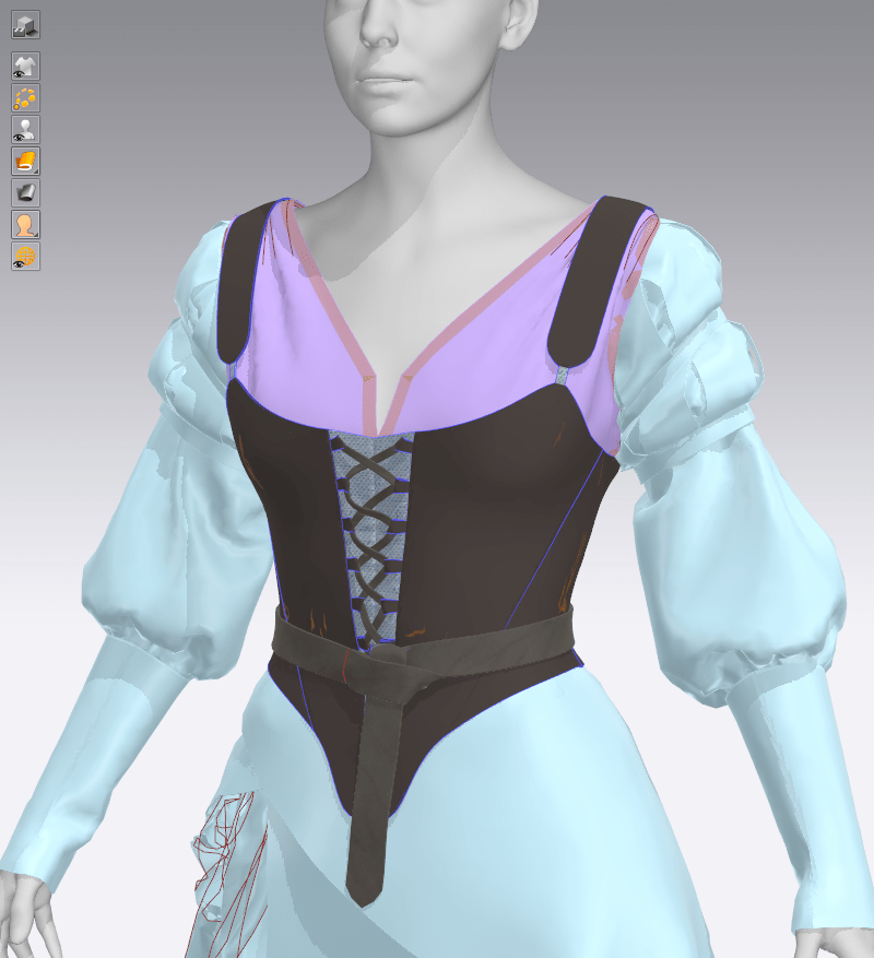
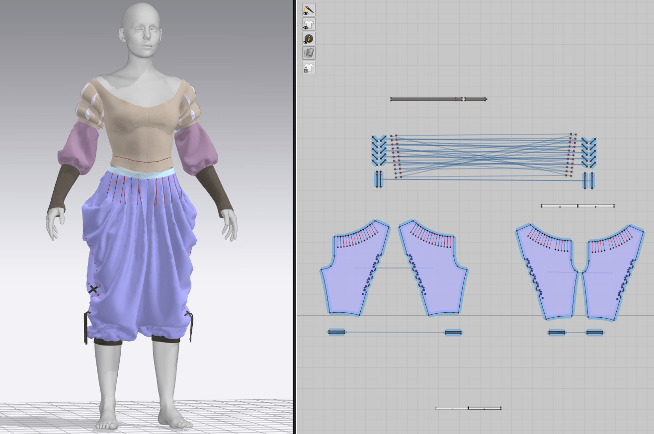
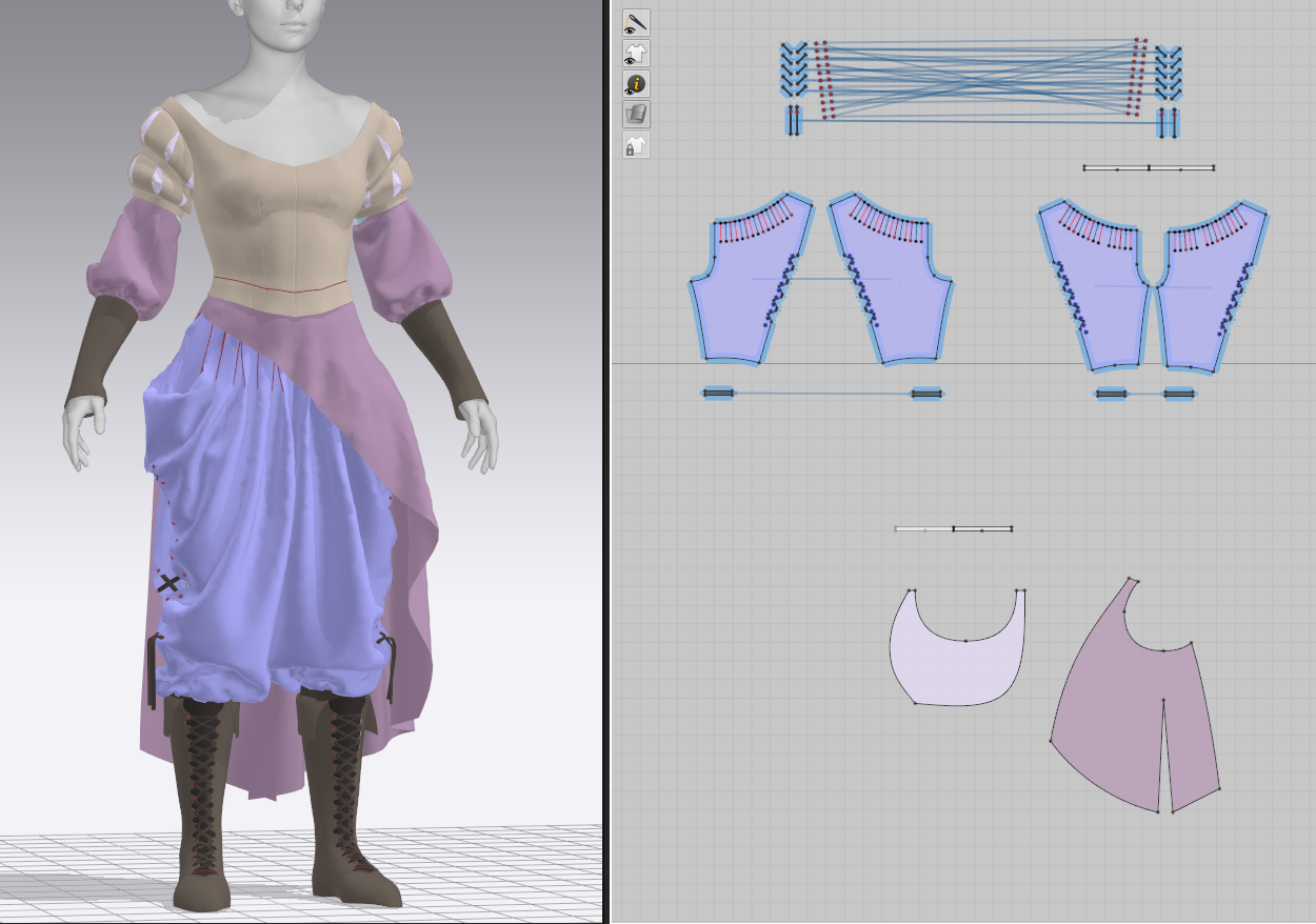
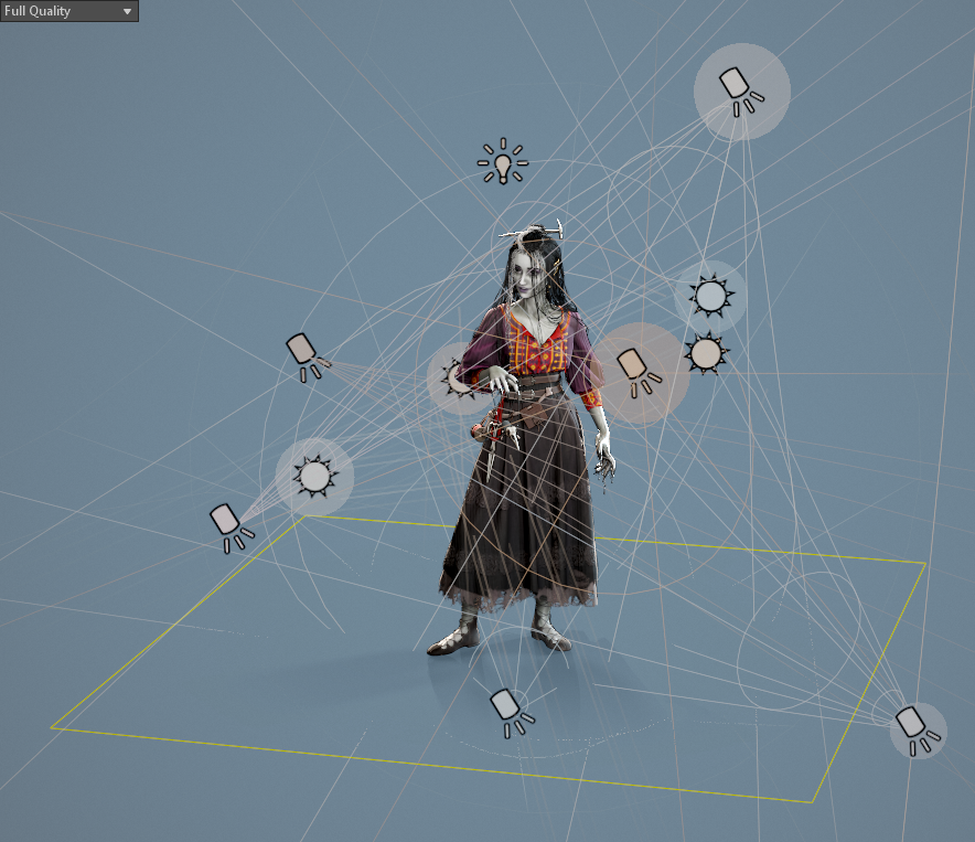
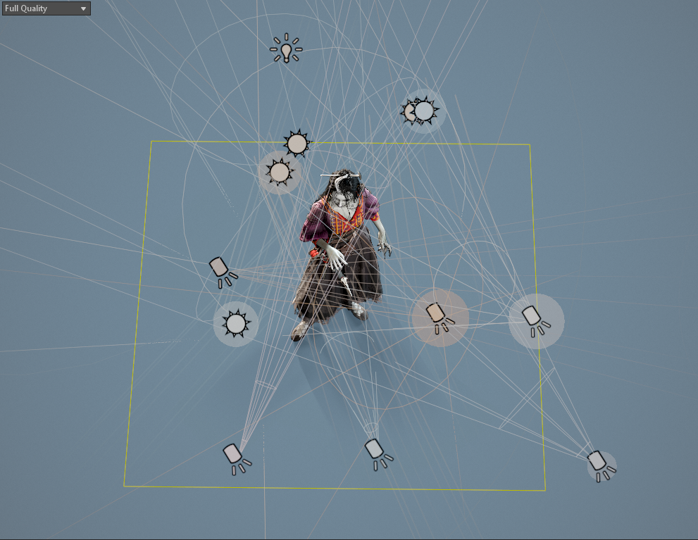
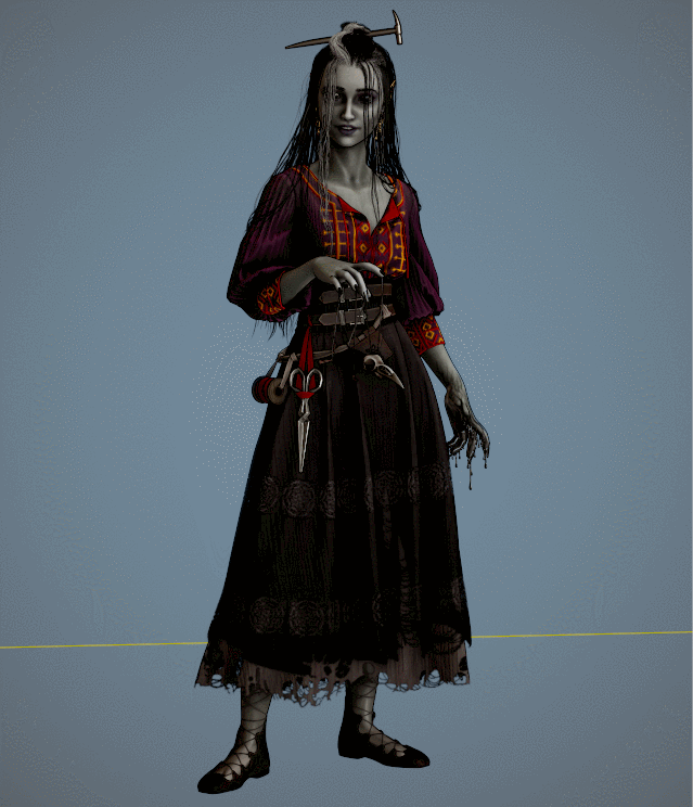
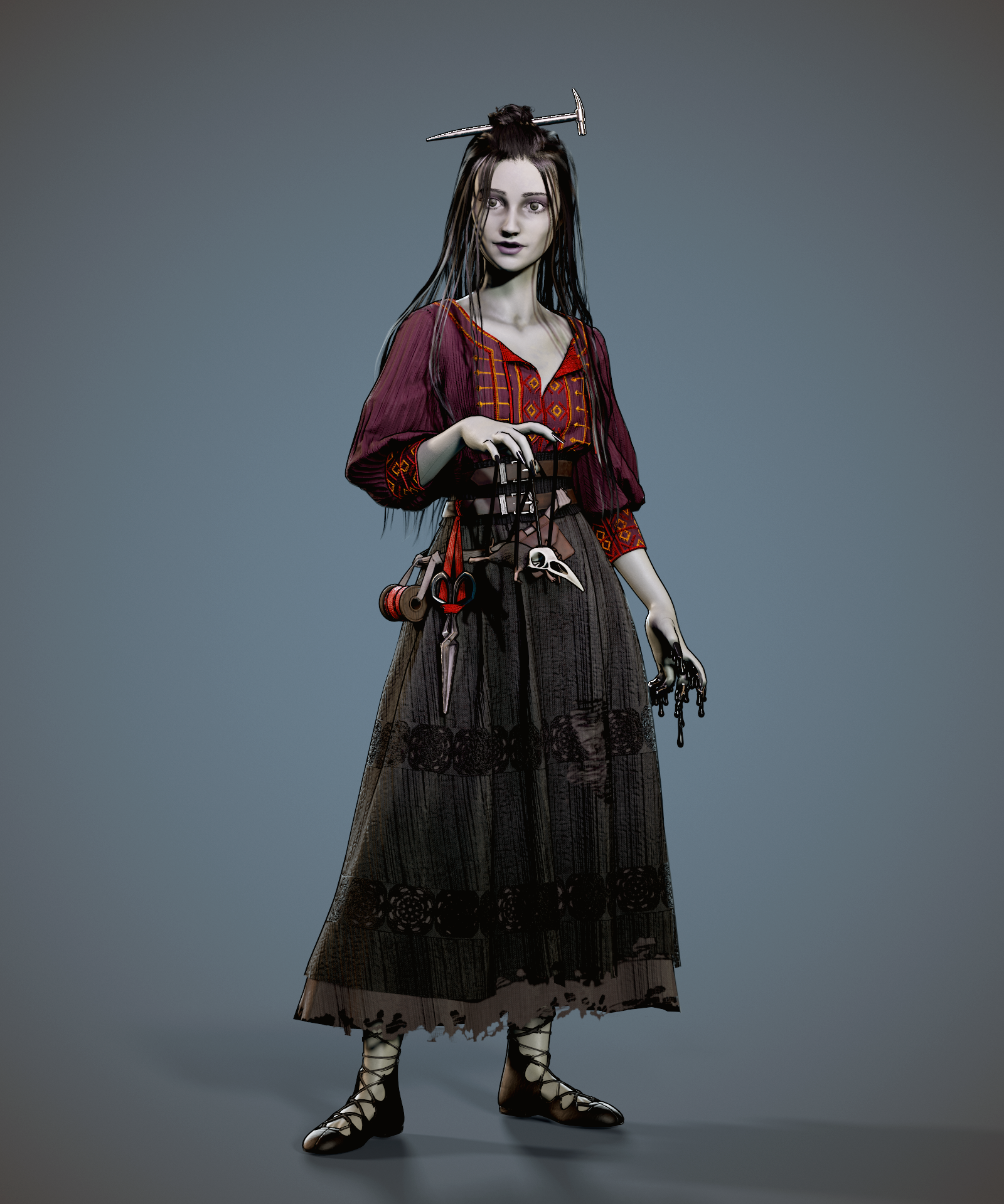
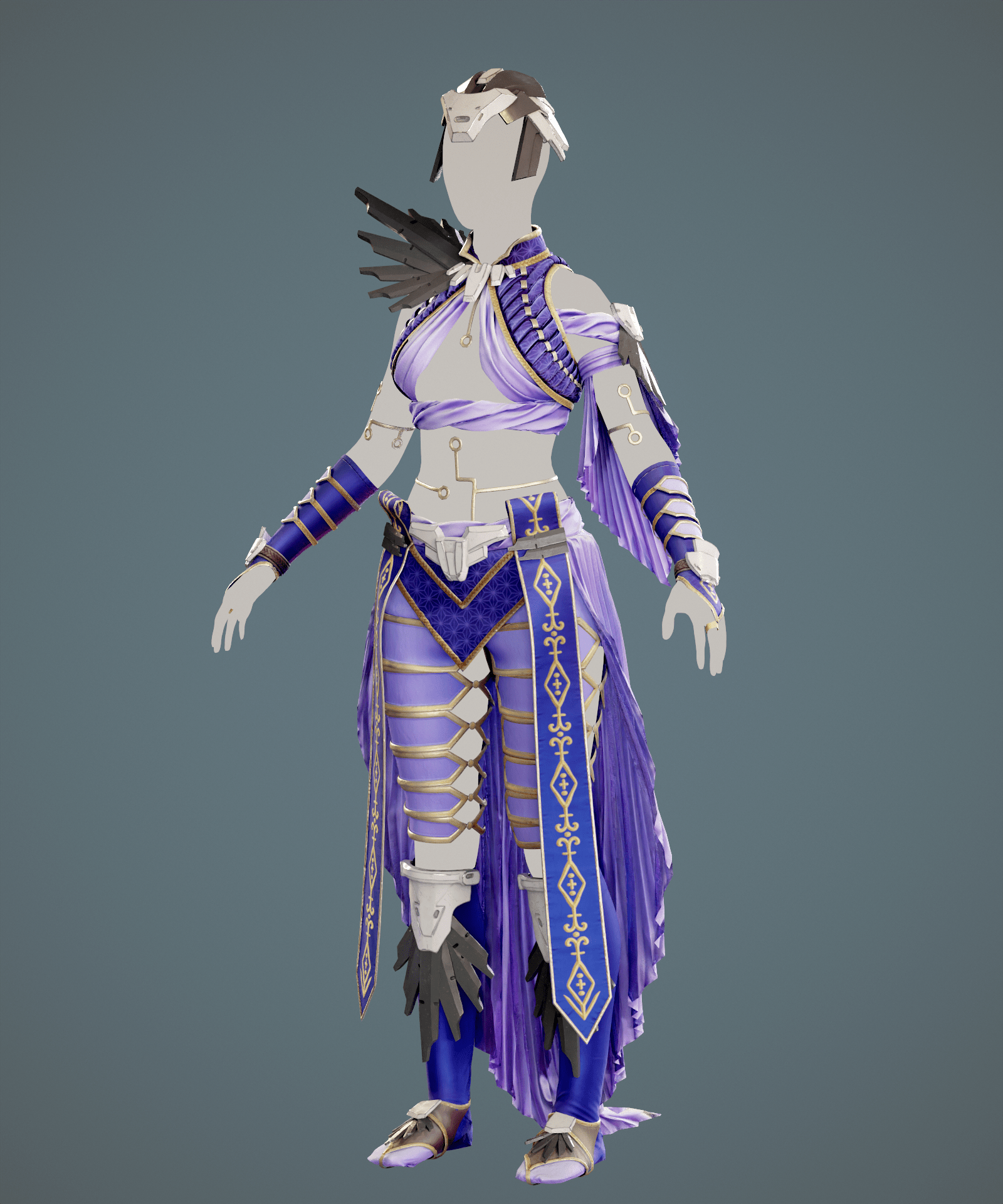
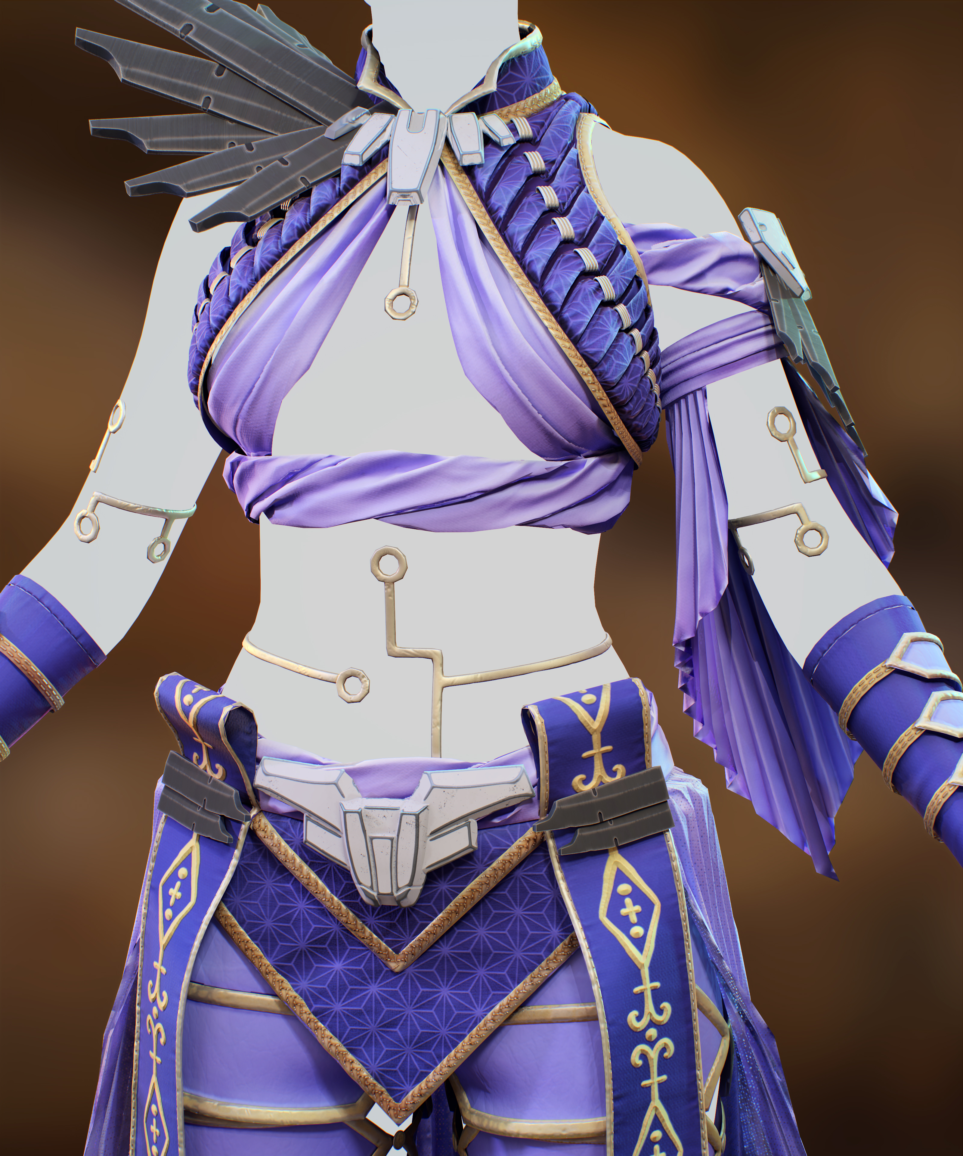
With this in mind, it’s become clear to me that I’m not including enough elements in my necromancer’s dress to truly indicate who she is as a person and her role in the world. Most viewers of my scene won’t have read her full backstory or played a tabletop game with me to understand her motivations; they’re just seeing a woman and a skeleton. I think my design is fairly successful so far on the practical side, with layers to keep her warm and avoiding anything too form-fitting or restrictive. I’m already indicating her penchant for sewing with homespun fabrics treated with complex textile techniques and clearly handmade embroidery. However, she’s missing the darker side of her profession in her dress.

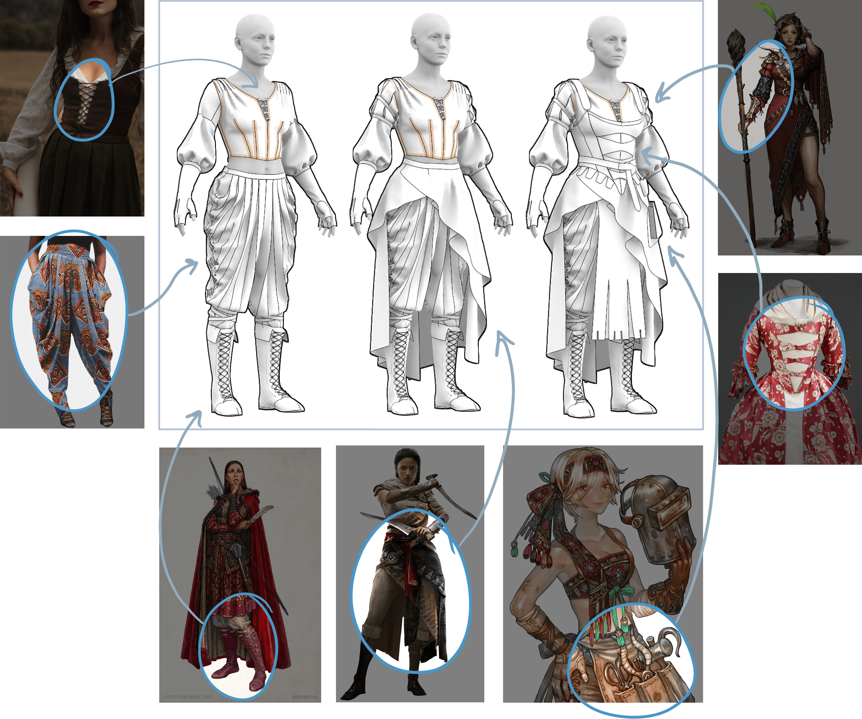
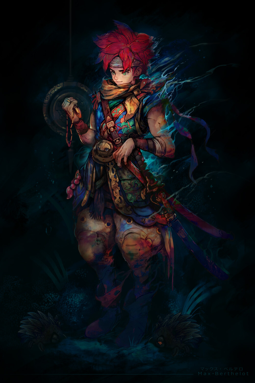
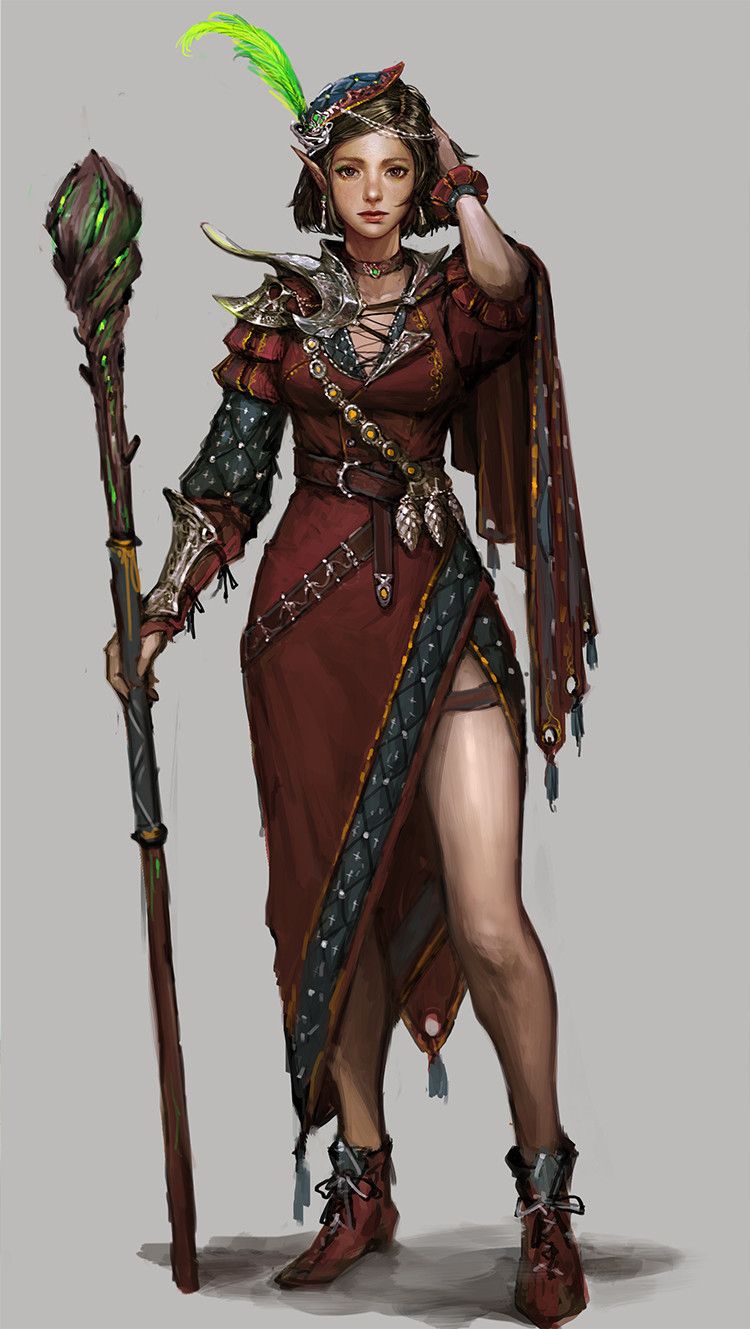
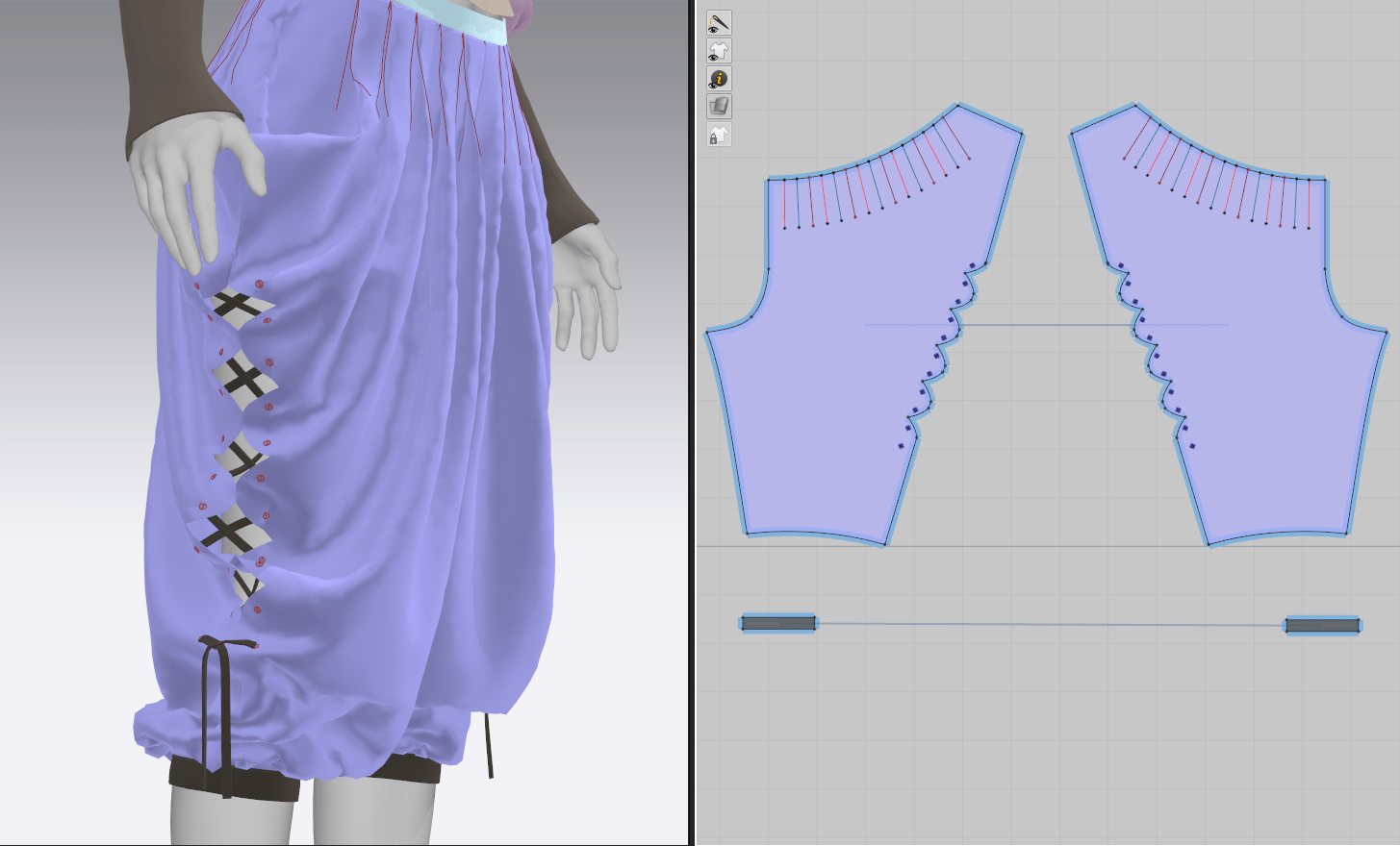
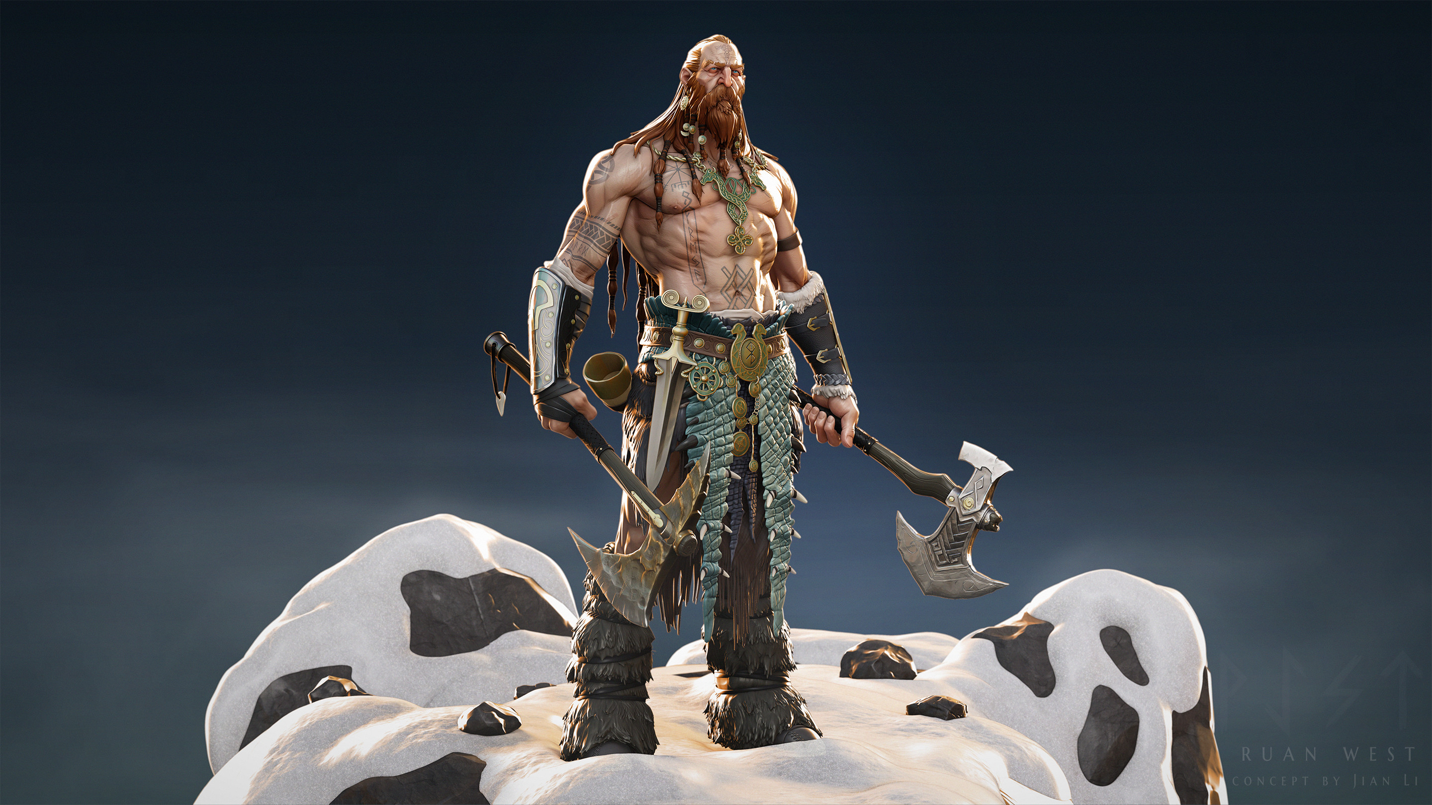
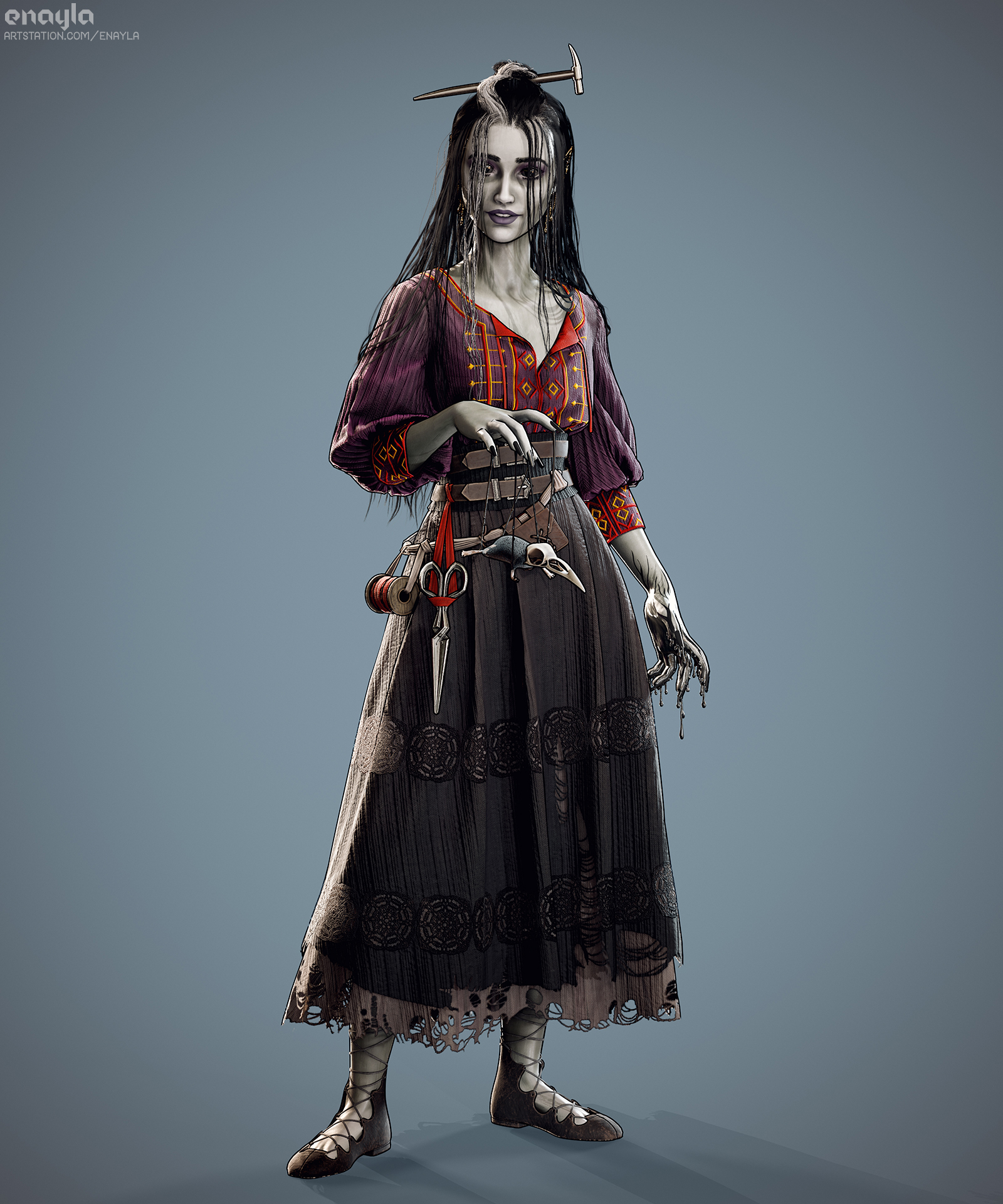
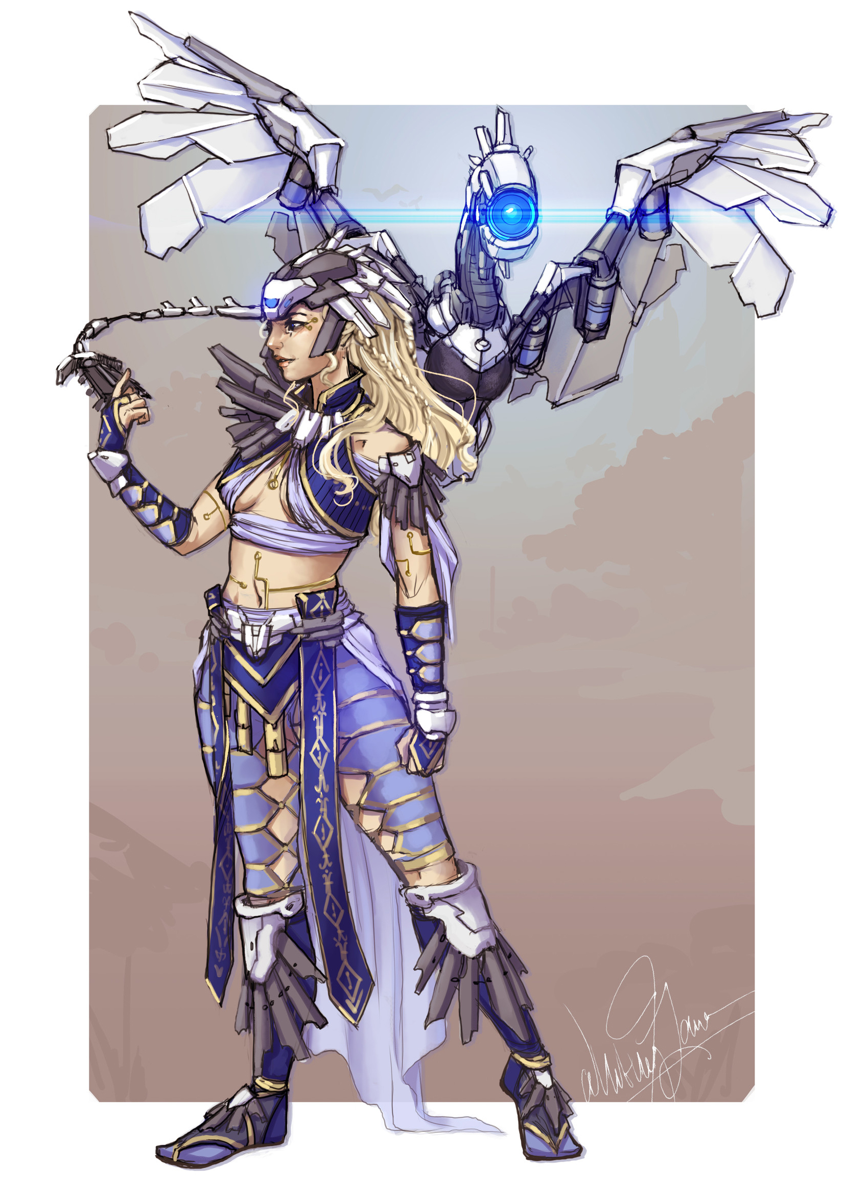
The above two concept arts were early inspirations for this character. Both have many obvious necromantic elements and make it clear what the character role is. That said, the fact that they’re so obvious in iconography somewhat defeats the purpose of my kindly grandmotherly character attempting to hide her necromancy. I’ve never been a fan of too on-the-nose costume details – I’d rather not cover her in bones, for example – but I’ve been brainstorming ways to incorporate some skeletal or magic (runic?) elements into her outfit instead. Changing the design of the front of her stays coincidentally created something of a ribcage effect without being too obvious, and this is the direction I’d like to continue to push.

Skeletal Designs

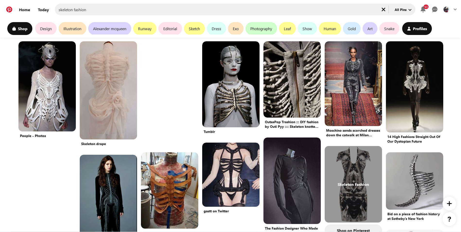
In looking up ‘skeletal fashion’ on Pinterest or Artstation, I was bombarded with more explicitly-skeleton pieces. I think it’s time to try and find more subtle ways to bring that idea across.

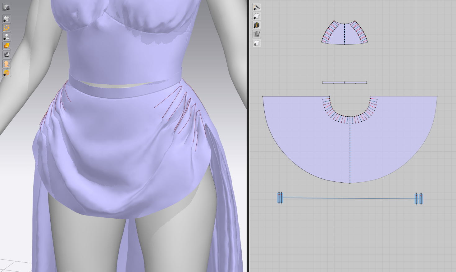
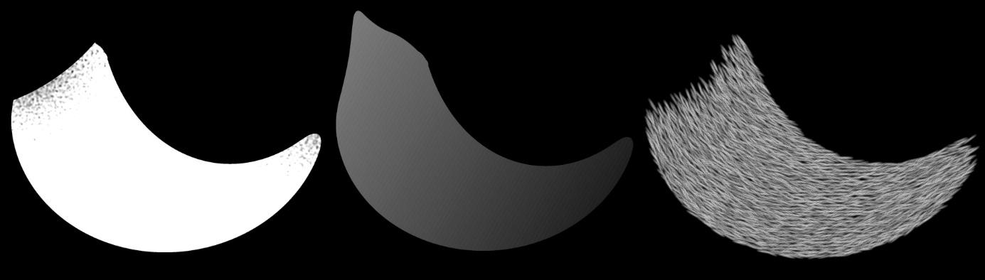
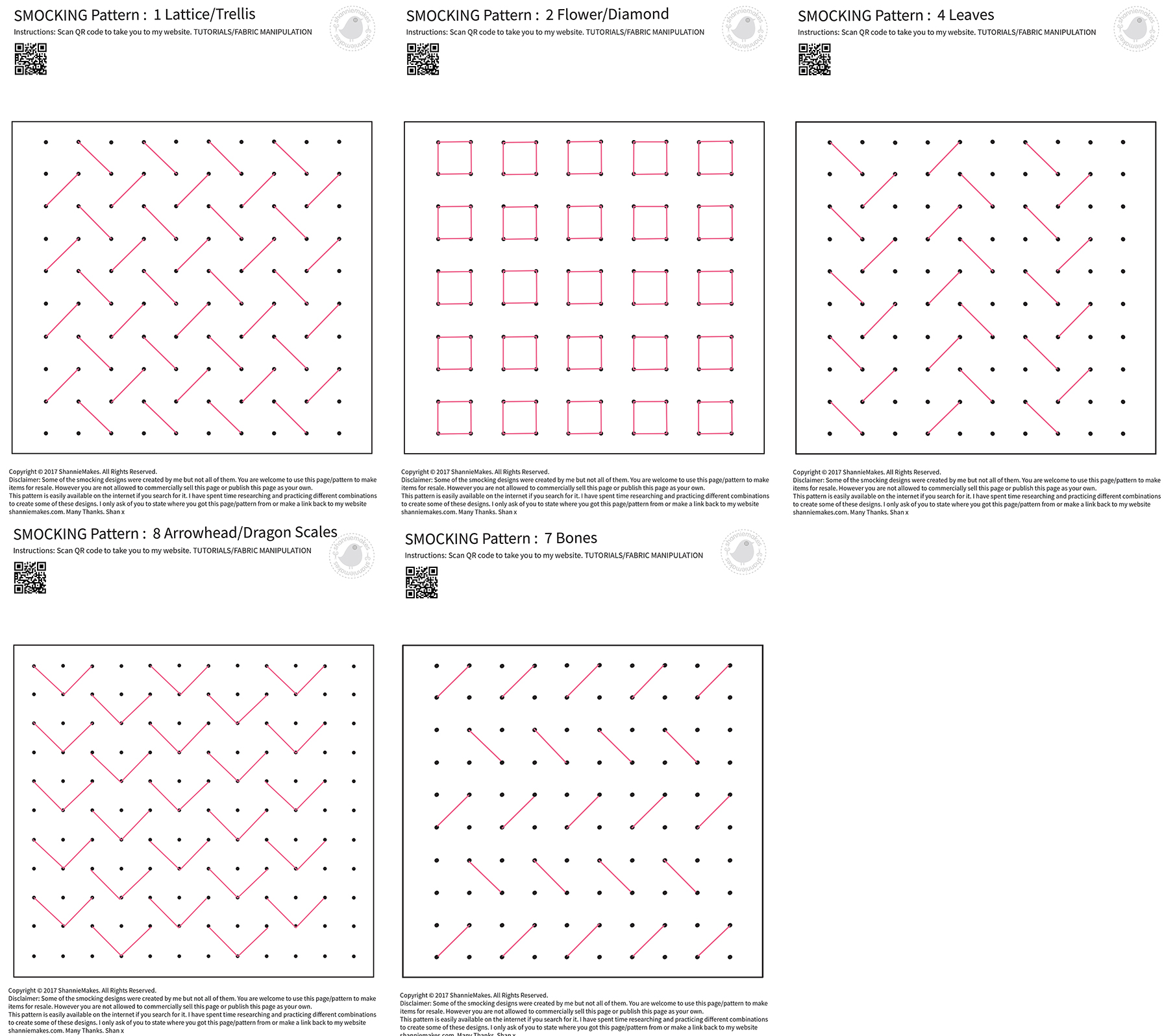
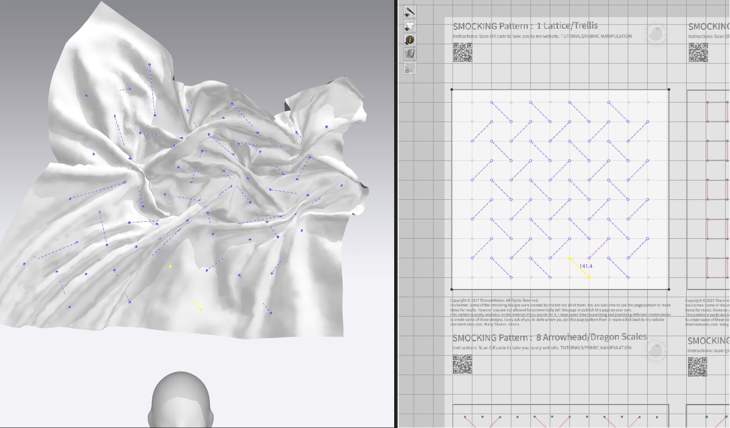
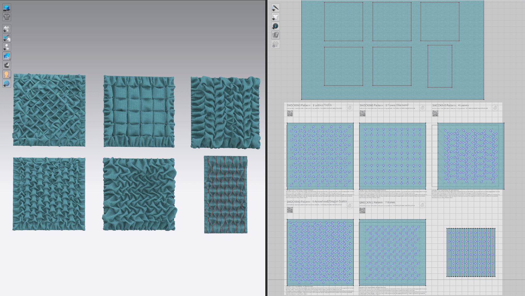
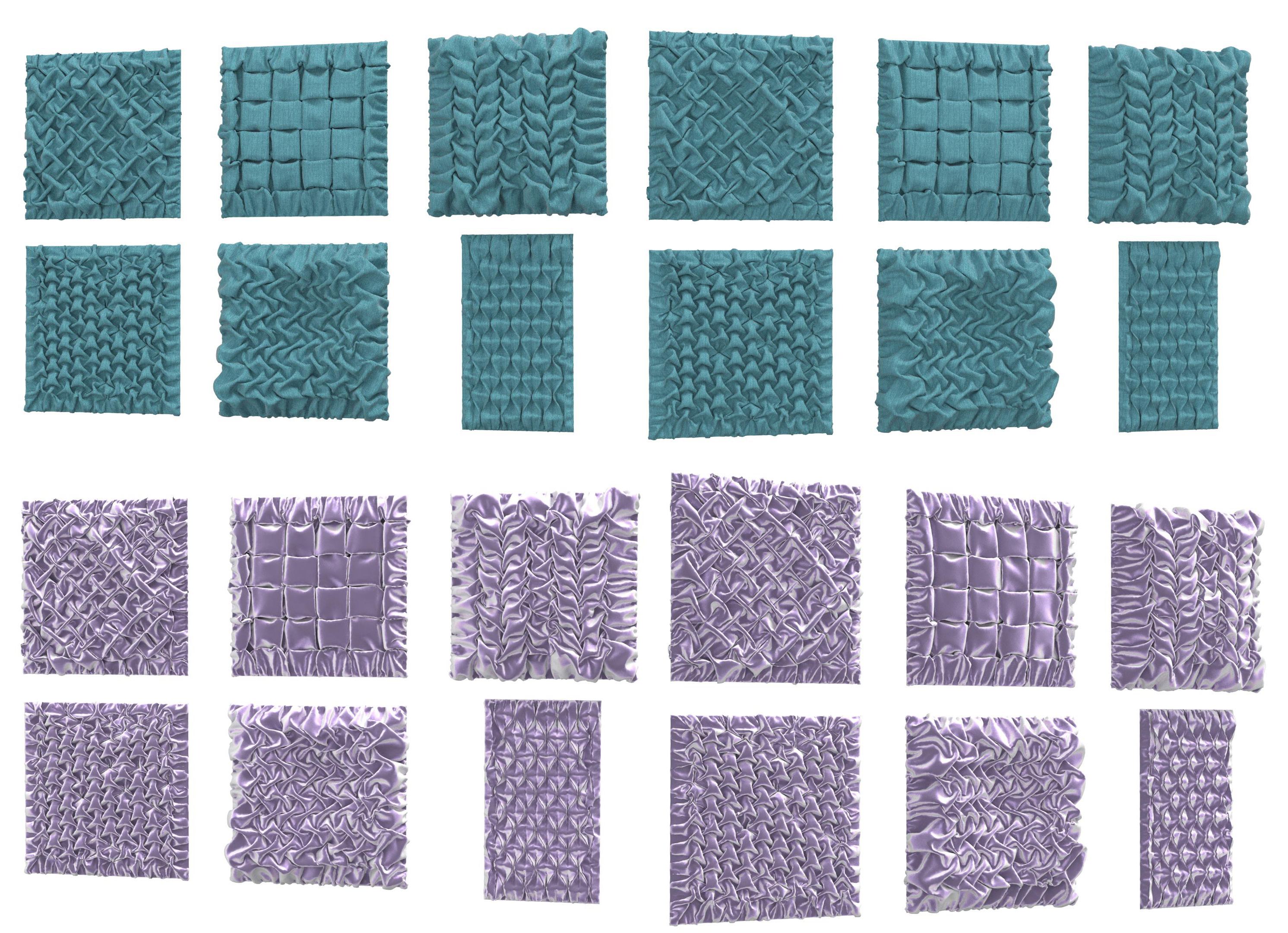
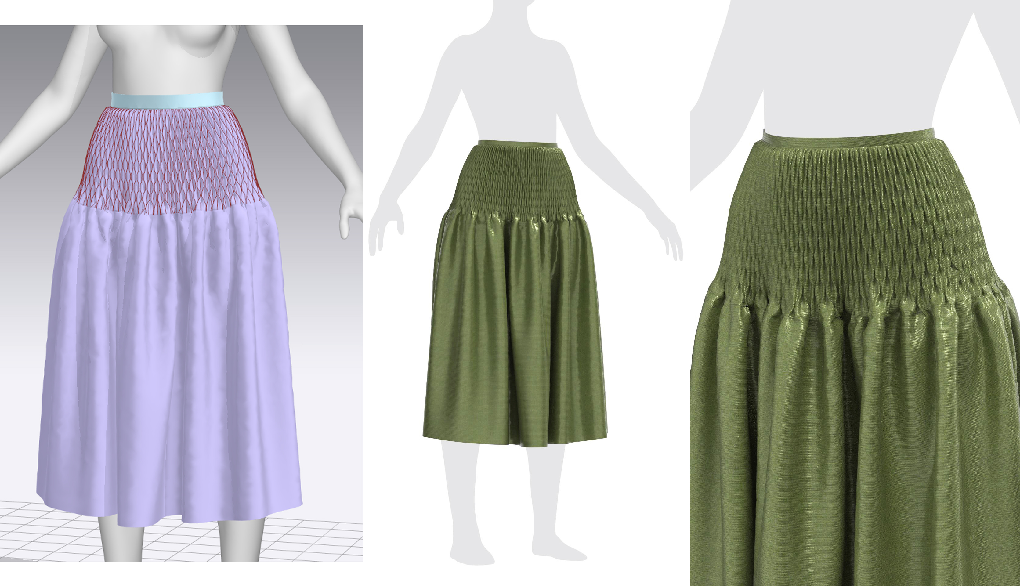
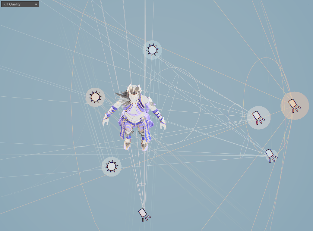
I’ve actually already sort of stumbled upon one potential element: one of the smocking tests I did previously was for a design called ‘Canadian’ smocking AKA..’bone’ smocking! It wasn’t necessarily one of my original picks, but I’d like to play around with it more to see if I can make the effect more consistent and the little bone shapes more obvious.

The other design I remembered was on one of Cersei’s dresses from Game of Thrones, where she has a spinal design done with folded fabric strips down the back. This is actually quite reminiscent of the technique I did on my live brief project, and I think it would work quite well with Marvelous’s tools, so I’ll look to ways to add something like this in – perhaps along the backs of the long gloves.

Bibliography

Dambach, V. (2021). Aasimar Warlock. [image] Available at: https://www.artstation.com/artwork/0nGll8 [Accessed 10 March 2022].

Kupriianov, R. (2022). What did you say? Repeat if you can.. [image] Available at:
https://www.artstation.com/artwork/2KyVa [Accessed 11 March 2022].

Making Game of Thrones Blog, 2017. To Dress a Queen: The Season 7 Costumes of Daenerys and Cersei. [image] Available at: https://www.makinggameofthrones.com/production-diary/to-dress-a-queen-the-season-7-costumes-of-daenerys-and-cersei [Accessed 19 April 2022].

Practice 2: Costume Refining (MS 8)

Practice 2

Proportion Issues

I brought the design over to CLO for some quick test renders, and it became apparent that there were some problems with her overall silhouette and proportions. It took me a while to nail down, but the issue is in the puff sleeves at the widest point of her shoulders – it makes her torso look extremely wide and the costume generally top-heavy. I tried to reduce this effect by pulling the puff sleeves further down her arms, but it was still a bit strange. I ended up removing the ‘stuffing’ (a gathered piece of internal sleeve) from the upper sleeves, letting them drape more, and that made a clear improvement. I also modified the shirt pattern slightly to pull the wide shoulders closer to the neck (and the sleeves further up), adjusting where the bulk of the volume lay. I still think perhaps there needs to be more volume in the lower half – additional skirts, bags, belts?

Stays Update

The shape of her stays was still bothering me – although I couldn’t put my finger on exactly why – so I set out to try and find a different look for their design. In digging through my old 18th century gown inspiration folder, I stumbled upon this dress from the 1860s-70s from the V&A Museum. It immediately struck me as something of a ribcage or other skeletal design, so I set out to replicate it.

I also managed to resolve a few issues with the underlying layers riding up or shifting under neath the stays, and that was via a dozen tacks to the waistband of the pants – now nothing can really move out of place.

Minor Shirt Fixes

I quite liked the lace-up detail I had done on the previous stays, and wanted to figure out how to incorporate it into the costume elsewhere. Marvelous has a useful feature where sections of garments can simply be replicated and re-stitched onto new sections of a garment, so I was able to pull the lacing and place it directly onto the opening in the shirt.

I also tried out an option for some of the smocking details – an apron on the front of the skirts – but decided it covered too much of the nice asymmetric details. I’ll look to incorporate that technique somewhere else.

Design Inspiration & Current Pattern

I put together a little infographic for my final documentation showing some of the inspiration that went into my current design. It’s worked quite well for me to just pull small elements from various pieces and change them up a little, even if this frankensteining led to quite a few elements being thrown away in the process. I am very pleased with how quickly the patterning has come together once I settled on a general look. I’ve allocated quite a lot of time at the start of the final semester for patterning, and I’m hoping that’s a place I can get a jumpstart.

Bibliography

Bedra Vintage. (2020). Estella corset. [image] Available at:
https://bedravintage.com/products/estella-corset [Accessed 4 April 2022].

New Chic. (2019). Plaid Ethnic Pattern Print Pleated Harem Pants with Pocket. [image] Available at:
https://www.newchic.in/pants-and-capris-3674 [Accessed 3 April 2022].

Han Kim, K. (2018). Elf. [image] Available at: https://www.artstation.com/artwork/94zqN [Accessed 3
March 2022].

Victoria and Albert Museum. (2006). Gown. [image] Available at:
https://collections.vam.ac.uk/item/O127162/gown-unknown/ [Accessed 8 April 2022].

Burmak, E. (2019). Character illustrations for Pathfinder. [image] Available at:
https://www.artstation.com/artwork/GYVXW [Accessed 2 April 2022].

Assassin’s Creed Wiki. (2022). Amunet – Assassin’s Creed Origins. [image] Available at:
https://assassinscreed.fandom.com/wiki/Amunet [Accessed 3 March 2022].

Tree of Savior. (2017). Tree of Savior Work of art Character. [image] Available at:
https://www.hiclipart.com/free-transparent-background-png-clipart-cpkuw [Accessed 26 April 2022].

Practice 2: Early Texturing (MS 7)

Practice 2

Substance Materials in Marvelous

I’ve had a play around with some textile/color options for the necromancer character just with previously-downloaded Substance Source materials. I’ve generally had some materials in mind during construction: leather boots, gloves, and potentially stays; linen undershirt and pants; rough-spun patterned skirts and sleeves. In applying placeholders, I’m generally fairly happy with those broad categories, and with the Eastern European look and feel of the geometric fabric. That said, the dull colors and general monotony leaves a lot to be desired, and I will likely overhaul most of these initial choices. I’d also like a lot more variety in the textiles themselves, applying intentional trim woven along pattern edges rather than simply cut out of a pre-made fabric, and with very few pieces made of the same fabric as I have here.

Color References

In gathering general ‘colors and style’ references, I’ve been particularly drawn to faded jewel tones and earthy greens/browns. The character does have humble roots and her backstory involves sewing most of her own clothing, so while they may have complex textile treatments and a lot of handwork that complicates her overall outfit, the base fabrics should remain accessible. I’ll do a few more experiments swapping out my current fabrics with replacements in a few different color schemes (conveniently, in Marvelous Designer, each fabric is applied to a set of patterns, so changing the geometric white-and-red will adjust it for all pieces where it’s currently used).

Bibliography

Azevedo, M. (2021). Espírito da Natureza. [image] Available at: https://www.artstation.com/artwork/6846rr [Accessed 27 March 2022].

Berthelot, M. (2019). Chrono Trigger – Crono. [image] Available at:
https://www.artstation.com/artwork/9eXgQN [Accessed 1 April 2022].

VendyVry. (2015). Sometimes you just wanna come up with a bog witch, and that’s okay. [image]
Available at: https://twitter.com/VendyVry/status/1338960455495274497 [Accessed 4 March 2022].

Practice 2: Conquering Gloves (MS 6)

Practice 2

Glove Patterning

My earlier placeholder design for my necromancer included a simple pair of gauntlets, but this didn’t entirely make sense with her very practical character who generally avoids combat. Instead, I’ve decided to give her a pair of fingerless gloves, appropriate for both sewing and digging up corpses. I admit, in all my long years of sewing and patterning garments in real life, I’ve never made a pair of gloves…and I now know why! They’re enormously fiddly patterns – even with a few dozen google searches, attempting to trace multiple diagrams, examining pairs that I physically own, and watching Youtube videos of people sewing them together, I genuinely couldn’t figure out which parts were meant to line up with which seams.

I finally managed it by referencing a pair of men’s Renaissance Faire gloves that simply had letter labels, matching up A->C and B->D…a little embarrassing, but I do now have a pair of functional, fitted gloves for her to wear!

I’d like to add a lot more detail complication to them – these are great candidates for quilted or embroidered detailing, large visible stitching, straps, and perhaps a little more lacing (for practicality’s sake, of course, how else would she take them on or off?).

Practice 2: Endless Outfit Designs (MS 5)

Practice 2

Designing is hard

As reasonably straightforward as the pants have been, the top half of my necromancer character, and the skirts over top, have been quite the source of frustration for me. I’m clearly not a designer – making any sort of decision about the shapes or appearance of this costume has been essentially trial-and-error. I’m not the strongest sketcher, so it truly is easier for me to simply mock up various shapes in Marvelous, but it’s also led to an absolute graveyard of discarded garments (maybe I ought to put together a pattern pack and post it on Artstation marketplace so at least it serves some purpose!).

I started out with a strong idea about wanting off-the-shoulder, puffy sleeves, typical for any medieval fantasy peasant woman, but ran into a few problems. The silhouette was generally quite top-heavy, it didn’t seem entirely appropriate for an elderly woman, but most importantly, these kind of tops just don’t behave well with the software. Marvelous has a feature, that I use constantly, where you can assign garments to ‘layers’ and it will do its best to pull outside of lower layers and tuck into higher ones. Just as a test, I imported a pair of stays (corset) I had made for a previous project, set it to a layer above the shirt, and watched the puff sleeves desperately attempt to worm their way inside the bodice. There really isn’t a good solution to this that will last more than a few simulations before it starts becoming a problem again. Since I have freedom of design here, I figure I’ll just work with the software limitations rather than fight them, and keep some of the volume out of the armpits where it’s directly in contact with the stays. I’d still like to have some volume in the sleeves, but perhaps lower down her arm.

I also tried out numerous different shapes for the torso part of the top, rejecting many of them for their lack of shape or interest, and attempted a few draped skirts as well. I think I’m a little too wedded to the complex pants I made previously, but I kept having problems with the skirts covering too much of the underlying layers; I’m thinking asymmetry is the way to go.

Yet another shirt, sleeves, skirts

In yet another attempt at the slight off-the-shoulder look, I started working on a shirt resembling the bodices of 1840s gowns. It’s getting closer to the look I want, and more importantly, is no longer fighting an overlaid corset, but still doesn’t quite feel right for the character. I decided to revisit it later.

For the sleeves, I discarded the entirely puff sleeve I had originally in favor of some Italian Renaissance puff-slash sleeves with volume lower down. My main inspiration was from a beautiful concept art by Kyung Han Kim, which has the perfect amount of volume without overwhelming the character; this is, at this point, the one area I can say I’m very happy with, and I expect the sleeves will remain largely as they are.

I drew upon designs from Aya from the game Assassin’s Creed: Origins for a more asymmetrical skirt that still showed off parts of the underlying garments. While mine ended up having somewhat of a different shape, it achieved exactly the effect I was looking for. I still think I’ll add more layers to the skirt – perhaps a center front panel – but this is fairly successful so far.

New stays, finally a neckline that works

Since my previous corset was just a stand-in, and I wanted to ensure that the sleeves were in fact working technically with the design, I went to work on the overlaying stays. I started out with my previous test pair, but in removing the tabs and drastically changing the fit (I didn’t want them nearly as cinching for an elderly woman seeking comfortable garb), the patterns are nearly unrecognizable. I didn’t like how blank the front was, so I tried out some lacing designs and a belt, which added some good visual interest.

However, something was off about the vertical proportions – she had too much empty space in her chest – so I attempted a..fourth? fifth? bodice with more coverage. I was vaguely thinking Viking-style tunics with an open V-shaped neckline, and added some pleats at the shoulders to keep it from resembling a modern-day t-shirt. I think this feels much more appropriate for the character, and I’m really enjoying the total mish-mash of historical time periods and styles (perfect for a centuries-old graverobber with eccentric tastes).

So, with those pieces settled, here’s just a small glimpse into the many, MANY rejected pieces I’ve made so far on top of my current WIP. It’s impressive (and just a little embarrassing) seeing it all together!

Bibliography

Assassin’s Creed Wiki. (2022). Amunet – Assassin’s Creed Origins. [image] Available at:
https://assassinscreed.fandom.com/wiki/Amunet [Accessed 3 March 2022].

Han Kim, K. (2018). Elf. [image] Available at: https://www.artstation.com/artwork/94zqN [Accessed 3
March 2022].

Practice 2: Pants Patterning (MS 4)

Practice 2

Inspiration

I decided to get started on blocking out/testing various pattern ideas with the pants portion of the necromancer character, since that’s possibly the area that I have the surest idea about. In general, I’m imagining her wearing many different draped layers, with a pair of loose, poufy pants and a few gathered or hiked-up skirts over top – I’d like to do some complex draping and have many different textiles, but still have her wearing something more practical than just skirts for adventuring.

These are three of my favorite styles from the collection of concept art I’ve gathered:

Pattern Testing

I sought to recreate several of the designs (as well as get in a bit of good patterning practice – pants are some of the most complex garments to fit!). I didn’t nail them down exactly, but rather played around with a few extra details and shapes. This wasn’t too complicated – I took basic pant block patterns and simply enlarged them at the waist or calf for different effects.

Options: Rendered

And here’s what they look like with basic materials applied and rendered in CLO! My favorite pair is the center one with the pleated waist, but I also really like the lacing detail from the LHS ones…and the asymmetrical drape from the RHS. In typical indecisive fashion, I started working on combining all three!

Design Combinations

Here’s where I ended up with the pants – I used the pleated pair as the base, but changed the proportions somewhat to better fit over the top of her boots and create a fuller silhouette higher up. Otherwise, the pants looked rather droopy and almost like they were pulling at the boots – not a very flattering silhouette. I took elements from the asymmetrical pair and created the first layer of the skirt, and moved the lacing to the sides of the legs where it would be more visible amongst the layers. I do think there are still some proportion issues, but it’s getting there.

Bibliography

Farazis, G. (2021). X Character / City 2 / The Project. [image] Available at: https://www.artstation.com/artwork/nYkAdX [Accessed 8 April 2022].

New Chic. (2019). Plaid Ethnic Pattern Print Pleated Harem Pants with Pocket. [image] Available at:
https://www.newchic.in/pants-and-capris-3674 [Accessed 3 April 2022].

Vinora, A. (2018). Costume Sketches. [image] Available at:
https://br.pinterest.com/pin/787004103629873989/ [Accessed 14 March 2022].

Practice 2: Forefront: Substance Designer Embroidery

Practice 2

Asa Booth

In starting to look for interesting textile techniques that I can incorporate into my design, I discovered the beautiful embroidery work of Asa Booth. This piece was done in Substance Designer, a software I’ve been dragging my heels at learning due to its complication, but it’s clear that it’s the place to go for customized texturing.

Much of this process is unfamiliar to me, but I think looking into the overall stages now is a good way to familiarize myself with the steps. The overall effect is fantastic – the artist was able to mimic the slightly wobbly direction of embroidery stitches, incorporate some inconsistencies, and create a very realistic textile.

They start out creating the base fabric with a series of gradients and warps to create that woven effect. They added some variation and noise along with knobby errors in the fabric – no textile is perfect and you’ll often see some parts where it was snagged or where threads are uneven. For my necromancer character, I’d like to incorporate quite a lot of this variation since her costume will primarily be constructed from roughspun, hand-made fabrics.

Asa then built the twisted, rope-like shape of the individual embroidery strands themselves. This is likely more detail than I will be going into for a reasonably low-poly game character, but even just looking at the SD diagrams, I’m glad I can make some sense of the steps: simply a series of modifiers and maps that refine the shape, similar to transform nodes in Maya.

The most illuminating part of this process for an outsider was how Asa created the embroidery threads that follow the rounded shape of the fox design. In essence, it was done with a black-white gradient where each shade indicates a certain degree of rotation; she’s created a mask so that the threads fade off appropriately and a rotation map to dictate their direction. The end result is individual stitches that correctly mimic the way threads would be placed to fill in an area of an image.

Bibliography

Booth, A. (2019). Creating Embroidery in Substance Designer. [online] 80.lv. Available at: https://80.lv/articles/001agt-creating-embroidery-in-substance-designer/ [Accessed 10 April 2022].

Practice 2: Forefront: Dramatic Lighting + Laudna Update

Practice 2

Dramatic Rim Lighting

I recently stumbled upon a particular piece of art, Norse Challenge – ArtQuest along with the full works of Ruan West, and I was immediately enthralled by his use of dramatic lighting for fairly simple stylized characters. Obviously if you look closer, there is a fair amount of detail in his pieces, but the lighting is doing some heavy lifting in bringing out those overemphasized shapes and vibrant colors. After a bit of digging through the comments, he explains that he creates, polypaints, and renders his pieces in ZBrush (with passes in Photoshop). Since this inherently forces some simplicity in lighting (ZBrush doesn’t have the most dynamic lighting system), this is a perfect learning opportunity for me to try to emulate.

Lighting has never been my strong suit – I’m fairly familiar with lighting setups from real-life photography, but often that involves managing far fewer artificial lights with limited settings and a high reliance on natural light. My attempts at basic three-point lighting kept leaving parts of the model in shadow, and I’ve generally not had the best luck with HDRIs for anything but soft fill as they provide static lighting often with strange tints.

Looking through his pieces, I’d guess that he has two or three rimlights: one behind the LHS shoulder, one above and slightly in front of the RHS part of the chest, and a very harsh but low-spread one directly behind the character for those sharp highlights. There’s obviously some soft fill from the front as well, as the character is well-lit overall, but nothing is overexposed. Most lights also appears to have some subtle orange or blue coloring rather than flat white. It’s particularly useful seeing some of his unlit WIPs and just how different they appear from the final renders: lighting really does make a huge difference.

I set out to experiment on one of my older pieces which I had JUST decided was finished, but alas, she needs some more dramatic lighting..! I’m working in Marmoset, not ZBrush, but hopefully the fundamentals are the same.

Laudna Update

Over the semester, I’ve been attempting to find a moment here or there to update my Semester A 3D printing project, Laudna from Critical Role. Although I’m very proud of what I managed to accomplish in a short time period and having never touched many of the character art processes before, my original model left a lot to be desired. She was a fairly new and un-established character when I first started on my sculpt, but I’ve now had months listening to her interactions and she’s become particularly near and dear to my heart – I want to do her justice!

I didn’t document all of my changes too carefully, since they were fairly similar to the workflow I used in the first run but simply more refined. I did, however, keep myself a wishlist of changes that I managed to check off in its entirety:

One of the main elements I wanted to update was the general presentation of the model, including a really dramatic lighting setup for her. She has so much detail that was being lost and ‘flattened’ by poor lighting, such that even as I heavily updated her textures with dark recesses and overemphasized highlights, she looked monochrome. I wasn’t too confident in Marmoset and relied upon a combination of a few tutorial lighting setups for my initial look. Seeing Ruan West’s work above inspired me to redo her lighting setup from scratch and really lean into the rimlights and subtler lights to bring out specific portions of the model.

Some of the lights appear to not be making much difference in the preview window, but I must have done a few hundred renders comparing subtle changes before I settled on this arrangement. In essence, she has very low lighting from the HDRI, several ambient lights in orange and pale blue for more even studio lighting, three rimlights of varying intensity and spread, and three soft fill lights on her lower face, rat, and shoes.

I think the result really pops! I’ve accidentally stumbled upon a technique I used to use in graphic design all the time: pairing a one-or-two-pixel dark line right next to a white one to sharpen and emphasize edges (of text, UI boxes, and the like). The harsh rimlight along with a thinner overall black outline helps to achieve that hand-drawn, slightly cartoony look that I’ve been trying to match from the concept art.

A few people on the Reddit thread where I shared this piece tried to argue they didn’t believe it was 3D as opposed to a digital painting until I showed off the turnaround video, which I’m taking as a badge of honor 🙂

Oh, and I ran into a Substance Painter glitch was just a little too appropriate when I was updating Laudna’s textures..

(everything worked just fine on a restart! And I’ve since discovered the ‘bake by name’ feature in SP so the exploded model wasn’t necessary in the end)

Bibliography

West, R., 2022. Norse Challenge – ArtQuest. [image] Available at: https://www.artstation.com/artwork/nENxVe [Accessed 5 April 2022].

Practice 2: Smocking Tests (MS 3)

Practice 2

Smocking Basics

Since one of the main focuses of my final major project will be textile manipulation and advanced costume work, I’ve been looking at ways to incorporate some real-world techniques into my piece. I’ve planned to do some complex quilting designs (essentially, stitching two layers of fabric together with decorative thread and puffing out the space in between – in real life, this is done with a sandwiched layer of fluffy batting, and in Marvelous Designer, created with internal stitch lines and the pressure feature). However, this is something that I see quite often in other people’s designs and I’m looking to push the envelope with this one.

Enter: smocking. Smocking is a neat trick for creating complex gathers and ruched designs in garments, and has historical roots from several time periods (particularly seen in Elizabethan garb). I’ve had my eye on it after doing so much research on my live brief project, as Daenerys has quite a few gowns on Game of Thrones that make use of a specific type of dragonscale smocking invented for the show. I hadn’t thought about applying it digitally until I happened across this Youtube tutorial where a very simple form of smocking is done using the pin/tack tool in Marvelous:

This makes perfect sense – smocking is, in essence, pinning two points on a piece of fabric together in a series to create a design. It’s most often used in areas of clothing where there is some stretch or ease, such as fitting garments to a neck, waistline, or sleeve cuff. However, it can also simply be inset into non-stretch areas of a garment for decoration. While Marvelous’s tack tool is primarily used to pin sections of clothing in place, either to each other or to a mannequin, it also works perfecty for smocking details.

I spent some time familiarizing myself with different types of smocking, and found that there are endless diagrams available online. ShannieMakes has an excellent set of free downloadable .pdf versions of various designs, although without specific views of the finished products, so I was off to test out how well the various designs would work in practice digitally.

Experimentation

I started out arranging all of the smocking diagrams on a single image and set them as the background reference in MD. I then simply created a series of test squares attached to a backing and traced over the indicated lines with the tack tool. In doing so, I discovered a great feature: tacks can be scaled, copied, pasted, and mirrored, meaning I only need to trace a small section manually and then can re-use and replicate parts of the tacking anywhere I like. This means that I can actually reuse these exact test pieces on the final garment, saving significant time.

Generally, I think most of my smocking tests were quite successful: there’s some messiness and inconsistency, but that adds to the realism. One issue became immediately apparent: some of the sections of fabric didn’t quite want to dip or puff out in the correct orientation (i.e. some bits that should be puffed up towards the camera were behind the stitching and vice versa). I was able to resolve this somewhat by applying pressure to the fabric squares and essentially creating a series of small pillows, then applying the tacks and simulating. However, there’s obviously an important element in real-world smocking where the sewist can physically manipulate each section and force it to fold correctly, something that I can’t reasonably do for an automatically simulated piece in the digital space.

All in all, the smocking designs that worked the best were the ones that ‘naturally’ fell into the correct place without too much adjustment. In particular, I like the look of the dragonscale and honeycomb designs (lower LHS and lower RHS respectively), and plan to make use of both in my necromancer’s costume.

Test Application

I wanted to do one more proof of concept with these designs, and that was to test them in larger scale on an actual garment. I chose a waistband of a simple rectangular gathered skirt and the easiest method to replicate, the honeycomb smocking. I had some minor trouble aligning my copy-pasted sections of the smocking tacks to each other, but once that was resolved (by pasting some duplicated over others and then deleting the extra tacks), I think the effect looks great! I’m currently eyeing this technique for part of the sleeve cuffs and likely a decorative waistband, belt, or part of her skirt.

Bibliography

CLO. (2021). Garment Details: Expressing smocking detail (w/tack tool) (EN). Available at: https://youtu.be/GwG4gxlMC1o [Accessed 2 April 2022].

ShannieMakes. (2021). North American Smocking. [online] ShannieMakes. Available at: http://shanniemakes.com/north-american-smocking-8-arrowheads-dragon-scales/ [Accessed 3 April 2022].

Practice 2: The Entire Kitchen Sink (MS 2)

Practice 2

Project Goals

I’ve been thinking about what I’d like to get out of my final semester project and how I can tailor its scope to match those goals. I’ve settled on two main ones: create a really spectacular portfolio piece, and learn (or at least familiarize myself with) all of the skills I’ll need to be successful in industry as a junior character artist.

At the beginning of this course, my biggest concern regarding my own skillset was my speed. I’m fairly quick at picking up new skills, but was painstakingly slow at settling on project ideas, concepting, and sculpting as a whole. While I still struggle with perfectionism and decision-making, I’ve gotten exponentially faster at each step of the character art pipeline with every new pass through it; what used to take me weeks (Marvelous costume construction, retopology, etc.) now only takes days as I become more familiar with the steps. While I’ve picked up a good variety of skills, there are still a few aspects I’ve never touched: hair cards, custom Substance Designer textiles, and rigging to name a few. I’d like to go into industry with at least an understanding of these basic processes and a better idea of how to budget time for them, hopefully avoiding panic or missed deadlines when the stakes are high(er than a self-directed university project).

Checking Boxes

In my years of cosplaying and judging crafting competitions, I’ve puzzled out that the single best way to be successful is to do a large variety of techniques well. It’s sort of become the rule for higher-level shows: it’s not simply enough to be extremely precise and perfect with one technique (e.g. sewing) because there will always be someone who has amazing sewing AND leatherwork AND armor AND resin casting AND wig work, and that acts as a tiebreaker. And while I’m fairly familiar with a range of techniques and do my best not to show any particular bias, I’ve certainly judged alongside specialists who only recognize skill in the area they’re familiar with, and push very hard for a winner in that category.

All this is to say, I think to create the best portfolio piece possible, it needs to touch on as many techniques as I can (competently) include. Even if I’m not actually focusing on all of them in industry, it’s important to have an understanding of the time constraints and processes of most, and a technique may impress one developer on a hiring team that happens to favor specialized skills.

Skill Goals

With that said, my primary aim is to create the most well-rounded portfolio piece that I can, which showcases a wide variety of character modeling techniques. My current plan should cover:

  • Anatomy (human elderly female, male skeleton with some musculature)
  • Grooming (hair cards)
  • Feminine and masculine clothing
  • Advanced garment work (smocking, quilting, complex patterning)
  • Textile design (embroidery, piping, jacquard)
  • Texturing weathered/worn garments
  • Complex detail sculpting (trinkets and jewelry)
  • Rigging and posing
  • Environment basics
  • Dramatic lighting
  • Unreal Engine 5 rendering
  • Full character pipeline

Practice 2: Major Study Planning (MS 1)

Practice 2

Main Idea

I’ve been thinking about my final semester project essentially since I was accepted onto the course, so I have a fairly fleshed-out idea in my head of what it will entail. In short, I’m going to be sculpting the Dungeons and Dragons character that I’ve invented and established. She’s a grandmotherly necromancer woman who spends her time babying her skeleton familiars and occasionally grave-robbing corpses for additional trinkets to add to her collection. Her idyllic cottage in the woods seems seems welcoming and non-threatening until you look a little closer, where you’ll notice nods to her darker hobbies.

I plan to sculpt two characters: the necromancer herself and a partially-decayed skeleton companion. The woman will be standing near her minion and interacting with him in an affectionate way, perhaps patching a wound or sewing up his clothing. As characters are the focus, I will only be making a small vignette of the environment (her front door and a portion of her doorstep with a patch of ground). This will allow me to focus on creating every element of both characters in a highly detailed, fairly realistic style, with particular care taken towards complex garment and accessory sculpting. In terms of time management, I’m trying to make this project as modular as possible (i.e. have ‘wishlist’ items like additional pieces of the environment, more jewelry and bits on her outfit, etc.) so that there are no issues if I need to drop extra elements.

I’ve been generally taking bullet-point notes for myself whenever I thought of new ideas for this project, which I’ve pasted below to document its evolution.

Necromancer

  • Figure (necromancer character) standing near the doorway of a semi-stylized stone-and-moss cottage, with loads of flowers and plants
  • Can design + sculpt woman in her entirety, including pose, hair, clothing, etc.
  • Pose ideas: woman tending to injured undead minion, putting some sort of band-aid situation on a bony knee or reaching up to a forehead or sitting with its head in her lap
  • Pair of stays-esque vest, over a billowy sleeved partially off-the-shoulder top, with pleated? wide leg pants (OR harem pants with intricate designs, cutouts, lacing?) and a split overskirt (or gathered up), maybe with some jewelry/filigree pieces like arm cuffs and belts, maybe pieces she took from graves
  • Skeleton familiar has matching opposite pieces so it’s clear she stole stuff from him (maybe she has the left pauldron and he has the right one in a set)
  • Belt covered in tools (for necromancy and healing, probably filigreed) and eclectic trinkets stolen from graves; loads of different eras, genres, levels of wear/patina/cleanliness
  • E.g. some jewelry that looks very Viking but also arm cuffs that are really Grecian and some pirate-coin belt trimming
  • Fairly simple rustic clothing so I can get some good woven textures in there and play with minor tears, fraying, and dirt on her clothes; sunbleached and worn areas/highlights
  • Loads of fabric details: layers of skirts, quilting, embroidery, SMOCKING
  • Alignment: chaotic neutral necromancy-specialization wizard

Skeleton

  • Male (for practice with male anatomy) with some musculature/clothing?
  • Skeleton familiar wearing Viking-style rags with a more pristine tunic top on top that she clearly gave him recently. Maybe a little embroidered floral design on it?
  • Embroidered skull/bones with flowers, clearly hand-done with errors

Environment

  • Door and maybe windows ajar, allowed a partial glimpse into the building?
  • Cottage is surrounded by small garden in a forest glade, super chill, maybe some light rays and dust
  • Lots of slightly creepy elements that aren’t immediately noticeable to indicate the necromancer side of things
  • House with some tree kind of encapsulating it, giving a skeletal vibe
  • Possible style: piecemeal or otherwise representative of a real DnD terrain, with seamlines or other indicators; tilt-shift on a wooden tabletop with blurry viewers in the background?
  • Instead of a full scene, simply a floating chunk of land with part of a house visible (front door, doorstep, window, etc.)
  • Skeletal hands planted in a windowbox surrounded by flowers
  • Workbench with mud-covered gold pieces that her charges were buried with
  • Just a vignette of the house: part of a front door/window/step that fades into nothing (or fades away with loose bricks)

Bibliography

Christian, B., 2021. Skaab Wrangler – MTG Innistrad. [image] Available at: https://www.artstation.com/artwork/eaAQPD [Accessed 1 April 2022].

Practice 2: Live Brief Self-Critique

Practice 2

Athena Cole – CPP Live Brief

When I first approached this assignment, I thought of my favorite sci-fi properties, which generally had one thing in common: they all contain some fantasy elements. Perhaps one of the best examples of this is the game Horizon Zero Dawn, which has an aesthetic I’ve always been drawn to. Therefore, I sought to create a piece that could exist somewhere in that universe but still have original elements.

I chose a concept art piece by Whitney Lanier, a crossover between Daenerys from Game of Thrones and Aloy from Horizon Zero Dawn. It has both hard-surface and organic clothing elements, including an opportunity to do some complex patterning and fabric manipulation, and is based on two of my favorite series. After obtaining enthusiastic permission from the artist to use it as inspiration, I started with the garments in Marvelous Designer.

The MD stage went extremely well – I was able to create the basis of the clothing within the first week, and refined it more through the next. I’m especially proud of the textile work on the vest; it’s a clear match to one of the canonical Aloy designs, and I spent several days experimenting to recreate that effect. I ended up slicing up the vest pattern, making a replica copy of a hundred+ small pattern pieces, and stitching them together with pressure. This forced me to gain a really solid understanding of seam angles and seam length matching as I assembled such a complex garment.

Unfortunately, once I left Marvelous, the rest of the character work was far less straightforward. I wanted to really nail down the process for converting extremely high-poly MD simulations into clean quad topology while maintaining all the detail and the neat UV shapes of the original pattern pieces. This involves manual retopo of the flat pattern pieces and transferring attributes in Maya on a piece-by-piece basis (avoiding issues with underhangs and overlapping fabric that would occur if I simply used ZBrush’s projection tool). I had practiced this on previous projects, but my focus this time was a) becoming comfortable with Maya’s quad draw and b) keeping the polycount very low, both of which I achieved with moderate success. That said, retopo still takes me an enormous amount of time, and I struggled with time management for the last stretch of this assignment.

I did take a few days once I had good high-poly meshes in ZBrush to add as much sculpted detail as I could to the fabric parts. This included creases, seam lines, large wrinkles, stitching designs, and general cleanup. I have a fair amount of real-world knowledge about how fabric behaves, but felt I wasn’t deliberate or dramatic enough in adding detail previously (with much of it being lost in texturing). This turned out quite well – I’m getting much better at identifying where to add which type of detail and how ‘hard’ to go with it, and I think my piece ultimately looks best at the ZBrush stage.

In contrast, the armor pieces were an area where I really struggled. Having seen several live demos from artists that worked on the original Horizon Zero Dawn costumes, I knew that even the hard-surface pieces were done first in high-poly dynameshed sculpts and then retopologized, rather than starting low. However, I’m still working on my hard-surface skills; even seeing the exact brushes and settings used, I couldn’t quite replicate those crispy sharp edges. I also really wasn’t sure at which stage I should be adding in the details like panel lines and greebles, so I kept putting off working on the armor, and it ended up being quite rushed for the deadline. As opposed to my neatly retopoed fabric, most of the armor was simply decimated using ZBrush’s automatic tool into (incredibly messy) triangles, and then auto-unwrapped. I absolutely need to go back in and manually retopo, clean up my sculpts, and then add in the details after the fact to get the cleanest bakes. I did manage to make good use of the texture space in one regard: I noticed that the brown spike parts of the armor was replicated many times (shoulders, knees, feet, belt), so I created that piece with clean topology and replicated it so that every one of those pieces uses a single section of the texture sheet. I intend to repeat that process for any of the other replicated/mirrored armor pieces.

I tried to keep the textures somewhere between the extreme realism of HZD/GoT and the hand-painted concept artwork. Most of my textures were programmatically generated using curvature and gradientsin Substance Painter, with very little hand-painting at this stage while I consider the UVs still a work-in-progress. They have faint fabric textures overlaid on top, but only enough to add roughness without losing my carefully-created sculpted details. I also added some custom height maps for embroidery and other masked areas. In general, I feel like my baking and texturing process wasn’t very successful. I have many artifacts despite playing around with bake settings, and much of my detail is pixelated or blurred compared to the original sculpt. More experimentation is needed!

Apart from a bit more refining on the armor, I think this piece is quite successful as a costume showcase. However, it’s still missing a lot before I can consider it a finished character sculpt. I roughly sculpted a hairstyle in ZBrush, but decided it was obscuring much of my careful work on the collar and vest. I plan to explore hair card creation to make her hairstyle instead, which is a new skill for me. She also obviously needs a face and detailed body! If I’m able, I’d like to go in and add her dragon as an accessory, since it really defines the character (and is a clever nod to both reference properties), and I’d like to give her a more dynamic pose as well. Finally, I’m still working on my lighting setups within Marmoset; my current piece is quite flat and could use more dynamic lights and background contrast.

Practice 2: Scene Setup + Final Renders (LB 8)

Practice 2

Scene Setup

My scene setup in Marmoset was fairly straightforward: a canyon HDRI mainly to add a small amount of universal light and for a nicely blurred background (default with the program), a couple slightly colored fill lights primarily in front, a large warm light in the upper RHS to emulate sunlight, and a neutral rimlight to emphasize details. I added a minor amount of post-processing to the camera but generally left the scene as-is.

Final Renders

I tried a few options for the final renders, both on a neutral colored background with a vignette and with the HDRI. I think the neutral shows off the sculpt marginally better, while the HDRI gives more context to the scene. Neither are particularly dynamic, however, and I would eventually like to go back and tweak the presentation.

Practice 2: Forefront: Hand-painted Texturing

Practice 2

Manuel Sitompul

Faced with a looming deadline and an untextured character, I sought out advice for rapidly creating those soft gradients and programatically-generated textures often seen in stylized looks. I had run across a very useful article by Manuel Sitompul a while back while investigating hand-painted looks for my Laudna sculpt, but didn’t have a chance to look into it in-depth. In reading further, I love the strong shapes and clear personality he’s created with this character, as well as his choice of creating a small grounding environment that fade outs – all of the elements are simply painted on but add a real ambiance to the piece.

Apart from a bunch of useful stylized sculpting tips, I was particularly impressed by the early-stage textures that he applied to the character in Substance Painter using (partially) automated tools, even before adding hand-painted details.

Much of this early texturing was done using a plugin called SoMuchDiffuse, which immediately looked promising from their example timelapses. It essentially combines a bunch of filters, gradients, and curve masks into a single smart material with every aspect editable. I purchased the tool to play around with in the hopes that I could put down some large, effective color onto my garment without needing to hand-paint every element.

Daenerys Application

I didn’t find the base materials to be too useful apart from the initial baked lighting, but it sped up the process significantly in that I didn’t have to make a few dozen separate smart layers for basic coloring. I ended up tweaking and customizing nearly all the settings, which went fairly quickly once I found my way around them. In the end, I applied a universal baked lighting to all of my fabric pieces, and then separate top-down gradients for additional color interest. I also made significant use of the cavity fill and highlights to bring out all those details I had previously sculpted in.

I didn’t have time to go in and add hand-painted elements to her costume, apart from bringing out a few areas of embossing or embroidery, but I actually am satisfied with the overall textures at this stage. In my previous work, I felt like much of the careful detailing was lost once textures were applied, and often I prefer the flat BPR render in ZBrush where they’re more visible, but I like the overall look of this piece.

Bibliography

Sitompul, M. (2019). Sculpting & Texturing a Fierce Character in 3D. [online] 80.lv. Available at: https://80.lv/articles/sculpting-texturing-a-fierce-character-in-3d/ [Accessed 12 March 2022].