Dramatic Rim Lighting
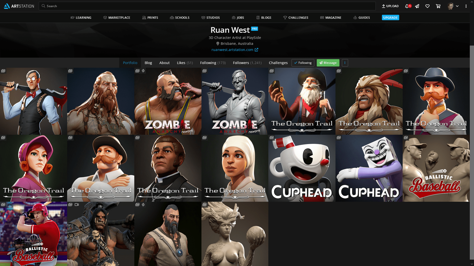
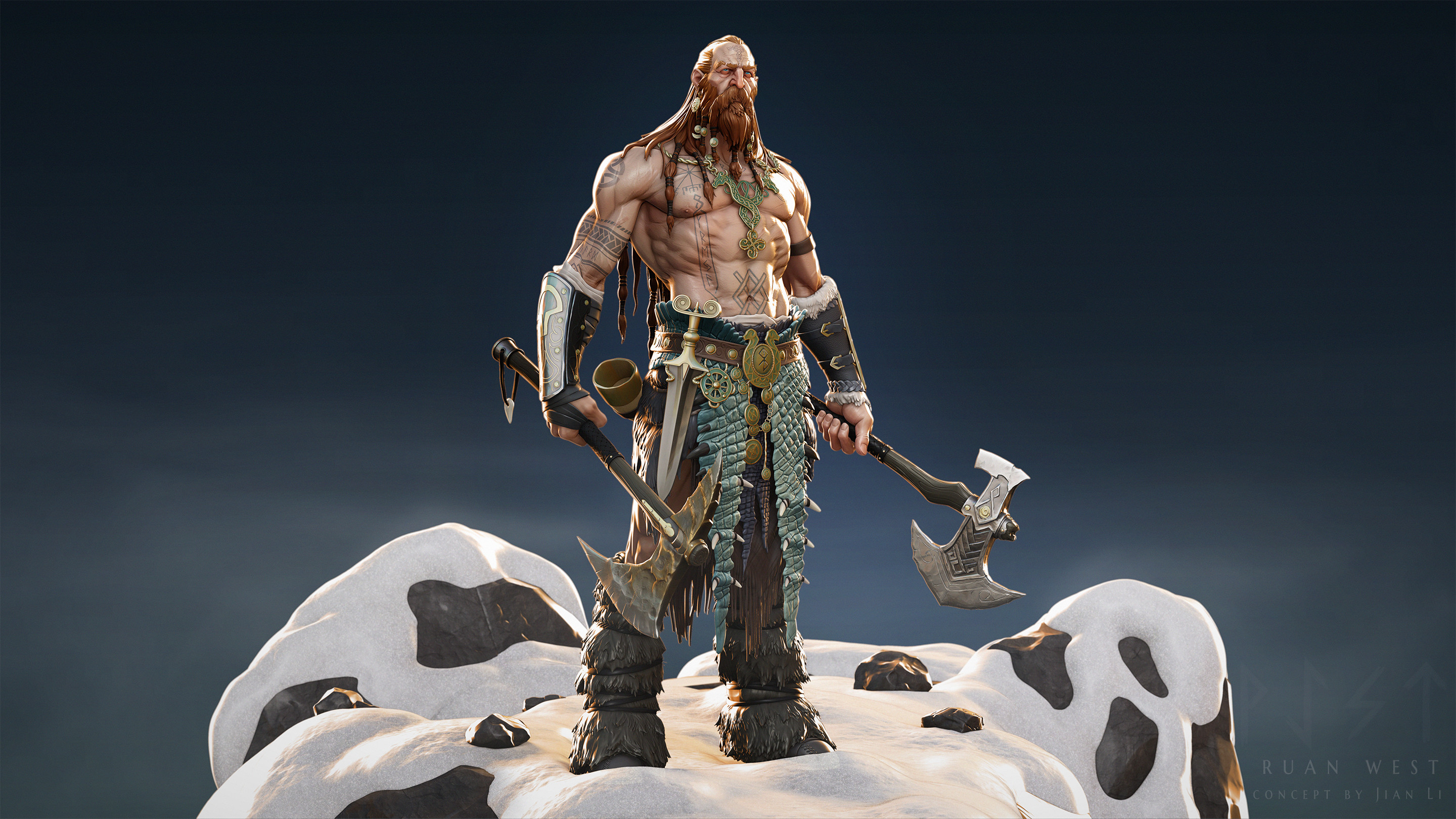
I recently stumbled upon a particular piece of art, Norse Challenge – ArtQuest along with the full works of Ruan West, and I was immediately enthralled by his use of dramatic lighting for fairly simple stylized characters. Obviously if you look closer, there is a fair amount of detail in his pieces, but the lighting is doing some heavy lifting in bringing out those overemphasized shapes and vibrant colors. After a bit of digging through the comments, he explains that he creates, polypaints, and renders his pieces in ZBrush (with passes in Photoshop). Since this inherently forces some simplicity in lighting (ZBrush doesn’t have the most dynamic lighting system), this is a perfect learning opportunity for me to try to emulate.
Lighting has never been my strong suit – I’m fairly familiar with lighting setups from real-life photography, but often that involves managing far fewer artificial lights with limited settings and a high reliance on natural light. My attempts at basic three-point lighting kept leaving parts of the model in shadow, and I’ve generally not had the best luck with HDRIs for anything but soft fill as they provide static lighting often with strange tints.
Looking through his pieces, I’d guess that he has two or three rimlights: one behind the LHS shoulder, one above and slightly in front of the RHS part of the chest, and a very harsh but low-spread one directly behind the character for those sharp highlights. There’s obviously some soft fill from the front as well, as the character is well-lit overall, but nothing is overexposed. Most lights also appears to have some subtle orange or blue coloring rather than flat white. It’s particularly useful seeing some of his unlit WIPs and just how different they appear from the final renders: lighting really does make a huge difference.
I set out to experiment on one of my older pieces which I had JUST decided was finished, but alas, she needs some more dramatic lighting..! I’m working in Marmoset, not ZBrush, but hopefully the fundamentals are the same.
Laudna Update
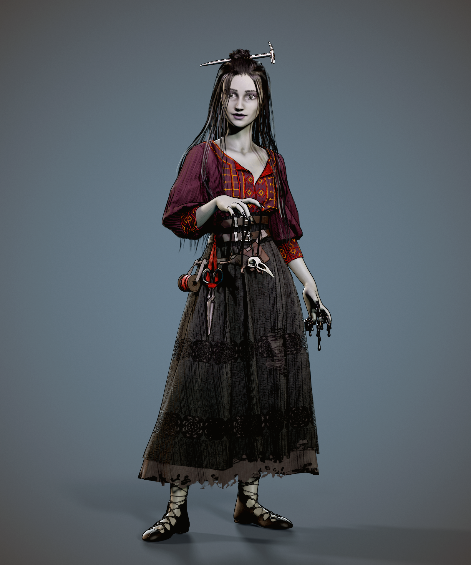
Over the semester, I’ve been attempting to find a moment here or there to update my Semester A 3D printing project, Laudna from Critical Role. Although I’m very proud of what I managed to accomplish in a short time period and having never touched many of the character art processes before, my original model left a lot to be desired. She was a fairly new and un-established character when I first started on my sculpt, but I’ve now had months listening to her interactions and she’s become particularly near and dear to my heart – I want to do her justice!
I didn’t document all of my changes too carefully, since they were fairly similar to the workflow I used in the first run but simply more refined. I did, however, keep myself a wishlist of changes that I managed to check off in its entirety:
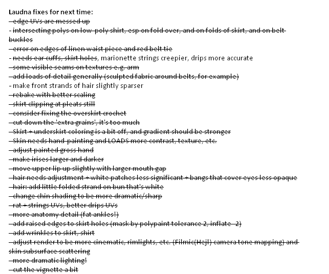
One of the main elements I wanted to update was the general presentation of the model, including a really dramatic lighting setup for her. She has so much detail that was being lost and ‘flattened’ by poor lighting, such that even as I heavily updated her textures with dark recesses and overemphasized highlights, she looked monochrome. I wasn’t too confident in Marmoset and relied upon a combination of a few tutorial lighting setups for my initial look. Seeing Ruan West’s work above inspired me to redo her lighting setup from scratch and really lean into the rimlights and subtler lights to bring out specific portions of the model.
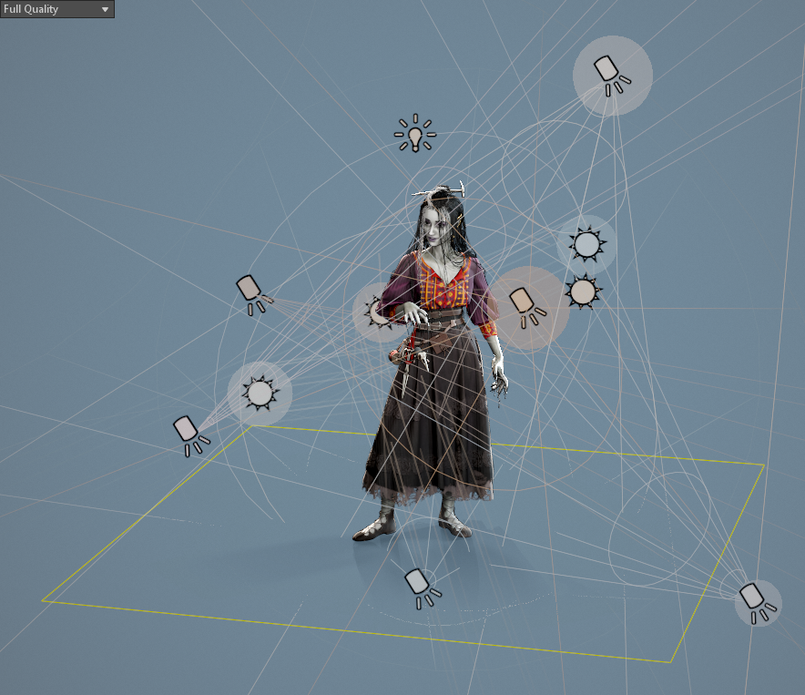
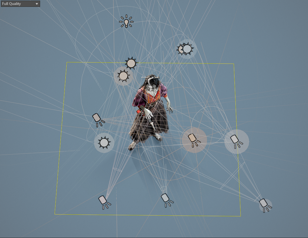
Some of the lights appear to not be making much difference in the preview window, but I must have done a few hundred renders comparing subtle changes before I settled on this arrangement. In essence, she has very low lighting from the HDRI, several ambient lights in orange and pale blue for more even studio lighting, three rimlights of varying intensity and spread, and three soft fill lights on her lower face, rat, and shoes.
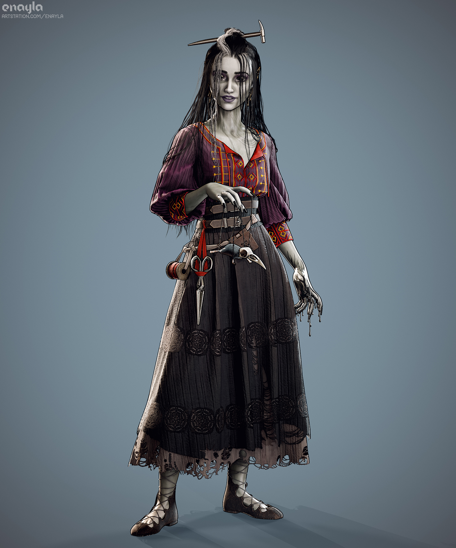
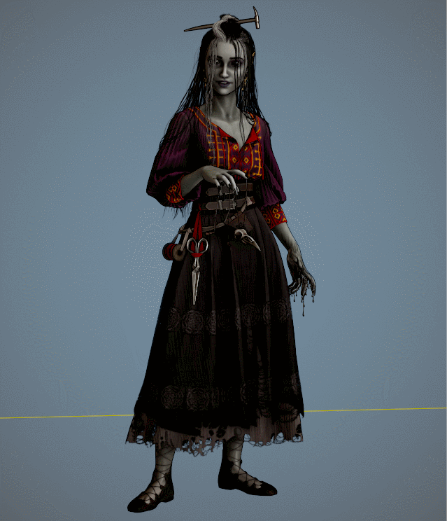
I think the result really pops! I’ve accidentally stumbled upon a technique I used to use in graphic design all the time: pairing a one-or-two-pixel dark line right next to a white one to sharpen and emphasize edges (of text, UI boxes, and the like). The harsh rimlight along with a thinner overall black outline helps to achieve that hand-drawn, slightly cartoony look that I’ve been trying to match from the concept art.
A few people on the Reddit thread where I shared this piece tried to argue they didn’t believe it was 3D as opposed to a digital painting until I showed off the turnaround video, which I’m taking as a badge of honor 🙂

Oh, and I ran into a Substance Painter glitch was just a little too appropriate when I was updating Laudna’s textures..
(everything worked just fine on a restart! And I’ve since discovered the ‘bake by name’ feature in SP so the exploded model wasn’t necessary in the end)
Bibliography
West, R., 2022. Norse Challenge – ArtQuest. [image] Available at: https://www.artstation.com/artwork/nENxVe [Accessed 5 April 2022].
