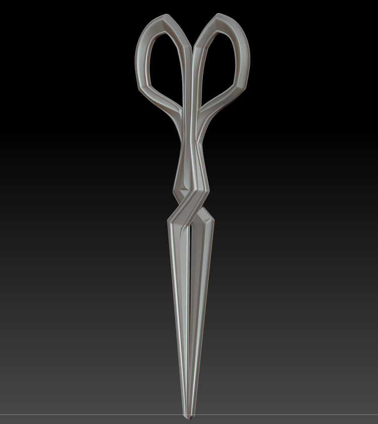
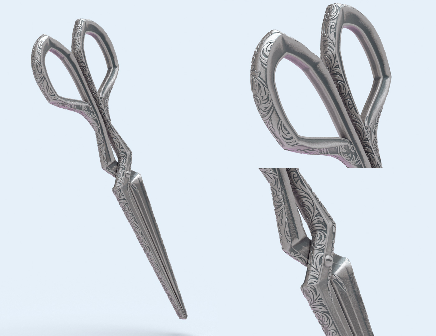
I’ve once again fallen prey to the 3D modeling curse of assuming that simple designs will be quick to model! Laudna’s scissors have proven far more difficult than their appearance would suggest, partially because I’m working out a few new fundamental skills (UVs and noisemaker) but mainly because of trying to recreate a real-world mechanism. That is, I don’t completely know how scissors work – I’ve never seen them with the blades separated and they have a few odd planar changes over the hinge part. It took quite a few prototypes, but I did manage to get them matched up and working in the end.
I ended up doing all of the base sculpting in ZModeler, creasing along polygroups and smoothing sections of the model. I have a feeling I interpreted a few of the outer lines and highlights on the (very painterly) reference image too literally, as I was determined to build in extra raised edges and bevels, but the final piece is quite faithful. I’m still stuck in the rut of doing all of my hard-surface work in ZBrush, just because I’m most familiar with it and try to avoid Maya whenever I can. It’s something that I do need to sit down and learn in a program better suited for CAD design, though.
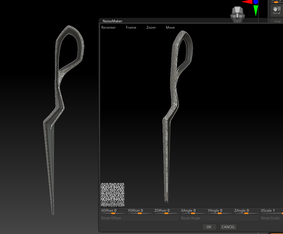
I still haven’t tackled manual UV unwrapping yet, and it didn’t matter too much for this piece where I simply needed UVs for noisemaker, so I used ZBrush’s automatic UV unwrapping tool. It’s not the cleanest, but it will suffice for a 3D print!
Noisemaker Filigree
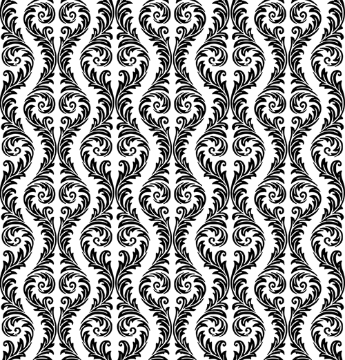
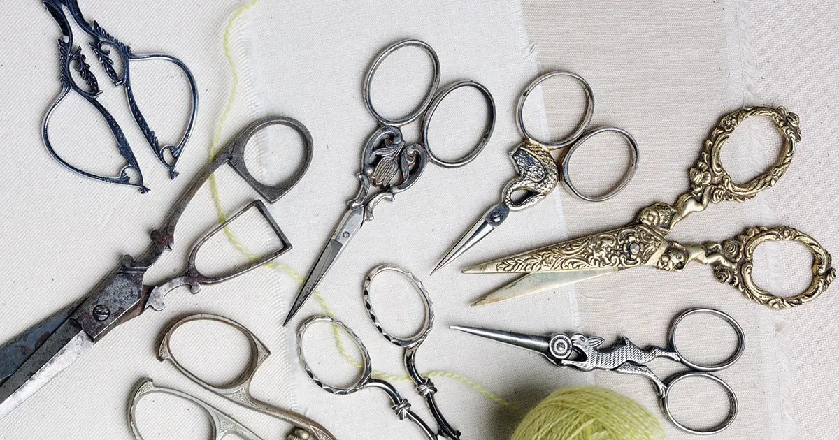
Because I wanted to push the limits of my printer, and because I’m allergic to un-ornamented surfaces, I decided to add my own filigree details to parts of the scissors. They reminded me of ornate Victorian leather shears, which would often be covered in intricate designs.
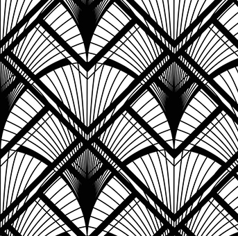
Once I had my scissors UV’d, I set out searching for a filigree alpha that would work with this design, and settled on a design from Vectorstock. I cleaned up the design, made it grayscale in Photoshop, and then re-vectorized it in Inkscape to avoid any pixelation. In testing both the regular and inverted alphas, I discovered cleaner results with a white-on-black design. From there it was just tweaking Noisemaker settings and masking off the areas that were to remain clean.
Vectorstock
Final Render
To show off the final piece, I applied a standard weathered metal material and created a simple scene in Keyshot. Overall, I think the piece really resembles the original concept art while still having some extra detail that might have been lost in the rough stylized nature of the artwork. They won’t be cutting anything, but they do look pretty!
This next project is to make a 3D printed piece, which I’m very excited for. Each week, I’ve been pushing myself pretty hard to tackle brand new skills or software, so it’s a nice change of pace to have an assignment in my wheelhouse. I’m quite familiar with 3D printing from my previous cosplay projects, and run a small 3D printed cosplay prop shop with my partner.
Creating and preparing a model for printing has quite a few constraints as compared to a model for a game or render. Topology isn’t as important and you don’t need to be concerned about UVs, but to avoid a print failure, models must:
Be completely watertight, with no overlapping geometry or floating parts (ZBrush’s dynamesh works great for this)
Not have any islands without supports (depending on the angle of the print, this means that there are no sharp overhangs, and comes with the understanding that any overhangs will need to be supported, creating small artifacts when the supports are later removed)
Have decently thick walls and no spindly parts that can snap during or after the printing process
Have an appropriate level of detail for what the printer and layer height are capable of printing
Must fit completely within the build area, which is quite small for most resin printers and may involve splitting the model into pieces
Initial Ideas
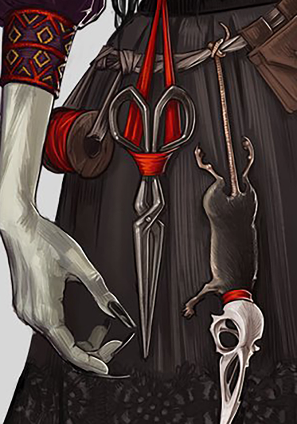
Hannah Friederichs / Critical Role
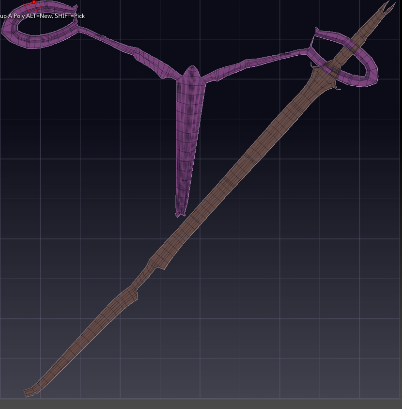
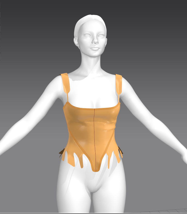
With these in mind, I’ve decided to print a cosplay accessory worn by the character Laudna on the new campaign of Critical Role. She has an intricate pair of scissors hanging off her belt that will allow me to practice my hard-surface work, and figure out how to add details in ZBrush’s noisemaker (which includes learning the basics of manual UVing). I’d like to make the scissors somewhat functional, so I plan to make them in two pieces and figure out a mechanism for them to slide past each other.
Joe Coca / Piecework Magazine
I’m hoping to have a prototype to show for class next week, but there are a few potential hangups with the model itself: the full sized scissors are pushing the size limit of our print bed and will need to be printed nearly vertically. This introduces the possibility of print wobble or issues with supporting a piece so that it doesn’t have too much suction near the end of the print. It’s also going to be difficult to decide where to put said supports to not obscure the detail on this double-sided piece.
I’ve been torn for the past couple weeks with the urge to drop everything and be (one of) the first to produce work relating to a newly revived fandom. The third campaign of the wildly popular Dungeons and Dragons series Critical Role started up again recently, and with the first episode came a full set of artwork depicting each of the characters. I’ve been a fan of the show for many years and familiar with the usual upswing in fanart, discussion, and cosplay whenever new characters are introduced. My current best-sellers in the 3D printed cosplay accessory shop I run with my partner are previous-campaign CR pieces by a large margin. But with university work, I haven’t had the time to sculpt any of the new designs (until this upcoming week!).
I admit, it frustrates me not being able to ‘keep up’ and missing out on sales and, to a much less important extent, social media boosts from the novelty factor. The popularity of the series will continue, of course, and I expect to see many new cosplayers popping up in the coming months (it makes sense to wait a few episodes before committing to a character). But there are already full sets of accessories for the characters for sale on various marketplaces; complexity and accuracy varies, but they’re available now.
Tracking trends
I generally try to keep very up-to-date with fandom trends, both in terms of my shop and as someone hoping to enter the rapidly-changing games industry. I’ve found that games do tend to follow certain genre or style trends (e.g. MMORPGs, cartoony MOBAs, slow-paced farming simulators..), and believe it’s important to be aware of the space.
I track trends in multiple ways:
Follow hashtags on Twitter and Instagram
Follow Facebook groups for specific genres or aesthetics
Join subreddits (general /r/gaming to genre- or game-specific forums)
Watch what cosplayers are currently constructing; they often tend to be fingers on the pulse of popular media, as there’s always a rush to be one of the first few people to cosplay a new release
Follow game awards, best sellers, and trailer releases
Two kinds of practitioners
The thing is, even if I had no other obligations, I wouldn’t be able to be ‘first’. I work in a slow, methodical way: gathering multiple references, obsessing over accuracy, adding additional detail, making pieces realistic and functional, agonizing over scale and print settings..which takes time. I wouldn’t want to compromise the quality of my work in favor of speed.
I can meet deadlines, but I don’t thrive on the stress of overly limited timeframes. Therefore, I believe I’d be best suited for larger, long-term game projects, without a fast turnover for sculpts, and where iteration is possible. I’m practicing working with an art director of sorts when I get feedback from my partner on our 3D prints, sometimes creating a dozen tweaked versions, and I’ve found this is the best way for me to refine my work.
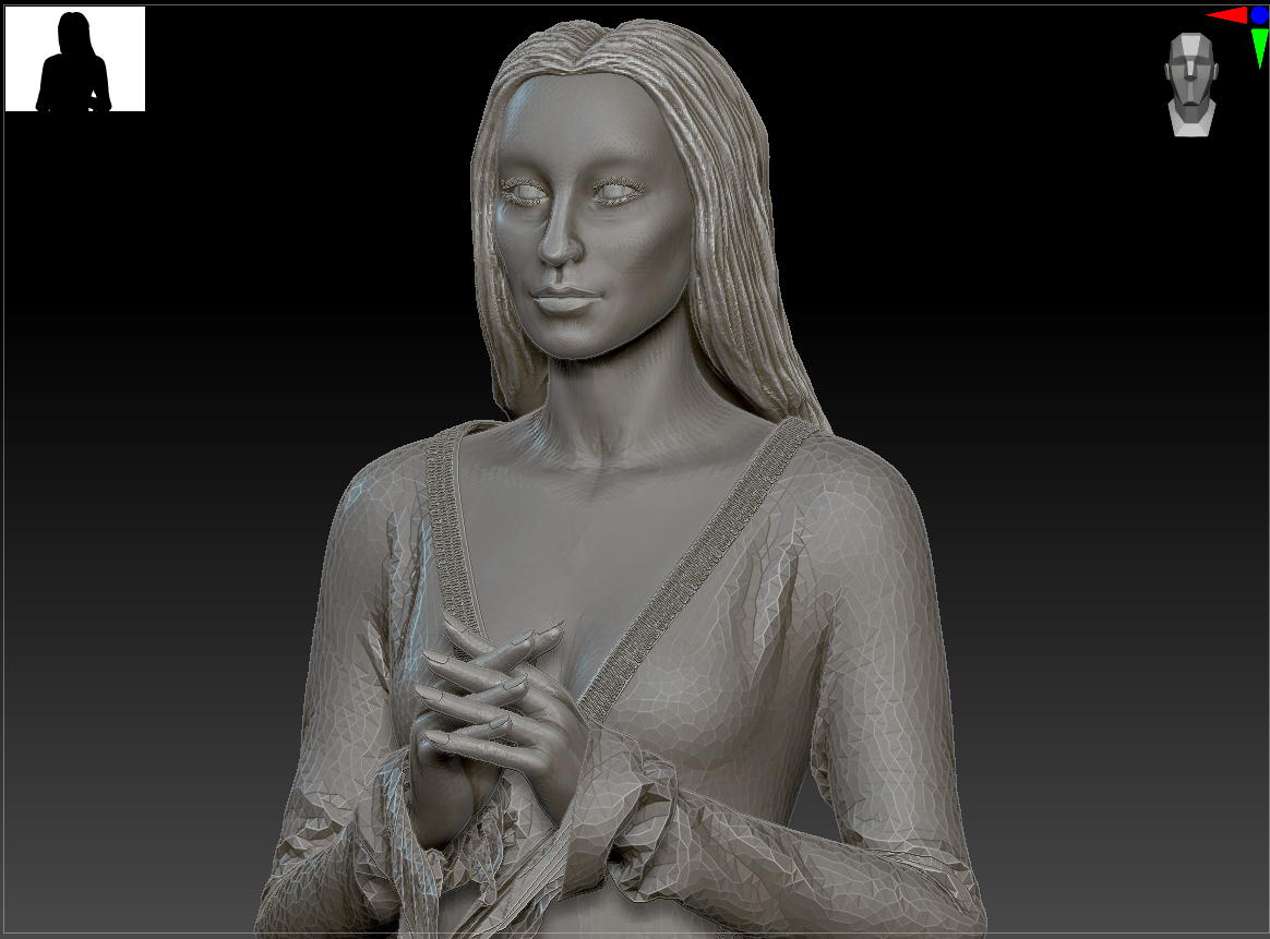
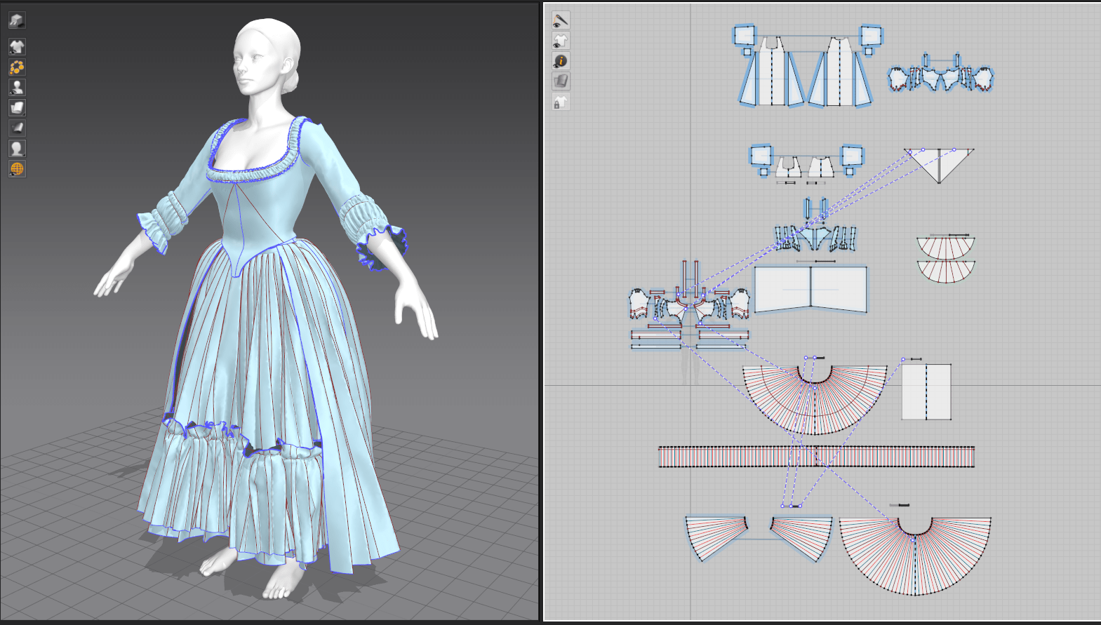
This week’s result is the most pleased I’ve been with a weekly project while being convinced that it’s not yet polished enough to add to my portfolio. In working on Morticia Addams, I was able to go through nearly the entire character art pipeline: designing clothing, posing and modifying a basemesh body, quick stylized hair, creating UVs, texturing, and setting up a lighting scene for final rendering. I had some familiarity with all of these steps except UV mapping and garment texturing, and by taking on only two brand new skillsets, I was able to keep the workload manageable. I also found that my familiarity with Photoshop (layer styles, brush settings) and generally how textiles behave in the real world helped me find my way around Substance Painter.
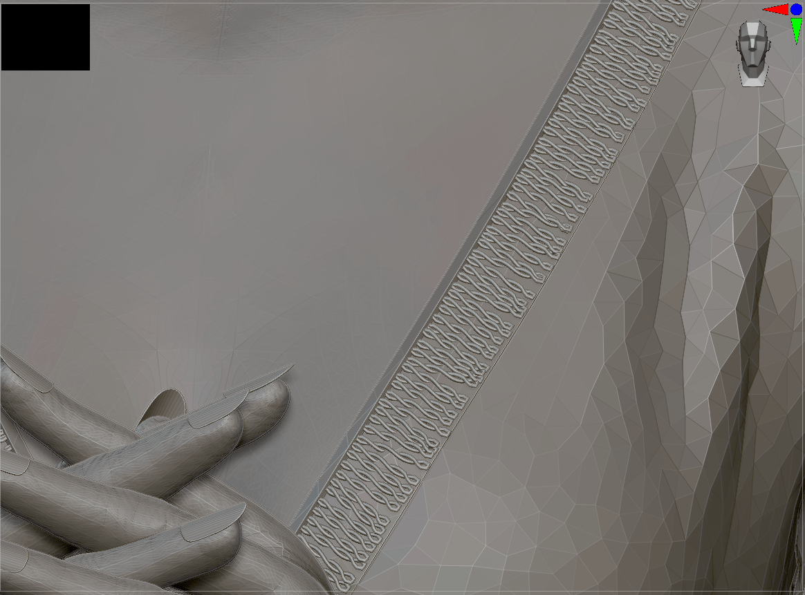
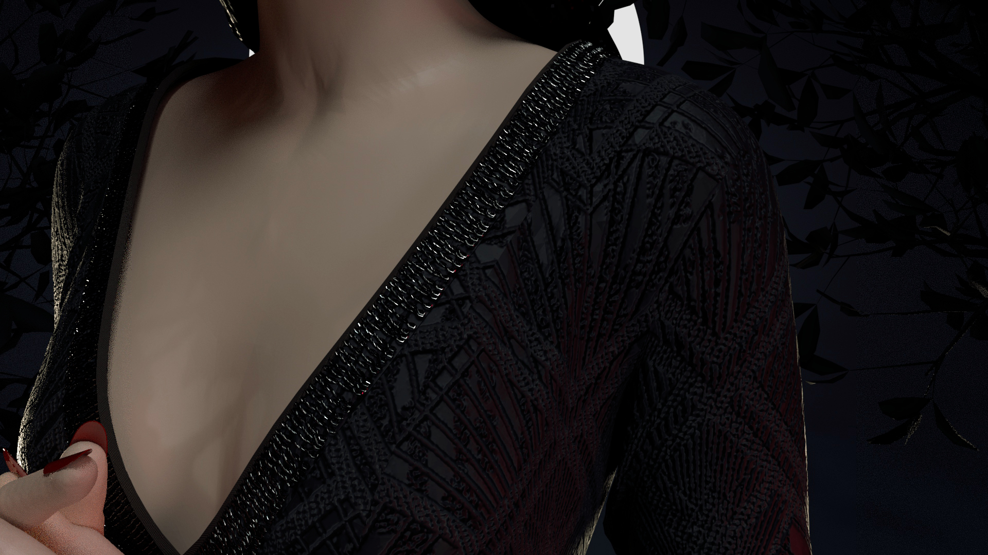
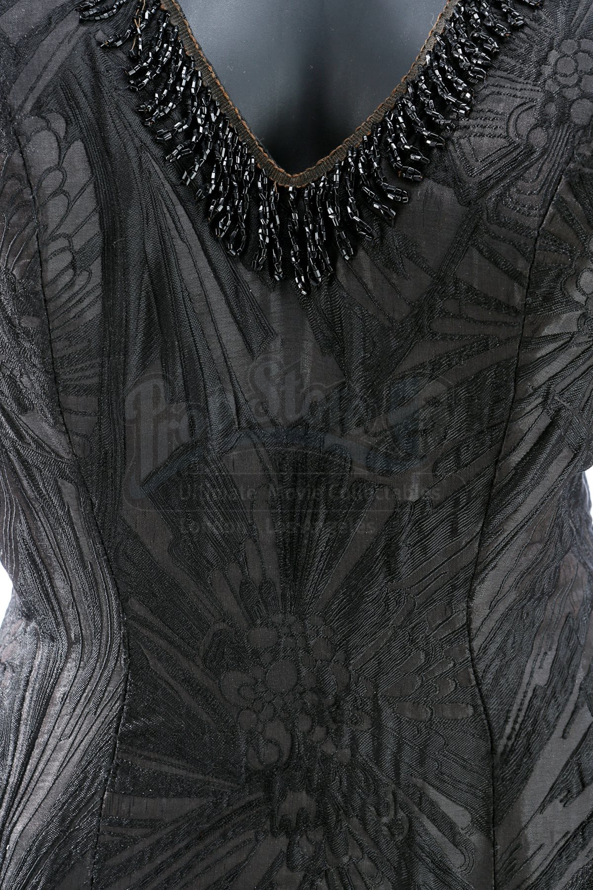
I did run into a few problems to resolve. I wanted to create the beaded trim around Morticia’s neckline, but Marvelous Designer doesn’t handle hard sculpts well (slows down the program and doesn’t have traditional sculpting tools). Instead, I went back to ZBrush and built the details there, simply baking them down to the low-poly version in the texturing stage; I just did a simplified test of a small section of trim to check if this technique would work beforehand. This opens up many possibilities for adding small, finicky details that would be difficult to properly UV. However, I did have issues baking high-res textures onto UV maps that weren’t consistently scaled (e.g. the threads on one panel of the garment were twice the size as on others of the same fabric). This is a rookie mistake, but reminded me of the importance of keeping UVs consistent.
The main area that still needs work is in Morticia’s hair and face. I was running into time crunch on both. I settled on modifying a basemesh from Marvelous Designer for her head and body rather than building them from scratch. My first inclination is to always start with a sphere and go through the steps of adding anatomy, but as it’s common practice even in industry to start with a basemesh, I felt like this was appropriate. For her hair, I initially wanted to create it in Maya’s XGen, as I’ve had practice with it before, but after a file-corrupting crash, I fell back on speed-sculpting stylized hair in ZBrush. Both her face and hair are rough, but don’t look proportionately bad for the time spent. I actually found it quite freeing to force myself to quickly produce the basic shapes without being bogged down in details!
That said, I was able to hide a lot of sins with harsh, strategically placed lighting. Since I’m happy with how the fabric turned out, I specifically pointed additional colored lighting at sections of her gown and beading, leaving her face and hair more shadowed. I’ve been frustrated with feeling like I have to create a complete, polished render of my progress each week (and the chunk of time that that always takes), but this further drives home that presentation is key.
Inspiration: Pauline Boiteux
This week I discovered an incredible textile artist, Pauline Boiteux on Artstation. She seems to be at the forefront of digital clothing, as she works for Substance showcasing ways to push the programs in terms of garment texturing. She does have a paid Substance Designer brocade creation tutorial that I plan to invest in, but in the meantime, there’s much to be learned from simply examining her portfolio.
Pauline Boiteux / Artstation
I was initially drawn to this piece from my prior practice in creating structured historical garments. It shows a wide range of techniques: ruffles, layers, structural corset and petticoats, transparency, and seam detailing; I now have a better grasp of what is possible within these programs. The comparison between the Marvelous Designer stage and textured piece gives good insight into which point she exports a garment between software and when she adds detail (stitching, ruffles, micro wrinkles). It’s clear that I’ve been trying to add too much complication within Marvelous. Rather, I should move to high-poly sculpting in ZBrush and texturing in Substance for those details.
Pauline Boiteux / Artstation
Some of her textile work is simply aspirational, as it’s mainly done in Substance Designer, a program I’m currently unfamiliar with. Still, I can appreciate the many layers of textures used here to really make the piece realistic. She starts with a matte base layer, has raised details with metallic and transparency maps, and even modified the underlying fabric to scrunch with the stitching on top. It’s small details like this that help achieve those near-photo-realistic results. I’m keen to play with SD in general, as I prefer programatically-generated work to freehand sculpting.
Bibliography
Boiteux, P. (2021). Portfolio – Pauline Boiteux. [Online]. Artstation. Available at: https://www.artstation.com/jappluz [Accessed: 4 November 2021].
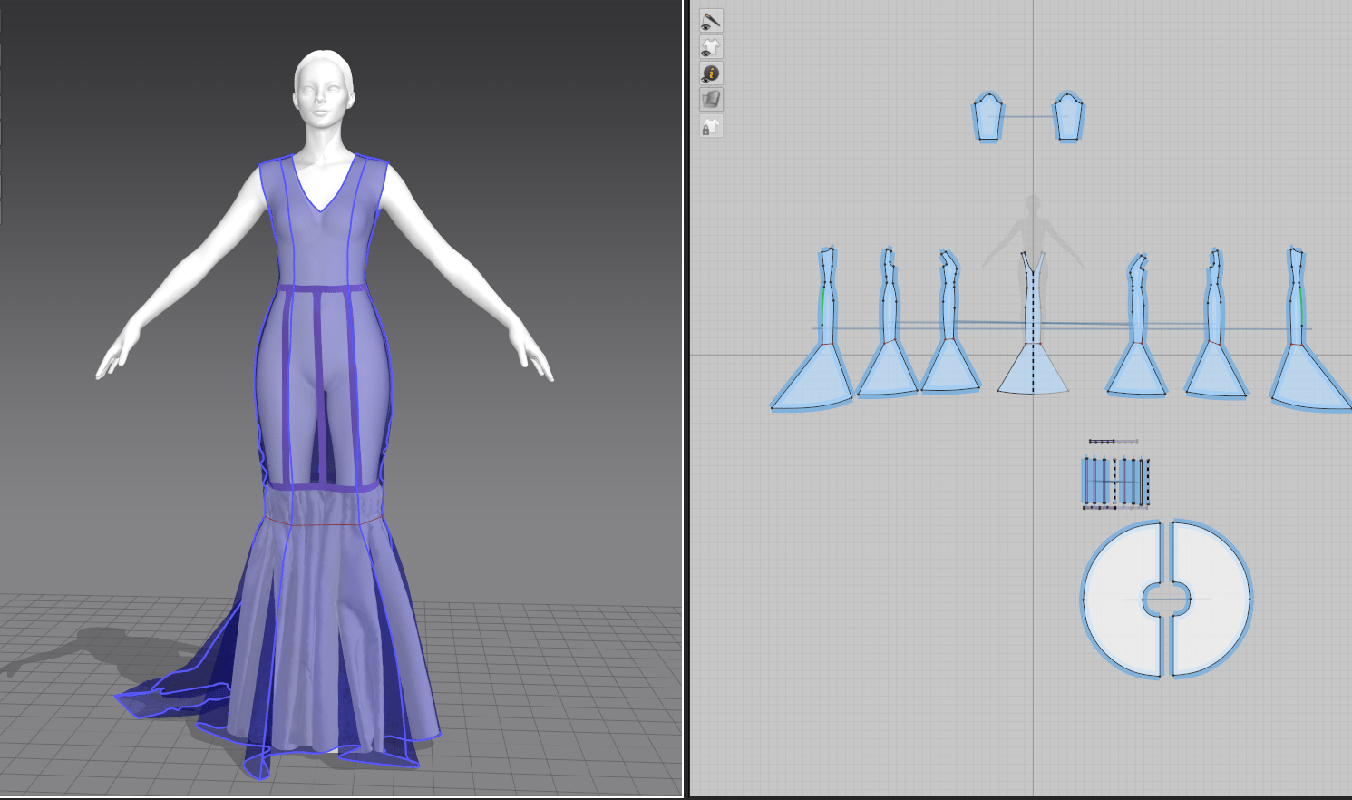
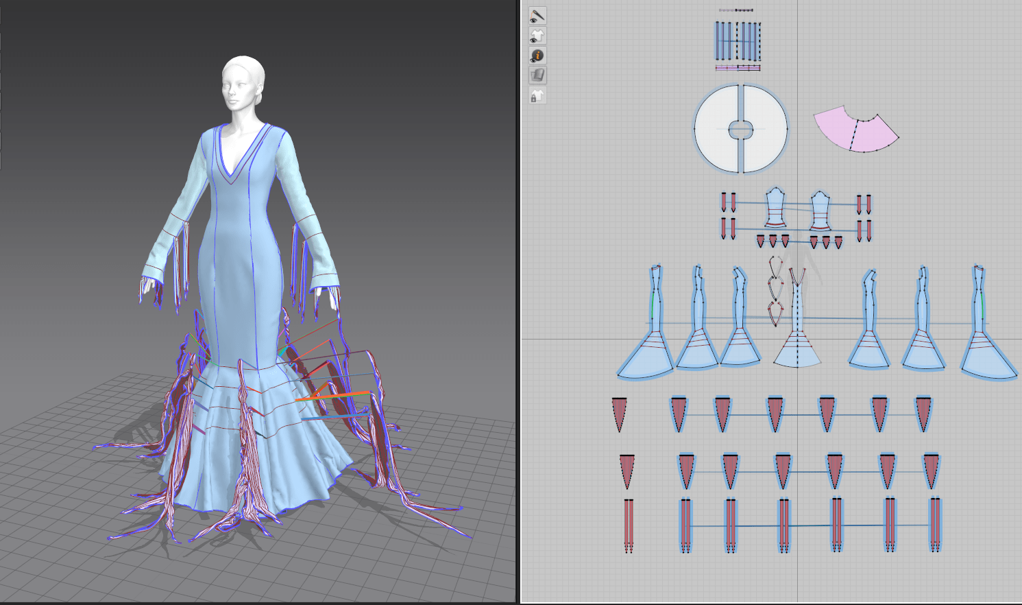
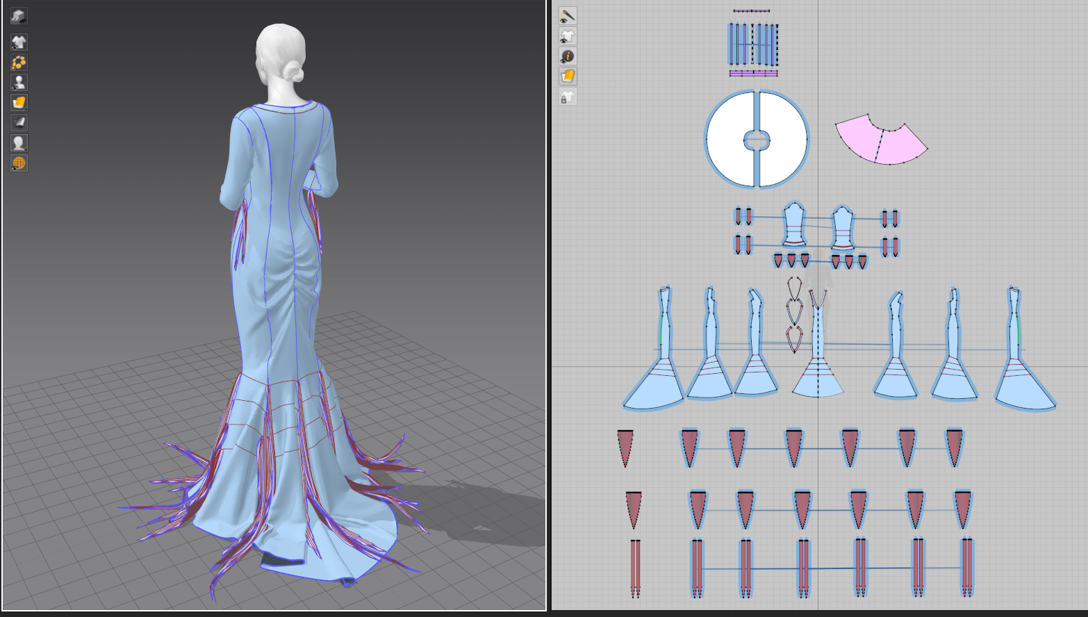
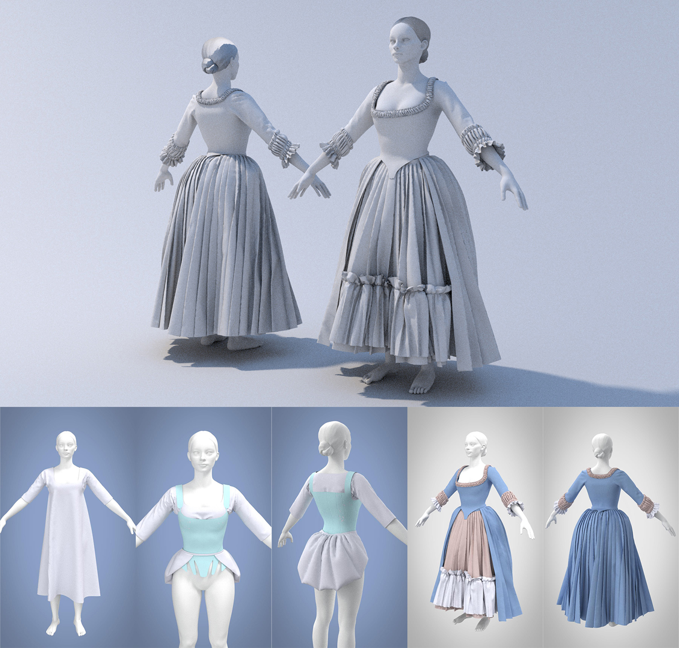
I felt like I had really hit my stride with my discovery of garment design in Marvelous Designer last week, so I knew I wanted Morticia’s fitted black dress to be the star of this assignment. Since I worked partially from a historical patterning book last time (I did some adjusting and fitting work, but didn’t develop the base shapes), I also wanted to tackle patterning completely from scratch. Morticia’s dress is a fairly standard princess-seamed mermaid gown with shapes that I’m familiar with, so I was able to build a basic block pattern from visual memory and get started on fitting.
Her base dress came together quickly once I was able to size it onto the standard avatar. It has some slightly unusual princess seams (more typically they curve off to the armscye rather than continuing over the shoulder) and I shifted the angle of the neckline V to sit flatter across her chest, but otherwise it was only minor tweaks. I did end up making the mermaid skirt fuller over several iterations, as I found from watching footage from the movie that the original dress had a lot more volume than it appeared stationary on a mannequin.
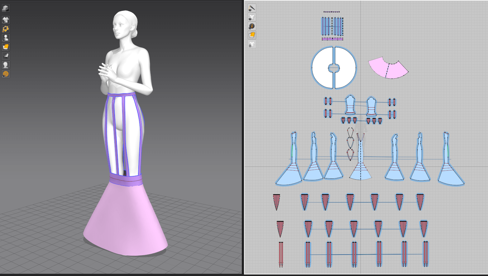
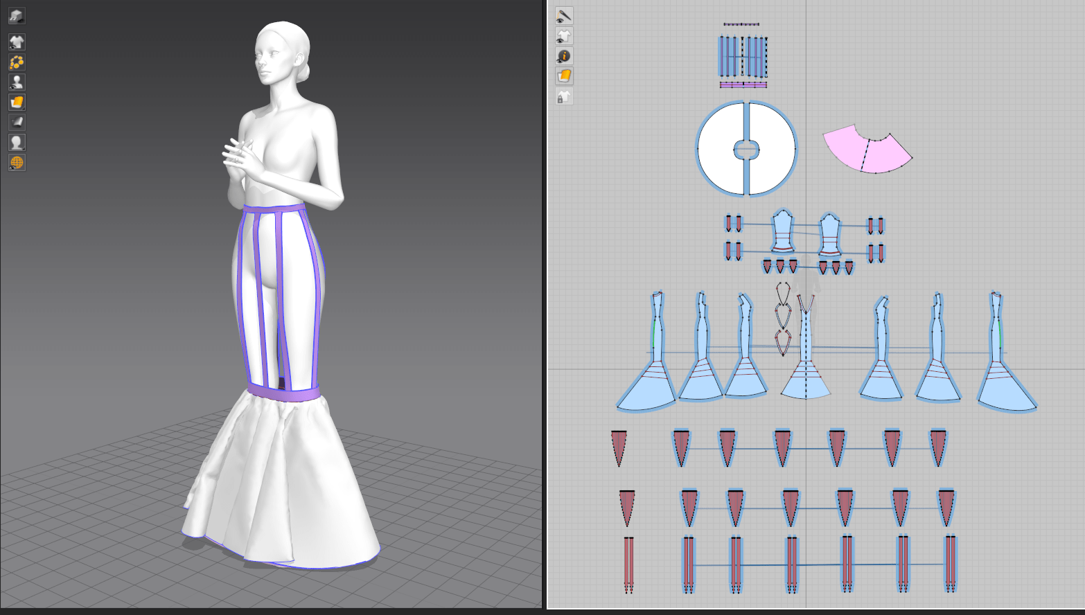
Even so, it soon became clear that I needed to add some sort of skirt support in the form of a petticoat to maintain the bell-shaped silhouette of her lower skirt. I was still a bit frustrated with the lack of stiff materials when working on my previous project’s pair of stays, but did have a breakthrough after browsing through still more forum posts: I discovered a feature called ‘solidify’ hidden in the pattern properties menu, where I could drape fabric in low gravity and partially freeze it into shape. I’ll definitely be applying this to the structural elements when I update my previous project!
In the end, I gave her two petticoat layers (a stiff cone with very little drape, and a fuller circle skirt on top to soften the support) suspended from tapes at the waist. By setting these pieces to a lower layer than the overall dress, they sat comfortably beneath the skirts with no clipping or conflicts and worked perfectly to keep that shape that I wanted. I later removed them for final exporting, as they just added unseen polygons to the dress that would be exported with a static shape.
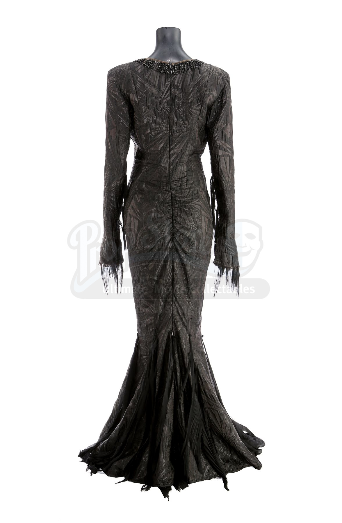
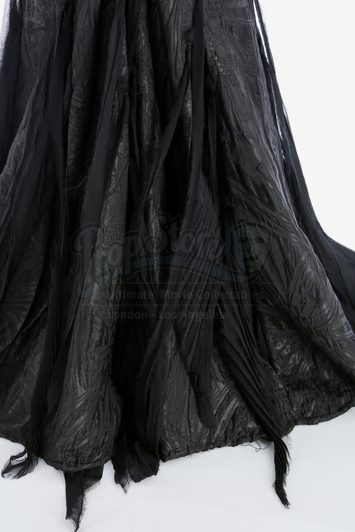
Morticia’s dress is also covered in strips of torn chiffon at several points on the sleeve and lower skirt. I struggled to puzzle out exactly what was happening with attachment points (black-on-black reference images only show so much..) but one detail photo showed some of the chiffon was narrowly accordion pleated. Marvelous’s pleating tool works really well for creasing and condensing the fabric but isn’t great at actually sewing the pleats down, so I ended up just using a running gathering stitch along the top edge of all the pieces and letting them fall into their set pleats for a similar effect. From last week, I again used the technique of letting the fabric crease in zero-gravity to set the pleats before sewing it to the garment. I also set the chiffon to a higher layer than the dress, so it would remain on top of the dress without clipping as I arranged the sleeves/skirt.
Since the pleats were so narrow, I needed to set the chiffon patterns to a higher poly density, but this meant that my laptop really struggled with the simulation. I ended up having to drape only a few sections at a time, freezing them in between.
Posing
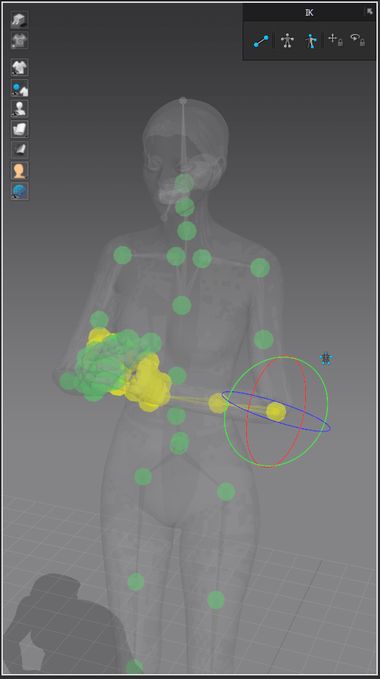
I knew I didn’t have time to create or fully rig a character body (both skills I’ve never done before and learning them was too much to tackle in one week), so instead I focused on one of the pre-made avatars from Marvelous Designer. I had discovered how to adjust various body measurements last week, but since Morticia already has essentially supermodel proportions, I stuck with the default avatar. From there, I did a deep dive into MD’s built-in posing tools rather than pulling the avatar into a separate program. I generally found them to be quite clunky – only certain body parts can be moved with restrictions turned on, so much of the time I was attempting to freely move joints without stretching or rotating them unnaturally. The finger posing was particularly tedious, as they kept deforming once moved past a certain threshold. I think I’ll try DAZ or another dedicated posing program next time!
Creating Morticia’s trailing strands of chiffon was another challenge. Simply gathering strips of fabric wasn’t quite giving me the effect I wanted, and looking closer at the reference photos, it was clear that the fabric had some sort of inherent crinkle or pleating effect. To mimic this, I played with the accordion fold tool, but rather than actually creating accordion pleats, I simply stitched the gathered ends to the gown in strategic places. This created a surprisingly accurate draping effect.
For the gathered section on the back of her dress, I used the elastic setting along part of the seam, scrunching the fabric for that ruched look.
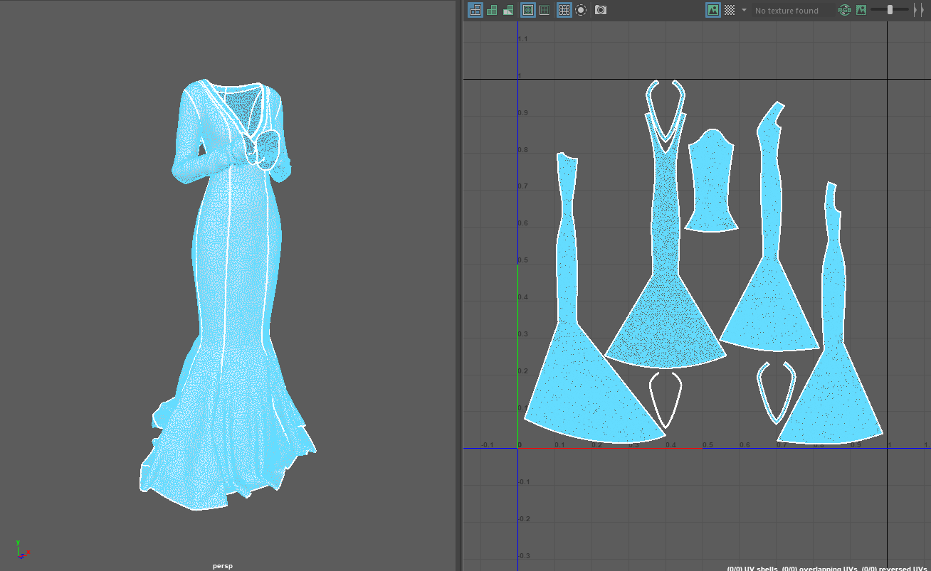
UV Creation
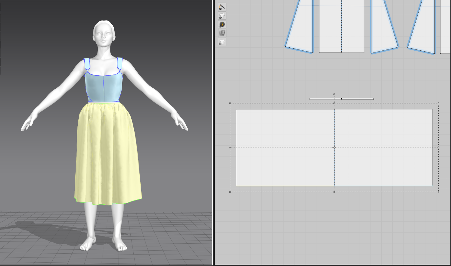
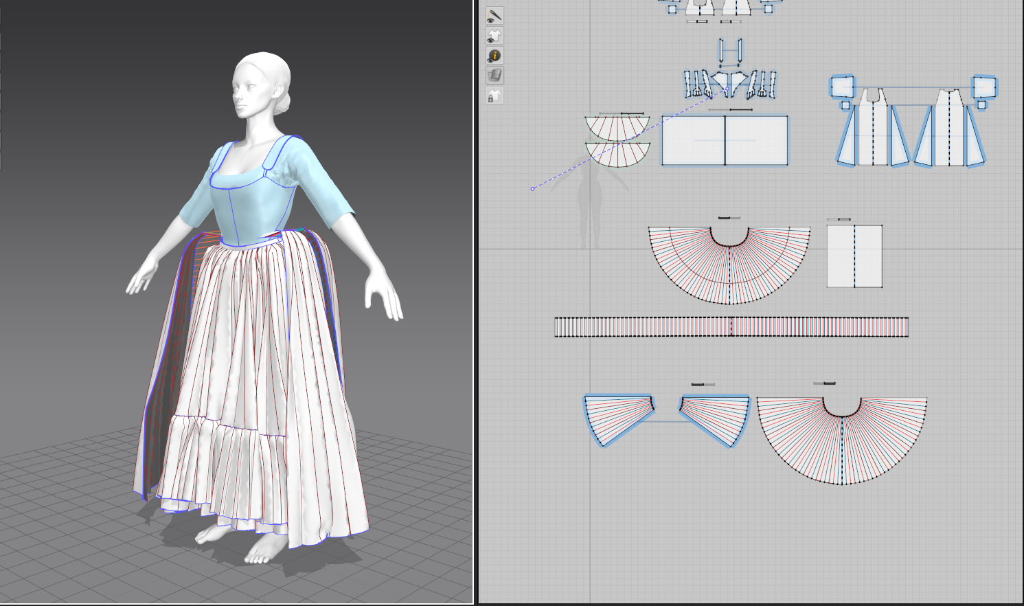
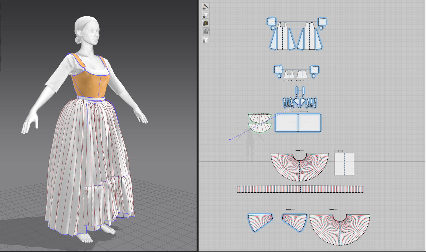
I knew that I wanted to bring the gown into a texturing program, so that meant it needed to be UV’d. Marvelous Designer creates UVs automatically from the pattern pieces, which is an enormously useful feature, but they still needed some work in arranging and scaling correctly. I made the initial mistake of trying to scale up the pieces of the gown with more detail (namely, the center front which has the beaded design); this led to a major mismatch in texture scale, with some threads appearing far larger than others. With this in mind, I re-scaled the UVs proportionately, and even worked out how to stack the symmetrical halves to better utilize UV space.
For the chiffon parts, I decided to simply create a shader in my final rendering program rather than create clean UVs, since I’m already familiar with adding transparency to materials in Maya and was running out of time.
Additional Sculpting
I went back to ZBrush to add the final pieces to the character: her beaded trim, fingernails, and the head sculpt itself. For the beads, I created a custom IMM brush and positioned copies of it along the neckline using nanomesh. With some added randomization, the effect was convincing enough from a distance.
For her head, I ended up modifying the default head from the Marvelous avatar and giving it a quick polypaint in ZBrush. I struggled for a while wanting to do the head from scratch, but with my timeframe and some reassurance from my classmates that even people in the industry use basemeshes, I decided not to reinvent the wheel. This is by far the weakest part of this week’s project, but I had bitten off more than I could chew and was hoping to hide some of the uncanny valley in the dramatic lighting of my render.
For her hair, I initially intended to create more realistic strands in XGen, but a corrupted savefile on the eve of the deadline meant that I had to quickly whip up some sculpted hair in ZBrush. That, too, will hopefully not be so jarring once rendered. If I revisit this project, I absolutely plan to redo both head and hair, and spend more time detailing the body for a less cartoon-y look.
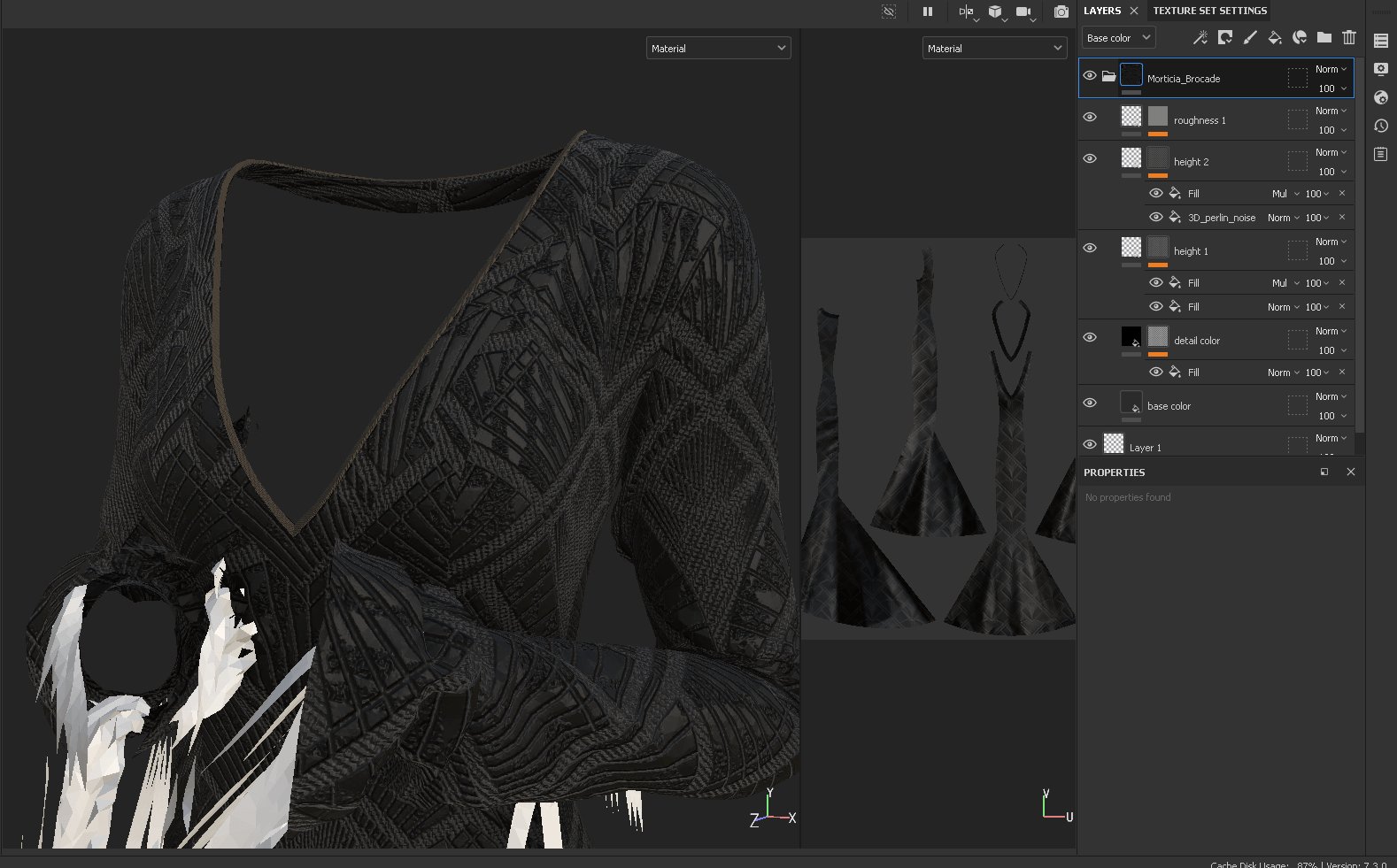
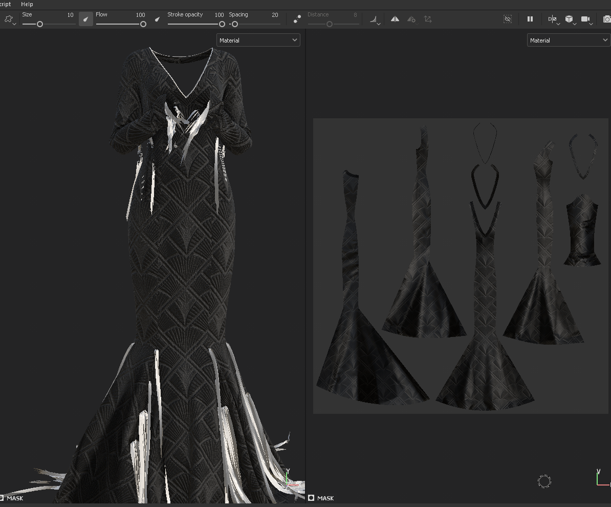
Texturing
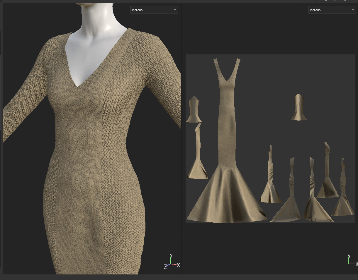
Now for the part I was really looking forward to: textile design in Substance Painter. I spent quite a while searching through vector sites for a similar alpha that makes up her brocade, and ended up settling for an art deco design with similar lines. I ended up dissecting one of the default brocade materials in SP to see how they used masked height maps over textured fabric to create a raised design. Adding layers for roughness and indenting an inverted mask to create the grooves in the fabric, I managed to create a fairly realistic textile design that captured the vibe of the original.
I found working in Substance fairly intuitive based on my familiarity with Photoshop – the layer system and styles are quite similar, and baking was straightforward. In general, I’m super impressed by what’s possible in Substance and look forward to creating more custom textiles in future.
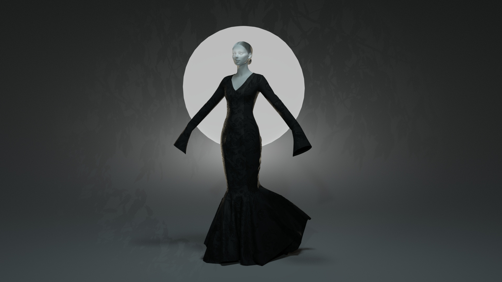
Lighting and Render Setup
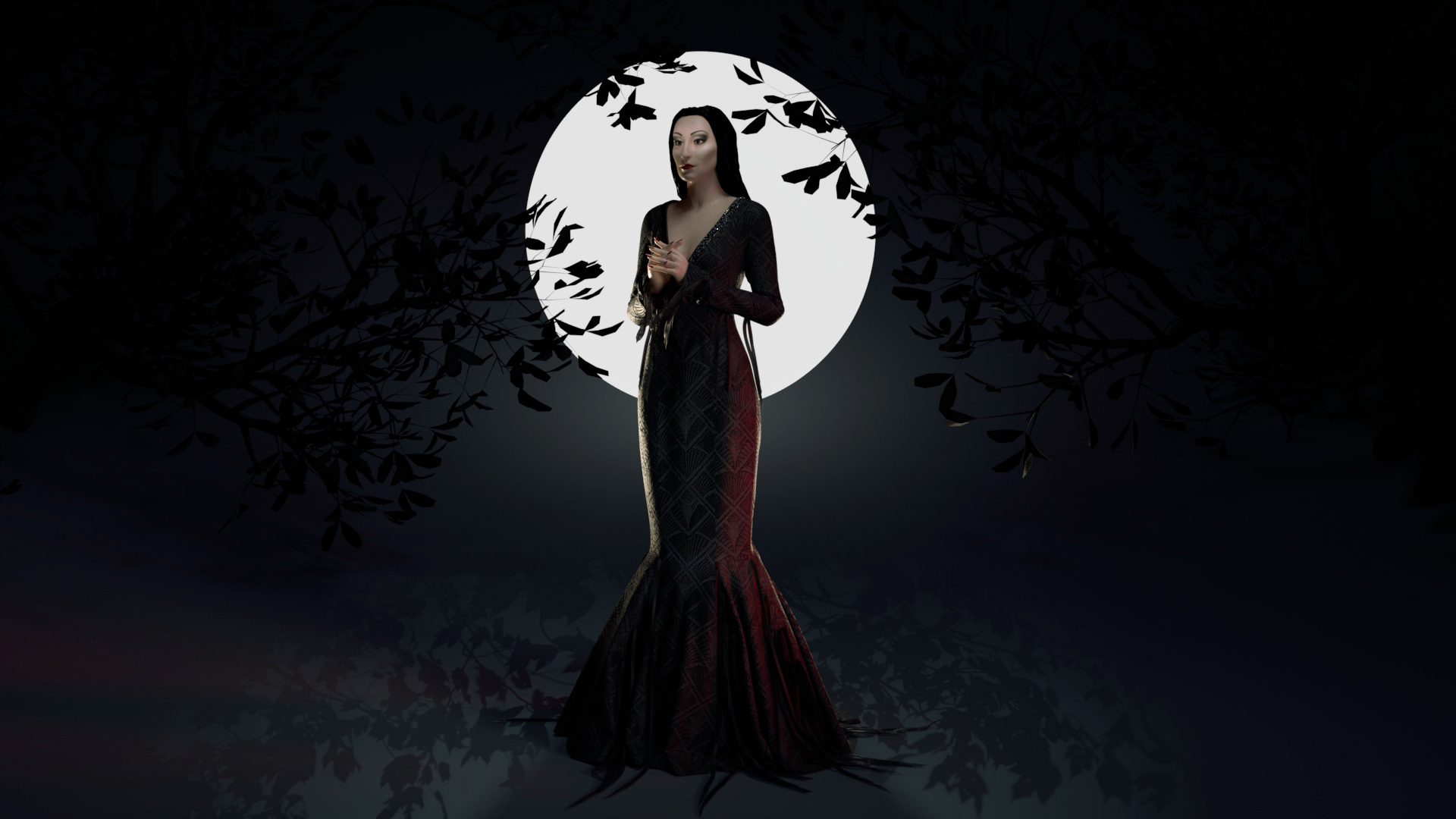
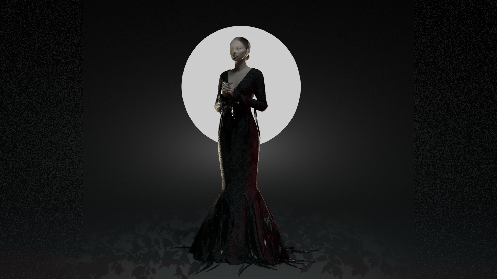
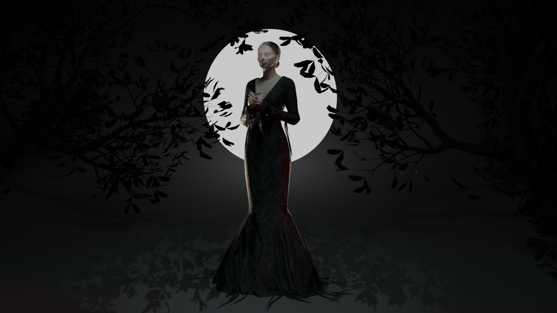
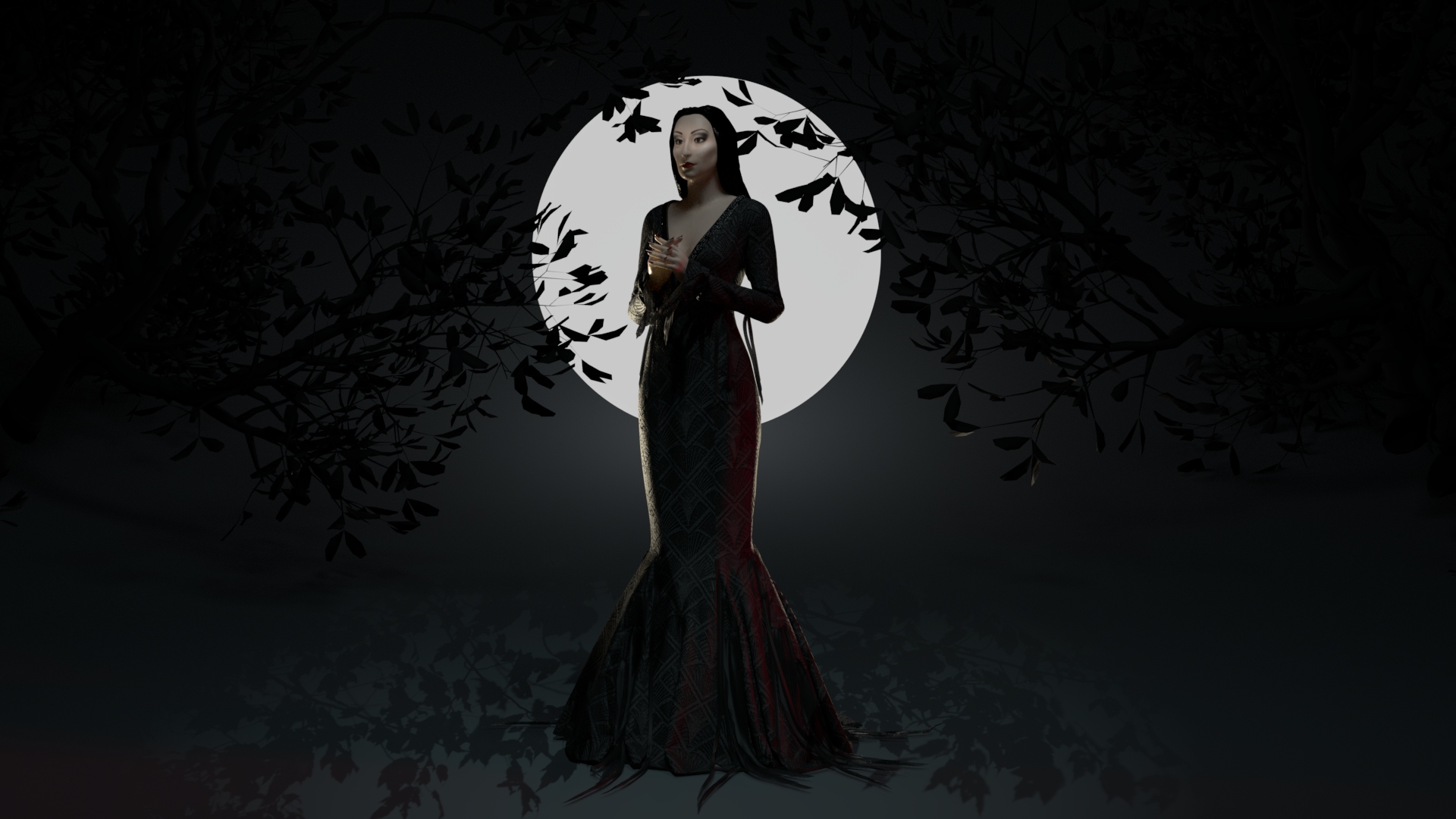
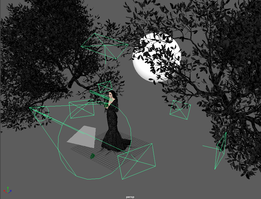
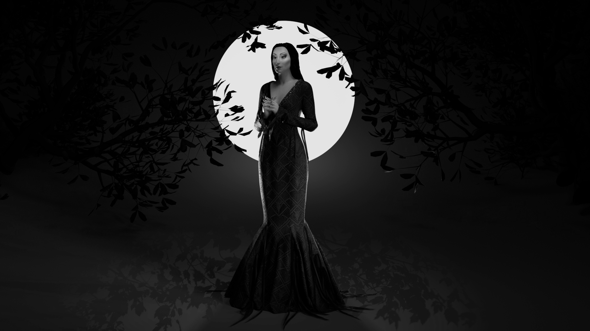
I played around with quite a few ideas for my final render. I wanted to feature Morticia at night without having to place her in a busy interior, but also didn’t want to lose her dress on a dark background. My solution was to place her in front of a ‘moon’ to create a strong silhouette, and add rim lighting to bring out the rest of her dress. I ended up using several slightly tinted lights, mainly from 3/4 direction behind the character, as well as learning about light blocking/excluding certain objects from lighting. She has a light gobo creating a leaf pattern on the ground, and I added more visual interest with a pair of downloaded tree assets (by mozhde_prz on Cubebrush).
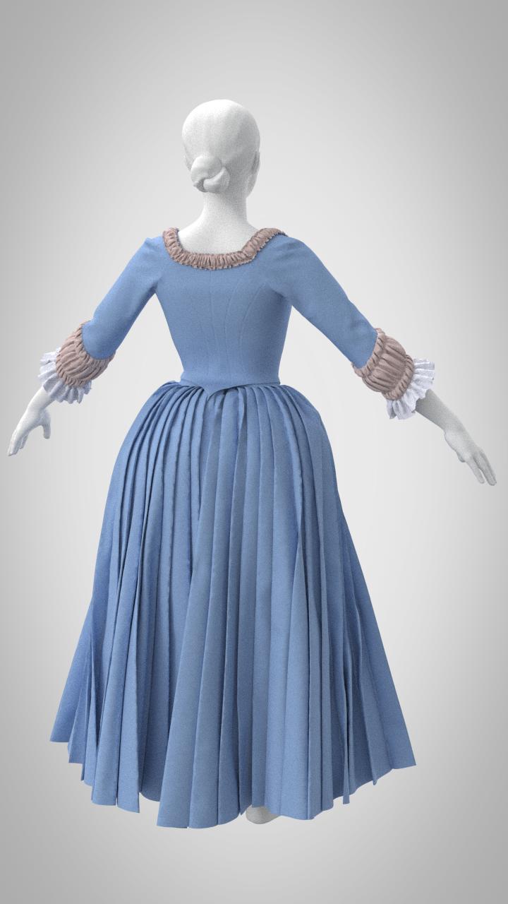
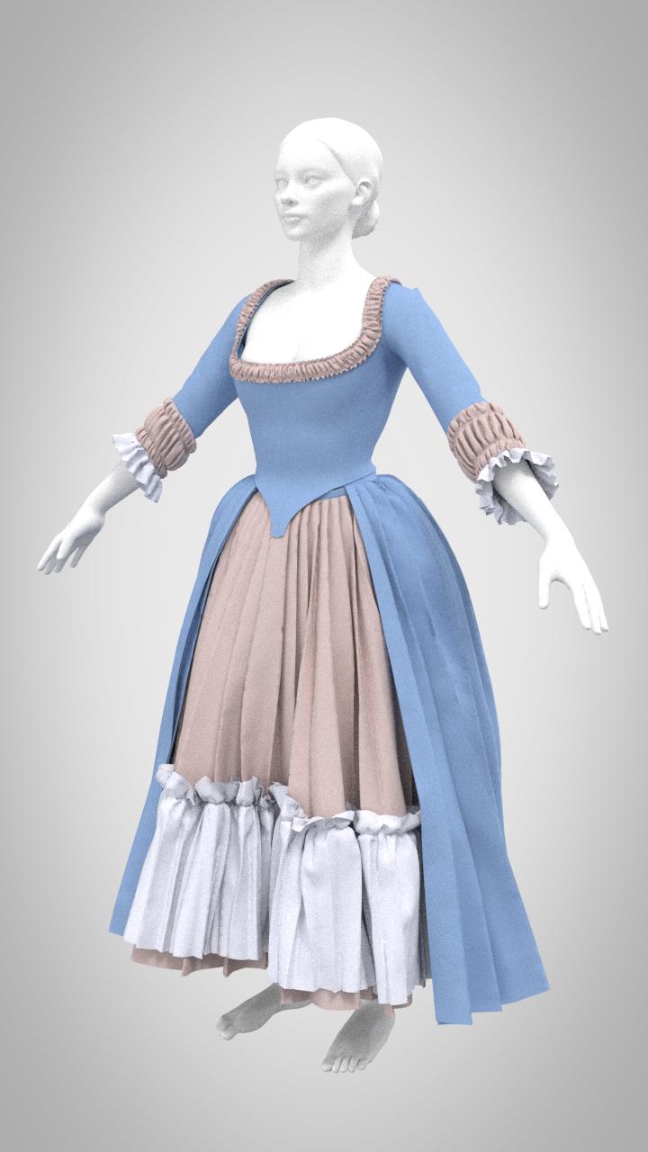
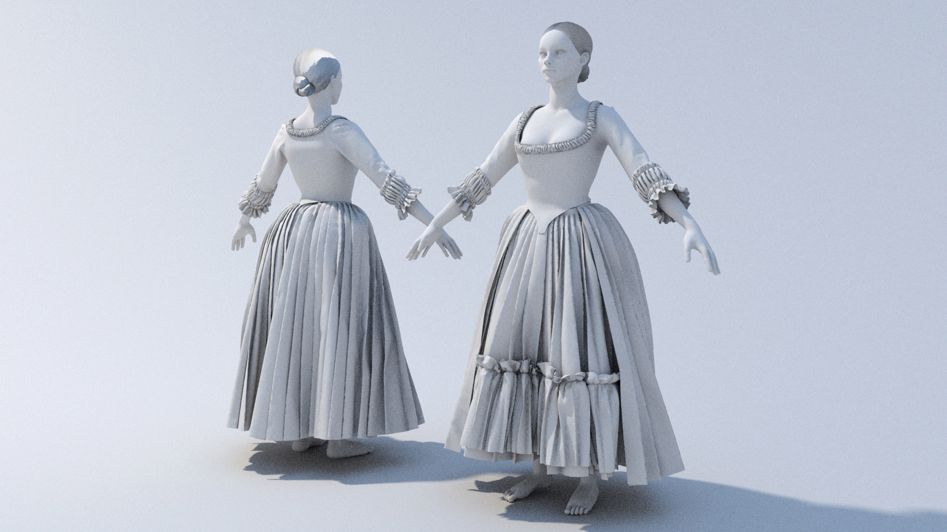
Final Renders
I did my final rendering in Maya, taking some close-up shots and a final full landscape render. I do think I could have stood to lighten some parts of the piece as some of the textile design is lost, but generally I think the result is quite striking. Overall, I’m very pleased with how my renders turned out, especially since I was able to hide so many issues with the underlying mesh.
When I heard this prompt, my mind immediately went to a factoid about the filming of The Addams Family: in every shot, Morticia has a beam of light across her upper face, no matter where she’s standing or what angle she moves. With it being Halloween this week, and with how much I’ve been enjoying my foray into Marvelous Designer, I decided to tackle a Morticia sculpt. This will give me a chance to work on a full body character, create another garment (with challenges in the close fit and skirt drape), and play around with dramatic, focused lighting.
x_toxictears / Twitter
Morticia has several looks in the first film, but I decided to go with her beaded brocade dress that she wears in several scenes. It has a little more detail than some of her plain black gowns, and I was able to find excellent reference images of it from when the real dress was sold at auction. Immediately, I’m curious about how to create both the beaded trim at the neckline and the partially transparent chiffon strips at her sleeves and skirt hem, as I’m not entirely sure how to go about creating them. The dress pattern itself shouldn’t be too complicated, as it is a straightforward princess seam mermaid silhouette.
This week went extremely well for me as I introduced myself to Marvelous Designer. Marvelous is a digital clothing construction software where garments are flat-patterned and then draped onto a mannequin. In exploring this program, nearly every tool just clicked for me: my fifteen years of patterning, sewing, and costume construction experience translated over perfectly. The program was clearly designed by sewists and fashion designers; there are parallels between the two at every step of garment construction within Marvelous, and it feels very intuitive. In addition, the overall pipeline matched the way I would create clothing in the real world: build outfits from the undergarments and structural elements outward, starting with basic pattern blocks and adjusting fit, and finally adding smaller details, seamlines, and embellishments. Replicating these steps digitally felt familiar, as tools behaved as I’d expect. There’s still plenty more to learn as I integrate this program into a larger pipeline: retopology, UVs, detailing, texturing..but I feel like I have a strong grasp of the first step.
Beyond simply utilizing skills from my non-3D background, clothing construction in Marvelous has an aspect that aligns with my preferred workflow: everything is completely and endlessly mutable. I’m never committed to a change until I’m ready for export. As someone who struggles with finalizing larger pieces of a project before moving onto the details, I appreciate being able to toggle between the two without being forced to finalize major choices.
I did run into some roadblocks this week as Marvelous appears to be missing a few key features. Unfortunately, I’m quite stubborn when it comes to not accepting that something is impossible within a program. For example, when the the built-in pleating tool wasn’t capable of automatically sewing deeper-than-standard knife pleats (as I used on the petticoat and overskirt), I began the tedious task of manually stitching every pleat. I also struggled to create truly stiff structural elements such as a pair of supportive stays under the bodice.
On the plus side, because the program uses real-world sewing vocabulary, I was able to search for forum posts or videos that described specific functions with consistently useful results. I found I was rarely looking up actual tutorials, since I generally assume, from my background in cosplay, that there are no specific tutorials for the strange garments I’m always trying to construct; I’m used to being self-reliant and experimenting rather than having a task laid out for me step-by-step. I did rely upon several physical pattern-blocking books that I own as a starting point for the more complex historical shapes, and found that I only needed to make minor tweaks to their fit. For the simpler pieces, I relied upon my own drafting skills and familiarity with basic pattern shapes.
Future Changes
I’m certain that this is a project that I’d like to develop later in the semester, as I feel I’ve barely scratched the surface – the dress is missing embellishments and texturing, and I can imagine a multitude of ways to render the final piece. For the dress itself, I plan to redo the skirt pleats to hopefully avoid some of the clipping issues that I’m currently experiencing; I’ve had advice from a member of the Marvelous Designer discord group with a way to tweak the built-in pleating tool for my purpose, but have not yet tried it out. Traditionally, the bodice would be stitched down to the skirt and petticoat, where it is currently free-floating until I discover how to tack sections of a garment. I’m also keen to play with a more dramatic silhouette – possibly a split rump to emphasize the back bodice point. In general, I’d like to modify the bodice into a zone front and add robe-a-la-turque-style short oversleeves, as well as much more extensive ruffles and lace around neckline, sleeve cuffs, and skirt opening. I’ve been collecting inspiration reference images, mainly of period paintings found on Pinterest and Instagram hashtags, but I do plan to ask for favorite embellishment references from some of my social media historical costuming groups. Finally, I plan to explore textile design as I texture the garment, particularly using transparency for complex lace designs.
In terms of her undergarments, I’d like to add boning, edge binding, and seam taping to emphasize the lines of her stays. I also plan to continue to experiment with material properties, as the stays are still not as stiff as I’d like. In real life, they should have approximately the stiffness of corrugated cardboard, as they are constructed with hundreds of reed bones sandwiched between two layers of sturdy fabric. They are currently modified with a combination of pattern options ‘strengthen’ and ‘solidify’, and material properties ‘bending’ and ‘buckling’ (essentially, every possible setting I could discover from forum searching keywords ‘boning’, ‘stiffen’, ‘strengthen’, ‘structure’, etc.). That said, I am still experiencing some issues with them conforming to the mannequin’s bust and upper hips, where they should instead leave some space. I’m sure that it is possible to achieve an appropriately stiff look, as other Marvelous artists have created pieces such as supportive hoop skirts and period corsets with the properties I’m looking for. More research is in order!
Having settled for creating partial circle skirts with standard pleating rather than the historically accurate rectangular skirts, my main challenge for these layers was in getting them to simulate correctly without conflict. So much fabric often got caught in the upper or lower layers, despite setting each skirt to progressively higher layer numbers in MD. I created a simple gathered petticoat to smooth the lines of the bum roll and stays (where a malleable garment would be pushed down by the weight of the overskirts in real life, digital garments are a little more solid). On top of that, I made the underskirt with a simple ruffle (simply knife pleated and then gathered onto the line of the underskirt. The final upper layer was an overskirt made of a duplicated pattern piece from the underskirt but rotated around and lengthened (one major advantage I wish was available for my real sewing needs!). I learned about functions like freezing and disabling garments to allow only certain pieces to simulate without affecting others, which appears to be a vital part of the Marvelous Designer workflow.
Bodice
For the bodice, I did end up testing both patterns from my historical books, and decided upon the Janet Arnold pattern for the final piece. It needed quite a few fit adjustments, both to fit my underlying avatar and to match up the pieces. Luckily, my real-life fitting skills translated over extremely well for this task; I’m used to doing very similar processes on paper and then fitting on a physical dressform. I suspect there is some minor stretching and warping happening in such a fitted garment, but I tried to do most of the fitting in a leather material that shouldn’t have much stretch. I believe Marvelous has some fit evaluation tools, but that’s something I’ll need to investigate later on.
Finished Garments
For my final touches, I added a few more gathered ruffles at the neckline and sleeve cuffs, and rendered the final piece with flat material shaders and a simple lighting setup in Maya. I’m generally thrilled with how much I was able to achieve in only a week’s time in a brand new program! I can already tell this is will be something that I want to devote far more time to, and I’m already considering how I can incorporate Marvelous Designer into my next project.
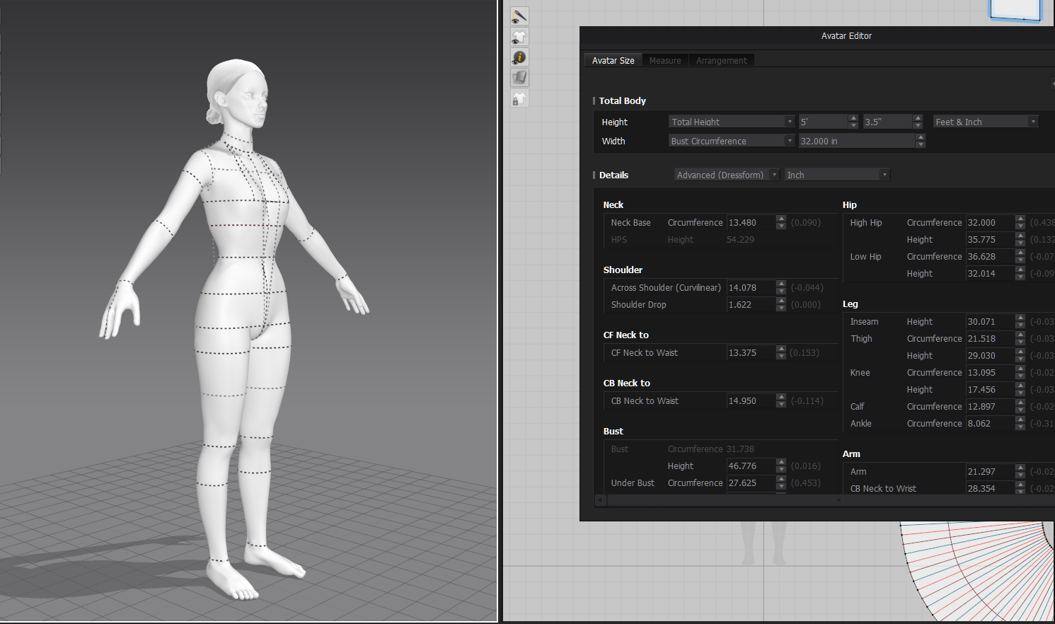
Because I’d like to make use of some of the patterns that I’ve already drafted and sewn for myself, my first step was to adjust the default Marvelous Designer mannequin to my measurements. This became quite complex as the built-in adjustment created some very strange warping and bending in the avatar that I needed to resolve; it doesn’t like extreme proportions. Obviously my stays and other foundation pieces can’t actually shape the underlying body, so I had to adjust the body to fit the stays. I ended up setting the basic measurements in place and then playing with the avatar posing system to shift the horizontal trunk lines vertically to approximately my (in-undergarments) proportions.
Foundation Garments
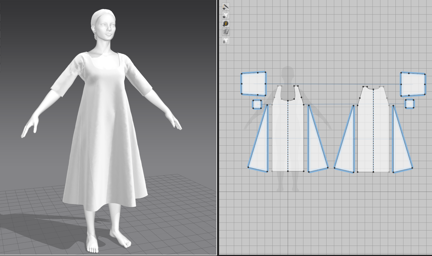
The foundation pieces came together surprisingly quickly, although I did have the advantage of having constructed them in real life and was therefore very familiar with how the pattern pieces should look. I started with the simplest piece, a shift meant to be worn under all the other pieces. This was patterned off a basic grid and had the benefit of not really needing to be fitted apart from proportionately.
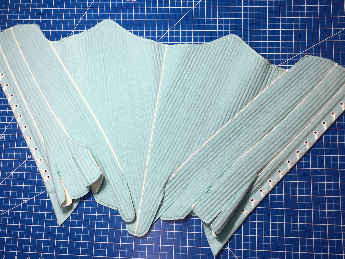
The skirt supports I created from the aforementioned Scroop pattern, and I used the pressure function in Marvelous to inflate them like a balloon in lieu of stuffing. Since designers often use Marvelous to create things like duvets and puffer jackets, this is a common technique with quite a few tutorials on the subject.
For her stays, I again used my own pattern that I had previously digitized, and because I had already input my measurements, the patterning stage went very quickly. I discovered Marvelous’s layering feature to force the pieces to sit correctly on top of each other (shift under stays under bum roll).
However, my first huge roadblock came in trying to stiffen the stays to how they should be. In real life, stays consist of so many strips of boning laid immediately next to each other that they are essentially the stiffness of cardboard or styrene. Marvelous doesn’t seem to have anything resembling boning, so I set to play with the material properties instead. I ended up throwing every single stiffening feature I could find at the stays in both material and compositing properties, and have a sufficiently stiff end result to continue with the rest of the garments (but will eventually need to adjust them further for accuracy).
Pleat Tests
The other problem I ran into early was the frustratingly limited pleat system within Marvelous. 18th century garments make extensive use of pleating rather than gathering, with both petticoats and overskirts relying on deep knife pleats for the correct shape. I played around with the automatic pleat folding and sewing tool, and was pretty quickly frustrated that I couldn’t discover a way to make deeper-than-standard pleats, even manually. I decided to compromise and create pleats on a circle skirt instead of a rectangle to mimic the extra fabric at the hemline.
I approached this week with a very solid idea of what I wanted to do right off the bat: instead of memories from my own life, I’m going for nostalgia for a historical time period with a character in period garb. A big part of my life is cosplay and historical costuming; I do everything from patterning to construction in real life, and my ideal niche in the games industry would be character garment work. I’m fairly new to historical costuming but it’s been a growing interest of mine, and I’ve been collecting inspiration for late 18th century gowns for a long while…so why not create one digitally?
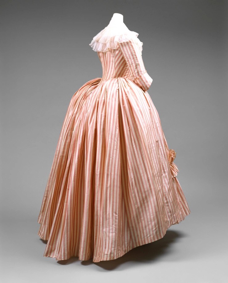
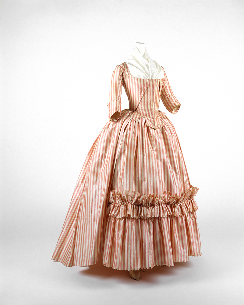
I’ve also been wanting to learn Marvelous Designer (3D textile program) since I started sculpting, as it’s such a good overlap between my patterning/sewing and 3D skills, so this is the perfect time to tackle it. I plan to create a bit of an amalgamation of elements from some of my favorite pieces, drawing mainly from this dress from the Met Museum.
Met Museum
Patterns
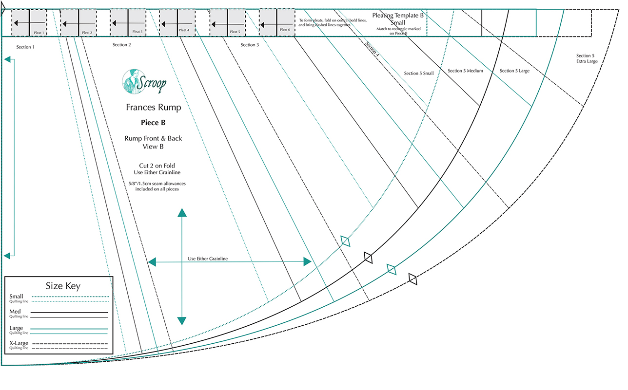
I have a fair amount of experience patterning non-historical garments, but when it comes to accuracy in shapes and construction, I turned to several of my owned pattern books. There are two similar gowns from publications by Janet Arnold and Norah Waugh, so I plan to translate them to Marvelous Designer garments and see which one has the better look. For undergarments, I already have a stays pattern that I’ve developed and made in real life, and borrowed a pattern for a bum roll/skirt support from Scroop Patterns. I feel confident that I can free-pattern the petticoats and skirts, as they are generally rectangle shapes constructed mathematically. Hopefully once I have the foundation pieces done, I can spend some time adding embellishments and details.
My own constructed staysScroop PatternsJanet Arnold / Patterns of Fashion 1Norah Waugh / The Cut of Women’s Clothes
Bibliography
Arnold, J., 2005. Patterns of Fashion 1. New York: Drama Book Publishers.
Waugh, N. and Woodward, M., 1968. The cut of women’s clothes, 1600-1930 [by] Norah Waugh; [completed and] with line diagrams by Margaret Woodward. London: Faber.
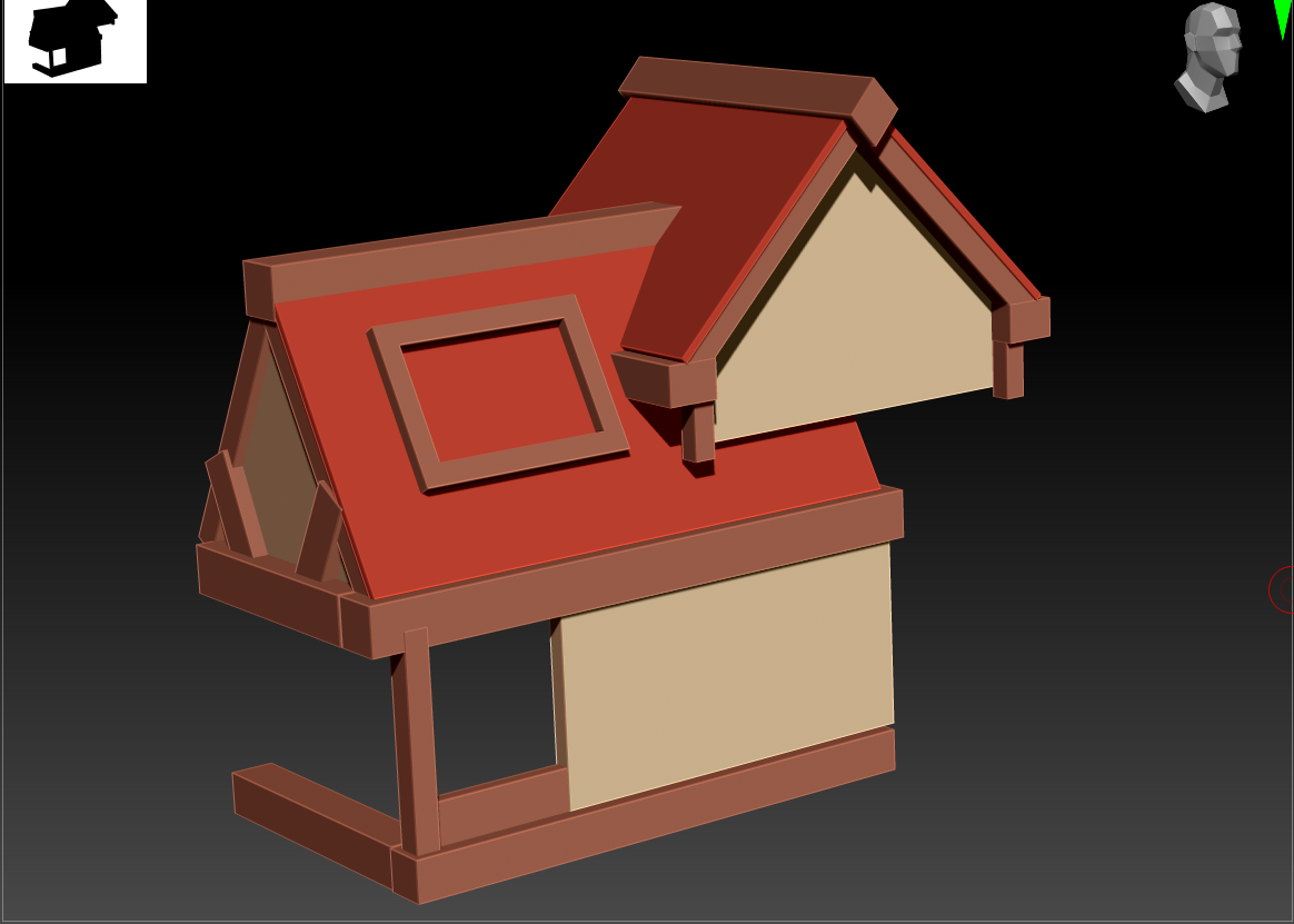
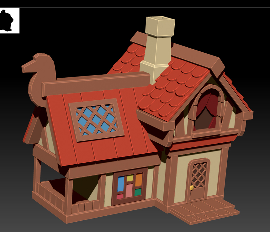
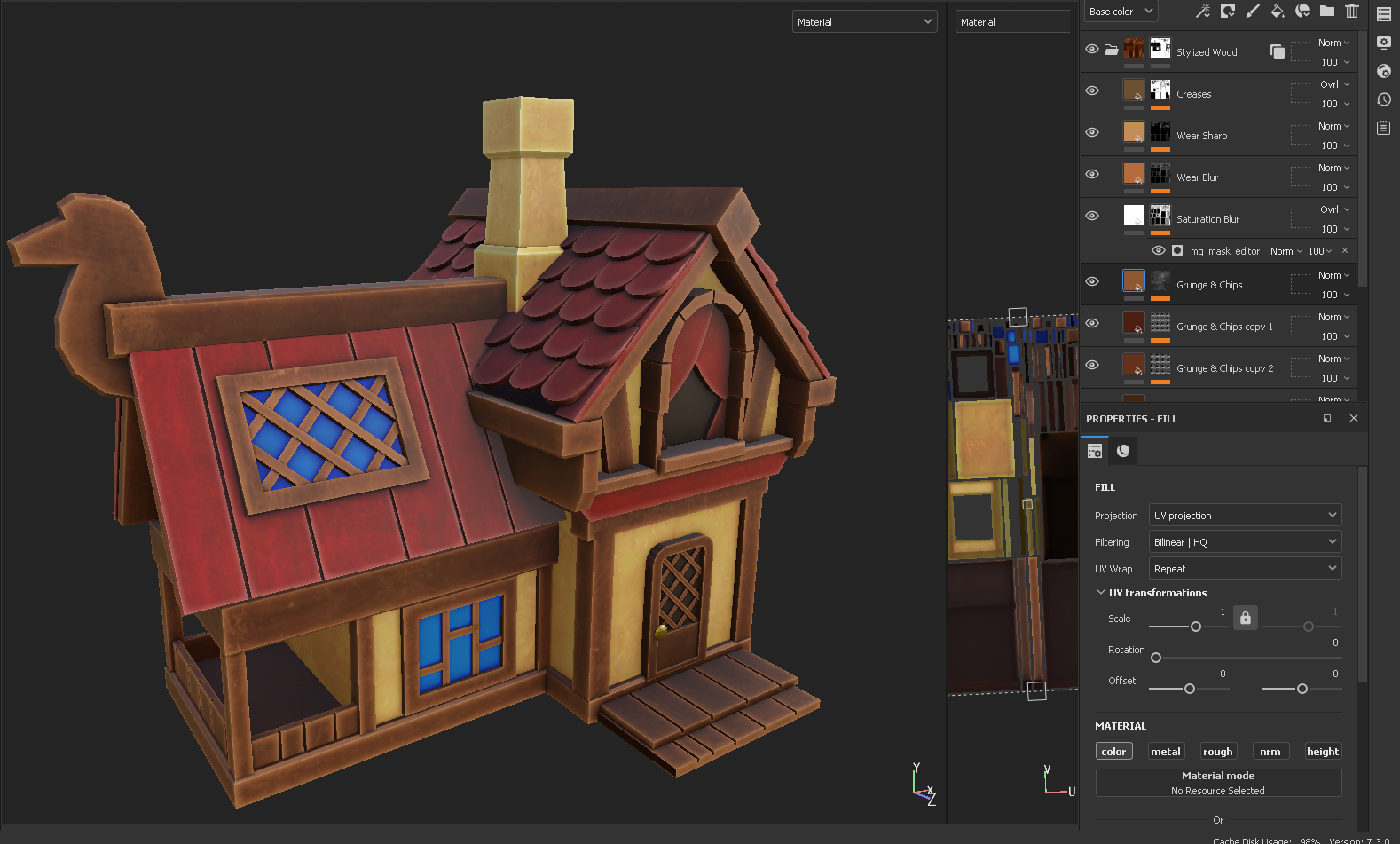
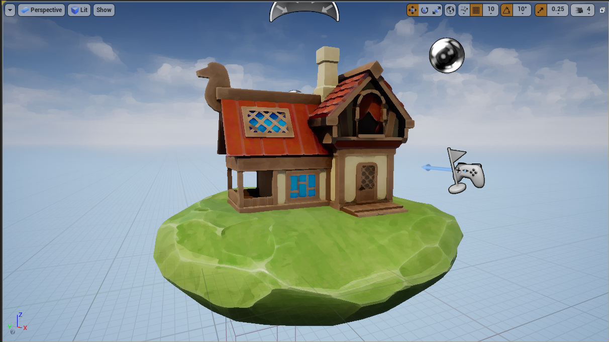
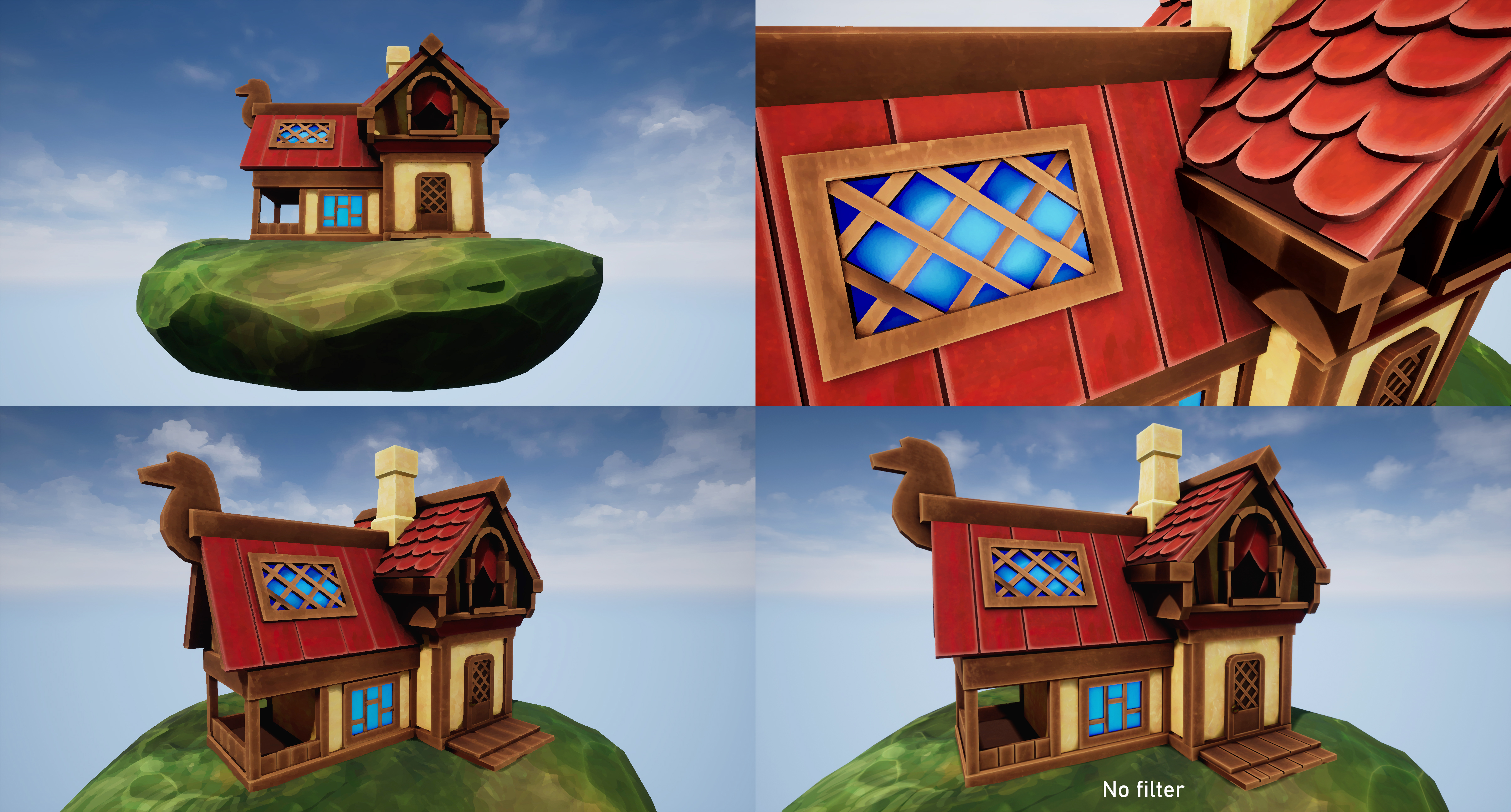
My piece this week is absolutely unfinished, as I focused more on completing small proof-of-concept elements along the entire pipeline when it became clear that the time limit wouldn’t allow for more than that (depth rather than breadth). Still, I do like the way it is going and would like to update it when I have more time. The first thing I’d adjust is the Kuwahara filter: working on it was a good introduction to UE4 and, with the basic state that my cottage is in, it did add to the overall effect. However, it really didn’t have the distinct brushstrokes I was hoping for in a painterly filter, and tended to overly blur the model, obfuscating the few details I did manage to include. With that, the house remains entirely primitives and is missing all of the woodgrain/stippling elements in the sculpt that exist in the original concept art. I also only hand-painted the ground and ‘automated’ the rest with materials in Substance Painter; I think it could be vastly improved by fully custom-painted textures. Finally, the concept building has exaggerated perspective and wonky angles to the roof and walls which I would like to match in my sculpt once the rest of the elements are finalized.
This week was rough in terms of the workload that I chose to give myself. Essentially, I took on learning three brand new programs (Maya’s UV mode, Substance Painter, and Unreal Engine) as I took my piece through the basics of the entire game-ready pipeline. I am pleased to finally feel like I have an overview of the entire process; this week de-mystified a lot of unfamiliar elements for me and I’m less intimidated by the idea of creating a full game character. That said, while I’m incredibly proud of the fact that I had anything to show with how many stumbling blocks I ran into, this is certainly a lesson in setting reasonable goals with such a quick turnaround.
One of my biggest issues at the moment is a tendency to settle on what a finished product looks like and refuse to compromise on that vision. I had grand plans to create a painterly filter over a beautifully painted, stylized house, despite never touching several of the primary pieces of software, nor ever practicing any architecture. I’m also very determined to have a polished piece to show off each week, despite the fact that the ‘showcasing’ stage is approximately 30% of the overall work; this week, it was creating choreographed fly-cam video in Unreal as well as high-res, post-processed screenshots. I’m trying to break out of that notion and accept that these weekly projects should be rapid-fire practice sculpts.
I also had a chance to revisit programming, my original degree discipline, in working on the Kuwahara post-processing shader. This clarified a few things for me. For one, it validated my choice to switch careers, as I found I’m not nearly as enthusiastic about programming as I am about sculpting/painting. I don’t intend to pursue much more shader programming, but as someone who feels quite out of my depth amongst other practiced artists, I’m glad to discover previous expertise that I can apply to my work (anything to feel like I’m ‘catching up’ to all my amazingly skilled classmates!). Next week, I intend to start exploring Marvelous Designer, where hopefully my sewing background will be an asset…and I’ll attempt to be happy with in-program screenshots to show off my work instead of full renders.
Cottagecore & Covid-19 Escapism
It’s no coincidence that my first thought upon hearing the prompt ‘Places of the Mind’ was to go to my ‘happy place’, the antithesis of the stress of starting a new course and moving overseas. For me, that’s imagining a cottage in a meadow, away from society and technology. Beyond that, I’ve been particularly influenced by a major aesthetic trend recently: ‘cottagecore’, which came into particular popularity during the pandemic and represents many people’s desire to escape to an isolated, safe, simpler time.
Like most trends, cottagecore can be interpreted in many ways, but it is essentially fashion, architecture, and lifestyle that involve a reconnection with nature and some nostalgia for the sugar-coated aspects of historical frontier living: picnics in meadows, farm animals, flowy summer dresses, home baking, and a lack of any real responsibility. Leah Dolan describes it in Vogue as a movement that “celebrates rural domesticity”. There are subreddits, Facebook groups, and Pinterest boards that embody this aesthetic. We’ve also seen the rise in popularity of charming, idyllic games like Stardew Valley, Valheim, and Animal Crossing in the past two years.
I recently discovered a large study on this phenomenon, focusing on the game Animal Crossing: New Horizons, a stylized village simulator game that was one of the most widely played during initial global lockdowns (Comerford, 2020). I’m clearly not alone in seeing the appeal: it provides a sense of community, roleplaying, routine, and small-scale accomplishments with very few punishing elements. Visually, it’s colorful and aesthetically pleasing, with stylized artwork that evokes childhood cartoons. This is something that I was keen to explore in my sculpt this week. While I usually tend stylistically towards realism, I shy away from dark/horror/upsetting genres, preferring to keep my artwork an expression of fantastical ideals.
Bibliography
Comerford, C. (2021). Coconuts, Custom-Play & COVID-19: Social Isolation, Serious Leisure and Personas in Animal Crossing: New Horizons. Persona Studies. [Online] 6(2), pp.101-117. Available at: https://doi.org/10.21153/psj2020vol6no2art970 [Accessed: 11 October 2021].
I set myself up for a struggle almost immediately with this project, as I chose to do all of my low-poly pieces in ZBrush rather than a more dedicated hard-surface program. I figured I was learning so much new software this week, I should at least stick partially to something that I knew, but I absolutely need to learn how to sculpt in Maya if I do more pieces like this.
I built all of the general pieces of the house in ZModeler, making use of symmetry and beveling. ZBrush has a major flaw in not saving transformation data to be copied over to other objects, so I had to move and rotate most pieces by eye and using the standard step locks. I discovered partway through that I could set a custom step for the transform tools, which sped up the process. The polypaint was purely to visualize the different sections of the house as I was building it.
The other struggle I had was in how inconsistent and stylized the concept art was – the house itself doesn’t quite follow the rules of perspective and has very few 90-degree angles (to great stylistic effect, but a nightmare to sculpt!). If I revisit this project, I absolutely want to adjust the angles of the pieces to better match the artwork rather than its current state of looking like a Lego house; it’s really lacking some of the charm of the original design.
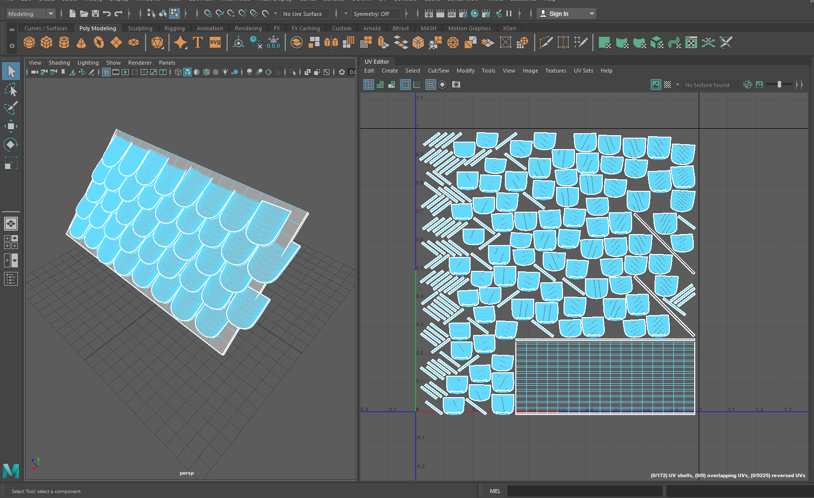
UVs and Baking
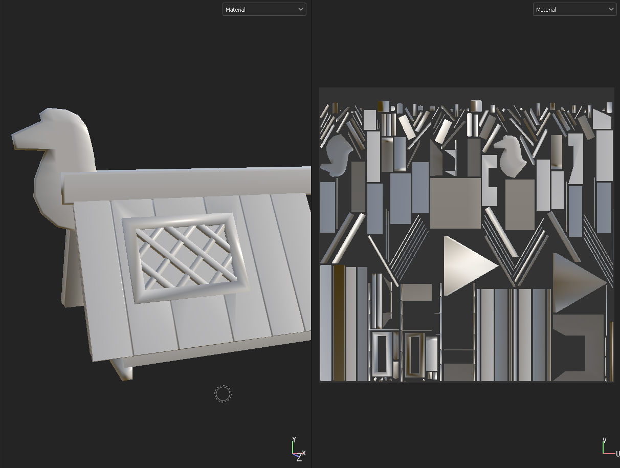
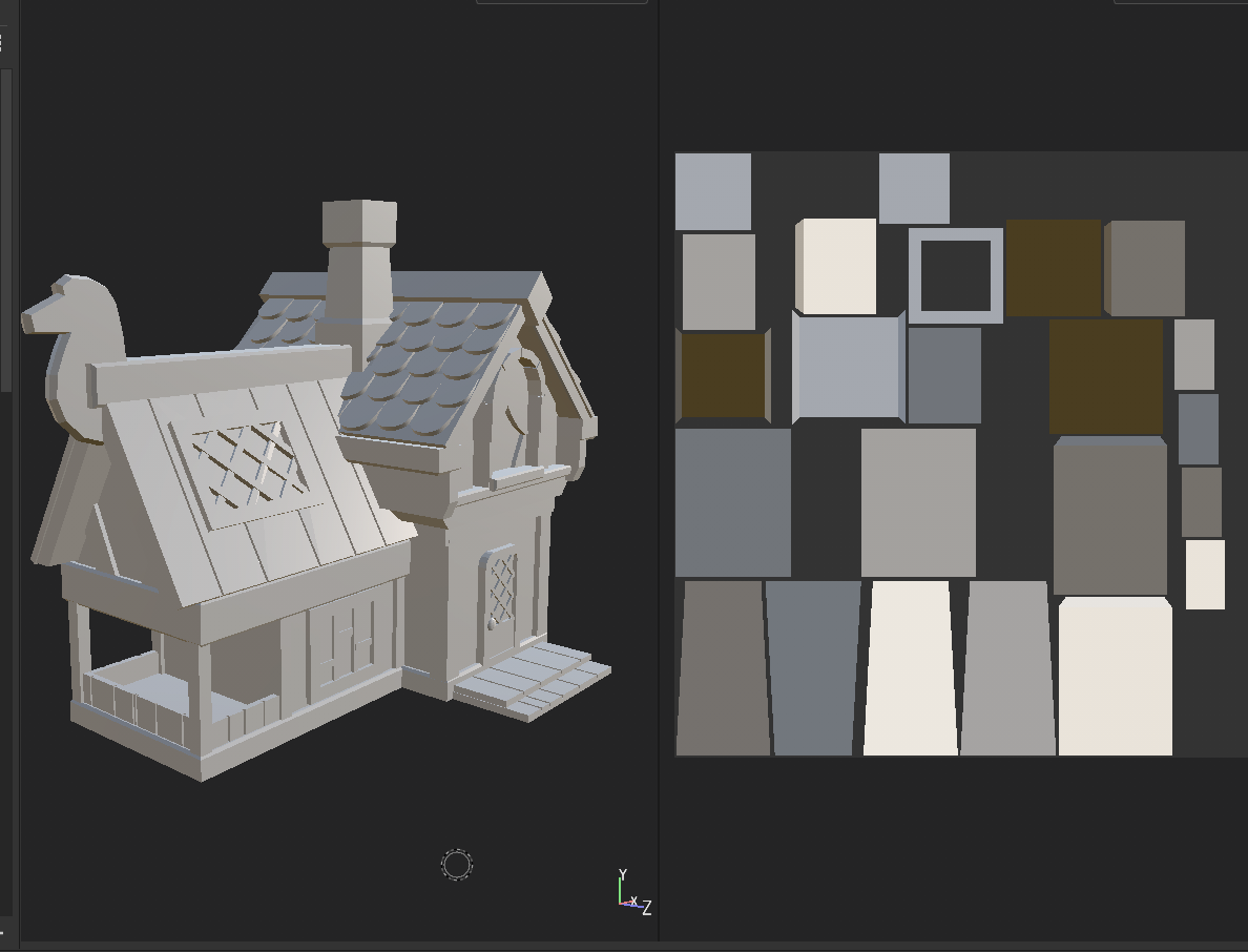
Probably the biggest skill I learned this week was UV creation and the high-poly low-poly pipeline. I had only the slightest familiarity with Maya previously (almost entirely in scene setup and rendering), and had made one set of UVs in ZBrush’s (terrible, sorry!) automatic UV unwrapping tool. For hard-surface, it was clear from reading forum posts about workflows that Maya was the way to go for UVs.
I managed to import my house into Maya in several smaller sections and was quite impressed with the UV creation/unwrapping/layout tools. I’m sure that my UVs aren’t particularly efficient, especially with so many poorly rotated and duplicated parts (e.g. I’m using half the texture for the back side of the roof tiles that will never be seen), but that’s something to improve upon later.
UVs in hand, I pulled the pieces back into ZBrush for additional detail testing. I practiced with scribbles on the roof of the house just to figure out the high-poly low-poly pipeline, and managed to bake these textures down in Substance Painter without much trouble. I did run out of time to do any real detailing for the final piece as I had originally liked (e.g. wood grain, uneven bevels, roof tile texture..), but I’m glad I have this proof of concept. I did end up making a ‘high poly’ version of the house in ZBrush with lightly smoothed bevels and curves, and this was what I input for my final texture baking.
In general, not bad for two major steps of the game asset pipeline that I had never touched before!
Texturing and UE4 Import
With the deadline drawing nearer and how many new skills I was attempting to learn, my plans for a completely hand-painted texture were out the window. Instead, I experimented with programmatically-generated stylized textures via grunge maps and curvature filters in Substance Painter. I attempted to bring out the highlights and lowlights while also adding some brushstroke texture, but it ended up being too consistent and flat to match the original concept. I was hoping that some of this would be resolved with filters in the final UE4 render.
The Kuwahara filter for my final render scene was fairly straightforward, as I closely followed the tutorial mentioned in my previous post. The final effect wasn’t quite what I was going for, as it tended to blur too much of the hard lines that I was hoping to keep; I think it would have looked much better were there more color variation in the underlying house, as it created a very nice effect on the one hand-painted section of my sculpt: the grassy rock. That said, my interest is definitely piqued to see exactly what’s possible with shader customization in Unreal.
Final Renders
My final renders were pretty straightforward once I figured out how to import all of my textures and set up a basic camera. I used the default sky and scene setup from the UE4 starter scene, and simply replaced all the assets (along with adding my custom filter as an overlay). Once I shot a few high-res screenshots, I pulled them into Photoshop for minor color correction, as they appeared quite dull in my scene; I suspect I had some of my textures in the wrong color space.
Oddly enough, the place I struggled the most with this project was in rendering out a final video – I found UE4’s keyframe system for video recording very unintuitive. It didn’t help that this was recorded at the eleventh hour in a bit of a panic, but still! I found quite a few tutorials for recording character gameplay, but not many for cinematics that travel along a set path. I ended up creating something passable, but pretty wonky in the abrupt directional changes. This is something I’d like to investigate further, since being able to show off assets in action is a major plus for the game-ready workflow.
I’m going into this week with a set of learning objectives, mainly centered around figuring out the high-poly low-poly pipeline for games. I have only ever done extremely high poly models meant for rendering; previously I’ve used automated decimation tools to reduce the polycount to a few hundred thousand for 3D printing, but never to the level (or with the manual care) that’s necessary for real-time. As I ultimately want to be making (potentially very performance-focused, e.g. mobile or portable console) games, it’s vital that I understand the full process.
From skimming a few timelapse videos and chatting with friends with more experience in the industry, these seem to be the main steps:
Low-poly base sculpt in ZBrush or Maya
Pull into Maya to create UVs
Back to ZBrush for the high-poly sculpt (added details, organic shapes)
Import low-poly into Substance Painter for texturing and bake maps using high-poly exported file
Export fully painted and textured piece to Unreal for real-time renderin (Obviously, there may be some changes if, say, the high-poly model needs to be retopologized or a character needs to be rigged, but I believe these are the basics).
Thus far, I’m quite familiar with ZBrush and somewhat with Maya, and have never touched any of the other software. I’ve also been doing limited UV mapping in ZBrush but there’s a real lack of control (e.g. seamlines are specified with loose polypainting and it’s nearly impossible to rearrange islands on a map) and I suspect it won’t be precise enough for industry standards. I’m excited to play around with some more specific tools!
Initial Ideas
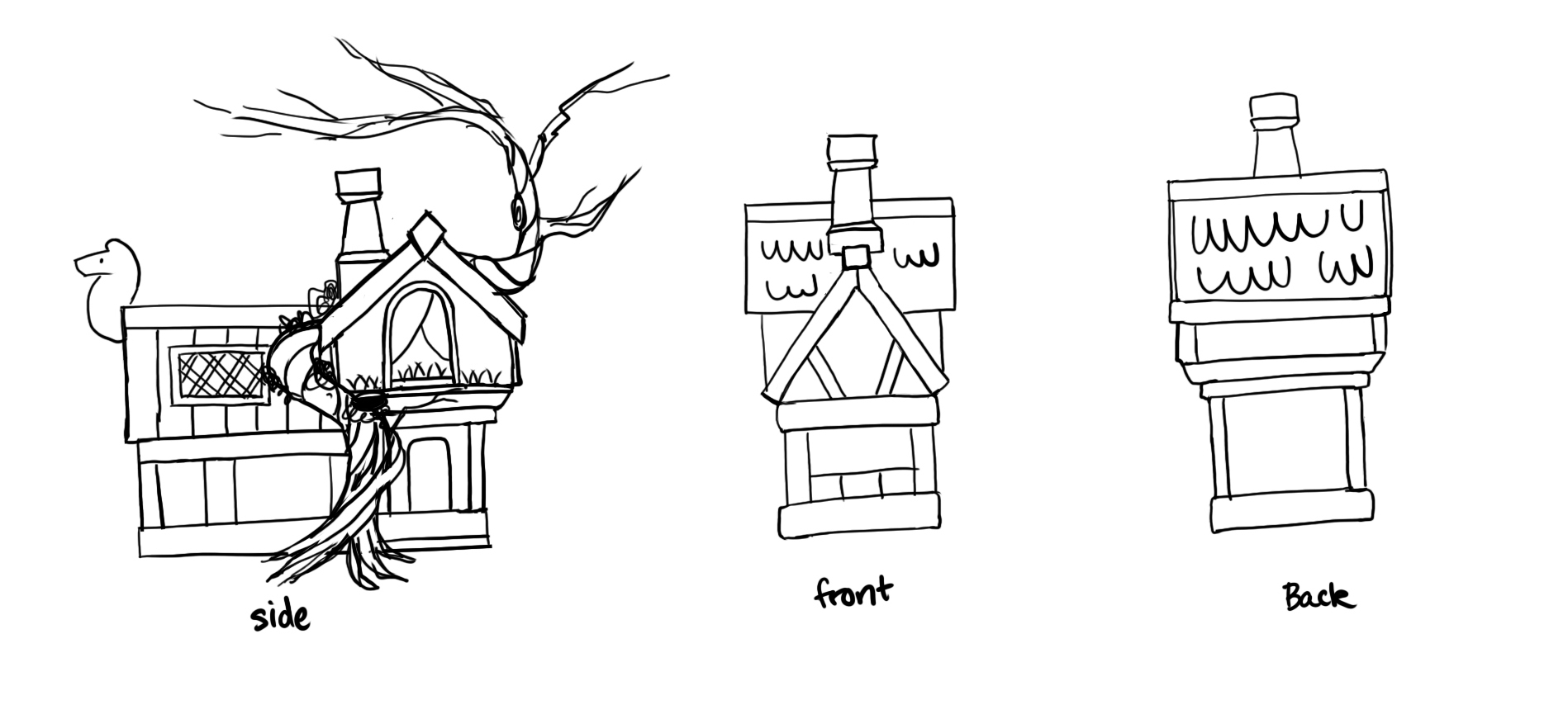
My initial idea for ‘places of the mind’ was of the concept of a ‘happy place’ – I think of sunny fields and idyllic cabins in the woods. I’ve been collecting concept art to potentially use for my final semester project, as I’d like to create a partial environment with a small hut in a clearing, and so already had this beautiful artwork by Daria Silbern in mind. While I’m not really an environment artist, I figured a simple base model would be my best bet for experimenting with so many new softwares. I’m also still trying to nail down my style, so what better than a painterly, brightly-colored, cartoon-distorted piece for inspiration? With that in mind, I started sketching an orthographic breakdown of the house, as I was working purely off a slight 3/4 view and need to wrap my head around the full 3D shapes.
Daria Silbern / BehanceMy initial breakdown of the main shapes of the house
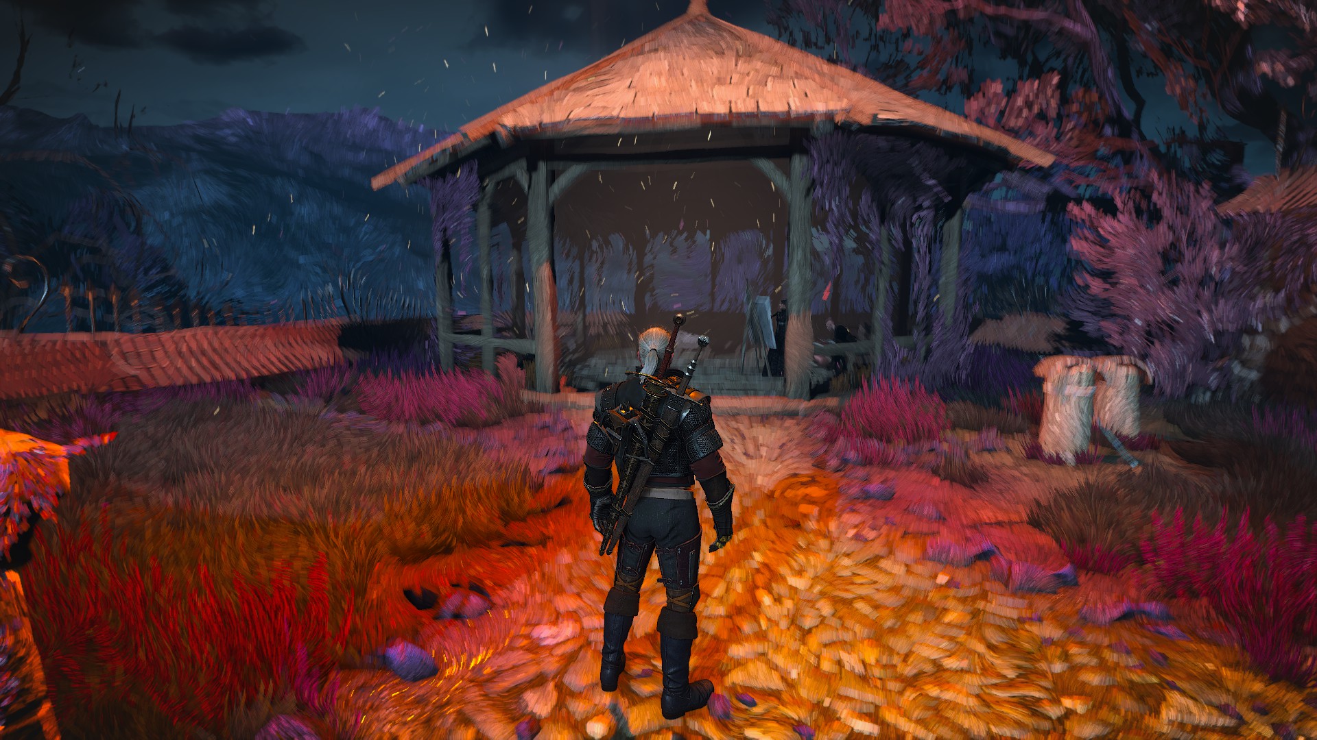
However, since digital painting isn’t my strong suit (er, at least, it’s something I’ve barely practiced..), I’d rather not hand-paint my entire piece. Rather, I thought of the overlay effect from one of my absolute favorite scenes from The Witcher 3, where the protagonist enters a painting. The entire world is transformed into a swirling mass of colors and brushstrokes, and it’s one of the most visually striking effects I’ve ever experienced in a game. I’m sure that it wasn’t painted manually, as my character can run through the world in 3D as the paint strokes adjust with depth of field. If I can pull off a similar look through filters or effects in UE4, it would save a lot of time!
astralis3d / Twitter
A quick google found that The Witcher developers did use their own proprietary engine, so I don’t necessarily have proof of concept that this is possible in UE4. After extensive research on Youtube and Artstation, I did however stumble upon this tutorial for something called a Kuwahara effect. From my understanding, this is a mathematical formula for creating something of a smoothing effect with harsh edges, similar to the ‘cut’ filter in Photoshop. This isn’t necessarily the exact effect I’m looking for, but it’s surprisingly close and likely the best I can do in my one-week timeframe. This tutorial also proved to be an invaluable resource for simply learning UE4, as I was able to follow the author’s navigation through the interface.
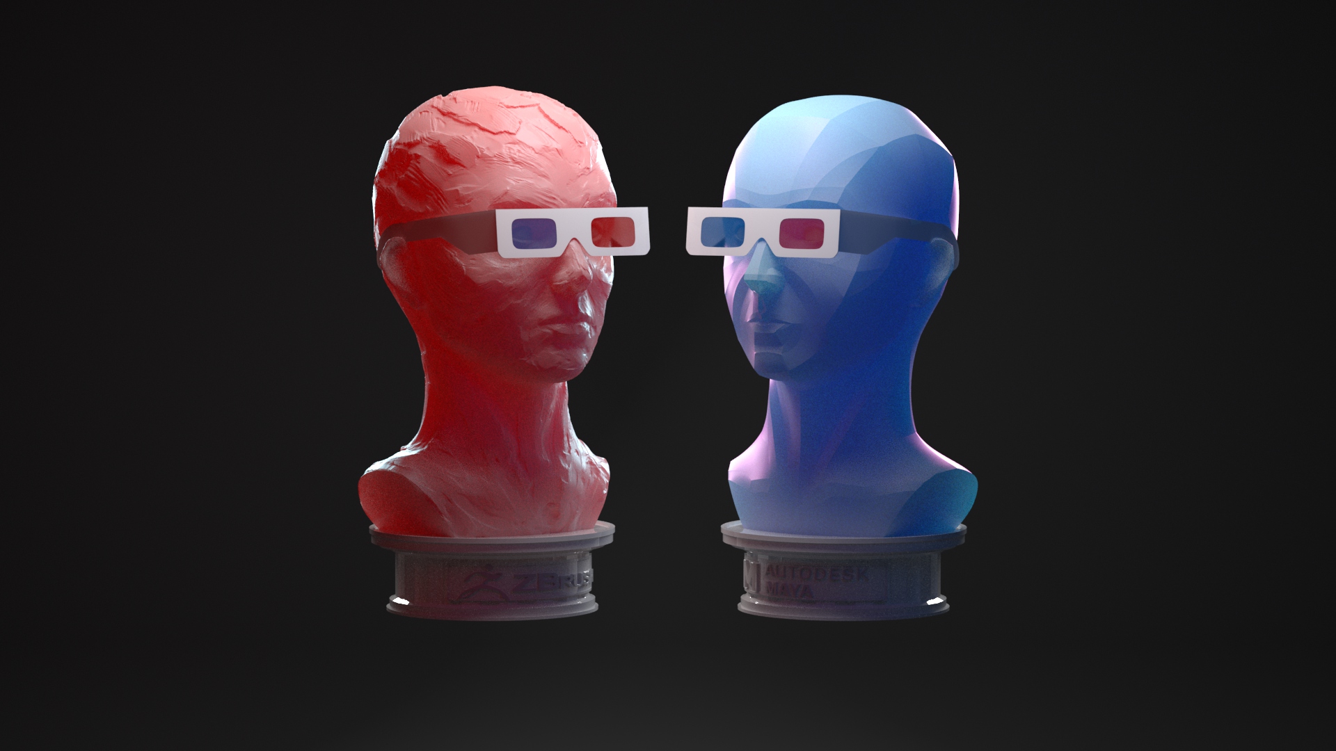
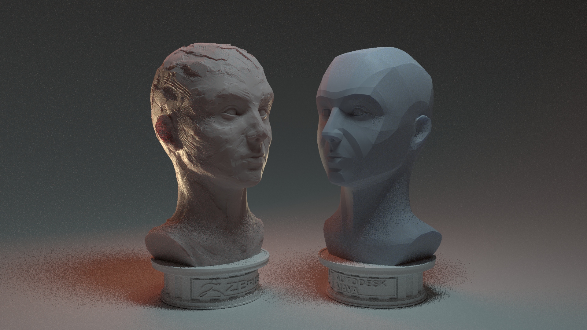
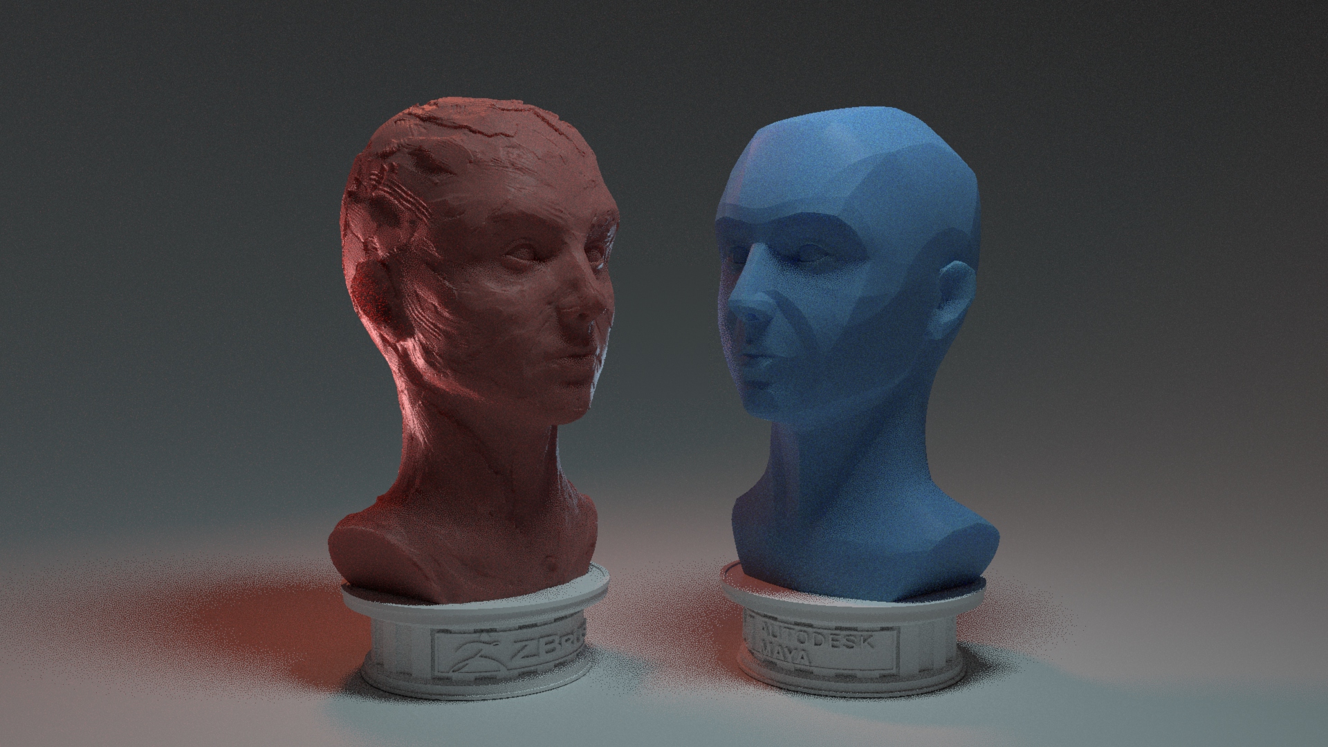
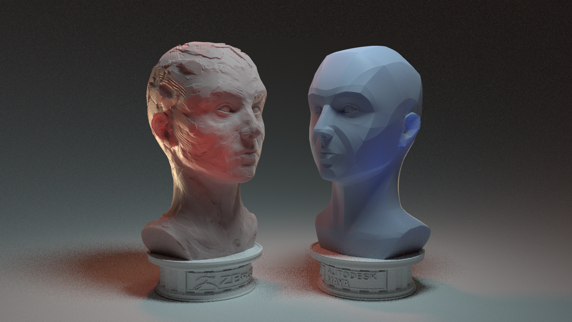
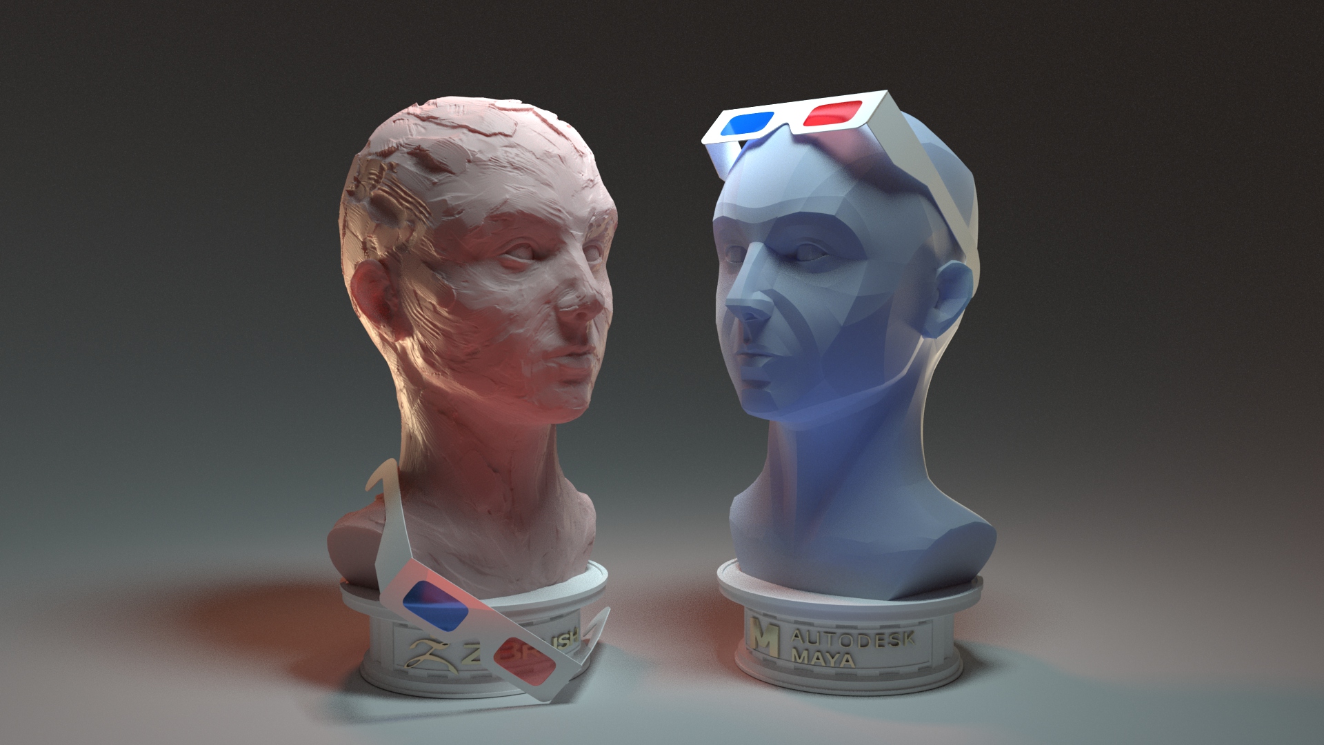
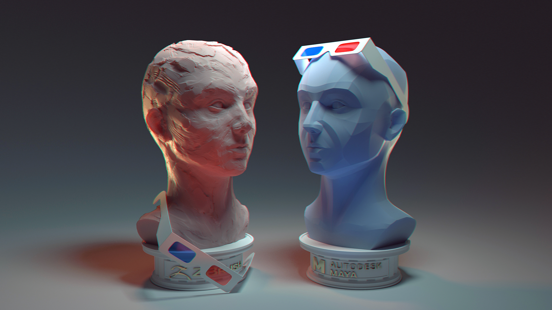
After finalizing the clay and hard-surface busts in ZBrush, I whipped up a few additional models: two simple plinths emblazoned with the software logos (converted to vectors and extruded) and a pair of 3D glasses. I imported the models into my previously-created test lighting scene in Maya and, while I think the overall look pops, much of the topography and detail I had worked so hard on was lost. I also used this experiment to decide upon a combination of colored shaders and colored lighting rather than uniformly-colored objects.
I ended up creating a new scene and adding in lights one by one, especially focusing on partial backlighting to skim the surface of my models and emphasize their features. I decided quickly to keep the shaders more neutral in color overall, with intense subsurface coloring to further bring out the peaks and valleys and add more color variation.
It became apparent that the 3D glasses worn ‘normally’ were obscuring far too much of the faces. I agonized over the placement of them since the two figures have detail in different places and I didn’t want to cover too much. Eventually I settled on the final placement, which I hope further drives home the loose/realistic nature of the clay sculpt as opposed to the neat, controlled hard-surface one.
AOC Pass
Final Render
My final piece: sculpted in ZBrush, composited and rendered in Maya with Arnold, and lightly post-processed in Photoshop (color tweaks and chromatic aberration effect).