You look weary, traveler..
Take a pause from your reading of student blogs and enjoy some hilarity and gentle horror at the hands of my projects this semester:
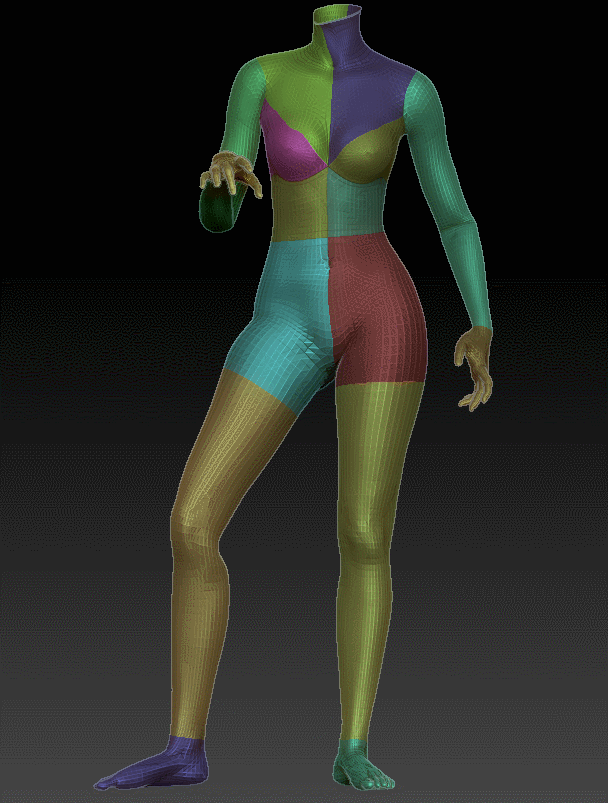
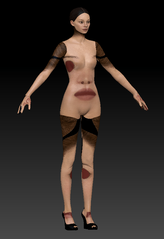
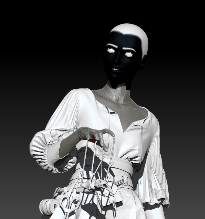

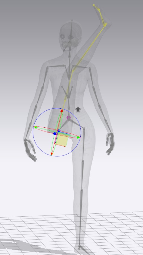
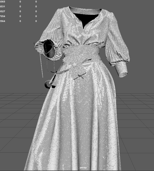
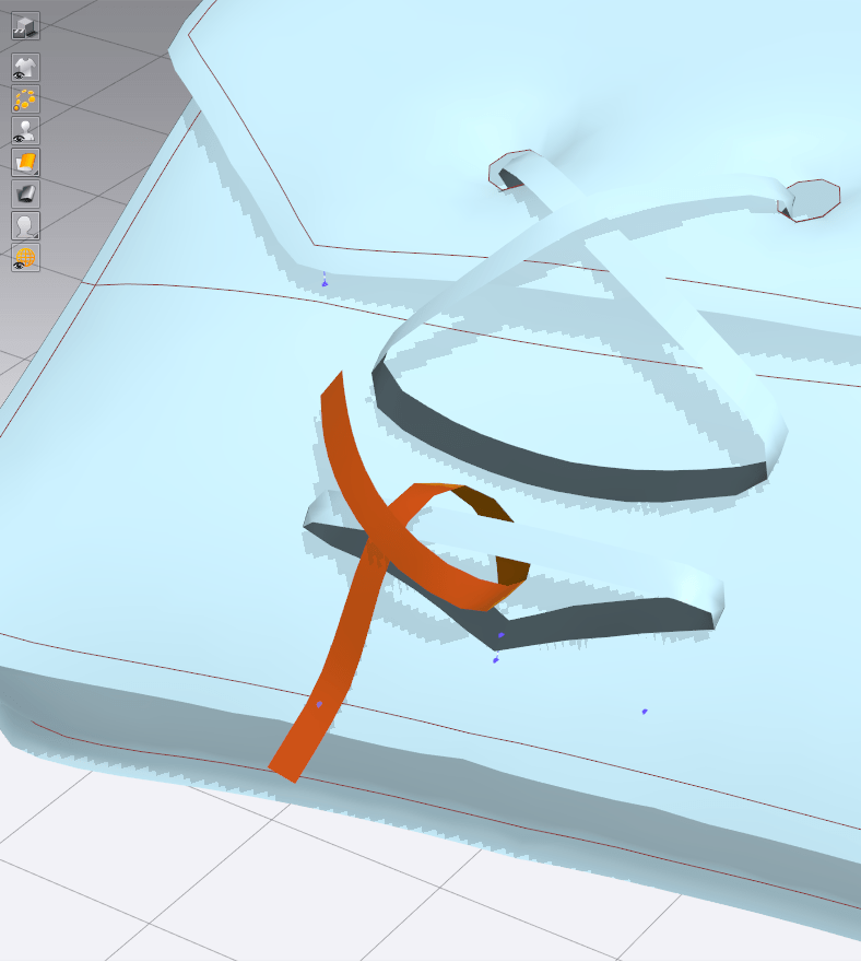
Fig 1: uterus holding a sword
And now on to your regularly scheduled blogging 🙂
Take a pause from your reading of student blogs and enjoy some hilarity and gentle horror at the hands of my projects this semester:
And now on to your regularly scheduled blogging 🙂
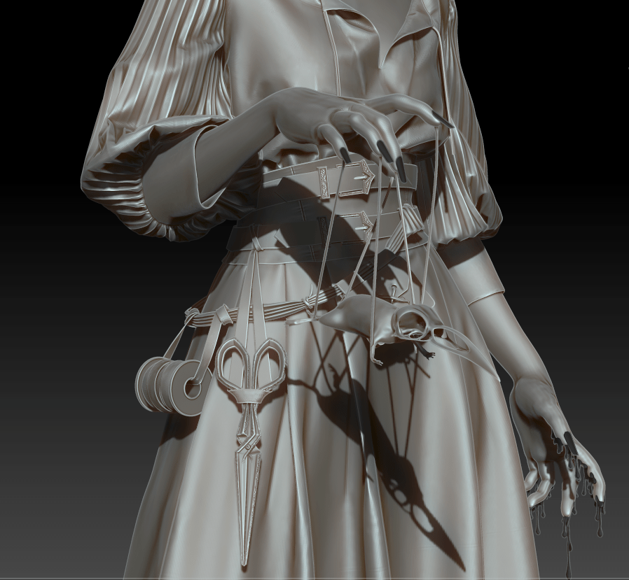
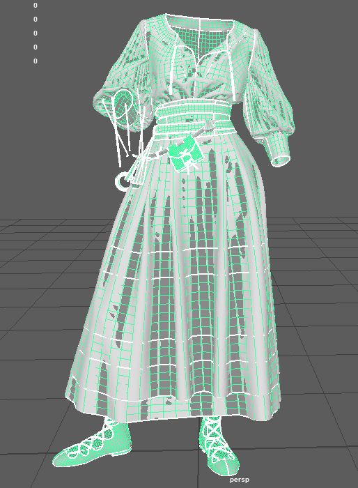
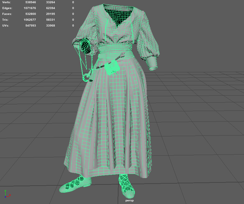
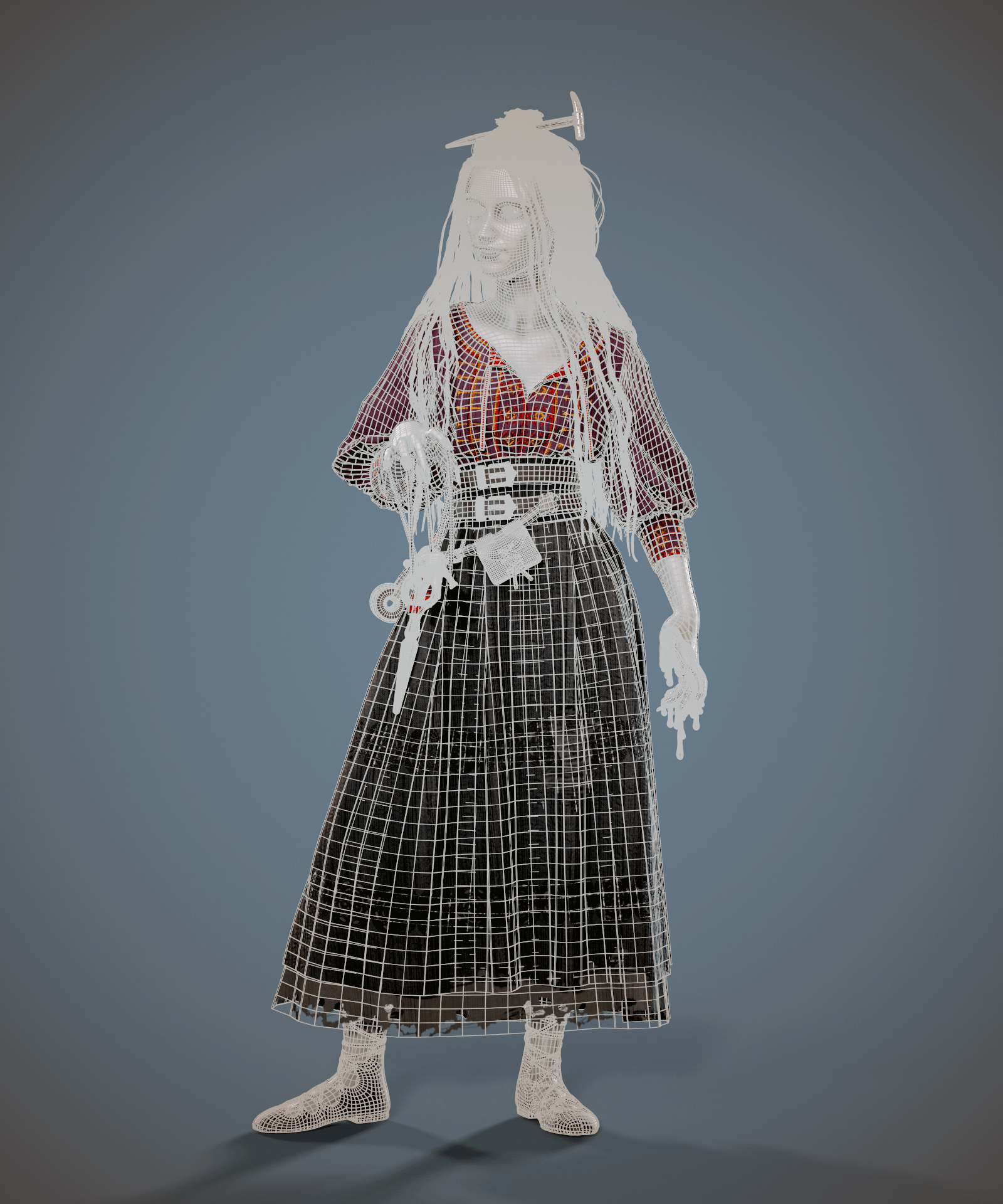
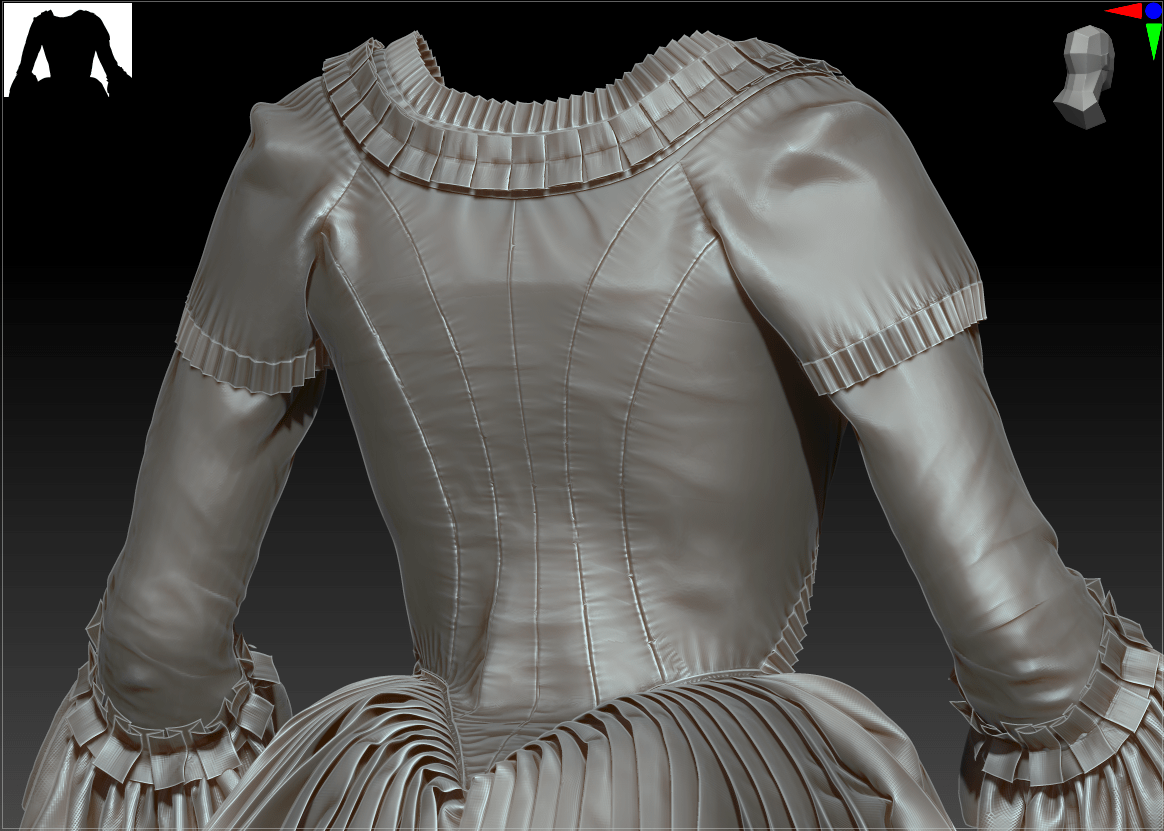
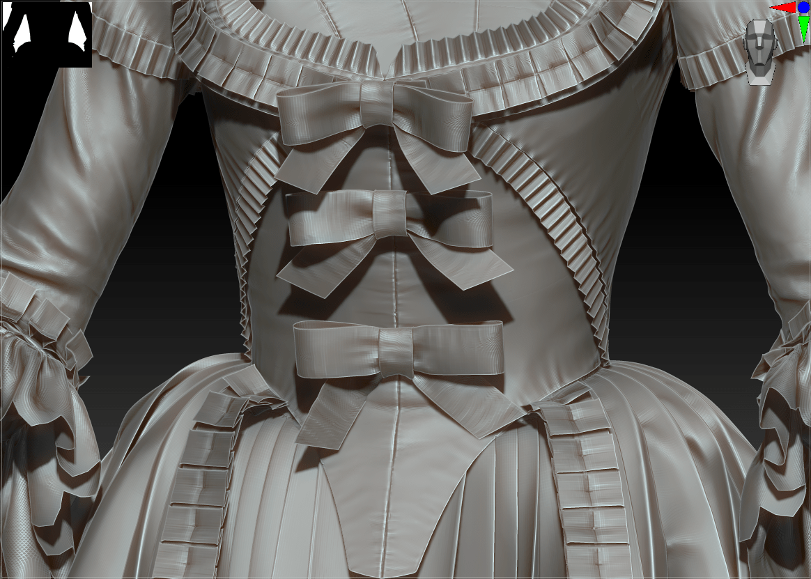
I went back into ZBrush to add the final accessories and details: her hair hammer, dripping fingers, fingernails, and tweaked rat familiar. I added some minor detailing like the seams on the corset and shoes, but ran out of time to do the full extent that I’d like. I plan to revisit this and re-bake the high-poly onto my existing Substance Painter project.

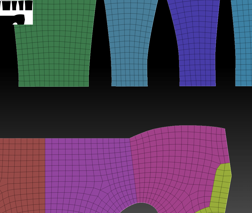
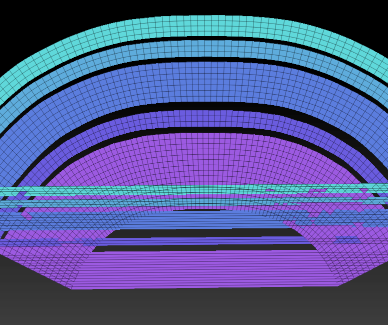
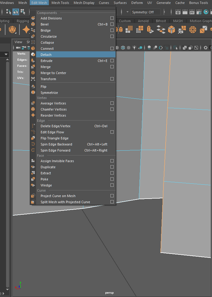
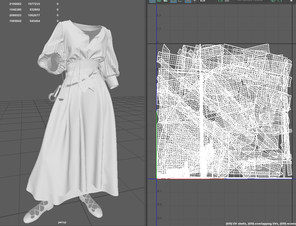
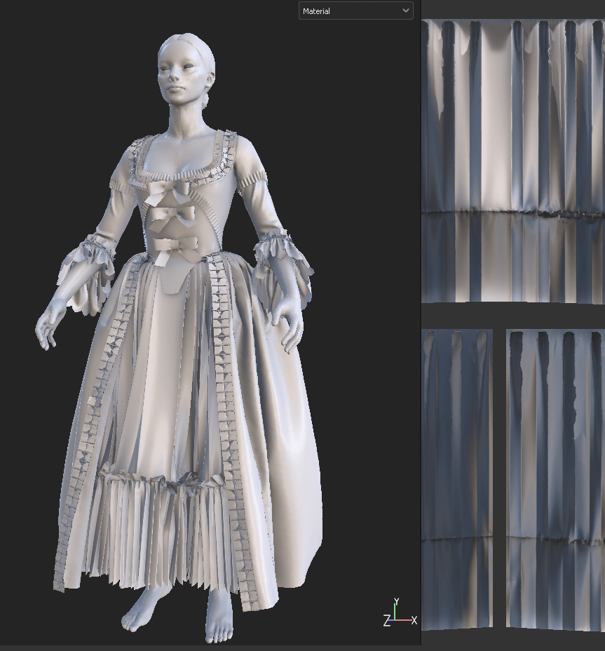
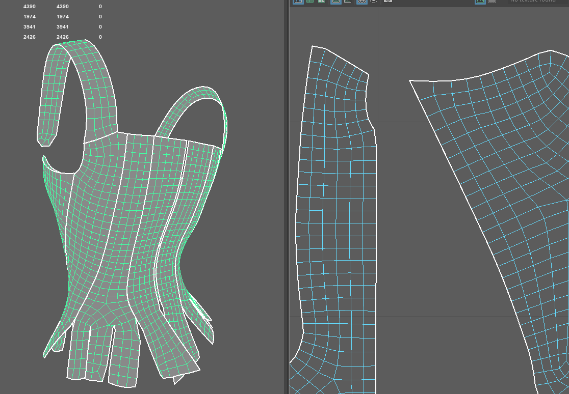
I probably spent the most time for this entire development project on a single element: converting UVs from Marvelous into low-poly geometry that can then be subdivided and projected later. I found an extremely useful tutorial by Laura Gallagher of Outgang that ran through a unique process of projecting the high-poly mesh back onto the low-poly, but it did result in some major issues when I tried to recreate my subdivision levels later. After quite a bit of frustration, I discovered that my issue lay with creating subdivs on ‘circular’ meshes (e.g. my skirt with no indicated start and end point for the high-poly geometry). ZBrush was automatically removing divisions starting from the incorrect polygon to disastrous results; I ended up resolving this by adding a split seam down the back of my meshes. I still ran into some issues adding thickness, where again the automatic subdiv tool was messing up divisions on the edges, but this clearly was something that I needed to resolve manually given more time.

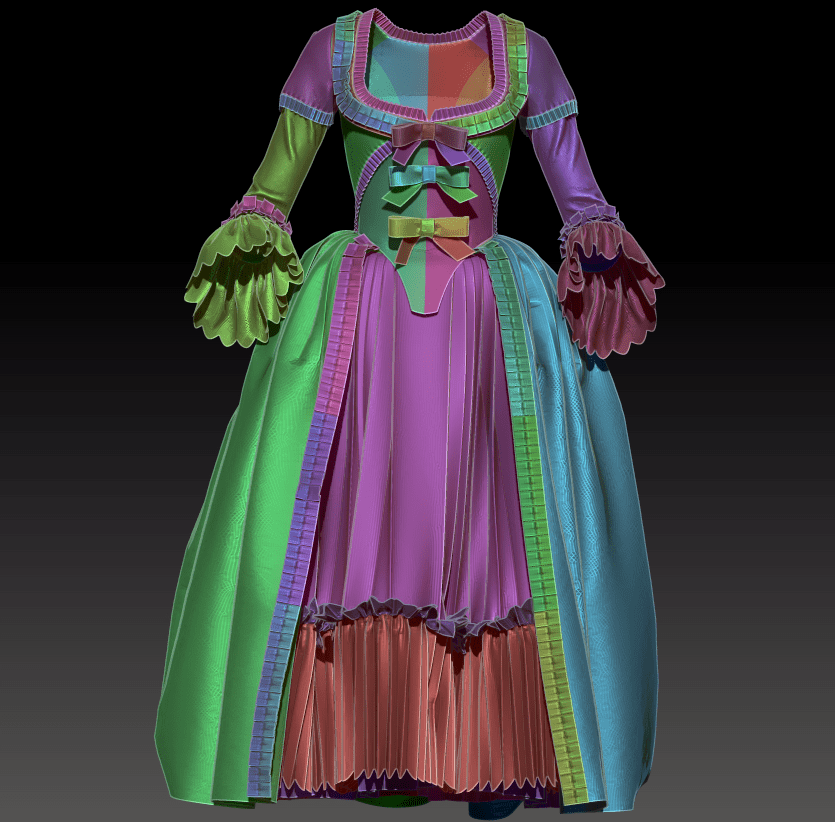
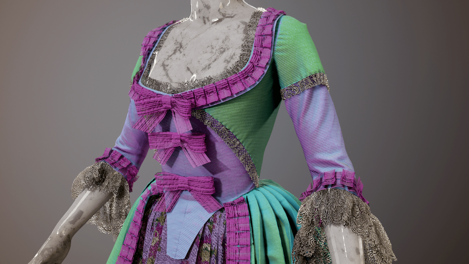
I ended up doing nearly all of my texturing in Substance Painter using mainly pre-made fabric from Substance Source and layering on overlays, curvature masks, and hand-painted effects. I did create two sections manually in Photoshop: her shirt embroidery and skirt crochet. For the embroidery, I took my previously-made vectors and created height maps from them with the inner glow tool, and then masked off a shiny taffeta fabric to mimic raised embroidery. For the crochet, I simply sketched out a design using the radial tool in Photoshop, created a similar height map, and replicated it along the strip of the UVs where the crochet appears. Finally, I added some of the streaky brushstroke effect by layering on a creased fabric texture as a height map over all of the fabric parts.
I absolutely want to go back and create more of a hand-painted look manually, but this will do for now!
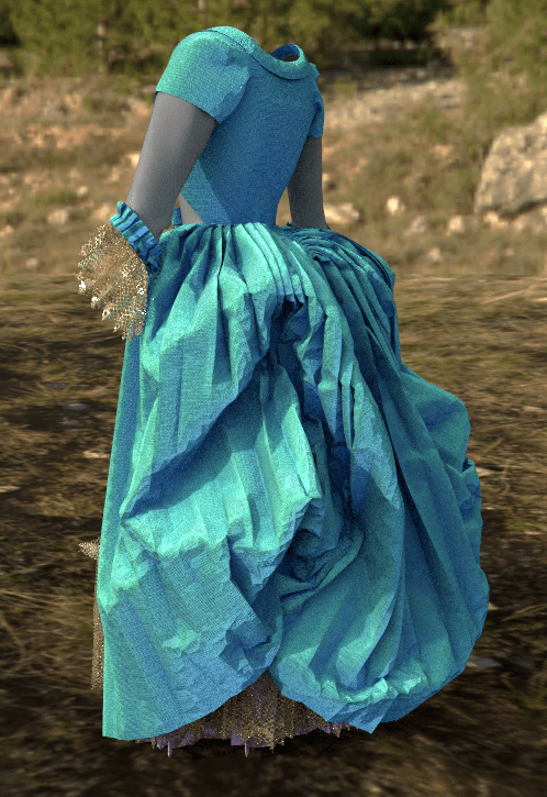
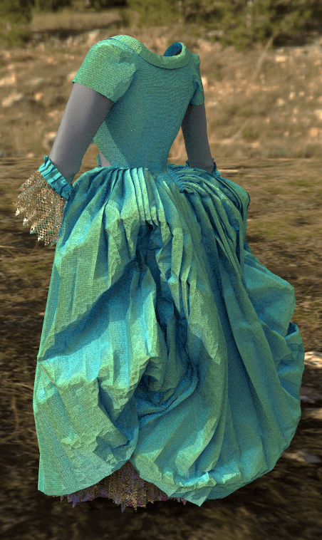
For my scene render, I went with Marmoset Toolbag, transferring all the files over and manually adding my exported Substance textures. The original concept art has a slightly cel-shaded look with a black outline on all elements. After investigating, there doesn’t seem to be any way to really create that effect within Marmoset (as opposed to Maya or Blender which have specific outline shaders). I ended up doing a hack-y workaround by inflating my original model slightly along the vertex normals in Maya, inverting the normals, applying a flat black material to this shell in Marmoset, and rendering with backfaces culled. This created exactly what I was hoping for: a black outline just on the edges of each component. The one downside is that the outline doesn’t scale when zooming, so it’s definitely too thick for a portrait shot, but matches the full-body concept quite well.


Friederichs, H. (2021). Laudna Character Portrait – Critical Role. [Image]. Available at: https://critrole.com/hype-check-out-our-official-campaign-3-character-art-by-hannah-friederichs-and-jrusar-art-by-clara-daly [Accessed: 4 November 2021].
Gallagher, L. (2020). How to export from Marvelous Designer to Zbrush (No Need for Manual Retopology). Available at: https://youtu.be/o_Q-N8CoyCU [Accessed: 1 January 2022].
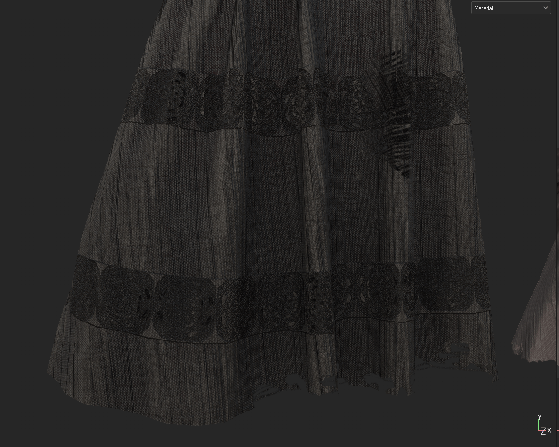
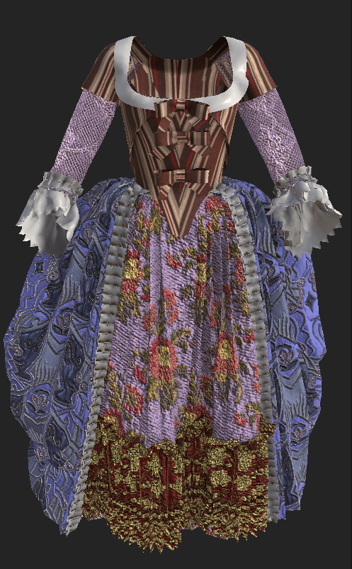
I repeated the same retopo process that I had done on my stays for the overall gown and other undergarments, so no need to re-document that here. I then experimented with baking settings in Substance Painter – I kept running into issues where the creases of the skirt and ruffles were intersecting, as the baking distance was too far. A combination of setting baking to only the same-named object and reducing the AO distance helped resolve this, although I am still getting minor clipping on the ruffle area.
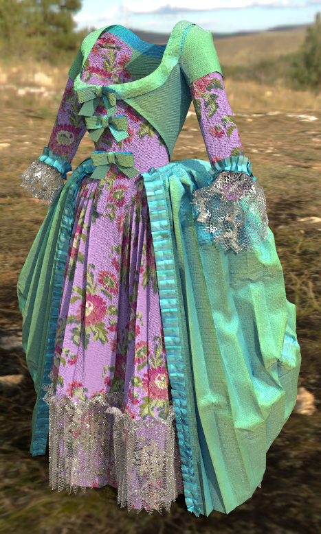
I then played around a bit more with colors and fabrics, finally settling on a pink-and-green color scheme with some purple shift color overlays created with baked lighting. I took special care to lay out my UVs in even increments so that I could tile a lace texture on top of them and have a nice transparent edge around the entire seam cuffs and ruffles.
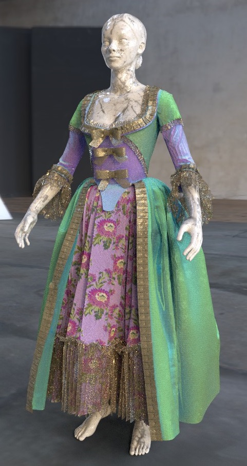

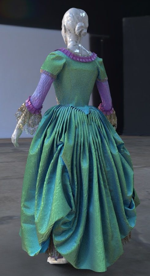

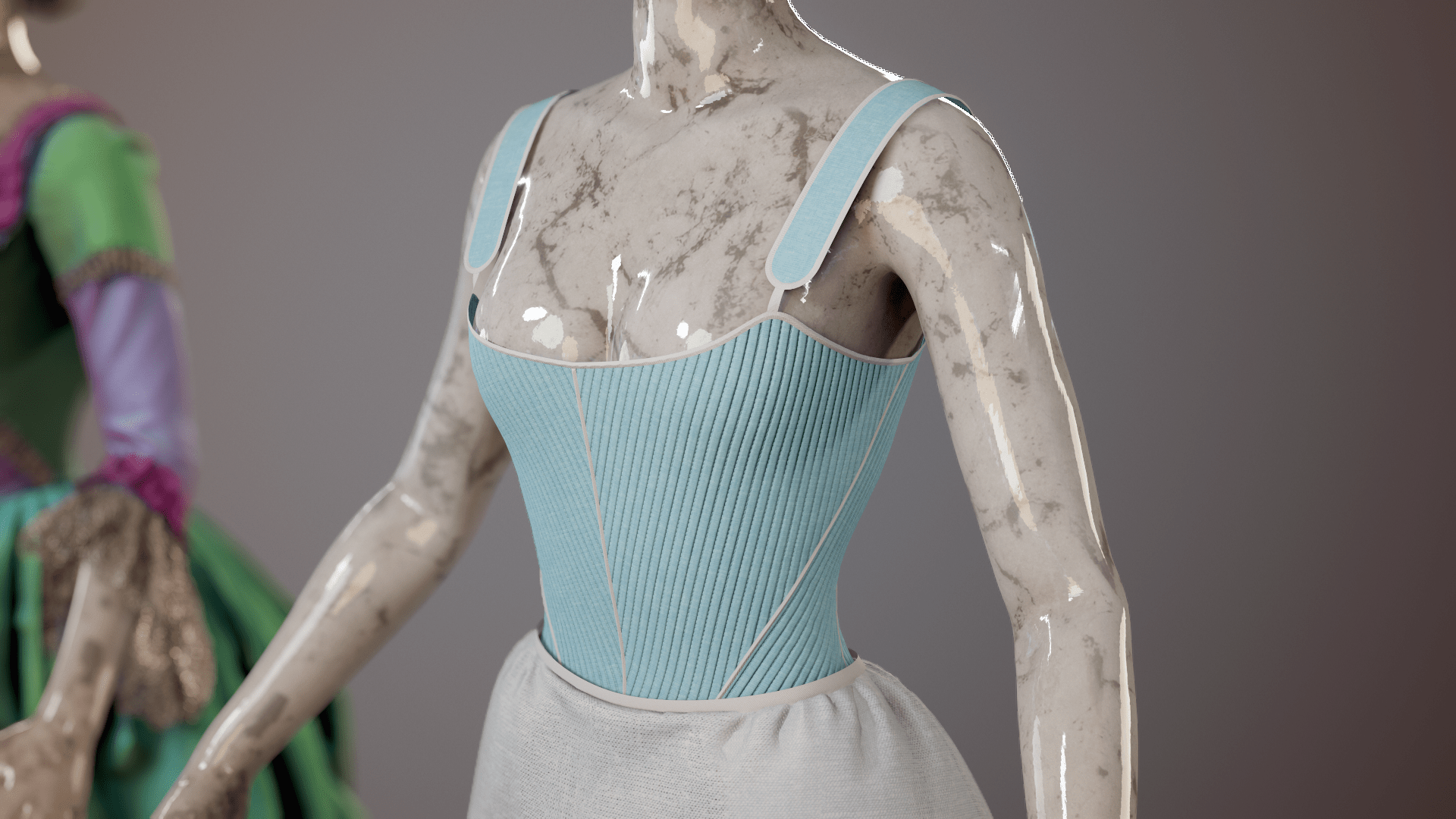
The marble mannequin was a spontaneous choice, but I ended up really liking the effect and felt that she needed a head/feet to show the proportions of the gown. I created a quick pedestal in ZBrush to ‘mount’ the mannequin on for rendering.
I had a great time going in and adding small creases and seam wrinkles to my high-poly sculpt. I have a fairly good knowledge of where seams stretch and pull from years of fighting wrinkles in real-life fitting, so it was mainly a matter of applying some standard ZBrush brushes and some purchased seam brushes in the correct places. I also discovered what is probably an obvious but invaluable feature: the layers function. This allowed me to go hard with my detailing and then pull it back to more realistic levels.
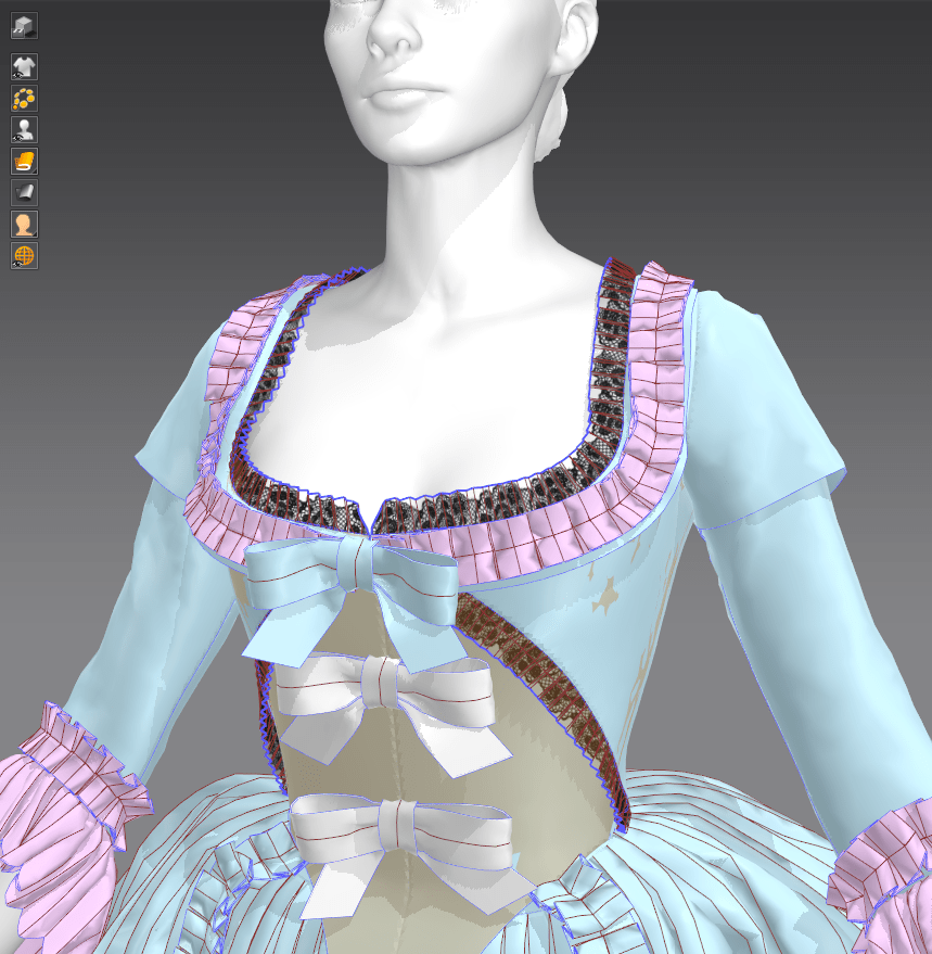
Overall, I emphasized all of the seams, added wrinkles around the sleeves and edges of the bodice as well as along all major seams and the hem of the skirt. I also added minor texture to the bows and ruffles, which were looking too flat.
(seam brushes by Muhammad Sohail Anwar on Artstation)

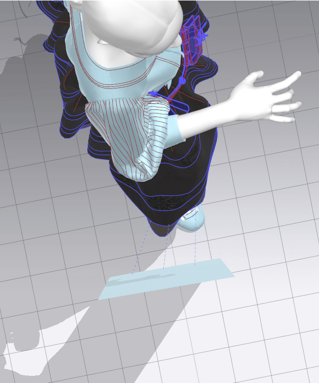
To create my final renders, I pulled my textured garment from Substance Painter into Marmoset Toolbag. I had never worked with the program before so my final setup ended up being simpler than I had liked, but I think it emphasizes the design quite well and captures that museum feel (if you squint!). I’m particularly pleased with how the stays turned out, as they look like my real-life pair.


Anwar, M. (2021). Cloth Seam Brushes + 4K Alphas – ZBrush 4R8+ FREE. [online] Artstation Marketplace. Available at: https://www.artstation.com/marketplace/p/rvv27/cloth-seam-brushes-4k-alphas-zbrush-4r8-free [Accessed: 10 January 2022].
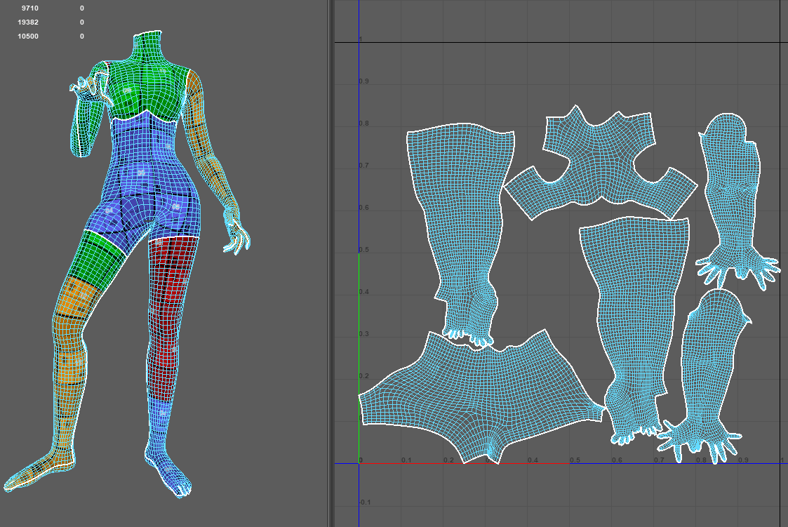
I did most of my retopo in Maya, exporting both a low-poly and high-poly copy of my mesh automatically generated by Marvelous Designer (changing the poly density). Because I wasn’t too fussed about having really clean topology for this gown, but did want a low-poly version for rendering, my final mesh was neither as clean nor as low-poly as I would have liked. However, this process worked just fine for the final (still image) result I was going for.


I pulled my quickly decimated gown into Substance Painter prior to doing a full bake just to test out some of the textiles available with the program. I knew I wanted to recreate a color-shift silk taffeta look, but SP doesn’t have a built-in fresnel node or other method of creating this effect in accordance to lighting. However, I was able to fake it with a combination of curvature masking and baked colored lighting, and I think it actually looks quite realistic!
I’m still playing around with color schemes, but I’m currently really liking the pink-and-green look; we have a historical misconception that people wore very dull colors because many of the extant garments in museums are faded, but in fact people were quite obsessed with their bright colors in the mid-to-late 18th century.


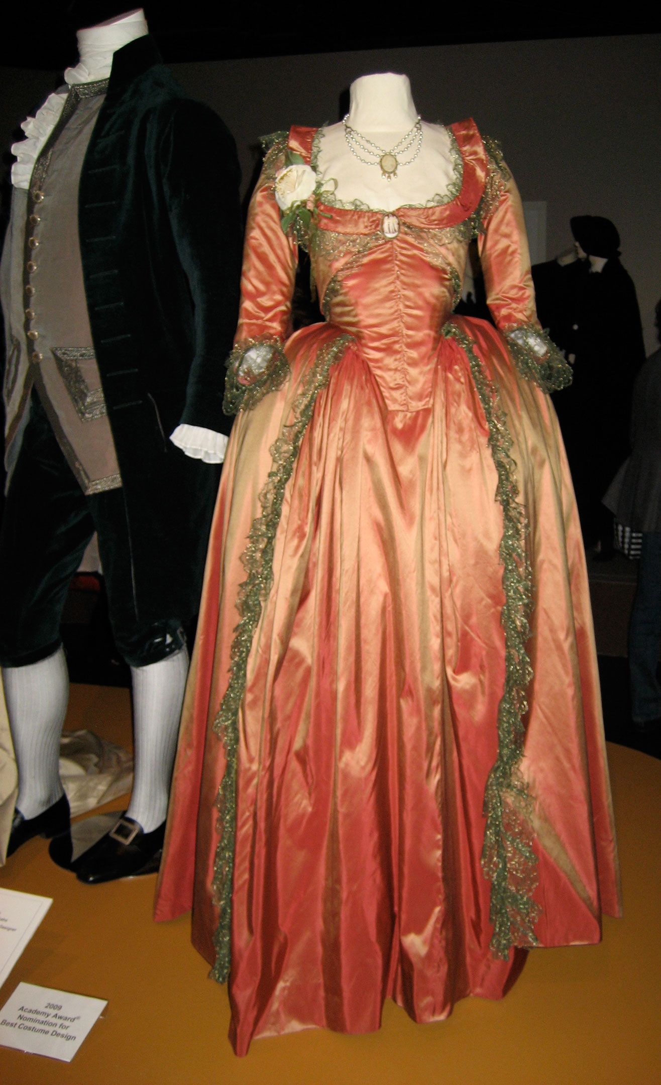
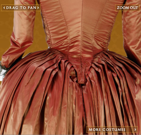
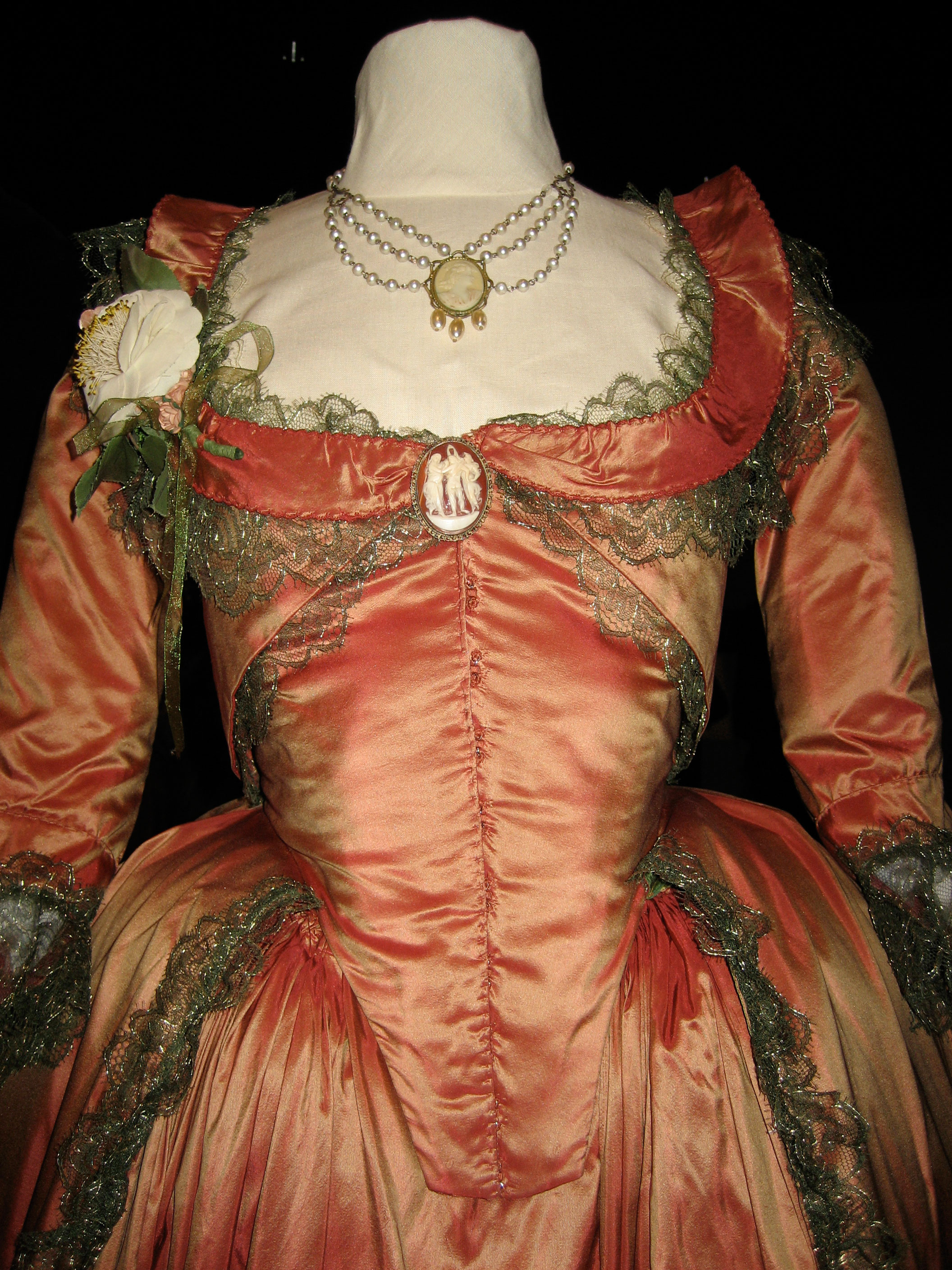
I finally sat down and watched a film that historical costumers have been drooling over for a decade: The Duchess. The entire move is full of incredible, quite historically accurate (at least in silhouette) costumes, and I was immediately drawn to the design of this rust and gold gown worn by the protagonist. Since the shape is already fairly similar to my previous work, it shouldn’t be too much of a change to add some of the bodice and lace details. I don’t think I’ll be too accurate to the colors, as I want to experiment with dramatic color schemes, but it’s an excellent reference for wrinkles and texturing overall.
Looking at the overall silhouette of my previous gown, it was clear that I needed to make some adjustments to the skirt foundation layers. I tested out a basic split rump design, but missed the padding provided by my previous bum roll. In the end, I created a combination of the two, splitting my previous skirt padding down the middle to allow for the dip of the back bodice to continue more gracefully into the overskirt. I then created a smoother petticoat over the top in form of an (inaccurate) circle skirt in order to create a smooth base for the skirts.

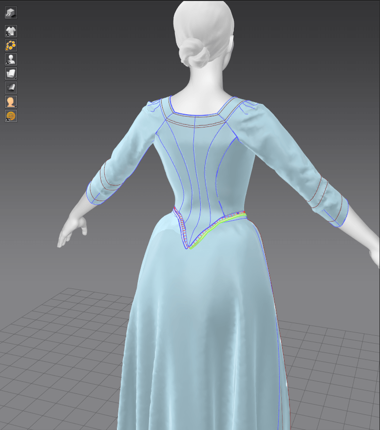
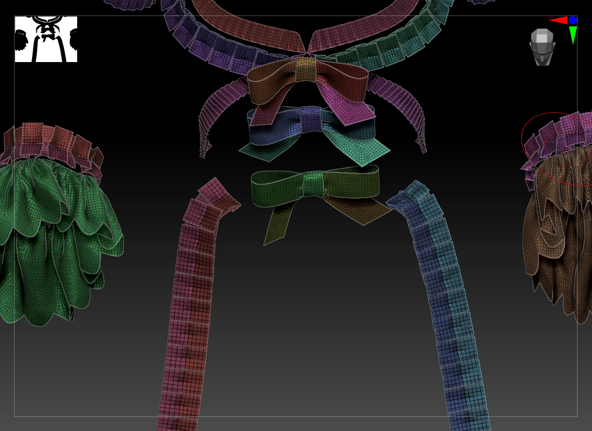
Knowing what I do now about the ins and outs of Marvelous Designer, I decided to revisit my old nemesis from the one-week project: the pleating system in MD. I simply couldn’t achieve the correct skirt silhouette with cobbled-together circle skirts. After experimenting with small sections of automatic pleating, I realized that there wasn’t anything magical happening – the pleating tool simply stitches rows of pleats with the correct settings, and can be reverse-engineered. By examining the stitch settings, I had a major ‘aha!’ moment in why my attempts at manual pleating had resulted in so many overlaps and conflicts: all of the stitches where the pleats are stitched to each other (as opposed to the waistband) are ‘turned’ in the stitching direction, rather than 180 degrees as is the default. Once I discovered that, I was able to manually stitch each pleat down on a rectangular piece of fabric to great (if tedious) effect. I then adjusted the upper edge of the skirt to follow the line of the bodice rather than sit underneath, as it should for historical construction, and sewed the skirts down.
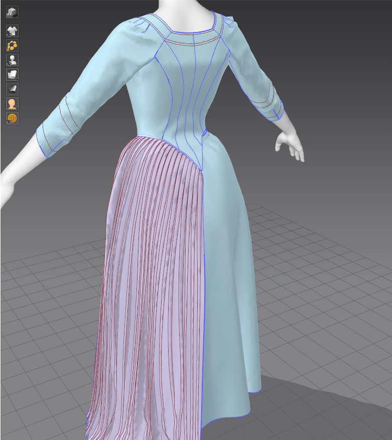
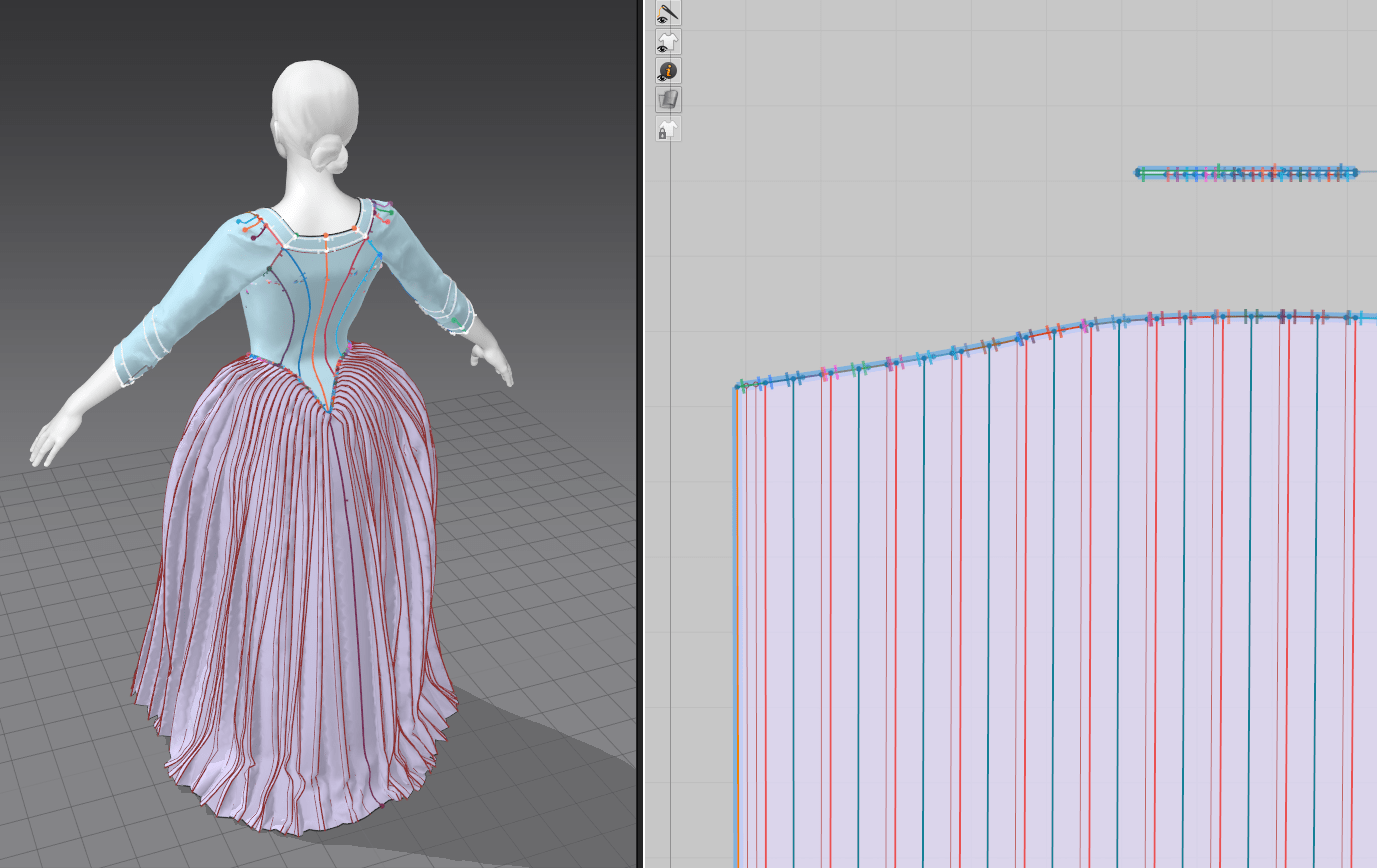
I knew I wanted to add loads of ruffles and pleat details elsewhere on her garment, so I applied my newfound knowledge of manual pleating to box pleats and accordion pleats. This was quite straightforward, but required a fair amount of freezing the underlying garment and simulating the pleats in zero gravity to get them to play nicely. Once I had a set of box pleats, I duplicated the pattern pieces in several areas around the garment, stretching and shrinking slightly so that the pleat math worked out.
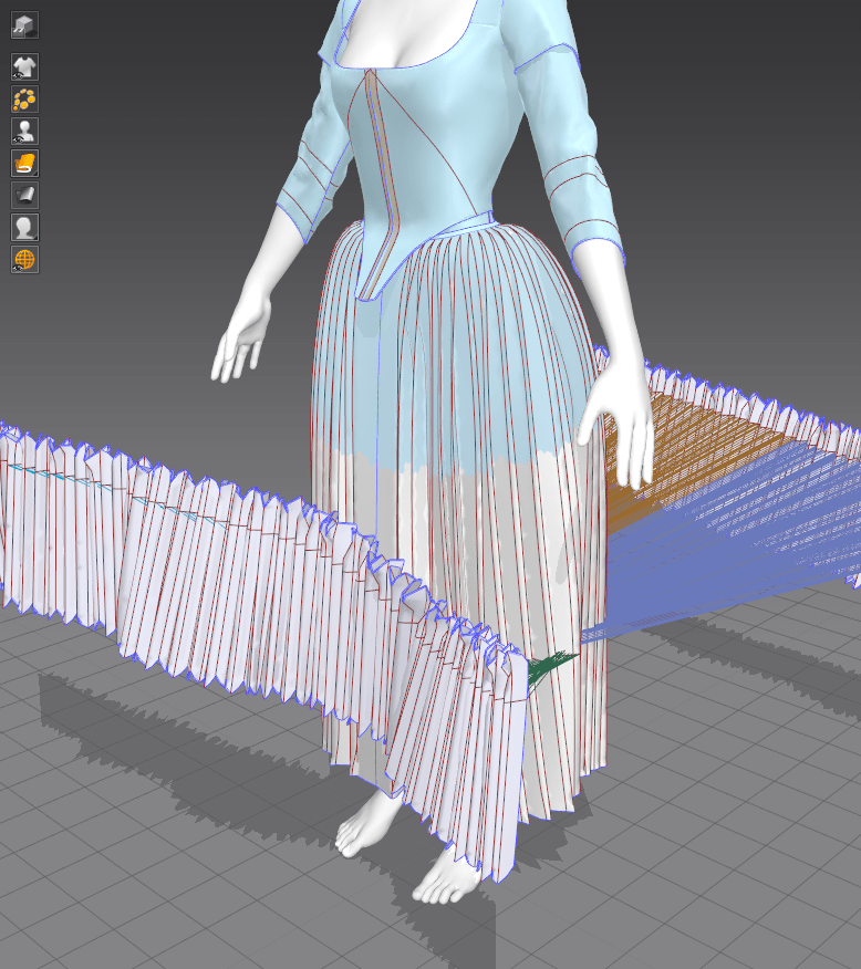

I added a few extra details beyond ruffles and pleats: three bows down her center front, a decorative collar, and gathering tapes for the overskirt. The tapes were the easiest part – I simply created two rectangles, set them to a non-stretch material, and used the tack function to tack them to places on the overskirt. A little back-and-forth simulating and I had a nicely voluminous robe a la polonaise on my hands.
The bows were fairly simple shapes, but were quite frustrating to get to lie flat in the correct vertical order. I ended up splitting them into a bunch of pieces and stitching those pieces down separately, with a strip of fabric covering the center. Finally, I played around a little with the built-in texture map system in Marvelous to put a transparent lace texture on some neck and zone front bodice details. I’ll do the final texturing in Substance Painter, but I wanted to see how these delicate, partially transparent pieces would look.

Costumer’s Guide. (2018). The Duchess – Drunken Gown. [image] Available at: <http://www.costumersguide.com/duchess12.shtml [Accessed: 20 December 2021].
For my second development project, I’ve chosen to revisit my late 18th century gown from the Nostalgia and Memory weekly assignment. I spent that week learning Marvelous Designer and didn’t have a chance to do any exporting, texturing, or rendering of my pieces. Therefore, I plan to take my gown and underlying undergarments, make them more historically accurate, and take them through the game-ready pipeline.
To present my work, I’m planning on creating a museum scene, showing off both gown and undergarments on mannequins with dramatic lighting, like this image from the Bath Fashion Museum.

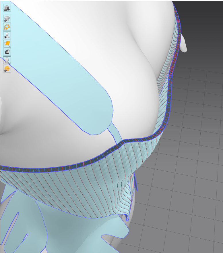
I struggled quite a bit with my previous stays design, unable to get it stiff enough to create the desired shape. After I sat down to experiment further, I discovered a function in MD that allows for freezing a garment with a percentage leeway. This worked beautifully: I simulated the stays in zero gravity off the mannequin, set the freeze to 90%, and then re-sim’d onto the avatar so that the stays fit but still maintained their overall shape.
I ran into quite a few problems adding the outer edge seam tape, however. It kept trying to clip through the fabric, or was fighting the surface so hard that it distorted all of the tabs. I finally discovered that the issue lay with my seam angle; setting the upper seam to ‘turned’ and freezing the underlying stays body helped resolve this.
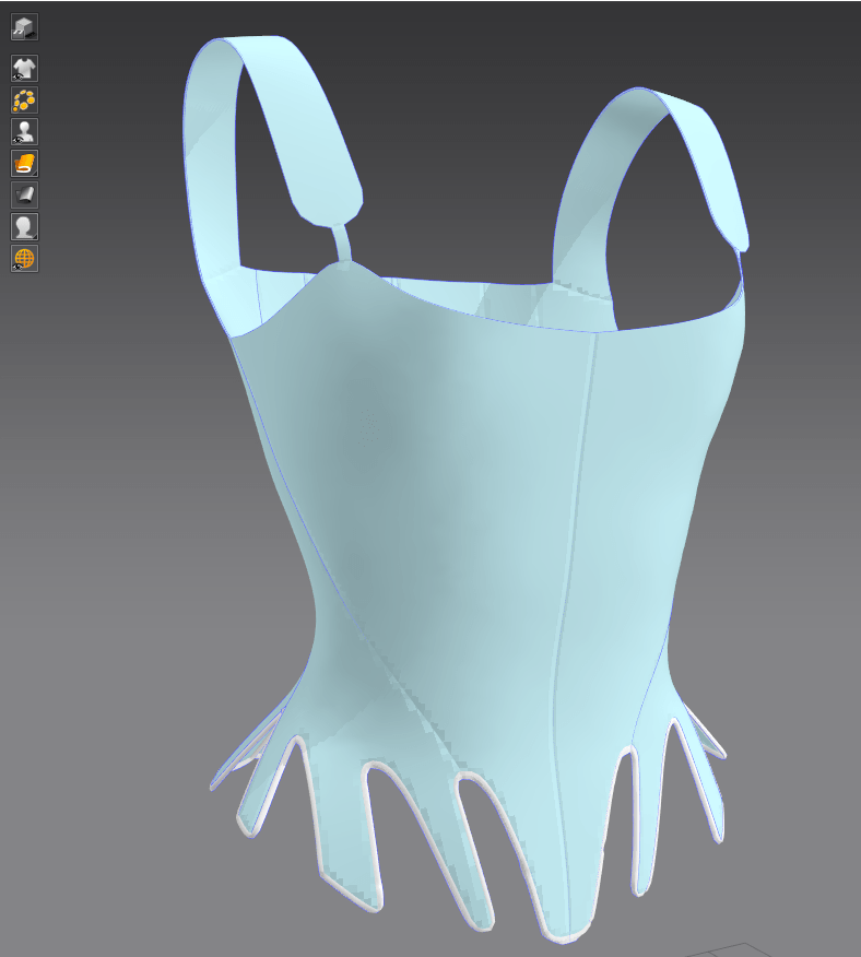
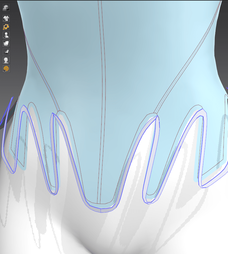
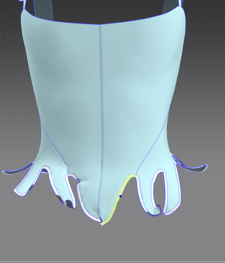
I then did the same technique for the upper edge and internal seam tapes.
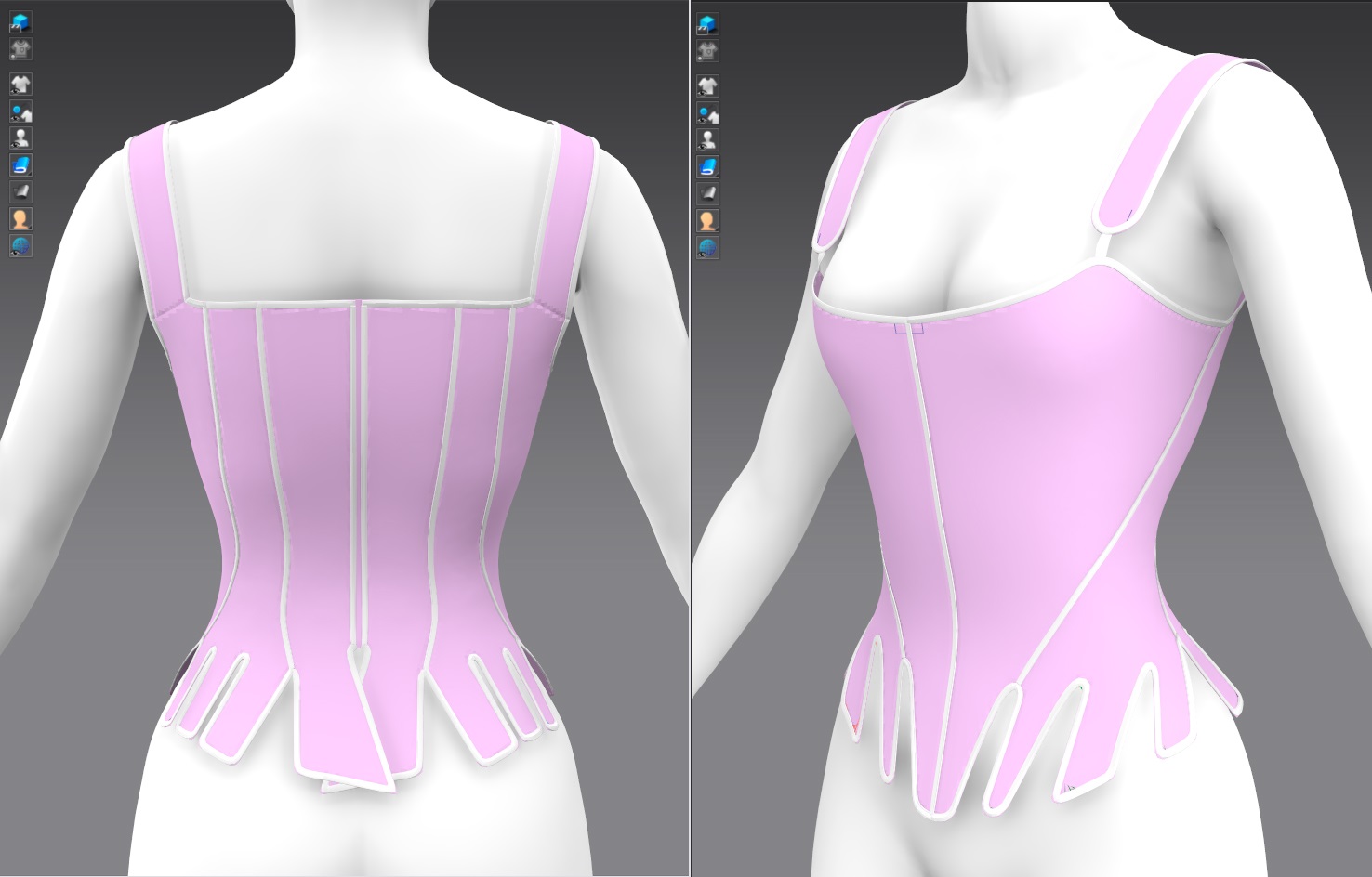
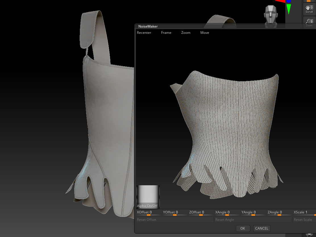
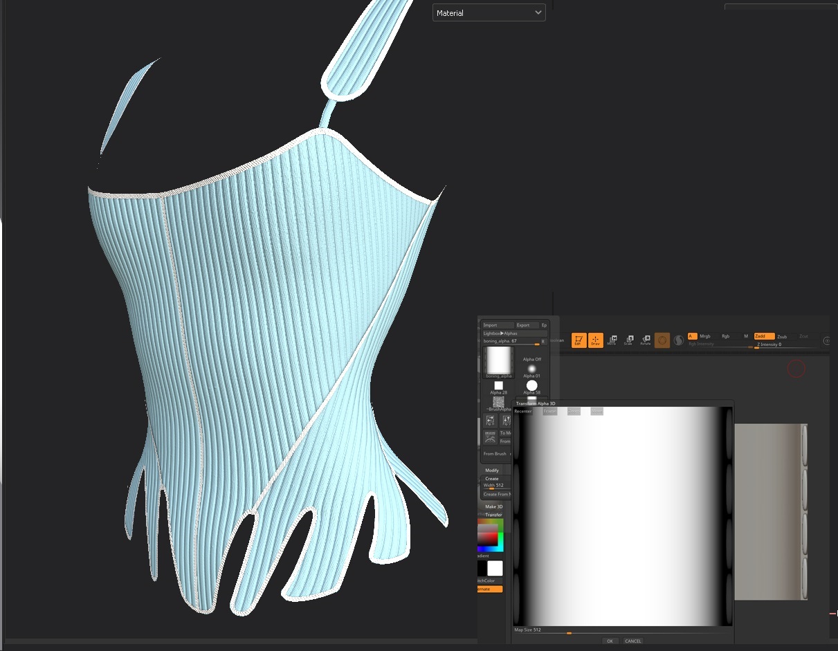
For the boning channels, I experimented with creating them within Marvelous Designer using stitching and pressure, but the effect was heavily distorting the overall shape and wasn’t creating those defined channels. Instead, I created a custom alpha in ZBrush and applied it using noisemaker to much cleaner effect. I still need to rotate my UVs so that the bones are pointing in the correct direction (they should be V-shaped in the center front), but this technique is giving me nicely realistic results.
Bath, F. (2015). Bath Fashion Museum. [image] Available at: https://www.cntraveler.com/galleries/2013-10-12/fashion-designer-museums-italy-spain-south-korea [Accessed: 10 December 2021].
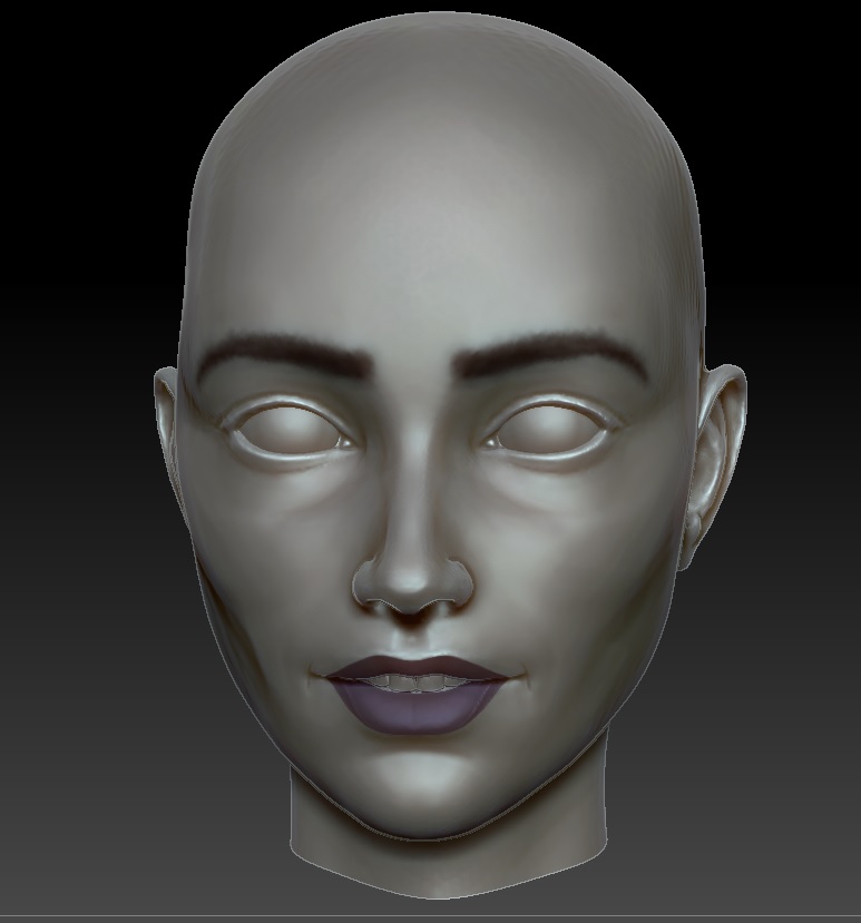
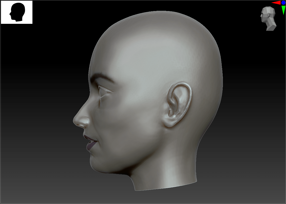
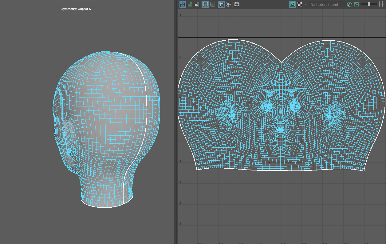
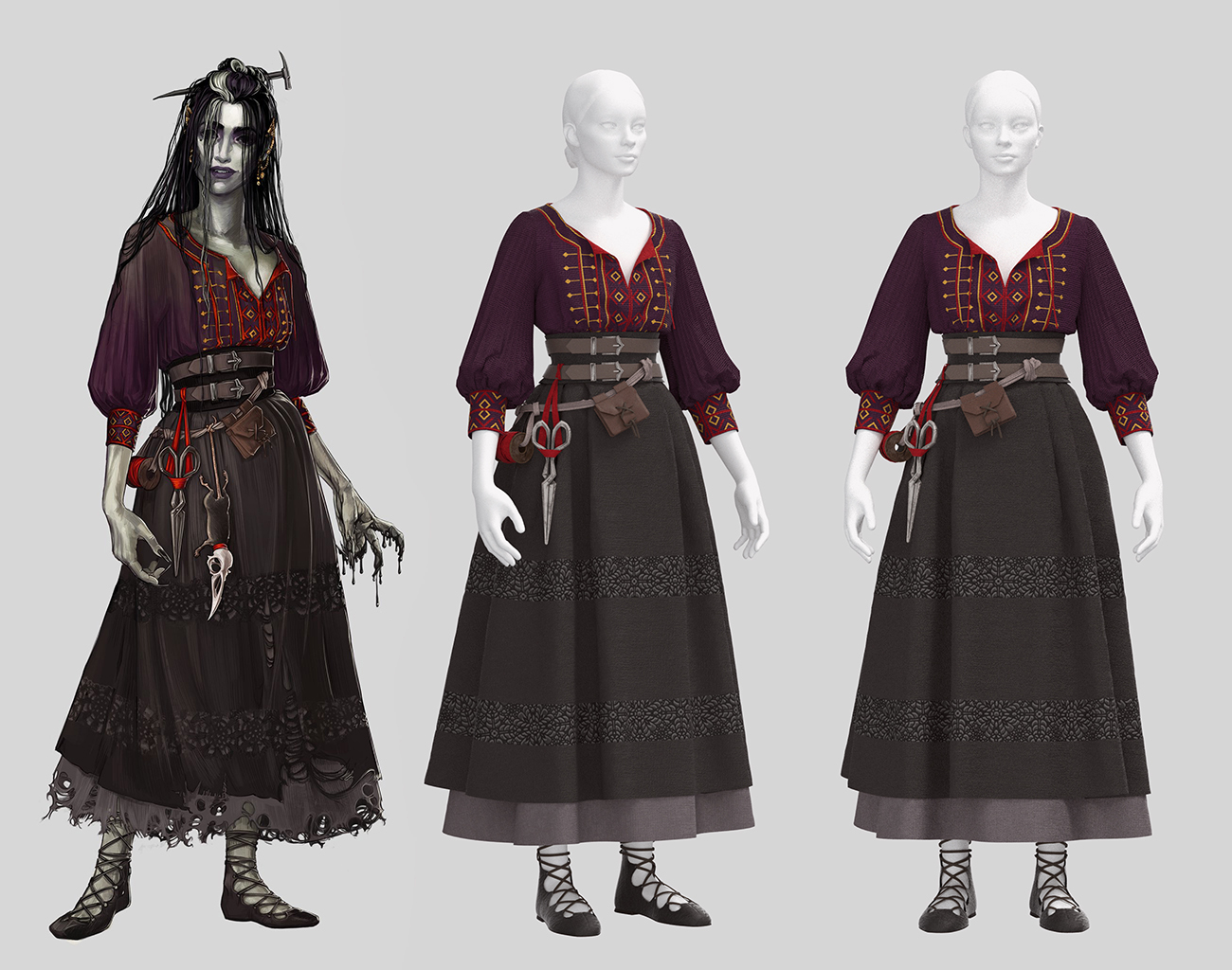
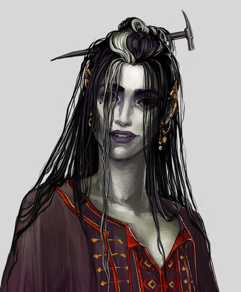
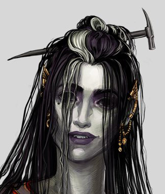
I spent far too much time attempting to nail down my head sculpt for Laudna! The character has very unusual facial features, often described as ‘doll-like’ in her exaggerated eyes and mouth. My head anatomy is definitely improving as I create more of these, but I had to fight some of my instincts to get that slightly cartoon-y effect. Luckily, I think the final version straddles the uncanny valley in just the right place!

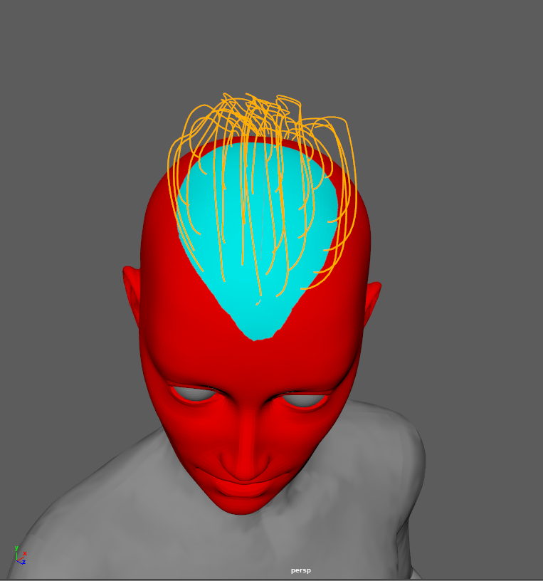
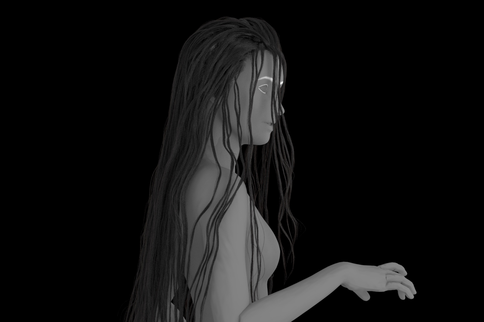
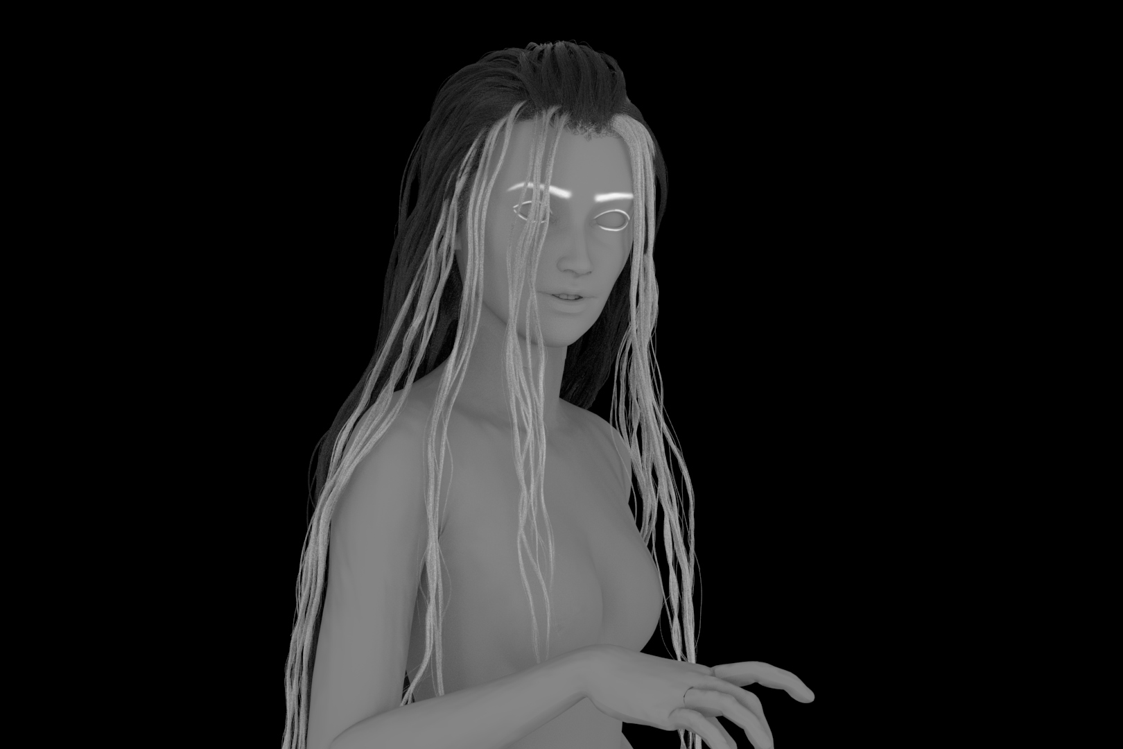
After experimenting with (read: banging my head against a wall) sculpted hair strands to very little success, I decided to create Laudna’s hair in XGen instead. Ultimately I’d like to create hair cards to make this character fully game-ready, but given my timeframe, I’ll need to settle for everything-but-the-hair in low-poly.
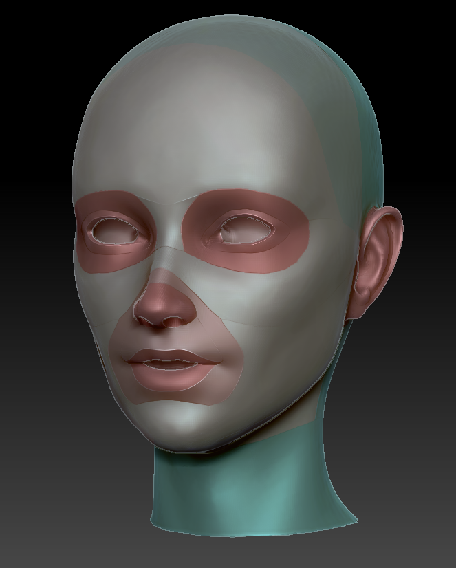
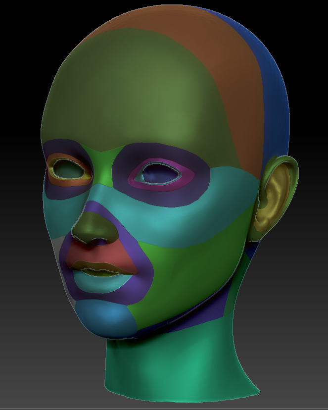
To prep my head for XGen, I first retopologized it by breaking up sections of my high-poly sculpt with polypaint and running groups-priority ZRemesher on it. A little manual tweaking later and I ended up with some decently good edgeloops, if potentially too high-poly geometry. I then subdivided my mesh a few times and projected the original high-poly mesh onto my low.
A single seam and a quick UV unwrap in Maya, and then a hairline density mask painted in ZBrush, and the head was ready for hair.
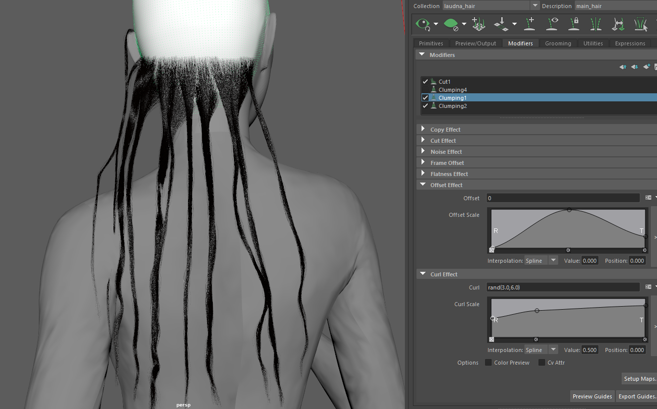
I definitely struggled with the hair in all aspects this time around. I had some experience with XGen before, but not for so complex a hairstyle with a stringy, wet-look. I first started by breaking down sections of the hair on the concept art to decide how to divide up my descriptions. Going into XGen, I set up my descriptions and started creating the different sections of hair.
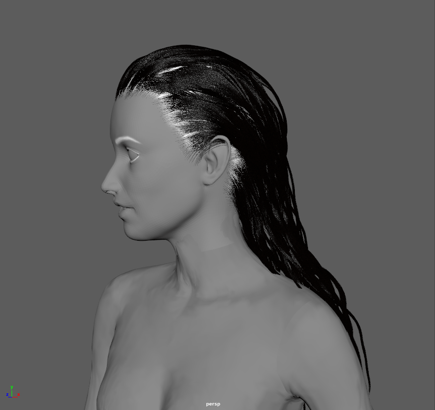
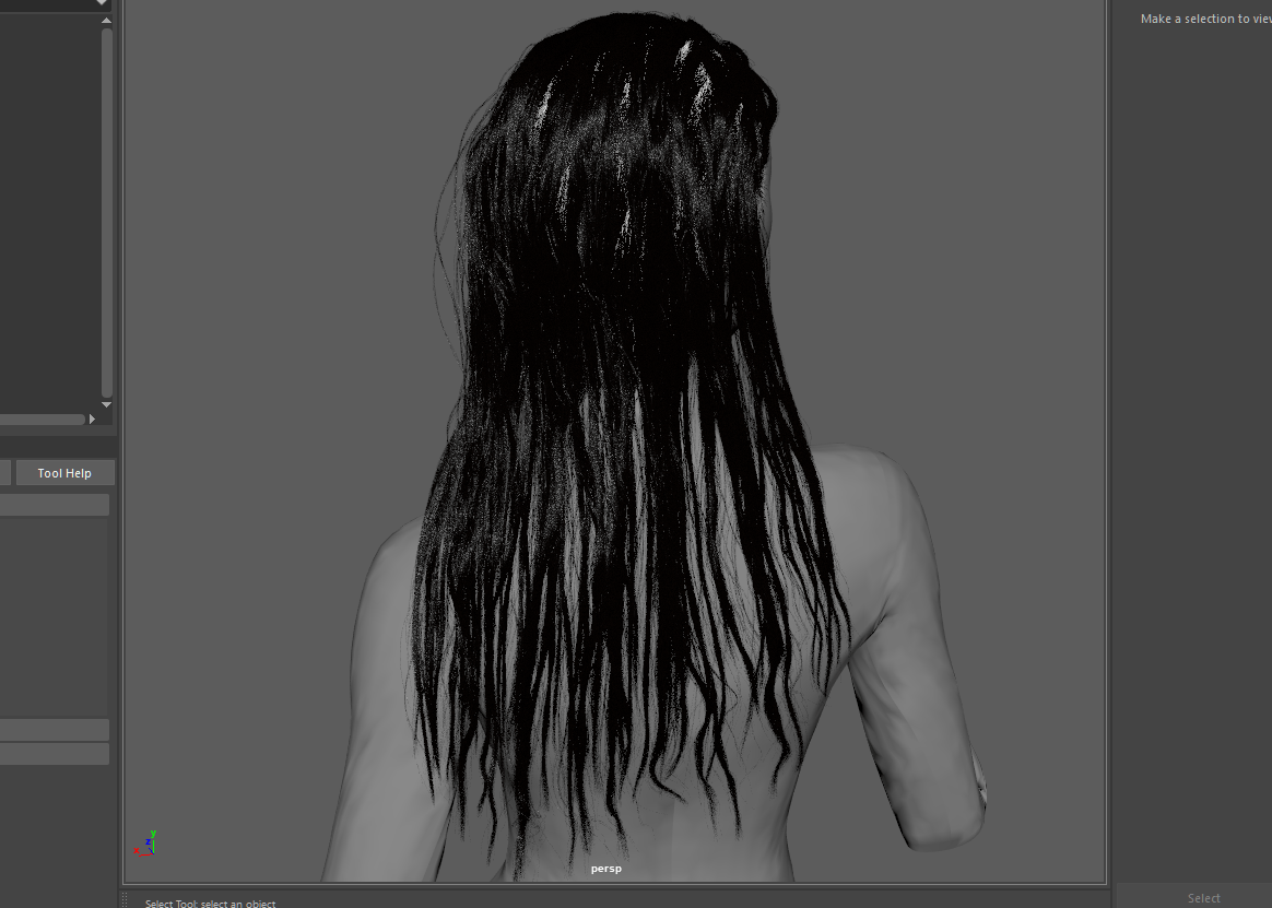
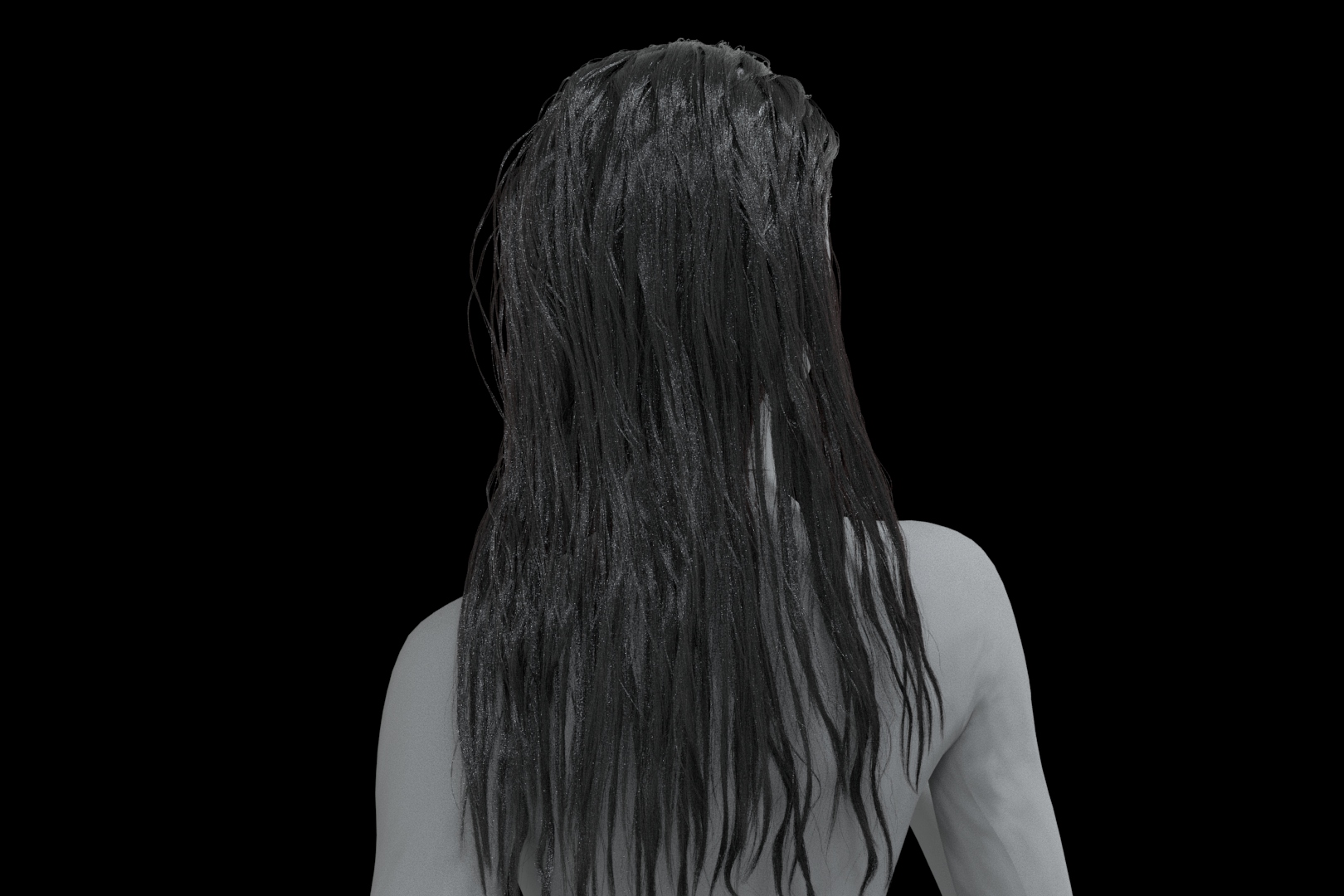
By far the most difficult part was experimenting with different strand modifiers to get that greasy effect. I ended up layering quite a few clumps and adding some curl and noise modifiers so that each strand twists around itself. I don’t plan to do my final render in Maya, but I did experiment with the shaders just to better visualize my overall shapes. XGen proved to be the right tool for the job, as being able to continually tweak individual strands made it far easier for me to lay out the hair than in my initial ZBrush sculpt.

Friederichs, H. (2021). Laudna Character Portrait – Critical Role. [Image]. Available at: https://critrole.com/hype-check-out-our-official-campaign-3-character-art-by-hannah-friederichs-and-jrusar-art-by-clara-daly [Accessed: 4 November 2021].
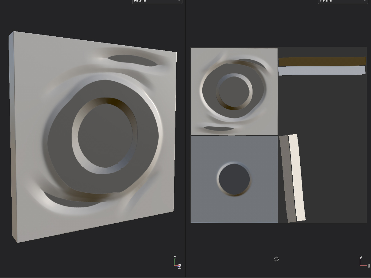
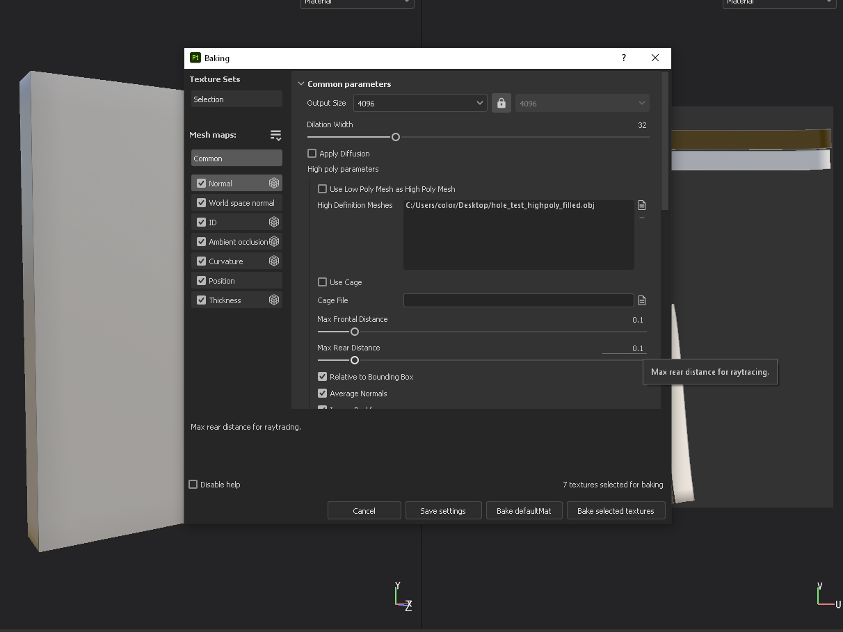
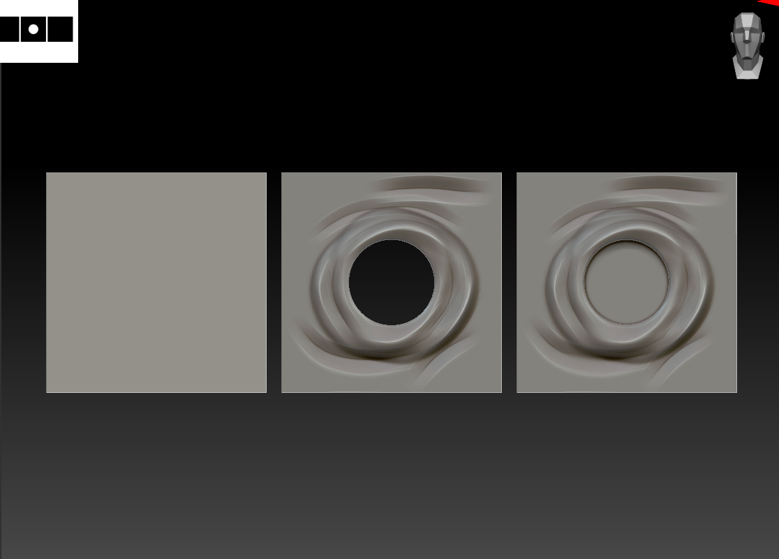
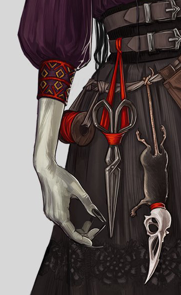
One of the major things I’m still trying to resolve on this project is the holes in Laudna’s skirt hemline. Because I intend to both create the character digitally and 3D print her, they’ll need to be backed by geometry, but I’d also like to be able to bake a high-poly version with opacity onto my nicely-topologized low res model. Luckily, it seems to work fairly similarly with either a real hole or a simple indentation when it comes to baking, as long as I set the bake distance to a higher value.

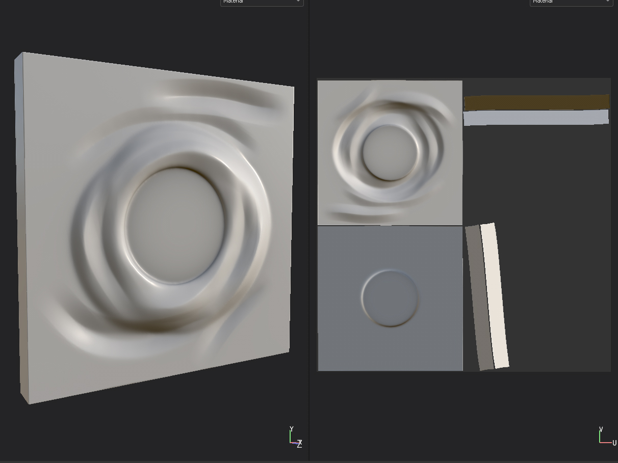

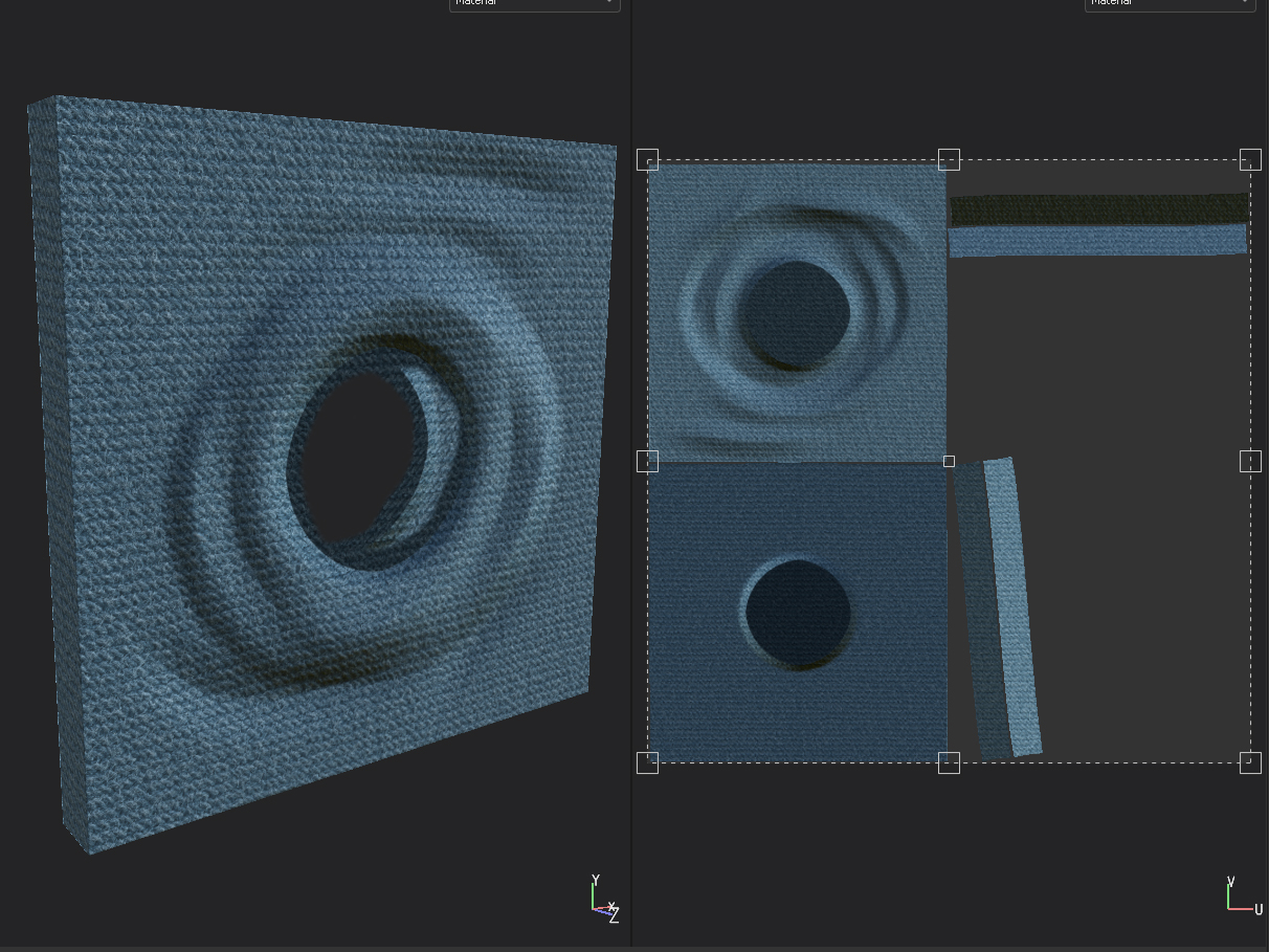
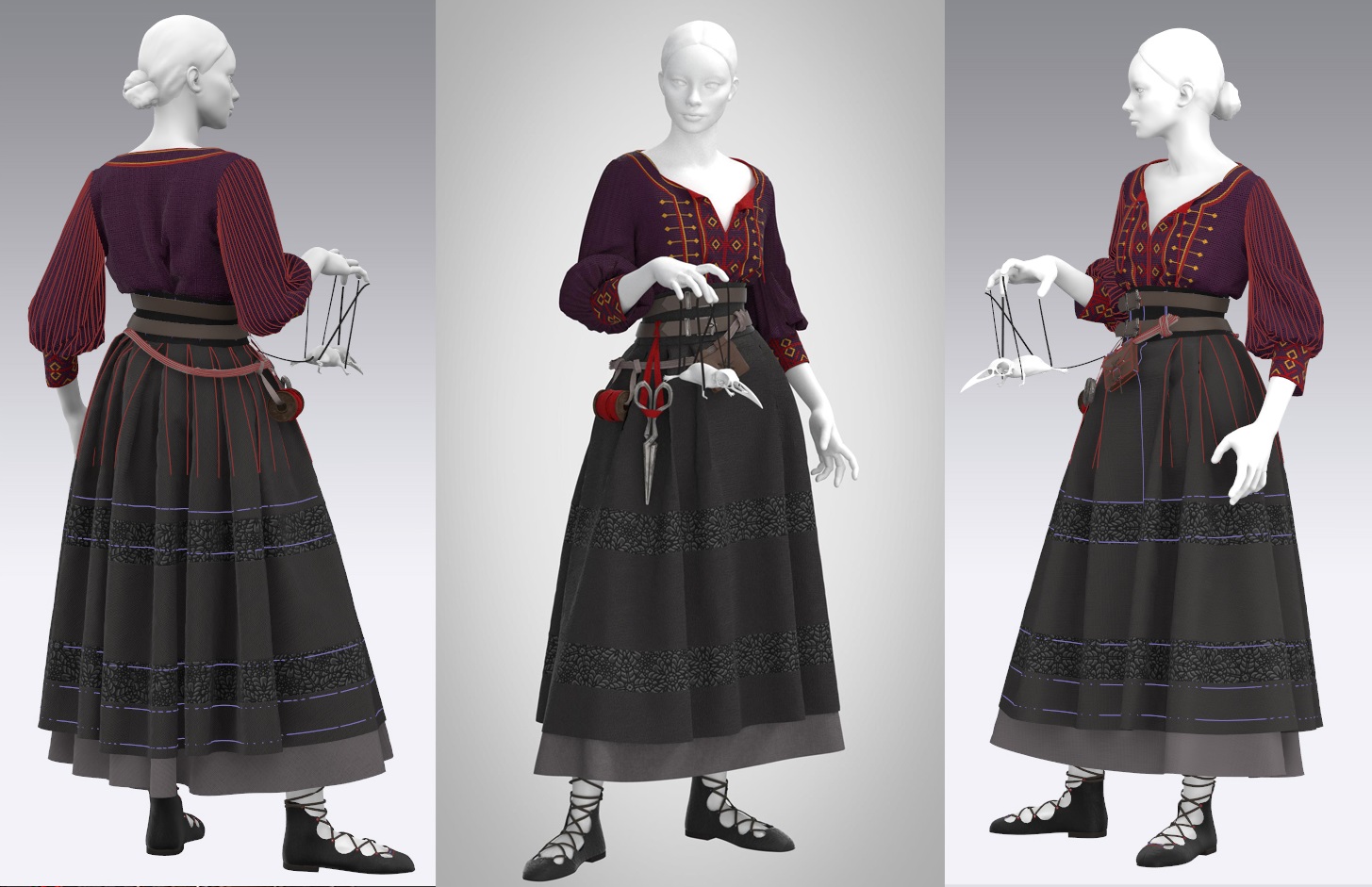
Otherwise, I spent a bunch of time this week tweaking minor sections of Laudna’s clothing to better match the concept art. Her shirt and corset are sitting asymmetrically on her body, so I achieved this effect with loads of invisible tacks. For her skirt, I created a frozen plane (to be hidden later) and tacked the underlying petticoat to that, guaranteeing the perfect skirt flourish in every simulation.
The character has an incredible in-game moment that inspired me to create a more dynamic pose for my sculpt: “About this time, you see rubber bands snap from each of Laudna’s tips that go to his head and each of his four limbs, and they kind of look like rubbery black sinew. She lifts him up and kind of starts puppeting him. ‘Oh, hello, I’m Pâté de Rolo, pleasure to meet you!'”
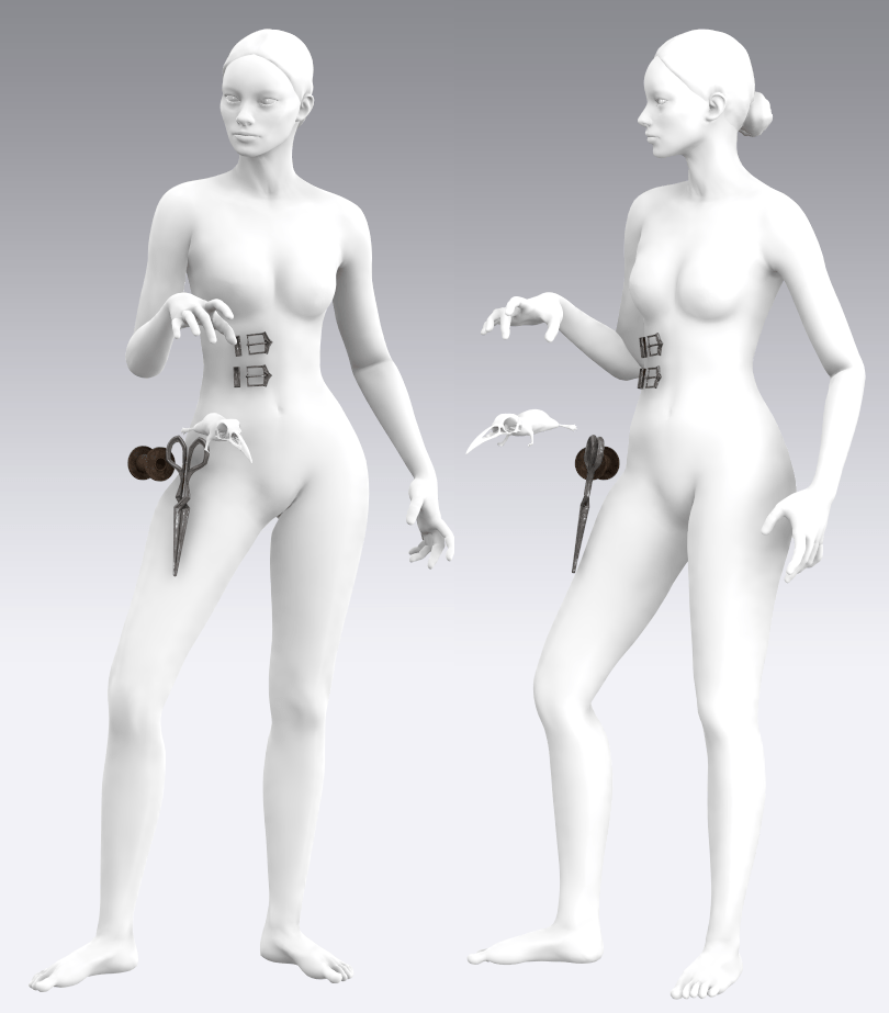
I also quickly whipped up her raven-headed-rat accessory in ZBrush and played around with posing in Marvelous. As per usual, I’m frustrated with the native posing tools, but after a LOT of time holding my hand up in a mirror, I think I like the general shapes she’s creating. I’m glad I decided to go with her marionette pose rather than the less striking pose from the concept art.
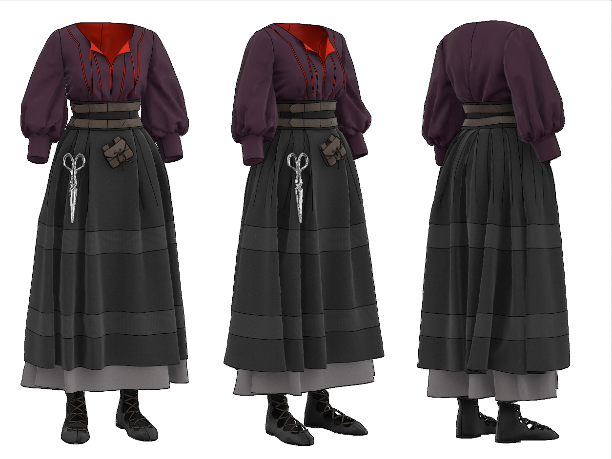
And that’s all of Laudna’s clothing and her main accessories finished!
Critical Role. (2021). Marisha Rays Dead Rat Pate Critical Role C3E2. Available at: https://youtu.be/H4O_nRVctxE [Accessed: 27 November 2021].
Friederichs, H. (2021). Laudna Character Portrait – Critical Role. [Image]. Available at: https://critrole.com/hype-check-out-our-official-campaign-3-character-art-by-hannah-friederichs-and-jrusar-art-by-clara-daly [Accessed: 4 November 2021].
I’ve been wrestling with a conundrum as I’m working on one of my final development projects, a character sculpt heavily featuring Marvelous Designer clothing. This piece is intended to be both a 3D printed figure (in a single pose) and a digitally rendered/painted piece (displayed in two separate poses as required by a competition I’m entering). I’m trying to decide at which stage of the pipeline I should put this character into her final pose(s): before exporting from Marvelous Designer to take advantage of its fabric simulation, or after exporting and detailing (sculpting her in a T-pose) at the end of the process.
The issue is, there isn’t necessarily an authoritative answer to this question. In investigating this, I’ve consulted two lecturers, watched countless Youtube sculpting timelapses, and delved into 3D modeling forums; opinions are very split.
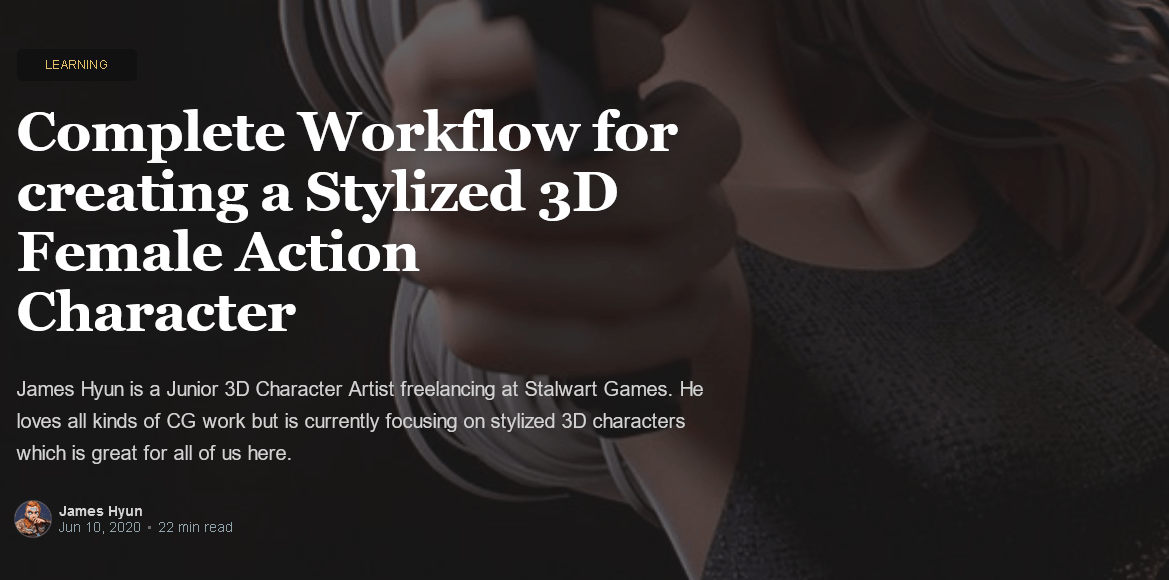
For example, this article by game artist James Hyun covers a full step-by-step method for sculpting a full stylized character. The artist does nearly all of the piece with the character in a T-pose, only giving her a final pose at the last step. This seems to be common for creating game- or animation-ready cartoon-y characters, as also demonstrated in this official Blender tutorial. However, these examples are of simplified characters with form-fitting or basic-planar clothing and little detail. My piece relies on complex, layered, draped clothing and will eventually have things like topstitching and embroidery details to contend with.
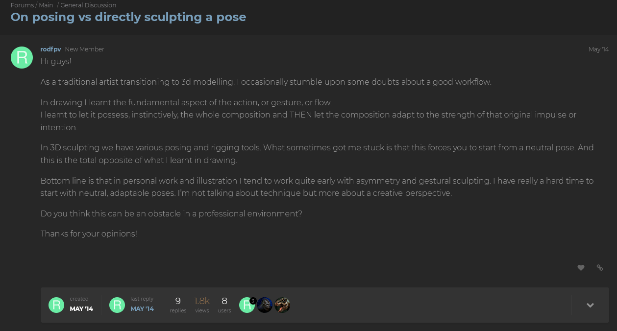
On the other hand, this CGSociety forum post is full of responses advising to sculpt in a dynamic pose in order to visualize overall composition and silhouette. One commenter mentions the downside of not being able to use symmetry tools in this scenario, but as my fabric patterns are inherently symmetrical and I’m working from a basemesh for the body, this is less of a concern. For detailing, the fabric has already been simulated asymmetrically even on a T-posed character, so symmetry doesn’t apply.
Approaches seem to be very correlated with the background of the answerer, as they have different requirements. Those who focus on 3D printing, such as DnD miniature sculptors, would say to pose the character first, as it will only exist in that single pose and topology isn’t a concern. A similar approach is favored by artists coming from a traditional drawing or sculpting background, where the pose is a vital first decision for a piece. On the other hand, game artists who expect the character to be rigged, animated, and moved into a hundred poses would push for sculpting in a T-pose and then posing it in the final stage. So what should I, someone who’s using the same piece for both purposes, choose?
I have an additional complication added here: 70% of the content of my sculpt consists of draped fabric. I’ll need to sculpt the character’s face, hair, few accessories, and small portions of her arms and legs, but she’s mainly covered in meters of flowing clothing. The main pose I’m considering has one of her (long-puff-sleeve-adorned) arms bent upward, and her hip cocked to one side, altering the way that three layers of skirts fall. I’m very concerned with stretching the details in the fabric texture after the fact.
With this in mind, I’ve decided to opt for the pose-first route, with the more complex pose being the main one and the second pose manipulated from that. I don’t yet know how to set up fabric rigging so that it moves appropriately with the character, and I think animation generally will be outside of the scope of this course for me. If she had closer-fitting clothing or pieces that moved with her pose (e.g. armor pauldrons that remained static apart from positioning), then I would choose otherwise. This makes my character inherently not game-ready, but will allow me to focus on getting really clean topology in a dynamic pose and learning how to add stitching and texture details without worrying about distortion.
This is one of the lessons I’ve been trying to work on over this semester: not taking on too many brand new skills with each project. I’ve found that a slightly narrower focus allows me to explore each of those techniques in more depth and better understand how to apply them to other projects in the future.
Blender. (2019). Stylized Character Workflow with Blender. [Video]. Available at: https://youtu.be/f-mx-Jfx9lA [Accessed: 23 November 2021].
Friederichs, H. (2021). Laudna Character Portrait – Critical Role. [Image]. Available at: https://critrole.com/hype-check-out-our-official-campaign-3-character-art-by-hannah-friederichs-and-jrusar-art-by-clara-daly [Accessed: 4 November 2021].
Hyun, J. (2020). Complete Workflow for creating a Stylized 3D Female Action Character. [Online]. Discover | The Rookies. Available at: https://discover.therookies.co/2020/06/10/complete-workflow-for-creating-a-stylized-3d-female-action-character [Accessed: 20 November 2021].
rodfpv. (2014). On posing vs directly sculpting a pose. [online] CGTalk. Available at: http://forums.cgsociety.org/t/on-posing-vs-directly-sculpting-a-pose/1623674/2 [Accessed: 22 November 2021].
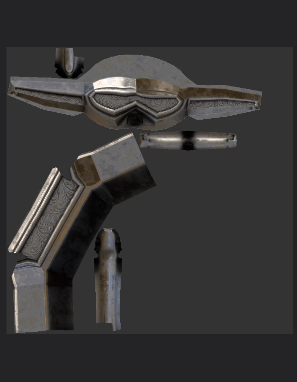
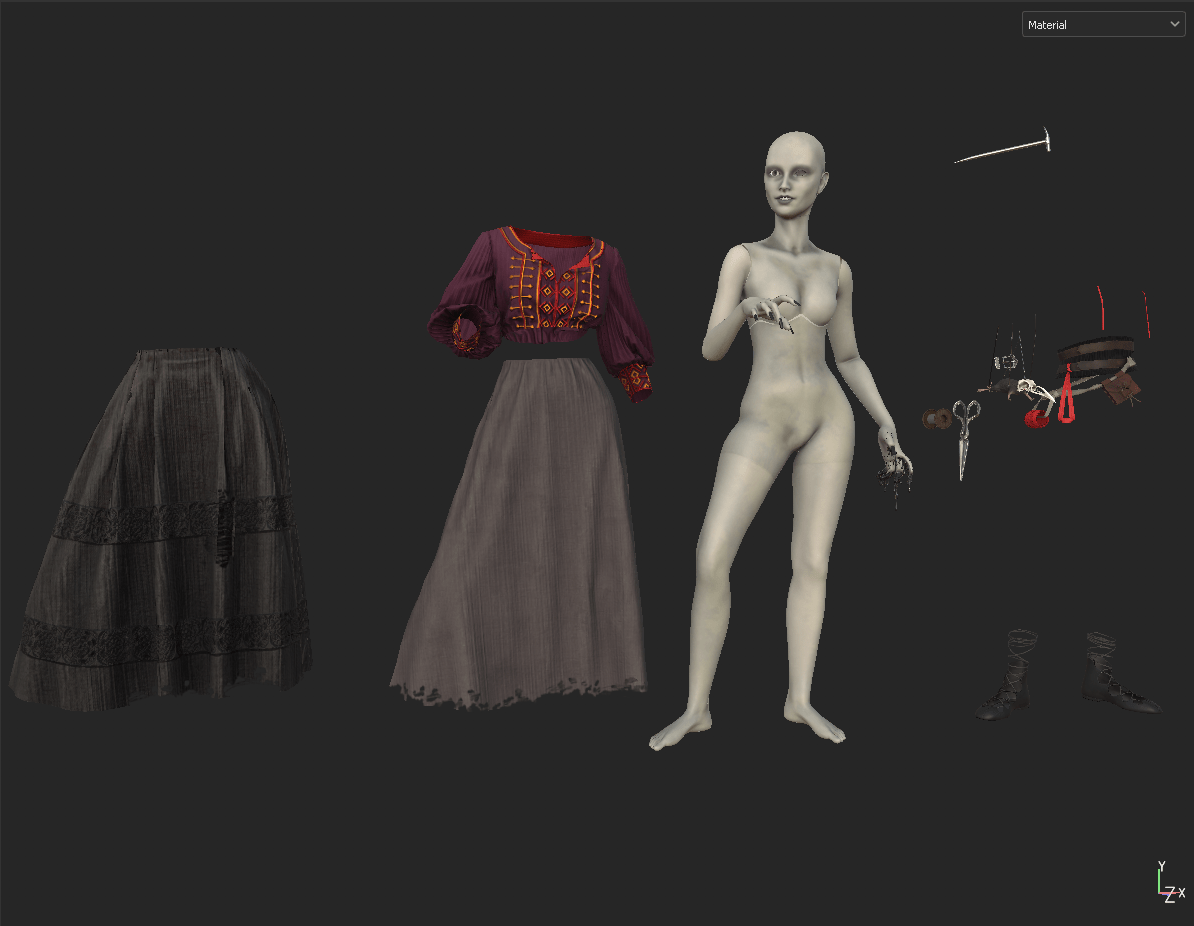
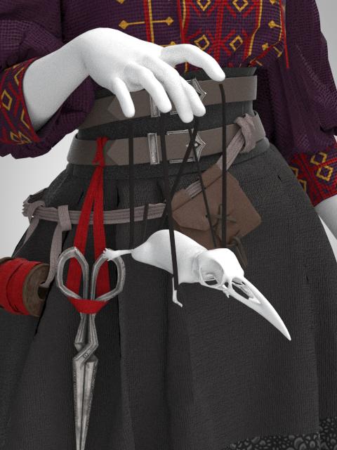
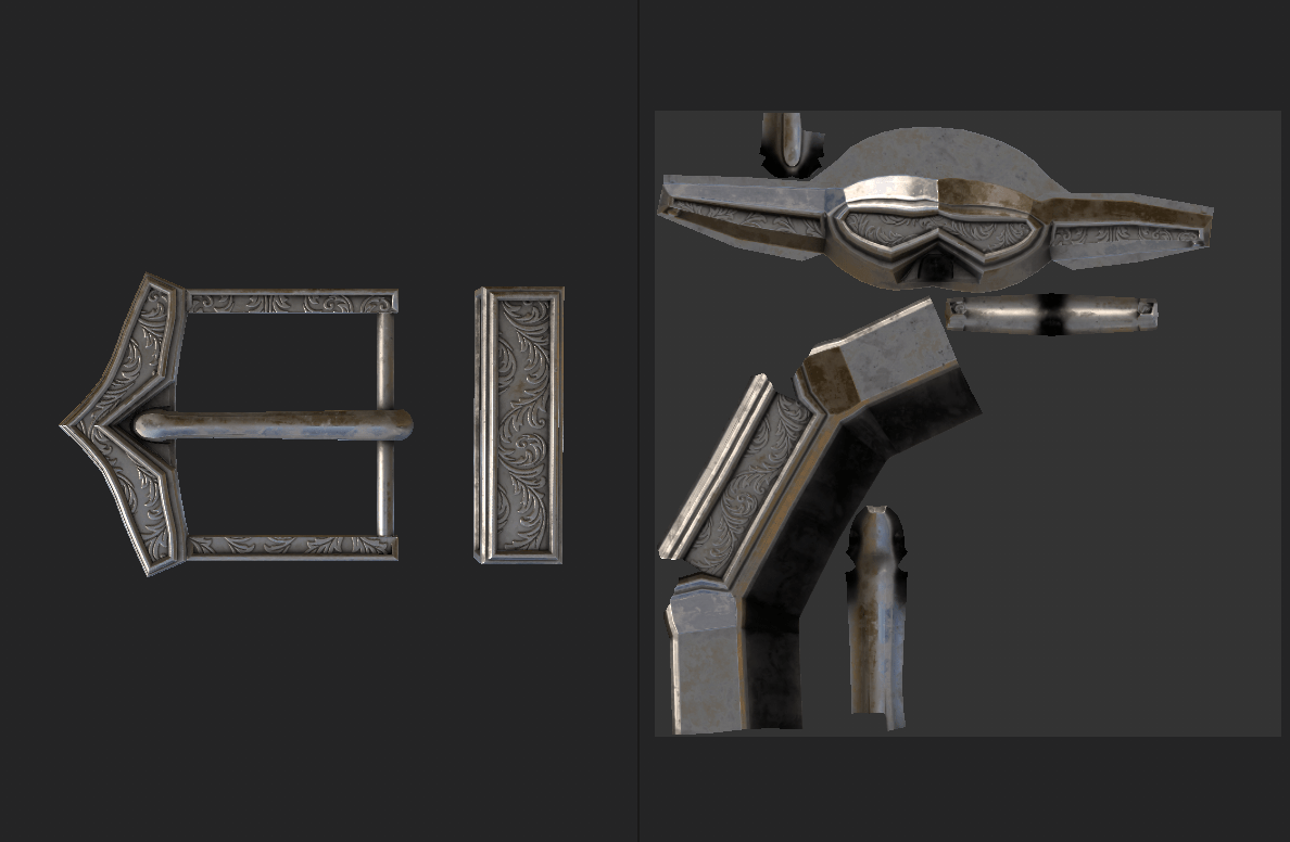
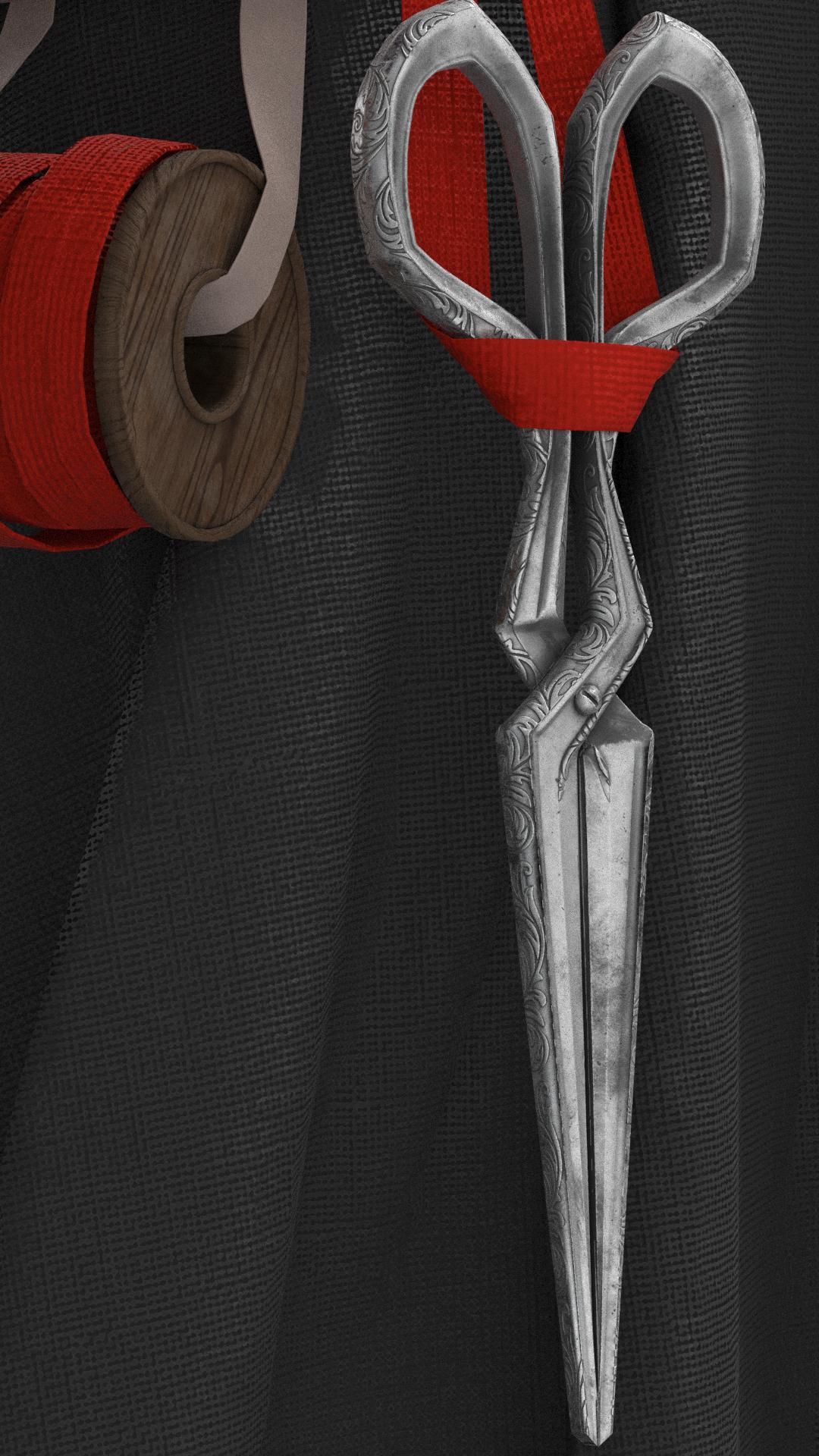
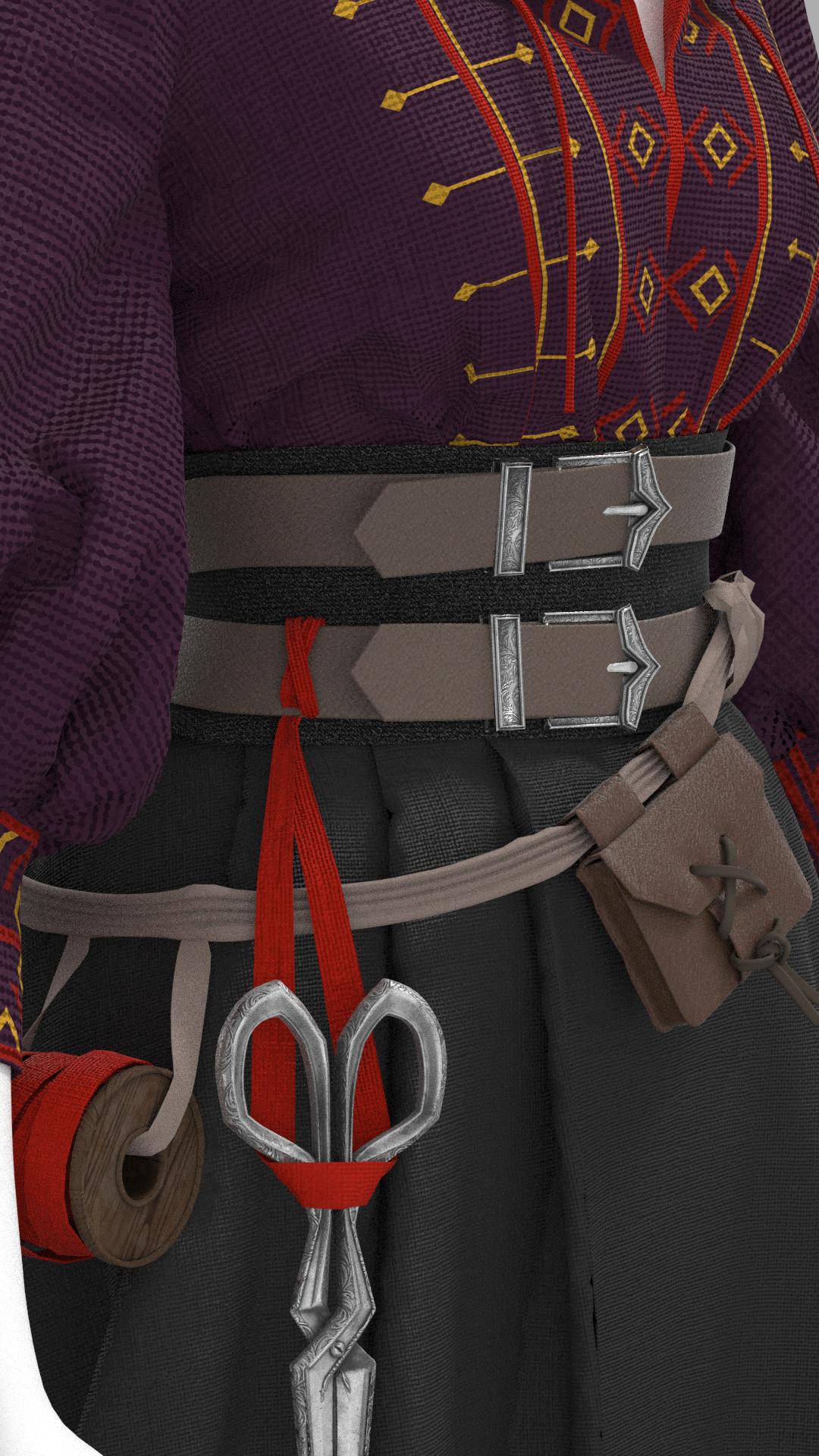
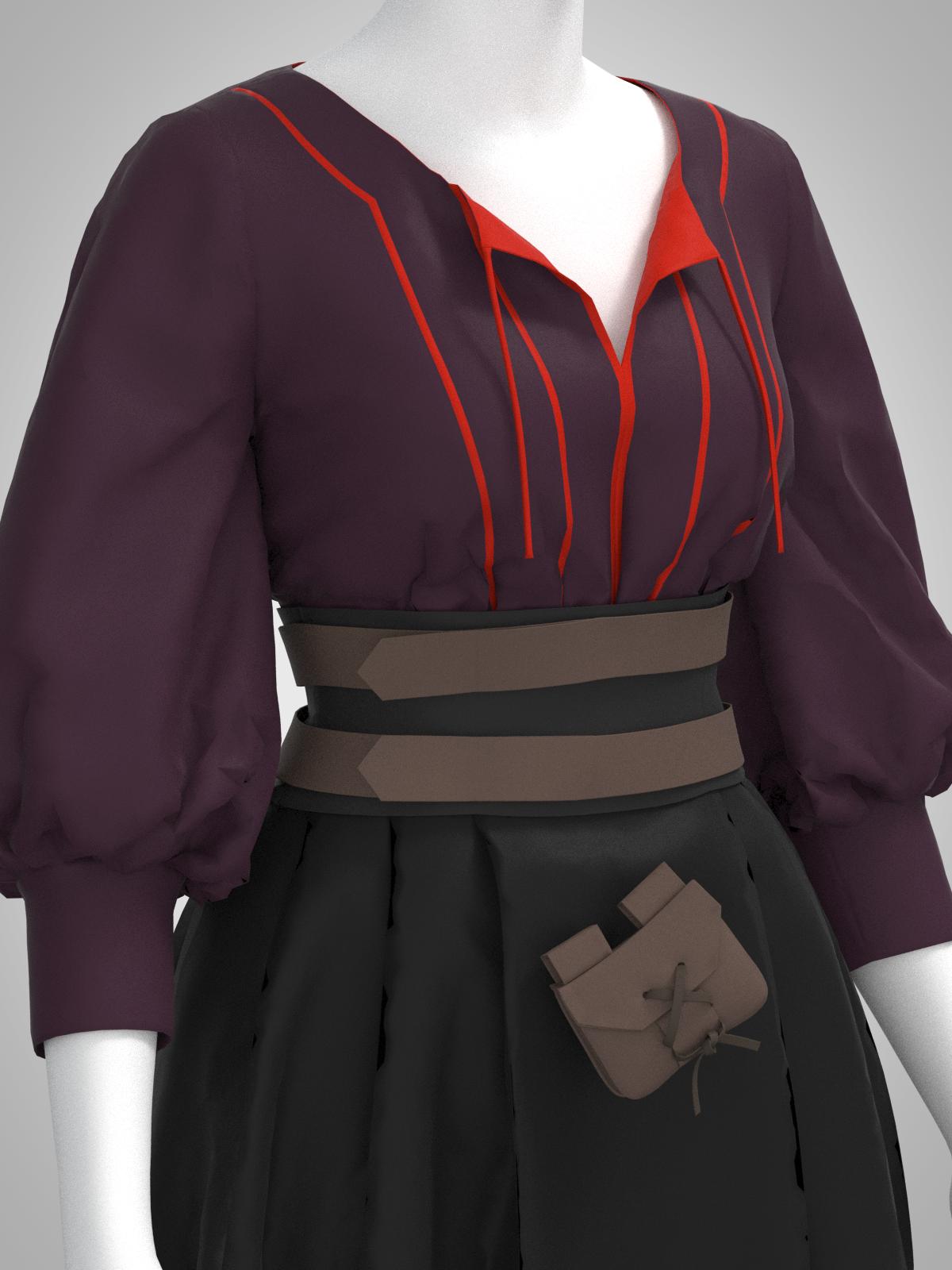
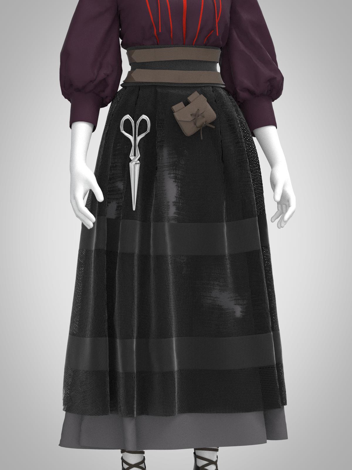
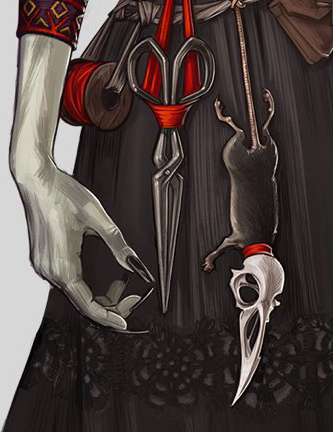
This week, I mainly focused on creating more of and adjusting Laudna’s existing accessories. I tweaked the size of her belt pouch after doing a side-by-side reality check of my model next to the concept art; this was frustrating in that scaling required me to re-simulate the entire pouch, which I had carefully forced into place previously. I then built her belt buckle using nearly all the same techniques I had done for her pair of scissors: sculpting in ZBrush with the same filigree nanomesh design, and textured in Substance Painter.
She has a wooden spool holding some sort of fabric on her belt, which I sculpted quickly in ZBrush. However, because I wanted a good layout for the woodgrain texture, it was time to figure out manual UVing in Maya. This was a good starter project for the subject, as it only had a few seams. I was then able to pull it into Substance Painter, apply a woodgrain texture, and export the height map as a displacement map back into ZBrush; this is going to be extremely useful for applying fine details physically onto my sculpts, a necessity for 3D printing where the texture can’t do any of the work.
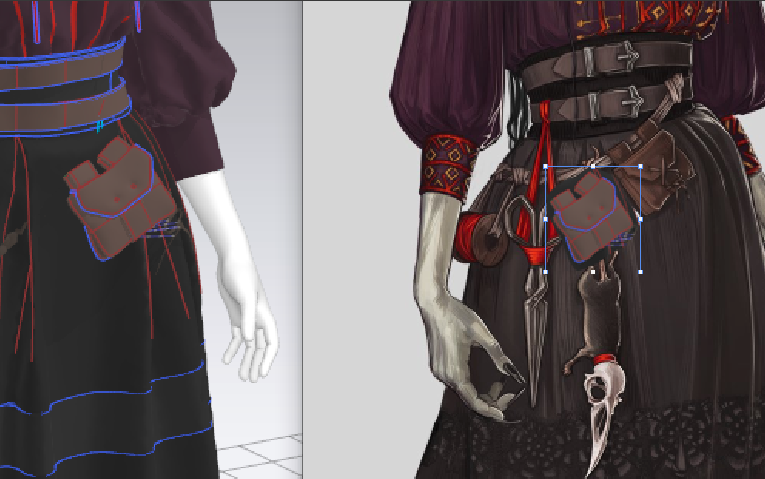

With a quick texture created in Substance, I pulled my accessories back into Marvelous so that I could simulate fabric interacting with them. I wrapped strips of fabric around the spool and created a ‘holder’ for the scissors. This is going to be an extremely useful thing to know in future if I ever need custom avatars or even want to sculpt solid supports for garments.
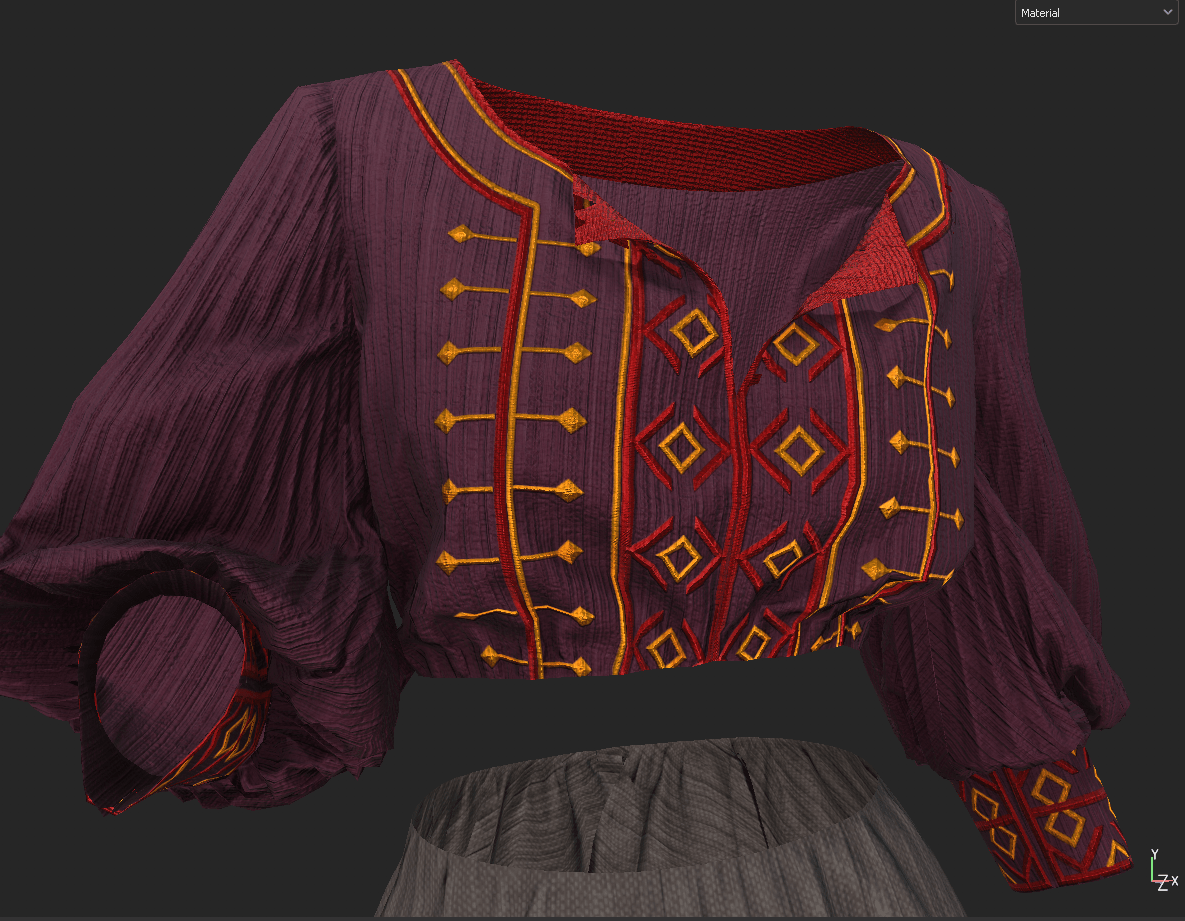
Finally, I went into Photoshop and actually sat down to create a texture for the embroidery design on the front of her shirt. This involved a lot of back-and-forth between Marvelous and PS, but I’ve managed to make a fairly accurate design that I can hopefully use to create raised embroidery with.
Here’s where I’m at from this week! I’ve made major improvements to the overall silhouette and the piece is really starting to come together now that I can see the basic fabric textures.

Friederichs, H. (2021). Laudna Character Portrait – Critical Role. [Image]. Available at: https://critrole.com/hype-check-out-our-official-campaign-3-character-art-by-hannah-friederichs-and-jrusar-art-by-clara-daly [Accessed: 4 November 2021].

Looking forward on my Laudna figure, I’m starting to think about the overall style I’m going for. Since she’ll be 3D printed, all of her details will need to be physically sculpted into the mesh rather than simply painted on afterwards, meaning that this style is something that I’ll need to establish now.
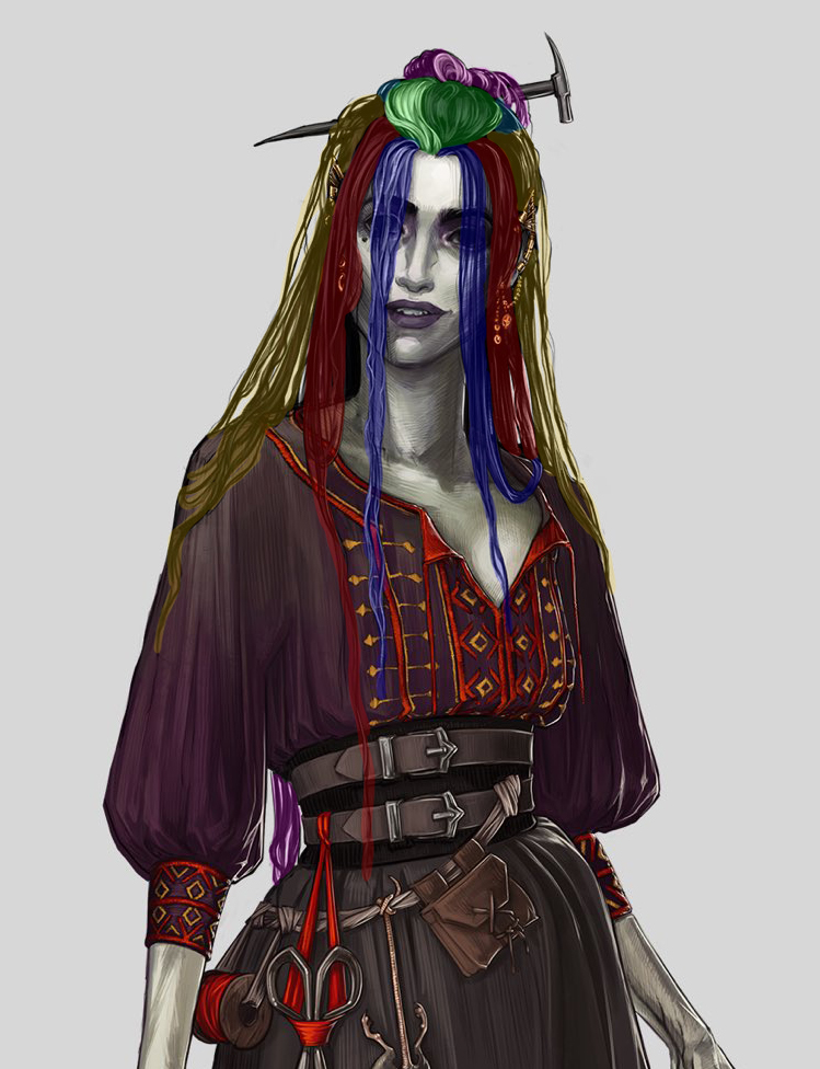
I’d like to somewhat match her character art, partially for accuracy and partially because it’s stylized in a way that I’ve never attempted before. At a glance, she looks somewhat monochrome. However, a closer look reveals a fair amount of hue jitter and colorized shadows. There are also visible brushstroke lines and crosshatching while still having strong 3D shading, which straddles the line between flat 2D and dimensional 3D art. She isn’t too detailed (you can’t see individual threads or embroidery), but there’s a great deal of detail implied with the sharp highlights on specific areas (e.g. metallic jewelry in her hair). Finally, every part is outlined in black, which gives it a slight cel-shaded look; for my final (digital) render, I’m thinking of applying an outline filter to create that effect regardless of viewing direction.
As I have plans to produce Laudna as a 3D printed miniature, I started investigating expert mini painters. An instant spotlight I found is Sergio Calvo, a professional miniature painter for DnD minis and figures. Apart from being impressive purely in the amount of detail he manages to convey on such tiny pieces, he also demonstrates quite a few useful techniques in a similar style to Laudna’s concept art.
I’ve noticed that he tends to make heavy use of gradients, often between two different hues. This helps make his pieces much more dimensional and mimics the way light would hit much larger objects. He also uses visible, consistent brushstrokes rather than perfect blending in some areas to add texture. For metal parts, he uses a technique known as ‘NMM’ (non-metallic metal) painting where he manually adds in highlights, reflections, and worn edges without relying on an outside lighting source (as with real metallic paint). This is a technique that I often used when painting my own cosplay armor, where it won’t necessarily always be photographed in a way that brings out the cartoony video-game look, and so I’m glad to find that I do have some background that I can apply to this project.

I also admire his use of false (often colored) lighting, highlights, and shadows to make details pop; it’s clear he picks a light direction at the start and paints the entire mini with it in mind. This gives a sense of the character’s surroundings (are they outside? In a tavern? Near synthetic lighting like a control room?). With this, he tends to have a larger contrast between light and dark areas than would exist in reality (or with non-painted lighting), again adding more depth.
Many of the same styles and techniques apply to digital painting as well, especially since I’d like to maintain the crosshatched brush strokes, gradient highlighting, and tinted shadows present in the original concept artwork. Often, 3D sculpts are painted in a flat way and rely upon external colored lighting and filters to create this effect, but this ‘painted shading’ look is clear in some of my favorite painterly-style games such as Dishonored, Borderlands, and Life is Strange.
Traditional drawing and painting skills are some of my weakest areas – I’m quite insecure in my lack of sketching ability, and it’s something that I don’t often practice. I’m also very new to digital painting in general. Because of this, I find it helpful to break down other artists’ work into easily identifiable steps (base color, gradients, shadows, highlights, false lighting..) to make it more manageable. I plan to basically follow along with this sequence when I paint my Laudna figure in Substance.
In anticipation of painting this piece, I’ve been generally collecting bookmarked articles that catch my eye as potentially containing useful techniques. I discovered a great writeup, ‘Character Art: Balancing Between Stylization and Realism‘ by Georgian Avasilcutei, character artist on 2/3 of the aforementioned stylized games. Beyond describing a useful pipeline for stylized painting, he reveals several creative ways of programmatically enhancing the painterly look.

He starts out creating his characters fairly high-poly and realistic-looking, specifically mentioning material choices and fine details. This is something I’m more comfortable with than stylized, as I tend towards realism in my work. He then does some automated adjustments to the texture maps in Photoshop, such as adding a cutout filter to the green channel of his diffuse and normal maps, and tweaking the settings from there; this creates distinct brushstrokes without having to manually paint them in. He then adds more hand-painted details but with a HSB jitter on the stroke – this is a really smart way to get that nice color/lightness variation without having to continually go into the color palette.
As I said, I’m not the strongest digital painter, so I appreciate any ‘hacks’ I can find! Both of these are useful methods for ‘faking’ the way more practiced artists paint their pieces. I intend to take advantage of both, at least while I work out my own style. In general, I’ve found that I prefer more automated methods for creating art (filters, adjustment layers, shader creation..) because I’m not yet happy with my from-scratch skills.
Avasilcutei, G. (2021). Character Art: Balancing Between Stylization and Realism. [Online]. Medium. Available at: https://medium.com/@EightyLevel/character-art-balancing-between-stylization-and-realism-19ac2a8054a6 [Accessed: 21 November 2021].
Calvo, S. (2021). Sergio Calvo Miniatures – Gallery. [Online]. Sergio Calvo Miniatures. Available at: https://sergiocalvominiatures.com [Accessed: 22 November 2021].
Friederichs, H. (2021). Laudna Character Portrait – Critical Role. [Image]. Available at: https://critrole.com/hype-check-out-our-official-campaign-3-character-art-by-hannah-friederichs-and-jrusar-art-by-clara-daly [Accessed: 4 November 2021].
Technically, I started working on Laudna’s clothing during the original 3D print week (I was excited to jump back into Marvelous!), but haven’t had a chance to gather up my progress photos until now. Laudna’s base garments were fairly straightforward, as her shirt and skirts aren’t particularly fitted, although I did have to work out how to force the shirt under the tight-fitting corset without adding too much bulk. Her shoes presented a bit of a challenge, as they’re something I’ve never patterned before, but I was able to reference basic ballet flats and tweak them from there.
For Laudna’s skirts, I made good use of my experimentation with manual pleating and created a few pleats rather than gathers to achieve that A-line silhouette. I’m still trying to decide how to flare out the side of the skirt to better match the concept art – perhaps with a stiffer material preset or a petticoat.
Overall, she still needs some proportion and silhouette tweaks, as the character has slightly in-human proportions, so I think my first task next week will be to adjust the avatar to match.
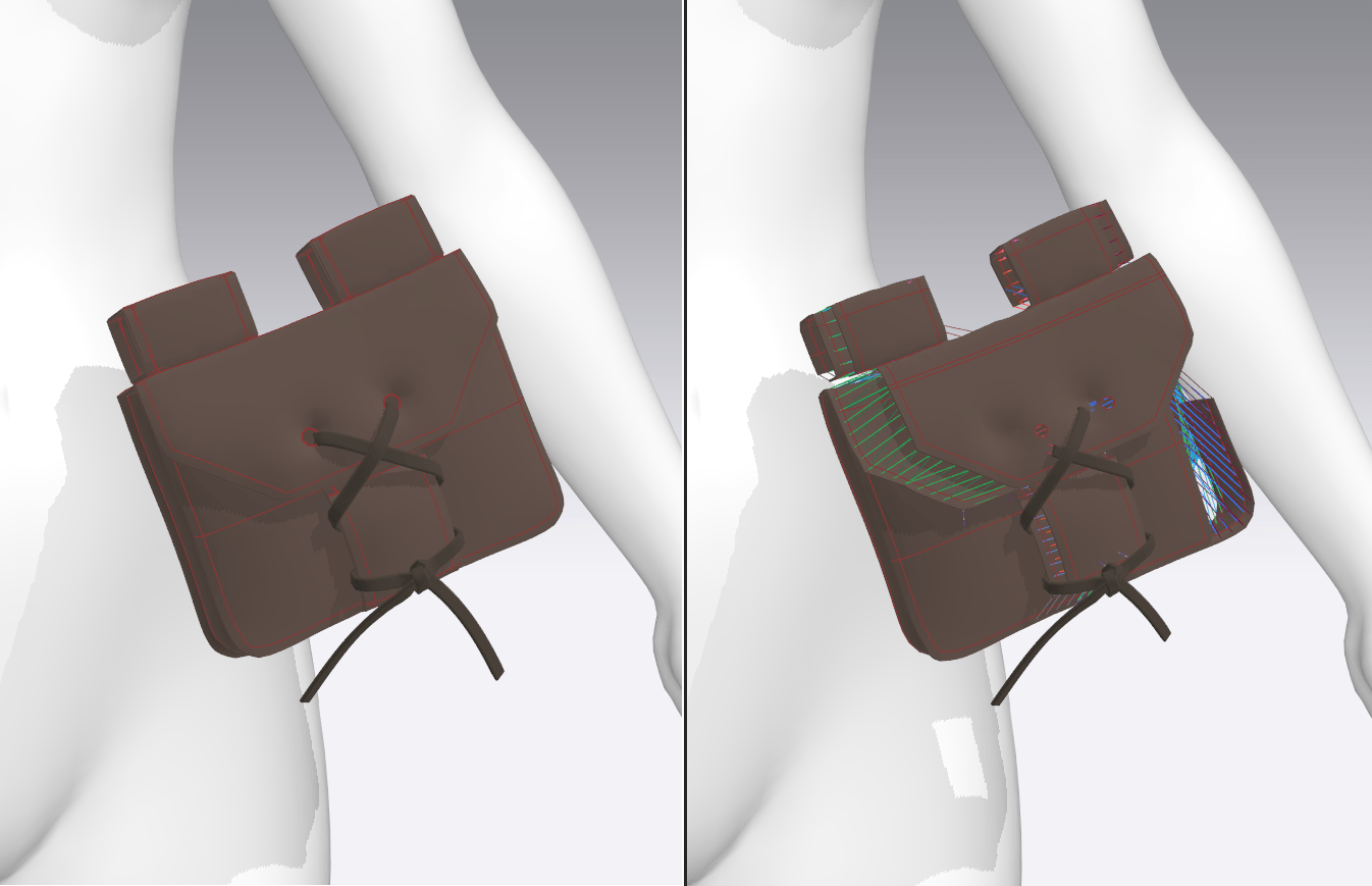
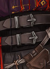
I started on the belt pouch as well. The basic shapes were very simple, but I ran into many problems trying to create the knot closure and overlapping seams along the bag edges. Eventually, through a lot of selective freezing and a bunch of invisible tacks, I managed to get the knot in place. For the seams, I played around quite a bit with setting the seam angle and offset so there wasn’t too much pressure on opposing pattern pieces.
I also started doing basic experimentation with texturing on exported UVs (the blue squiggly lines are, of course, a placeholder!). Marvelous has a neat system for applying textures generally over a surface, so I was able to play around with a few seamless height maps and torn fabric alphas. Eventually I’ll texture her properly by hand in Substance, but having a PBR system built-in is a nice feature.
This is where I’m at after this week! The first image was rendered using the built-in outline tool for that pattern-cover look, and the second was just rendered normally within the program.

Friederichs, H. (2021). Laudna Character Portrait – Critical Role. [Image]. Available at: https://critrole.com/hype-check-out-our-official-campaign-3-character-art-by-hannah-friederichs-and-jrusar-art-by-clara-daly [Accessed: 4 November 2021].
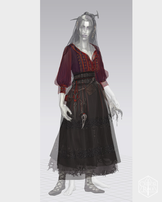
For my development project, I’ve decided to take my 3D printing weekly assignment a step further and create a full character. I’m continuing to work off of this concept art of Laudna from Critical Role, as I think it would be very suited for printing a miniature figure: it has a fair amount of detail but not too many protruding parts, and I can fill in the lower layers of her skirt solid so there shouldn’t be too many thin parts. It’s also a great opportunity for me to practice both garments and hard-surface accessories.
There are definitely a few things I’m concerned about right off the bat. First off, I’ve never truly gone through the entire character pipeline, so I’m unsure whether I’ve chosen a project with too large of a scope. Assuming I can pull it off, I’m mainly worried about creating her hair and the holes in her skirt. Previously, I’ve made hair from XGen, but for printing it will obviously need to be sculpted, and those thin strands could present an issue for the printer. Ditto for her torn hem – islands are always an issue for 3D printing, so I’ll likely have to fill in the holes with a recessed piece of fabric rather than leave them floating.
Overall, I adore her character design and I’m excited for all the challenges I’ll be tackling with this one!
Friederichs, H. (2021). Laudna Character Portrait – Critical Role. [Image]. Available at: https://critrole.com/hype-check-out-our-official-campaign-3-character-art-by-hannah-friederichs-and-jrusar-art-by-clara-daly [Accessed: 4 November 2021].

I wasn’t expecting to struggle during 3D printing week. This was, perhaps, the most prepared (skill-wise) I’ve been for an assignment so far – my partner and I run a small shop for 3D printed cosplay pieces, and I’m extremely familiar with the pipeline.
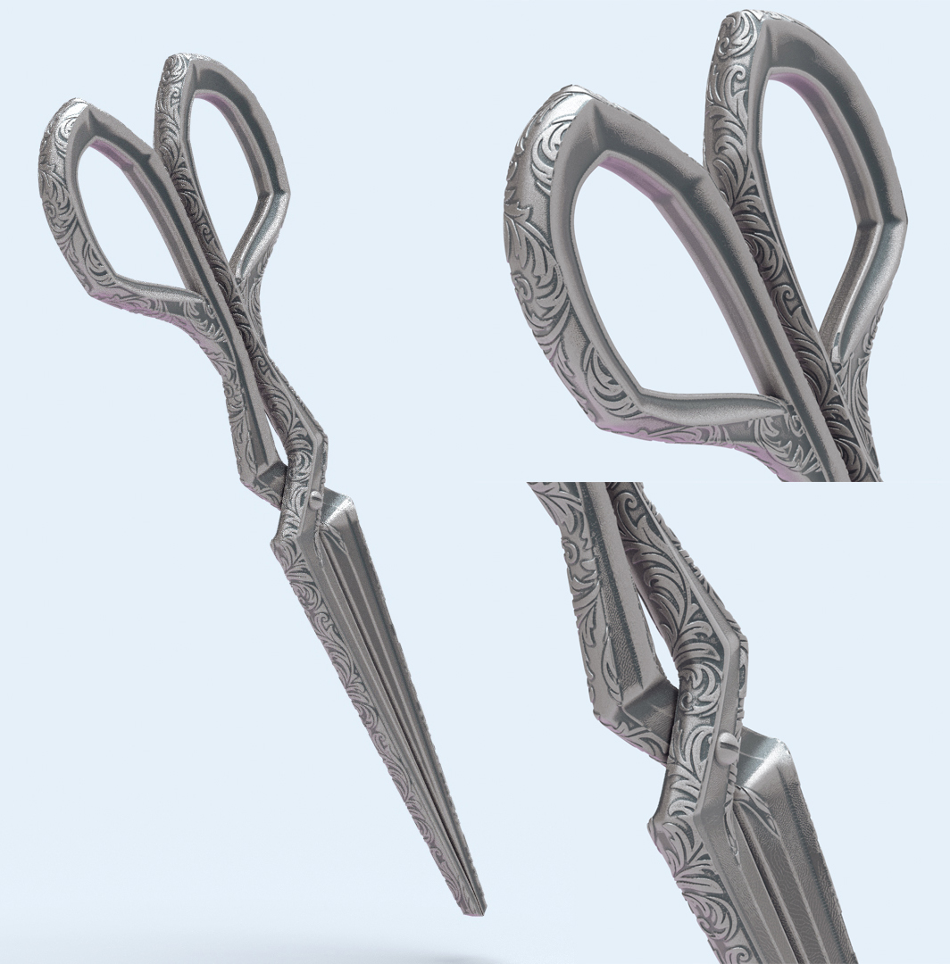
I ran into a few smaller snags this week: I had an issue with with adding filigree details using ZBrush’s noisemaker, and through experimentation discovered an option to apply the effect to the UVs rather than stretching the details over the full model. I took this opportunity to learn how to manually UV an object and manipulate UV layouts. However, my main stumbling block was that I felt an overwhelming need to ensure that my 3D printed scissors would function in real life, rather than just being a static accessory.
I spent an embarrassing amount of time attempting to figure out how scissors work, something that clearly neither I nor the original concept artist from which I based this piece understood. Traditional scissors tend to have overlapping blades, whereas these were drawn to meet at the center, and were missing the necessary plane shifts around the pivot point to slide past each other. I ended up physically examining multiple pairs of scissors and observing how the pieces were shaped, along with looking at alternative bladed tools, like gardening or leather shears, online. Meanwhile, I had wasted time working out the complex contours and details to match the concept art, before I had established the basic shape.
There are a few lessons to be learned from this: always do a few quick prototypes, try to find parallels in real-world objects for reference, or stop caring about functionality altogether.
(on the plus side, when 3D printed, my scissors did in fact ‘work’ as intended, although they won’t be cutting anything!)
As a cosplayer, I’ve been frustrated countless times in trying to recreate impossible designs in the real world. I teach a lecture on fabric manipulation and accuracy for cosplay, and one of my major talking points is that “game devs ≠ seamstresses”. By this, I mean that character artists and sculptors are constructing digital garments without necessarily knowing about fabric weights, seams, structural layers, or attachments, and it’s okay to amend a cosplay design to account for this. Because I’ve been on the other side – trying desperately to fit a garment to my regular human proportions or jury-rig a way to ‘float’ that gravity-defying prop – I suspect I have different priorities than many artists.
My first inclination is to think of how to make pieces functional in real life. I want to add accurate seamlines, pouches for carrying items, layers for handling different climates, and appropriate footwear. I think about whether a pauldron will clip through a character’s neck when they raise their arm, and about how they get dressed (will the cuff of their sleeve fit over their wrist? If not, it needs a closure! Will they be able to reach their sword where it’s holstered over their shoulder? If not, reposition it to their hip..).
The question I have to ask myself: is this worth it? Incorporating these factors takes additional time and energy, yet does it really add to a project? I’m sure cosplayers will appreciate it, but for the vast majority of players, these are characteristics that they wouldn’t even notice (although I’m still awaiting a study exploring whether these realism details subconsciously add to a game’s immersion..).
Friederichs, H. (2021). Laudna Character Portrait – Critical Role. [Image]. Available at: https://critrole.com/hype-check-out-our-official-campaign-3-character-art-by-hannah-friederichs-and-jrusar-art-by-clara-daly [Accessed: 4 November 2021].
l-o-t-r on Tumblr (2012). Boromir Fear and Doubt gif. [Image]. Available at: https://l-o-t-r.tumblr.com/post/24952885026/doubt [Accessed: 5 November 2021].
