Reflection Final: Methodology

Reflection, Research and Enquiry

In creating such a number and variety of projects this semester, I’ve noticed some patterns in the way that I work as I attempt to establish my personal style and aspirational place in the games industry.

My approach to each project generally begins with visual research: reference images, mood boards, and investigations into others’ work. I keep computer folders of carefully-organized inspirational pieces (certain color schemes, painting styles, ways of using lighting, stylized elements..) as I encounter them on Artstation or Reddit, and often refer back when starting a new piece. I spend very little time sketching, because I have a picture in my head of the general outcome of a project but am not a strong traditional artist.

Instead, I prototype. If there is a technical aspect that I’m unfamiliar with, I start out with the parts that I’m most concerned about and do quick test projects to work out those processes; otherwise, I worry I’ll be panicking up against a deadline. Often, the most difficult research step is simply figuring out which terminology to search for (i.e. a uniquely-named operation in a software). I will look for tutorials on Youtube and forum posts for very general techniques, but tend to assume that experimentation is best for more specific tasks. I’m coming from a cosplay background where there’s never a set tutorial for the strange piece I’m trying to create and everything must be invented from scratch, and I’m still breaking out of that mindset.

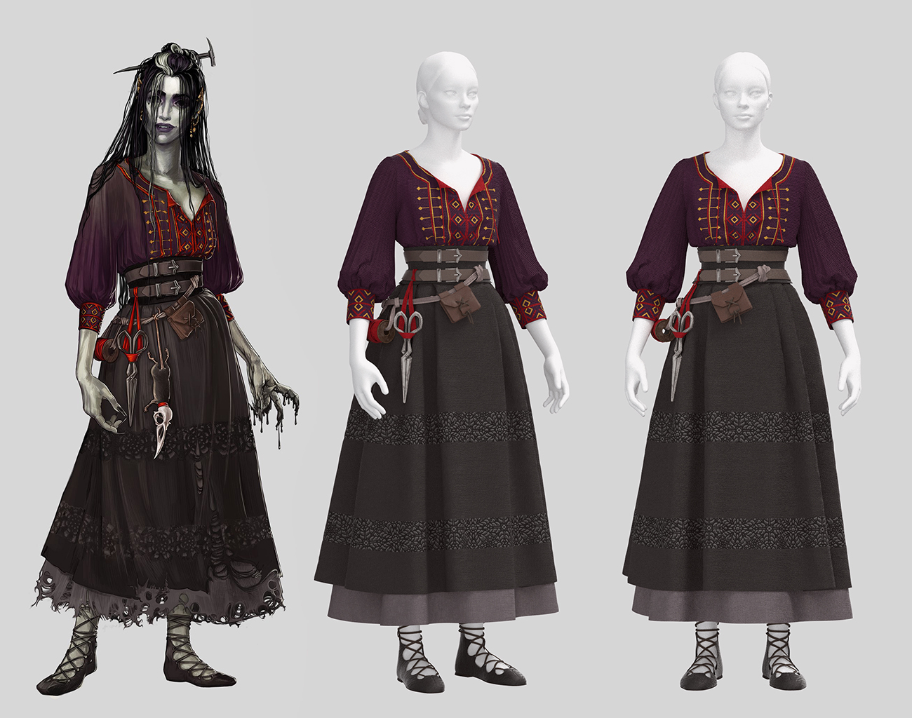
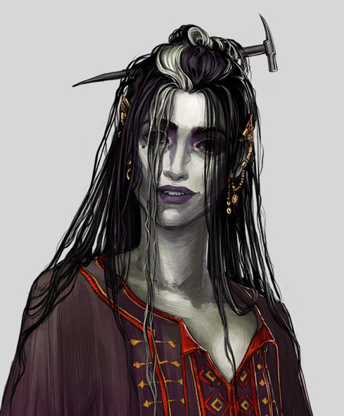
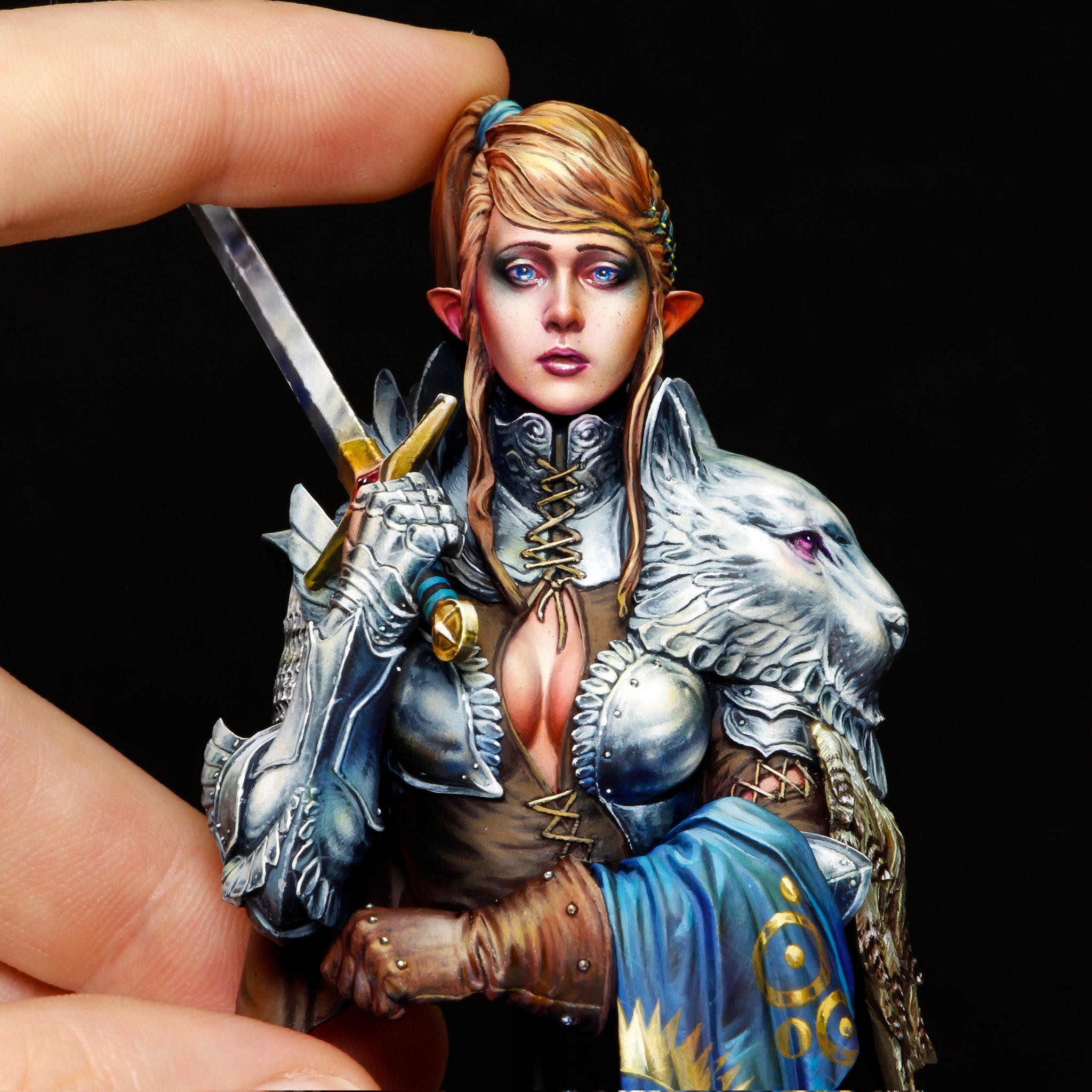
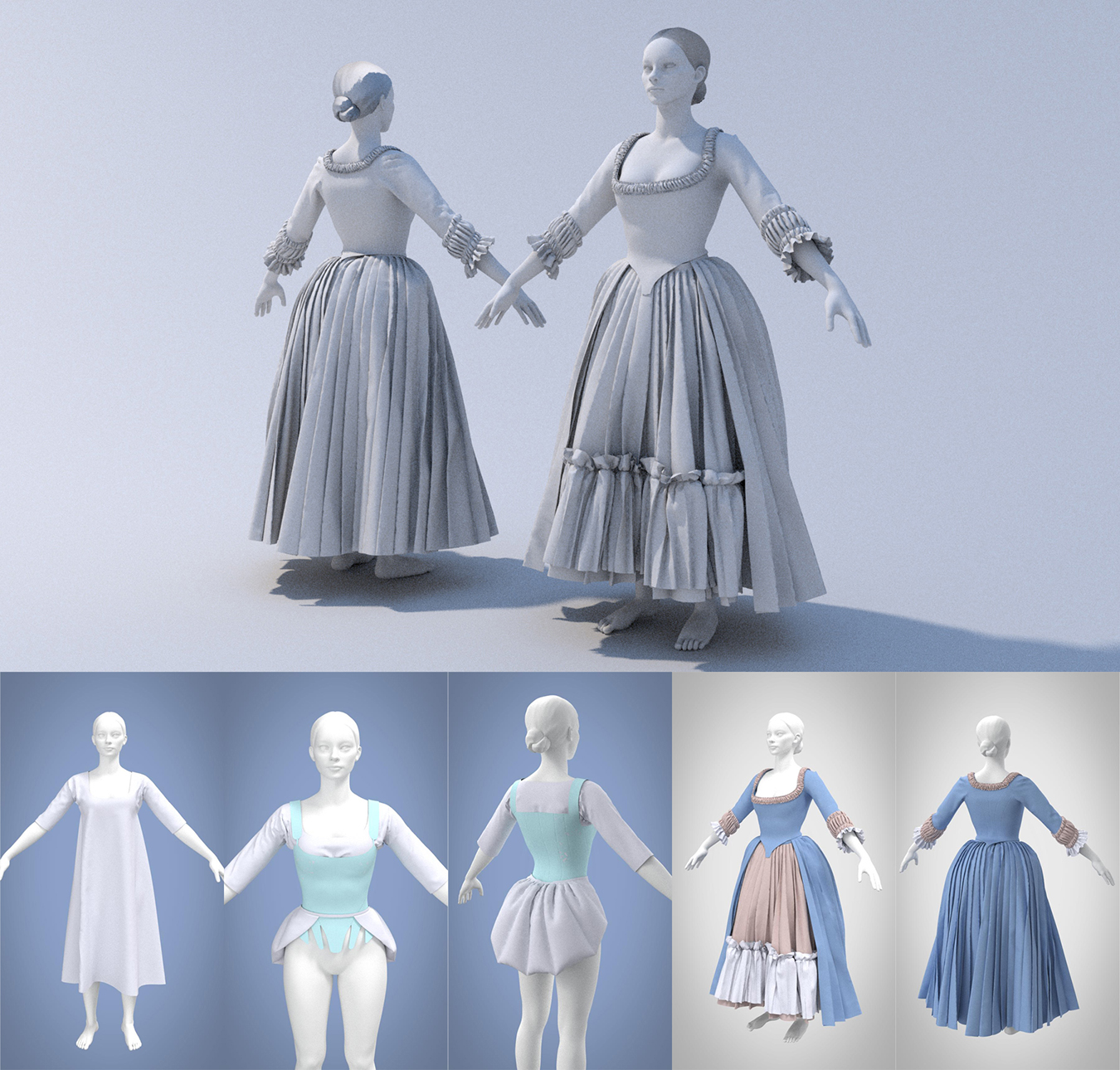
Once I start sculpting, I’ll frequently pause and compare back to the original reference image(s) to do reality checks and avoid fixating on an inaccurate mental visualization of how a piece should look. I’ve found that generally I much prefer the stage where my sculpts are heavily mutable, as I struggle with being locked into a decision or finalizing one step of a piece. I enjoy being able to toggle between large overall shapes and small details, so my favorite tasks have been garment design in Marvelous Designer and early rough sculpting with ZBrush’s Dynamesh.

Originality and novelty are extremely important to me. I usually look at a potential idea, figure out what influences may have put it into my head, and try to find a unique twist to distance myself from others’ work; I dislike the idea of copying or feeling like my art is not unique. I also really enjoy discovering original techniques, and tend to introduce complexity or force the invention of a new way of doing something (often because I’m stubborn and refuse to accept that an outcome isn’t possible). On the downside, this means that I sometimes waste significant time and frustration when I could just compromise on my initial vision.

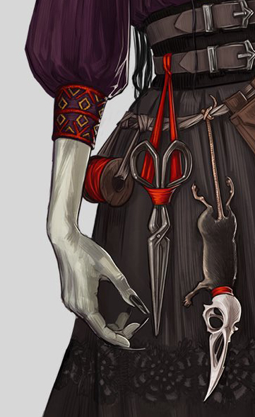
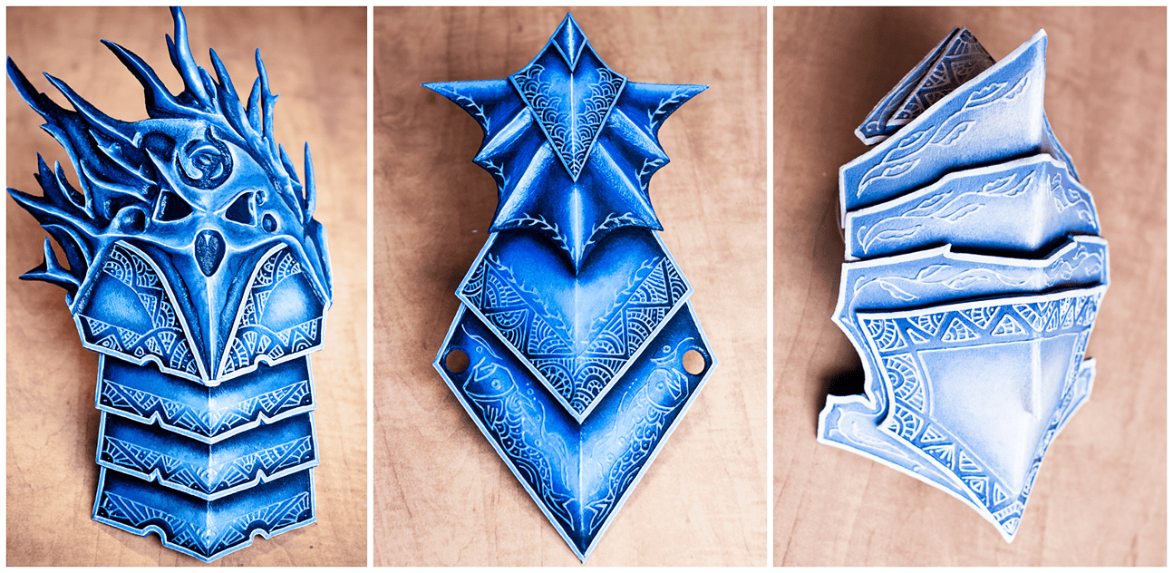
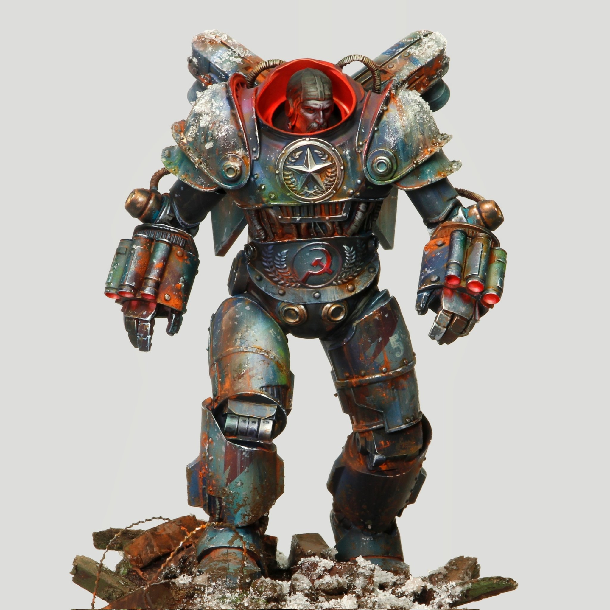
Many of the entries in my annotated bibliography were sources that I found organically through my weekly research, and relate to either conveying meaning through character design or elaborate on potential career specializations. I found that I was mainly searching for academic sources, as many of the non-peer-reviewed articles that I found were limited, one-sided, or heavily biased; I generally don’t seek out many ‘opinion’ pieces, rather focusing on technical walkthroughs or more substantiated sources. On a similar note, I tend to prefer experimentation over explicit tutorials, or at least creating small test pieces to prove that a technique is effective rather than simply trusting a source. My explorations this semester have confirmed my initial choice to pursue character art (as opposed to environment or VFX), but more importantly, have clarified my niche in costume, armor, and accessory modeling. These have easily been the projects that I’ve been most excited and motivated to work on, and from my research I feel confident that there is a space in the industry for that focus.

Reflection: Posing Pipeline

Practice 1, Reflection, Research and Enquiry

When to pose a character?

I’ve been wrestling with a conundrum as I’m working on one of my final development projects, a character sculpt heavily featuring Marvelous Designer clothing. This piece is intended to be both a 3D printed figure (in a single pose) and a digitally rendered/painted piece (displayed in two separate poses as required by a competition I’m entering). I’m trying to decide at which stage of the pipeline I should put this character into her final pose(s): before exporting from Marvelous Designer to take advantage of its fabric simulation, or after exporting and detailing (sculpting her in a T-pose) at the end of the process.

Investigation

The issue is, there isn’t necessarily an authoritative answer to this question. In investigating this, I’ve consulted two lecturers, watched countless Youtube sculpting timelapses, and delved into 3D modeling forums; opinions are very split.


For example, this article by game artist James Hyun covers a full step-by-step method for sculpting a full stylized character. The artist does nearly all of the piece with the character in a T-pose, only giving her a final pose at the last step. This seems to be common for creating game- or animation-ready cartoon-y characters, as also demonstrated in this official Blender tutorial. However, these examples are of simplified characters with form-fitting or basic-planar clothing and little detail. My piece relies on complex, layered, draped clothing and will eventually have things like topstitching and embroidery details to contend with.


On the other hand, this CGSociety forum post is full of responses advising to sculpt in a dynamic pose in order to visualize overall composition and silhouette. One commenter mentions the downside of not being able to use symmetry tools in this scenario, but as my fabric patterns are inherently symmetrical and I’m working from a basemesh for the body, this is less of a concern. For detailing, the fabric has already been simulated asymmetrically even on a T-posed character, so symmetry doesn’t apply.

Analysis re: Laudna

Approaches seem to be very correlated with the background of the answerer, as they have different requirements. Those who focus on 3D printing, such as DnD miniature sculptors, would say to pose the character first, as it will only exist in that single pose and topology isn’t a concern. A similar approach is favored by artists coming from a traditional drawing or sculpting background, where the pose is a vital first decision for a piece. On the other hand, game artists who expect the character to be rigged, animated, and moved into a hundred poses would push for sculpting in a T-pose and then posing it in the final stage. So what should I, someone who’s using the same piece for both purposes, choose?

I have an additional complication added here: 70% of the content of my sculpt consists of draped fabric. I’ll need to sculpt the character’s face, hair, few accessories, and small portions of her arms and legs, but she’s mainly covered in meters of flowing clothing. The main pose I’m considering has one of her (long-puff-sleeve-adorned) arms bent upward, and her hip cocked to one side, altering the way that three layers of skirts fall. I’m very concerned with stretching the details in the fabric texture after the fact.

With this in mind, I’ve decided to opt for the pose-first route, with the more complex pose being the main one and the second pose manipulated from that. I don’t yet know how to set up fabric rigging so that it moves appropriately with the character, and I think animation generally will be outside of the scope of this course for me. If she had closer-fitting clothing or pieces that moved with her pose (e.g. armor pauldrons that remained static apart from positioning), then I would choose otherwise. This makes my character inherently not game-ready, but will allow me to focus on getting really clean topology in a dynamic pose and learning how to add stitching and texture details without worrying about distortion.

This is one of the lessons I’ve been trying to work on over this semester: not taking on too many brand new skills with each project. I’ve found that a slightly narrower focus allows me to explore each of those techniques in more depth and better understand how to apply them to other projects in the future.

Bibliography

Blender. (2019). Stylized Character Workflow with Blender. [Video]. Available at: https://youtu.be/f-mx-Jfx9lA [Accessed: 23 November 2021].

Friederichs, H. (2021). Laudna Character Portrait – Critical Role. [Image]. Available at: https://critrole.com/hype-check-out-our-official-campaign-3-character-art-by-hannah-friederichs-and-jrusar-art-by-clara-daly [Accessed: 4 November 2021].

Hyun, J. (2020). Complete Workflow for creating a Stylized 3D Female Action Character. [Online]. Discover | The Rookies. Available at: https://discover.therookies.co/2020/06/10/complete-workflow-for-creating-a-stylized-3d-female-action-character [Accessed: 20 November 2021].

rodfpv. (2014). On posing vs directly sculpting a pose. [online] CGTalk. Available at: http://forums.cgsociety.org/t/on-posing-vs-directly-sculpting-a-pose/1623674/2 [Accessed: 22 November 2021].

Reflection: Stylized Mini Painting

Practice 1, Reflection, Research and Enquiry

Observing Laudna

Looking forward on my Laudna figure, I’m starting to think about the overall style I’m going for. Since she’ll be 3D printed, all of her details will need to be physically sculpted into the mesh rather than simply painted on afterwards, meaning that this style is something that I’ll need to establish now.

I’d like to somewhat match her character art, partially for accuracy and partially because it’s stylized in a way that I’ve never attempted before. At a glance, she looks somewhat monochrome. However, a closer look reveals a fair amount of hue jitter and colorized shadows. There are also visible brushstroke lines and crosshatching while still having strong 3D shading, which straddles the line between flat 2D and dimensional 3D art. She isn’t too detailed (you can’t see individual threads or embroidery), but there’s a great deal of detail implied with the sharp highlights on specific areas (e.g. metallic jewelry in her hair). Finally, every part is outlined in black, which gives it a slight cel-shaded look; for my final (digital) render, I’m thinking of applying an outline filter to create that effect regardless of viewing direction.

Inspiration: Sergio Calvo Miniatures

As I have plans to produce Laudna as a 3D printed miniature, I started investigating expert mini painters. An instant spotlight I found is Sergio Calvo, a professional miniature painter for DnD minis and figures. Apart from being impressive purely in the amount of detail he manages to convey on such tiny pieces, he also demonstrates quite a few useful techniques in a similar style to Laudna’s concept art.

I’ve noticed that he tends to make heavy use of gradients, often between two different hues. This helps make his pieces much more dimensional and mimics the way light would hit much larger objects. He also uses visible, consistent brushstrokes rather than perfect blending in some areas to add texture. For metal parts, he uses a technique known as ‘NMM’ (non-metallic metal) painting where he manually adds in highlights, reflections, and worn edges without relying on an outside lighting source (as with real metallic paint). This is a technique that I often used when painting my own cosplay armor, where it won’t necessarily always be photographed in a way that brings out the cartoony video-game look, and so I’m glad to find that I do have some background that I can apply to this project.

My own cosplay paintjob (Orrian armor from Guild Wars 2)

I also admire his use of false (often colored) lighting, highlights, and shadows to make details pop; it’s clear he picks a light direction at the start and paints the entire mini with it in mind. This gives a sense of the character’s surroundings (are they outside? In a tavern? Near synthetic lighting like a control room?). With this, he tends to have a larger contrast between light and dark areas than would exist in reality (or with non-painted lighting), again adding more depth.

Many of the same styles and techniques apply to digital painting as well, especially since I’d like to maintain the crosshatched brush strokes, gradient highlighting, and tinted shadows present in the original concept artwork. Often, 3D sculpts are painted in a flat way and rely upon external colored lighting and filters to create this effect, but this ‘painted shading’ look is clear in some of my favorite painterly-style games such as Dishonored, Borderlands, and Life is Strange.

Traditional drawing and painting skills are some of my weakest areas – I’m quite insecure in my lack of sketching ability, and it’s something that I don’t often practice. I’m also very new to digital painting in general. Because of this, I find it helpful to break down other artists’ work into easily identifiable steps (base color, gradients, shadows, highlights, false lighting..) to make it more manageable. I plan to basically follow along with this sequence when I paint my Laudna figure in Substance.

Stylized Painting Tips + Procedural Adjustments

In anticipation of painting this piece, I’ve been generally collecting bookmarked articles that catch my eye as potentially containing useful techniques. I discovered a great writeup, ‘Character Art: Balancing Between Stylization and Realism‘ by Georgian Avasilcutei, character artist on 2/3 of the aforementioned stylized games. Beyond describing a useful pipeline for stylized painting, he reveals several creative ways of programmatically enhancing the painterly look.

Georgian Avasilcutei / 80Level

He starts out creating his characters fairly high-poly and realistic-looking, specifically mentioning material choices and fine details. This is something I’m more comfortable with than stylized, as I tend towards realism in my work. He then does some automated adjustments to the texture maps in Photoshop, such as adding a cutout filter to the green channel of his diffuse and normal maps, and tweaking the settings from there; this creates distinct brushstrokes without having to manually paint them in. He then adds more hand-painted details but with a HSB jitter on the stroke – this is a really smart way to get that nice color/lightness variation without having to continually go into the color palette.

As I said, I’m not the strongest digital painter, so I appreciate any ‘hacks’ I can find! Both of these are useful methods for ‘faking’ the way more practiced artists paint their pieces. I intend to take advantage of both, at least while I work out my own style. In general, I’ve found that I prefer more automated methods for creating art (filters, adjustment layers, shader creation..) because I’m not yet happy with my from-scratch skills.

Bibliography

Avasilcutei, G. (2021). Character Art: Balancing Between Stylization and Realism. [Online]. Medium. Available at: https://medium.com/@EightyLevel/character-art-balancing-between-stylization-and-realism-19ac2a8054a6 [Accessed: 21 November 2021].

Calvo, S. (2021). Sergio Calvo MiniaturesGallery. [Online]. Sergio Calvo Miniatures. Available at: https://sergiocalvominiatures.com [Accessed: 22 November 2021].

Friederichs, H. (2021). Laudna Character Portrait – Critical Role. [Image]. Available at: https://critrole.com/hype-check-out-our-official-campaign-3-character-art-by-hannah-friederichs-and-jrusar-art-by-clara-daly [Accessed: 4 November 2021].

Reflection: Sculpts and real-world functionality

Practice 1, Reflection, Research and Enquiry

3D Printing Retrospective

I wasn’t expecting to struggle during 3D printing week. This was, perhaps, the most prepared (skill-wise) I’ve been for an assignment so far – my partner and I run a small shop for 3D printed cosplay pieces, and I’m extremely familiar with the pipeline.

I ran into a few smaller snags this week: I had an issue with with adding filigree details using ZBrush’s noisemaker, and through experimentation discovered an option to apply the effect to the UVs rather than stretching the details over the full model. I took this opportunity to learn how to manually UV an object and manipulate UV layouts. However, my main stumbling block was that I felt an overwhelming need to ensure that my 3D printed scissors would function in real life, rather than just being a static accessory.

l-o-t-r / tumblr

I spent an embarrassing amount of time attempting to figure out how scissors work, something that clearly neither I nor the original concept artist from which I based this piece understood. Traditional scissors tend to have overlapping blades, whereas these were drawn to meet at the center, and were missing the necessary plane shifts around the pivot point to slide past each other. I ended up physically examining multiple pairs of scissors and observing how the pieces were shaped, along with looking at alternative bladed tools, like gardening or leather shears, online. Meanwhile, I had wasted time working out the complex contours and details to match the concept art, before I had established the basic shape.

There are a few lessons to be learned from this: always do a few quick prototypes, try to find parallels in real-world objects for reference, or stop caring about functionality altogether.

(on the plus side, when 3D printed, my scissors did in fact ‘work’ as intended, although they won’t be cutting anything!)

Real-world Functionality

As a cosplayer, I’ve been frustrated countless times in trying to recreate impossible designs in the real world. I teach a lecture on fabric manipulation and accuracy for cosplay, and one of my major talking points is that “game devs ≠ seamstresses”. By this, I mean that character artists and sculptors are constructing digital garments without necessarily knowing about fabric weights, seams, structural layers, or attachments, and it’s okay to amend a cosplay design to account for this. Because I’ve been on the other side – trying desperately to fit a garment to my regular human proportions or jury-rig a way to ‘float’ that gravity-defying prop – I suspect I have different priorities than many artists.

My first inclination is to think of how to make pieces functional in real life. I want to add accurate seamlines, pouches for carrying items, layers for handling different climates, and appropriate footwear. I think about whether a pauldron will clip through a character’s neck when they raise their arm, and about how they get dressed (will the cuff of their sleeve fit over their wrist? If not, it needs a closure! Will they be able to reach their sword where it’s holstered over their shoulder? If not, reposition it to their hip..).

The question I have to ask myself: is this worth it? Incorporating these factors takes additional time and energy, yet does it really add to a project? I’m sure cosplayers will appreciate it, but for the vast majority of players, these are characteristics that they wouldn’t even notice (although I’m still awaiting a study exploring whether these realism details subconsciously add to a game’s immersion..).

Bibliography

Friederichs, H. (2021). Laudna Character Portrait – Critical Role. [Image]. Available at: https://critrole.com/hype-check-out-our-official-campaign-3-character-art-by-hannah-friederichs-and-jrusar-art-by-clara-daly [Accessed: 4 November 2021].

l-o-t-r on Tumblr (2012). Boromir Fear and Doubt gif. [Image]. Available at: https://l-o-t-r.tumblr.com/post/24952885026/doubt [Accessed: 5 November 2021].

Reflection: Timeliness and fandom trends

Practice 1, Reflection, Research and Enquiry

First out of the gate

Hannah Friederichs / Critical Role

I’ve been torn for the past couple weeks with the urge to drop everything and be (one of) the first to produce work relating to a newly revived fandom. The third campaign of the wildly popular Dungeons and Dragons series Critical Role started up again recently, and with the first episode came a full set of artwork depicting each of the characters. I’ve been a fan of the show for many years and familiar with the usual upswing in fanart, discussion, and cosplay whenever new characters are introduced. My current best-sellers in the 3D printed cosplay accessory shop I run with my partner are previous-campaign CR pieces by a large margin. But with university work, I haven’t had the time to sculpt any of the new designs (until this upcoming week!).

I admit, it frustrates me not being able to ‘keep up’ and missing out on sales and, to a much less important extent, social media boosts from the novelty factor. The popularity of the series will continue, of course, and I expect to see many new cosplayers popping up in the coming months (it makes sense to wait a few episodes before committing to a character). But there are already full sets of accessories for the characters for sale on various marketplaces; complexity and accuracy varies, but they’re available now.

I generally try to keep very up-to-date with fandom trends, both in terms of my shop and as someone hoping to enter the rapidly-changing games industry. I’ve found that games do tend to follow certain genre or style trends (e.g. MMORPGs, cartoony MOBAs, slow-paced farming simulators..), and believe it’s important to be aware of the space.

I track trends in multiple ways:

  • Follow hashtags on Twitter and Instagram
  • Follow Facebook groups for specific genres or aesthetics
  • Join subreddits (general /r/gaming to genre- or game-specific forums)
  • Watch what cosplayers are currently constructing; they often tend to be fingers on the pulse of popular media, as there’s always a rush to be one of the first few people to cosplay a new release
  • Follow game awards, best sellers, and trailer releases

Two kinds of practitioners

The thing is, even if I had no other obligations, I wouldn’t be able to be ‘first’. I work in a slow, methodical way: gathering multiple references, obsessing over accuracy, adding additional detail, making pieces realistic and functional, agonizing over scale and print settings..which takes time. I wouldn’t want to compromise the quality of my work in favor of speed.

I can meet deadlines, but I don’t thrive on the stress of overly limited timeframes. Therefore, I believe I’d be best suited for larger, long-term game projects, without a fast turnover for sculpts, and where iteration is possible. I’m practicing working with an art director of sorts when I get feedback from my partner on our 3D prints, sometimes creating a dozen tweaked versions, and I’ve found this is the best way for me to refine my work.

Bibliography

Friederichs, H. (2021). Campaign 3 Characters – Critical Role. [Image]. Available at: https://critrole.com/hype-check-out-our-official-campaign-3-character-art-by-hannah-friederichs-and-jrusar-art-by-clara-daly [Accessed: 4 November 2021].

Reflection: Light and Shadow & Textile Design

Practice 1, Reflection, Research and Enquiry

Light and Shadow Retrospective

This week’s result is the most pleased I’ve been with a weekly project while being convinced that it’s not yet polished enough to add to my portfolio. In working on Morticia Addams, I was able to go through nearly the entire character art pipeline: designing clothing, posing and modifying a basemesh body, quick stylized hair, creating UVs, texturing, and setting up a lighting scene for final rendering. I had some familiarity with all of these steps except UV mapping and garment texturing, and by taking on only two brand new skillsets, I was able to keep the workload manageable. I also found that my familiarity with Photoshop (layer styles, brush settings) and generally how textiles behave in the real world helped me find my way around Substance Painter.

I did run into a few problems to resolve. I wanted to create the beaded trim around Morticia’s neckline, but Marvelous Designer doesn’t handle hard sculpts well (slows down the program and doesn’t have traditional sculpting tools). Instead, I went back to ZBrush and built the details there, simply baking them down to the low-poly version in the texturing stage; I just did a simplified test of a small section of trim to check if this technique would work beforehand. This opens up many possibilities for adding small, finicky details that would be difficult to properly UV. However, I did have issues baking high-res textures onto UV maps that weren’t consistently scaled (e.g. the threads on one panel of the garment were twice the size as on others of the same fabric). This is a rookie mistake, but reminded me of the importance of keeping UVs consistent.

The main area that still needs work is in Morticia’s hair and face. I was running into time crunch on both. I settled on modifying a basemesh from Marvelous Designer for her head and body rather than building them from scratch. My first inclination is to always start with a sphere and go through the steps of adding anatomy, but as it’s common practice even in industry to start with a basemesh, I felt like this was appropriate. For her hair, I initially wanted to create it in Maya’s XGen, as I’ve had practice with it before, but after a file-corrupting crash, I fell back on speed-sculpting stylized hair in ZBrush. Both her face and hair are rough, but don’t look proportionately bad for the time spent. I actually found it quite freeing to force myself to quickly produce the basic shapes without being bogged down in details!

That said, I was able to hide a lot of sins with harsh, strategically placed lighting. Since I’m happy with how the fabric turned out, I specifically pointed additional colored lighting at sections of her gown and beading, leaving her face and hair more shadowed. I’ve been frustrated with feeling like I have to create a complete, polished render of my progress each week (and the chunk of time that that always takes), but this further drives home that presentation is key.

Inspiration: Pauline Boiteux

This week I discovered an incredible textile artist, Pauline Boiteux on Artstation. She seems to be at the forefront of digital clothing, as she works for Substance showcasing ways to push the programs in terms of garment texturing. She does have a paid Substance Designer brocade creation tutorial that I plan to invest in, but in the meantime, there’s much to be learned from simply examining her portfolio.

Pauline Boiteux / Artstation

I was initially drawn to this piece from my prior practice in creating structured historical garments. It shows a wide range of techniques: ruffles, layers, structural corset and petticoats, transparency, and seam detailing; I now have a better grasp of what is possible within these programs. The comparison between the Marvelous Designer stage and textured piece gives good insight into which point she exports a garment between software and when she adds detail (stitching, ruffles, micro wrinkles). It’s clear that I’ve been trying to add too much complication within Marvelous. Rather, I should move to high-poly sculpting in ZBrush and texturing in Substance for those details.

Pauline Boiteux / Artstation

Some of her textile work is simply aspirational, as it’s mainly done in Substance Designer, a program I’m currently unfamiliar with. Still, I can appreciate the many layers of textures used here to really make the piece realistic. She starts with a matte base layer, has raised details with metallic and transparency maps, and even modified the underlying fabric to scrunch with the stitching on top. It’s small details like this that help achieve those near-photo-realistic results. I’m keen to play with SD in general, as I prefer programatically-generated work to freehand sculpting.

Bibliography

Boiteux, P. (2021). PortfolioPauline Boiteux. [Online]. Artstation. Available at: https://www.artstation.com/jappluz [Accessed: 4 November 2021].

Reflection: Nostalgia and Memory & Digital Fashion

Practice 1, Reflection, Research and Enquiry

Nostalgia and Memory Retrospective

This week went extremely well for me as I introduced myself to Marvelous Designer. Marvelous is a digital clothing construction software where garments are flat-patterned and then draped onto a mannequin. In exploring this program, nearly every tool just clicked for me: my fifteen years of patterning, sewing, and costume construction experience translated over perfectly. The program was clearly designed by sewists and fashion designers; there are parallels between the two at every step of garment construction within Marvelous, and it feels very intuitive. In addition, the overall pipeline matched the way I would create clothing in the real world: build outfits from the undergarments and structural elements outward, starting with basic pattern blocks and adjusting fit, and finally adding smaller details, seamlines, and embellishments. Replicating these steps digitally felt familiar, as tools behaved as I’d expect. There’s still plenty more to learn as I integrate this program into a larger pipeline: retopology, UVs, detailing, texturing..but I feel like I have a strong grasp of the first step.

Beyond simply utilizing skills from my non-3D background, clothing construction in Marvelous has an aspect that aligns with my preferred workflow: everything is completely and endlessly mutable. I’m never committed to a change until I’m ready for export. As someone who struggles with finalizing larger pieces of a project before moving onto the details, I appreciate being able to toggle between the two without being forced to finalize major choices.

I did run into some roadblocks this week as Marvelous appears to be missing a few key features. Unfortunately, I’m quite stubborn when it comes to not accepting that something is impossible within a program. For example, when the the built-in pleating tool wasn’t capable of automatically sewing deeper-than-standard knife pleats (as I used on the petticoat and overskirt), I began the tedious task of manually stitching every pleat. I also struggled to create truly stiff structural elements such as a pair of supportive stays under the bodice.

On the plus side, because the program uses real-world sewing vocabulary, I was able to search for forum posts or videos that described specific functions with consistently useful results. I found I was rarely looking up actual tutorials, since I generally assume, from my background in cosplay, that there are no specific tutorials for the strange garments I’m always trying to construct; I’m used to being self-reliant and experimenting rather than having a task laid out for me step-by-step. I did rely upon several physical pattern-blocking books that I own as a starting point for the more complex historical shapes, and found that I only needed to make minor tweaks to their fit. For the simpler pieces, I relied upon my own drafting skills and familiarity with basic pattern shapes.

Future Changes

I’m certain that this is a project that I’d like to develop later in the semester, as I feel I’ve barely scratched the surface – the dress is missing embellishments and texturing, and I can imagine a multitude of ways to render the final piece. For the dress itself, I plan to redo the skirt pleats to hopefully avoid some of the clipping issues that I’m currently experiencing; I’ve had advice from a member of the Marvelous Designer discord group with a way to tweak the built-in pleating tool for my purpose, but have not yet tried it out. Traditionally, the bodice would be stitched down to the skirt and petticoat, where it is currently free-floating until I discover how to tack sections of a garment. I’m also keen to play with a more dramatic silhouette – possibly a split rump to emphasize the back bodice point. In general, I’d like to modify the bodice into a zone front and add robe-a-la-turque-style short oversleeves, as well as much more extensive ruffles and lace around neckline, sleeve cuffs, and skirt opening. I’ve been collecting inspiration reference images, mainly of period paintings found on Pinterest and Instagram hashtags, but I do plan to ask for favorite embellishment references from some of my social media historical costuming groups. Finally, I plan to explore textile design as I texture the garment, particularly using transparency for complex lace designs.

In terms of her undergarments, I’d like to add boning, edge binding, and seam taping to emphasize the lines of her stays. I also plan to continue to experiment with material properties, as the stays are still not as stiff as I’d like. In real life, they should have approximately the stiffness of corrugated cardboard, as they are constructed with hundreds of reed bones sandwiched between two layers of sturdy fabric. They are currently modified with a combination of pattern options ‘strengthen’ and ‘solidify’, and material properties ‘bending’ and ‘buckling’ (essentially, every possible setting I could discover from forum searching keywords ‘boning’, ‘stiffen’, ‘strengthen’, ‘structure’, etc.). That said, I am still experiencing some issues with them conforming to the mannequin’s bust and upper hips, where they should instead leave some space. I’m sure that it is possible to achieve an appropriately stiff look, as other Marvelous artists have created pieces such as supportive hoop skirts and period corsets with the properties I’m looking for. More research is in order!

Reflection: Places of the Mind & Trend – Cottagecore

Practice 1, Reflection, Research and Enquiry

Places of the Mind Retrospective

My ‘Places of the Mind’ weekly piece

My piece this week is absolutely unfinished, as I focused more on completing small proof-of-concept elements along the entire pipeline when it became clear that the time limit wouldn’t allow for more than that (depth rather than breadth). Still, I do like the way it is going and would like to update it when I have more time. The first thing I’d adjust is the Kuwahara filter: working on it was a good introduction to UE4 and, with the basic state that my cottage is in, it did add to the overall effect. However, it really didn’t have the distinct brushstrokes I was hoping for in a painterly filter, and tended to overly blur the model, obfuscating the few details I did manage to include. With that, the house remains entirely primitives and is missing all of the woodgrain/stippling elements in the sculpt that exist in the original concept art. I also only hand-painted the ground and ‘automated’ the rest with materials in Substance Painter; I think it could be vastly improved by fully custom-painted textures. Finally, the concept building has exaggerated perspective and wonky angles to the roof and walls which I would like to match in my sculpt once the rest of the elements are finalized.

This week was rough in terms of the workload that I chose to give myself. Essentially, I took on learning three brand new programs (Maya’s UV mode, Substance Painter, and Unreal Engine) as I took my piece through the basics of the entire game-ready pipeline. I am pleased to finally feel like I have an overview of the entire process; this week de-mystified a lot of unfamiliar elements for me and I’m less intimidated by the idea of creating a full game character. That said, while I’m incredibly proud of the fact that I had anything to show with how many stumbling blocks I ran into, this is certainly a lesson in setting reasonable goals with such a quick turnaround.

One of my biggest issues at the moment is a tendency to settle on what a finished product looks like and refuse to compromise on that vision. I had grand plans to create a painterly filter over a beautifully painted, stylized house, despite never touching several of the primary pieces of software, nor ever practicing any architecture. I’m also very determined to have a polished piece to show off each week, despite the fact that the ‘showcasing’ stage is approximately 30% of the overall work; this week, it was creating choreographed fly-cam video in Unreal as well as high-res, post-processed screenshots. I’m trying to break out of that notion and accept that these weekly projects should be rapid-fire practice sculpts.

I also had a chance to revisit programming, my original degree discipline, in working on the Kuwahara post-processing shader. This clarified a few things for me. For one, it validated my choice to switch careers, as I found I’m not nearly as enthusiastic about programming as I am about sculpting/painting. I don’t intend to pursue much more shader programming, but as someone who feels quite out of my depth amongst other practiced artists, I’m glad to discover previous expertise that I can apply to my work (anything to feel like I’m ‘catching up’ to all my amazingly skilled classmates!). Next week, I intend to start exploring Marvelous Designer, where hopefully my sewing background will be an asset…and I’ll attempt to be happy with in-program screenshots to show off my work instead of full renders.

Cottagecore & Covid-19 Escapism

It’s no coincidence that my first thought upon hearing the prompt ‘Places of the Mind’ was to go to my ‘happy place’, the antithesis of the stress of starting a new course and moving overseas. For me, that’s imagining a cottage in a meadow, away from society and technology. Beyond that, I’ve been particularly influenced by a major aesthetic trend recently: ‘cottagecore’, which came into particular popularity during the pandemic and represents many people’s desire to escape to an isolated, safe, simpler time.

Like most trends, cottagecore can be interpreted in many ways, but it is essentially fashion, architecture, and lifestyle that involve a reconnection with nature and some nostalgia for the sugar-coated aspects of historical frontier living: picnics in meadows, farm animals, flowy summer dresses, home baking, and a lack of any real responsibility. Leah Dolan describes it in Vogue as a movement that “celebrates rural domesticity”. There are subreddits, Facebook groups, and Pinterest boards that embody this aesthetic. We’ve also seen the rise in popularity of charming, idyllic games like Stardew Valley, Valheim, and Animal Crossing in the past two years.

I recently discovered a large study on this phenomenon, focusing on the game Animal Crossing: New Horizons, a stylized village simulator game that was one of the most widely played during initial global lockdowns (Comerford, 2020). I’m clearly not alone in seeing the appeal: it provides a sense of community, roleplaying, routine, and small-scale accomplishments with very few punishing elements. Visually, it’s colorful and aesthetically pleasing, with stylized artwork that evokes childhood cartoons. This is something that I was keen to explore in my sculpt this week. While I usually tend stylistically towards realism, I shy away from dark/horror/upsetting genres, preferring to keep my artwork an expression of fantastical ideals.

Bibliography

Comerford, C. (2021). Coconuts, Custom-Play & COVID-19: Social Isolation, Serious Leisure and Personas in Animal Crossing: New Horizons. Persona Studies. [Online] 6(2), pp.101-117. Available at: https://doi.org/10.21153/psj2020vol6no2art970 [Accessed: 11 October 2021].

Dolan, L. (2020). Trust Us, The Pastoral Fantasies Of Cottagecore Are The Perfect Antidote To Quarantine Blues. [Online]. British Vogue. Available at: https://www.vogue.co.uk/arts-and-lifestyle/article/what-is-cottagecore-trend [Accessed: 17 October 2021].

Reflection: Red vs. Blue & Speed Sculpting

Reflection, Research and Enquiry

Red vs. Blue Retrospective

For this first two-week project, I sculpted the busts of two heads representing two approaches to sculpting (and their corresponding softwares): organic, clay-like sculpts in ZBrush vs. hard-surface angular work in Maya. Overall, I’m quite pleased with my final piece, but there are definitely some changes I would make given more time. I tried to place the clay 3D glasses in a way that the logo text was still readable, but I don’t like how much it obscures the text. Although I think the final lighting setup shows off the texture of the sculpts well, it doesn’t have as much 10-ft impact as my original brightly-colored lighting setup. I struggled with adding colored lighting without losing some of the much-needed shadows, but that’s something I’ll experiment with in future. Finally, when I compare the two head sculpts to my references, I think I could make the differences even stronger (more divots and exaggerated shapes on the clay head, flatter and sharper planes on the hard-surface one). Part of this stems from a continued resistance to letting go of and distorting my original clean sculpt.

While many of the techniques I used were new to me – proper head anatomy, planar sculpting, rough clay brush creation, etc. – I did fall back on some skills that I was already comfortable with, namely in the final rendering. We were encouraged to pick up Unreal to show off the finished piece, but overwhelmed with this new assignment as I was, I chose to render in Maya to avoid last-minute panic. This is something I hope to remedy next week, as my idea fits well with UE4 integration.

This first assignment revealed a time management issue for me. I started on it immediately and spent many hours, but I struggle with two major things: making snap judgements and executing ideas quickly. My previous projects took at least a few months, and while my speed has improved between each project, this was an order of magnitude quicker than I’m used to. My usual approach to a task is to consider it from as many angles as possible, evaluate possible ideas, and pick the best one. In industry, as in this assignment, I won’t necessarily have that luxury. I was actually able to settle on a concept fairly quickly, and modified it somewhat after storyboarding/prototyping without too much deliberation. However, when it came to actually sculpting the pieces, I wanted to carefully perfect each element (for example, actually sculpt the skull from scratch before creating a detailed head, which meant researching head anatomy and proportions, trying out twenty brushes with different settings, and so on). I’m clearly still in the rut of wanting to experiment with many ideas first, and have a hard time committing to a final design.

Speed Sculpting

Many years ago, I read a story on Tumblr regarding the benefits of speed practice for artists. From memory, the parable goes something like this: a ceramics teacher tells his class that they will be divided into two groups for grading purposes. Half the students will be graded on the quantity of pots they produce by the end of the semester, while the other half will be graded on the quality of a single pot. By the end of the course, the students who had created a hundred pots without being concerned about their perfection ended up producing collectively higher quality pieces, while the ‘single perfect pot’ group was struggling with philosophizing about what defines a perfect artwork to the detriment of their skill.

Given concerns about my ability to keep up with these quick weekly projects, I decided to investigate this story and found an article by Austin Kleon explaining its background. It turns out that it was based on a real experiment by Professor Jerry Uelsmann at the University of Florida, albeit with photography students, not ceramics. The tale was modified by authors Bayles and Orland in their book Art & Fear in order to broaden the range of artistic mediums described in their examples.

This stuck with me for many years, despite assuming it was an exaggerated or simply invented story. It touches upon one of my frustrations with my own work: I’m very much in the quality over quantity camp, despite knowing that speed sculpting and rough practice is a more effective way to learn. I tend to want to perfect every stage of a project as I go along, and really struggle with establishing the larger, basic forms before focusing in on the details. Part of this stems from my background in 3D printing: my pieces have to be set in stone before being sent to the printer with no room for iteration later, and are based on existing concept artwork where accuracy is a major factor. I’m hoping that this semester’s weekly projects, with their lack of expectation for a finished or polished result, will be just what I need to adjust my workflow.

Bibliography

Bayles, D. and Orland, T. (1993). Art & fear. Santa Cruz, CA: Image Continuum Press.

Kleon, A. (2021). Quantity leads to quality (the origin of a parable). [Online]. Austin Kleon Blog. Available at: https://austinkleon.com/2020/12/10/quantity-leads-to-quality-the-origin-of-a-parable [Accessed: 9 October 2021].

Reflection: Introduction + Plans

Reflection, Research and Enquiry

Introduction

As a practitioner, I enjoy structure; I tend to want to look ahead at a larger picture or have some overarching threads within my work. Ultimately, I’d like to become a character artist for games, so I’ve been thinking about what kinds of major areas I should investigate and tailor my work towards. I’ve decided upon two: a study of stylization within character design, and looking forwards to my final (semester 3) project and the skills needed to complete it.

Current skillset

I’d consider myself still quite new to 3D art, although I do have a background in traditional sculpting and costume/prop construction. I’m very proud of the 3D pieces I’ve completed so far – mainly jewelry and accessories 3D printed for cosplay – but I believe that they are as polished as they are for two reasons that I won’t be able to carry over to this course: I was able to spend copious, unlimited time on them, and therefore was able to delve very deeply into (only) the specific skills that I needed to complete them. My current skillset is quite narrow – I’ve never done a full character sculpt, never touched Unreal/Substance Painter/Marvelous Designer/more than the surface of Maya, and am only gently familiar with the game-ready pipeline (retopology? rigging? UVs? high-poly-low-poly workflow? No clue!). I do pick up programs and skills quite readily – I often joke that my computer science degree was mainly useful in making me an expert on how to google a problem – but I’ll certainly have my work cut out for me with projects set on such a rapid timeframe. Speaking of, it’s going to be a big hurdle for my usual slow, methodical, perfectionist way of sculpting to have weekly projects, but I do think it’s exactly what I need to become successful.

Getting a Game Art Job

Looking forward to this course, it’s important to have an idea of where I’m heading. I started researching what my endgame skillset should look like for someone new the games industry. I discovered this GamesIndustry.biz article entitled ‘How to get a job in game art‘, quoting a dozen industry professionals about their best advice to entry-level practitioners.

Apart from basic technical and artistic skills, the article mentions a major sought-after trait in a character artist: the ability to adapt to many different styles according to the defining style of the studio. It emphasizes the importance of having an individual style for portfolio pieces, but often an artist entering a new company will need to match their artwork to a coherent look. This is something I plan to explore this semester, as I’ve generally focused on realistic and non-stylized pieces in the past. Many of the games I’m drawn to use stylized, cartoony, or pixellated characters, and generally artwork that makes unique use of color and lighting.

The consensus also seems to be to focus in on a specific niche rather than being a true generalist (excepting small-team indie work). I’m sure that I’d like to be a character artist, but I haven’t yet settled into exactly what specific area I’d like to become an expert in. I’m currently finding that anatomy and figure sculpting isn’t as interesting to me as clothing, armor, and prop design, which makes sense from my background in costuming. That said, there are huge realms that I haven’t yet explored and I’m hoping that this year will help me find my preferred space.

Final Project Musings

For my final project, I’d like to create a character-focused scene that covers as many 3D-skill bases as I can. My current (very early) plan is to digitally create my DnD character and her environment (a grandmotherly necromancer stepping out from an idyllic cottage, gently bandaging her decrepit-skeleton-familiar who was damaged in battle). This gives me an opportunity to create a character (including proportions, likeness, hair, clothing, texturing, and posing), a creature (skeletal and musculature anatomy study), simple architecture and prop modeling, environment design, the high-poly-low-poly pipeline, the basics of working within a game engine, and presentation of a scene. As my focus is on characters, I intend to keep most of the detail there, but I would like to have a fundamental understanding of environment and lighting. I’m still debating about the overarching style – currently, I tend towards high-detail semi-realism with painterly textures and dreamlike colors – but hopefully my exploration this semester will help me solidify the overall intended look.

Bibliography

Dealessandri, M. (2021). How to get a job in game art. [Online]. GamesIndustry.biz. Available at: https://www.gamesindustry.biz/articles/2020-02-26-how-to-get-a-job-in-game-art [Accessed: 30 September 2021].