Practice 1: Development 1 – 3D Printing (D1 – 6)

Practice 1

Final high-poly sculpt

I went back into ZBrush to add the final accessories and details: her hair hammer, dripping fingers, fingernails, and tweaked rat familiar. I added some minor detailing like the seams on the corset and shoes, but ran out of time to do the full extent that I’d like. I plan to revisit this and re-bake the high-poly onto my existing Substance Painter project.

Fabric Retopo

I probably spent the most time for this entire development project on a single element: converting UVs from Marvelous into low-poly geometry that can then be subdivided and projected later. I found an extremely useful tutorial by Laura Gallagher of Outgang that ran through a unique process of projecting the high-poly mesh back onto the low-poly, but it did result in some major issues when I tried to recreate my subdivision levels later. After quite a bit of frustration, I discovered that my issue lay with creating subdivs on ‘circular’ meshes (e.g. my skirt with no indicated start and end point for the high-poly geometry). ZBrush was automatically removing divisions starting from the incorrect polygon to disastrous results; I ended up resolving this by adding a split seam down the back of my meshes. I still ran into some issues adding thickness, where again the automatic subdiv tool was messing up divisions on the edges, but this clearly was something that I needed to resolve manually given more time.

Substance Texturing

I ended up doing nearly all of my texturing in Substance Painter using mainly pre-made fabric from Substance Source and layering on overlays, curvature masks, and hand-painted effects. I did create two sections manually in Photoshop: her shirt embroidery and skirt crochet. For the embroidery, I took my previously-made vectors and created height maps from them with the inner glow tool, and then masked off a shiny taffeta fabric to mimic raised embroidery. For the crochet, I simply sketched out a design using the radial tool in Photoshop, created a similar height map, and replicated it along the strip of the UVs where the crochet appears. Finally, I added some of the streaky brushstroke effect by layering on a creased fabric texture as a height map over all of the fabric parts.

I absolutely want to go back and create more of a hand-painted look manually, but this will do for now!

Final Renders

For my scene render, I went with Marmoset Toolbag, transferring all the files over and manually adding my exported Substance textures. The original concept art has a slightly cel-shaded look with a black outline on all elements. After investigating, there doesn’t seem to be any way to really create that effect within Marmoset (as opposed to Maya or Blender which have specific outline shaders). I ended up doing a hack-y workaround by inflating my original model slightly along the vertex normals in Maya, inverting the normals, applying a flat black material to this shell in Marmoset, and rendering with backfaces culled. This created exactly what I was hoping for: a black outline just on the edges of each component. The one downside is that the outline doesn’t scale when zooming, so it’s definitely too thick for a portrait shot, but matches the full-body concept quite well.

Bibliography

Friederichs, H. (2021). Laudna Character Portrait – Critical Role. [Image]. Available at: https://critrole.com/hype-check-out-our-official-campaign-3-character-art-by-hannah-friederichs-and-jrusar-art-by-clara-daly [Accessed: 4 November 2021].

Gallagher, L. (2020). How to export from Marvelous Designer to Zbrush (No Need for Manual Retopology). Available at: https://youtu.be/o_Q-N8CoyCU [Accessed: 1 January 2022].

Practice 1: Development 2 – Nostalgia and Memory (D2 – 4)

Practice 1

Baking & More Texturing

I repeated the same retopo process that I had done on my stays for the overall gown and other undergarments, so no need to re-document that here. I then experimented with baking settings in Substance Painter – I kept running into issues where the creases of the skirt and ruffles were intersecting, as the baking distance was too far. A combination of setting baking to only the same-named object and reducing the AO distance helped resolve this, although I am still getting minor clipping on the ruffle area.

I then played around a bit more with colors and fabrics, finally settling on a pink-and-green color scheme with some purple shift color overlays created with baked lighting. I took special care to lay out my UVs in even increments so that I could tile a lace texture on top of them and have a nice transparent edge around the entire seam cuffs and ruffles.

The marble mannequin was a spontaneous choice, but I ended up really liking the effect and felt that she needed a head/feet to show the proportions of the gown. I created a quick pedestal in ZBrush to ‘mount’ the mannequin on for rendering.

Detailing

I had a great time going in and adding small creases and seam wrinkles to my high-poly sculpt. I have a fairly good knowledge of where seams stretch and pull from years of fighting wrinkles in real-life fitting, so it was mainly a matter of applying some standard ZBrush brushes and some purchased seam brushes in the correct places. I also discovered what is probably an obvious but invaluable feature: the layers function. This allowed me to go hard with my detailing and then pull it back to more realistic levels.

Overall, I emphasized all of the seams, added wrinkles around the sleeves and edges of the bodice as well as along all major seams and the hem of the skirt. I also added minor texture to the bows and ruffles, which were looking too flat.

(seam brushes by Muhammad Sohail Anwar on Artstation)

Final Renders

To create my final renders, I pulled my textured garment from Substance Painter into Marmoset Toolbag. I had never worked with the program before so my final setup ended up being simpler than I had liked, but I think it emphasizes the design quite well and captures that museum feel (if you squint!). I’m particularly pleased with how the stays turned out, as they look like my real-life pair.

Bibliography

Anwar, M. (2021). Cloth Seam Brushes + 4K Alphas – ZBrush 4R8+ FREE. [online] Artstation Marketplace. Available at: https://www.artstation.com/marketplace/p/rvv27/cloth-seam-brushes-4k-alphas-zbrush-4r8-free [Accessed: 10 January 2022].

Practice 1: Development 2 – Nostalgia and Memory (D2 – 3)

Practice 1

Retopo and UV unwrapping

I did most of my retopo in Maya, exporting both a low-poly and high-poly copy of my mesh automatically generated by Marvelous Designer (changing the poly density). Because I wasn’t too fussed about having really clean topology for this gown, but did want a low-poly version for rendering, my final mesh was neither as clean nor as low-poly as I would have liked. However, this process worked just fine for the final (still image) result I was going for.

Initial Texture Experimentation

I pulled my quickly decimated gown into Substance Painter prior to doing a full bake just to test out some of the textiles available with the program. I knew I wanted to recreate a color-shift silk taffeta look, but SP doesn’t have a built-in fresnel node or other method of creating this effect in accordance to lighting. However, I was able to fake it with a combination of curvature masking and baked colored lighting, and I think it actually looks quite realistic!

I’m still playing around with color schemes, but I’m currently really liking the pink-and-green look; we have a historical misconception that people wore very dull colors because many of the extant garments in museums are faded, but in fact people were quite obsessed with their bright colors in the mid-to-late 18th century.

Practice 1: Development 2 – Nostalgia and Memory (D2 – 2)

Practice 1

Additional Inspo

I finally sat down and watched a film that historical costumers have been drooling over for a decade: The Duchess. The entire move is full of incredible, quite historically accurate (at least in silhouette) costumes, and I was immediately drawn to the design of this rust and gold gown worn by the protagonist. Since the shape is already fairly similar to my previous work, it shouldn’t be too much of a change to add some of the bodice and lace details. I don’t think I’ll be too accurate to the colors, as I want to experiment with dramatic color schemes, but it’s an excellent reference for wrinkles and texturing overall.

Structure Adjustments

Looking at the overall silhouette of my previous gown, it was clear that I needed to make some adjustments to the skirt foundation layers. I tested out a basic split rump design, but missed the padding provided by my previous bum roll. In the end, I created a combination of the two, splitting my previous skirt padding down the middle to allow for the dip of the back bodice to continue more gracefully into the overskirt. I then created a smoother petticoat over the top in form of an (inaccurate) circle skirt in order to create a smooth base for the skirts.

Pleats: Round Two

Knowing what I do now about the ins and outs of Marvelous Designer, I decided to revisit my old nemesis from the one-week project: the pleating system in MD. I simply couldn’t achieve the correct skirt silhouette with cobbled-together circle skirts. After experimenting with small sections of automatic pleating, I realized that there wasn’t anything magical happening – the pleating tool simply stitches rows of pleats with the correct settings, and can be reverse-engineered. By examining the stitch settings, I had a major ‘aha!’ moment in why my attempts at manual pleating had resulted in so many overlaps and conflicts: all of the stitches where the pleats are stitched to each other (as opposed to the waistband) are ‘turned’ in the stitching direction, rather than 180 degrees as is the default. Once I discovered that, I was able to manually stitch each pleat down on a rectangular piece of fabric to great (if tedious) effect. I then adjusted the upper edge of the skirt to follow the line of the bodice rather than sit underneath, as it should for historical construction, and sewed the skirts down.

I knew I wanted to add loads of ruffles and pleat details elsewhere on her garment, so I applied my newfound knowledge of manual pleating to box pleats and accordion pleats. This was quite straightforward, but required a fair amount of freezing the underlying garment and simulating the pleats in zero gravity to get them to play nicely. Once I had a set of box pleats, I duplicated the pattern pieces in several areas around the garment, stretching and shrinking slightly so that the pleat math worked out.

Additional Details

I added a few extra details beyond ruffles and pleats: three bows down her center front, a decorative collar, and gathering tapes for the overskirt. The tapes were the easiest part – I simply created two rectangles, set them to a non-stretch material, and used the tack function to tack them to places on the overskirt. A little back-and-forth simulating and I had a nicely voluminous robe a la polonaise on my hands.

The bows were fairly simple shapes, but were quite frustrating to get to lie flat in the correct vertical order. I ended up splitting them into a bunch of pieces and stitching those pieces down separately, with a strip of fabric covering the center. Finally, I played around a little with the built-in texture map system in Marvelous to put a transparent lace texture on some neck and zone front bodice details. I’ll do the final texturing in Substance Painter, but I wanted to see how these delicate, partially transparent pieces would look.

Bibliography

Costumer’s Guide. (2018). The Duchess – Drunken Gown. [image] Available at: <http://www.costumersguide.com/duchess12.shtml [Accessed: 20 December 2021].

Practice 1: Development 2 – Nostalgia and Memory (D2 – 1)

Practice 1

Main Plan

For my second development project, I’ve chosen to revisit my late 18th century gown from the Nostalgia and Memory weekly assignment. I spent that week learning Marvelous Designer and didn’t have a chance to do any exporting, texturing, or rendering of my pieces. Therefore, I plan to take my gown and underlying undergarments, make them more historically accurate, and take them through the game-ready pipeline.

To present my work, I’m planning on creating a museum scene, showing off both gown and undergarments on mannequins with dramatic lighting, like this image from the Bath Fashion Museum.

Stays Revisited

I struggled quite a bit with my previous stays design, unable to get it stiff enough to create the desired shape. After I sat down to experiment further, I discovered a function in MD that allows for freezing a garment with a percentage leeway. This worked beautifully: I simulated the stays in zero gravity off the mannequin, set the freeze to 90%, and then re-sim’d onto the avatar so that the stays fit but still maintained their overall shape.

I ran into quite a few problems adding the outer edge seam tape, however. It kept trying to clip through the fabric, or was fighting the surface so hard that it distorted all of the tabs. I finally discovered that the issue lay with my seam angle; setting the upper seam to ‘turned’ and freezing the underlying stays body helped resolve this.

I then did the same technique for the upper edge and internal seam tapes.

For the boning channels, I experimented with creating them within Marvelous Designer using stitching and pressure, but the effect was heavily distorting the overall shape and wasn’t creating those defined channels. Instead, I created a custom alpha in ZBrush and applied it using noisemaker to much cleaner effect. I still need to rotate my UVs so that the bones are pointing in the correct direction (they should be V-shaped in the center front), but this technique is giving me nicely realistic results.

Bibliography

Bath, F. (2015). Bath Fashion Museum. [image] Available at: https://www.cntraveler.com/galleries/2013-10-12/fashion-designer-museums-italy-spain-south-korea [Accessed: 10 December 2021].

Critical Analysis

Critical Analysis, Research and Enquiry

Original Text: ‘Fashion and Costume Design in Electronic Entertainment—Bridging the Gap between Character and Fashion Design’ by Thomas Makryniotis

Digital costume in video games functions as an important link between the gaming and fashion industries. This article argues that it serves three main, vital purposes which could symbiotically benefit both fields: as an expression and exploration of the player’s identity and role, involving both the player’s own lived experience and their performance as their digital character; as a form of representation via non-customizable garments through which the player can experience another identity or reinforce their own; and with potential for commercial crossover between industries. Therefore, fashion in games warrants additional attention and research. This topic is of particular interest to me as an aspiring character sculptor for games: when designing garments, I’ll need to consider what they communicate and ensure that sufficient choice is provided for players’ self-expression.

This paper, published in the journal Fashion Practice, is a strong authority on the subject. The author, Thomas Makryniotis, is a PhD researcher and former lecturer at the London College of Fashion who currently works in the field of digital clothing, giving him insight into current industry practices. While this may bring up concerns about bias, as emphasizing the importance of this research does promote his work, the author relies primarily upon outside sources. He cites 60 reputable articles and mentions examples from a wide variety of games genres and academic disciplines.

The text begins by restricting the scope of the discussion to video games and electronic media rather than other forms of costume design. Instead, the initial focus is on character clothing as performance and an expression of player identity. Makryniotis examines several definitions of identity, establishing that identity is not something inherent but rather a ‘mask’ to be actively worn and portrayed, and is constantly being explored, changed, and performed via different mediums.

Within games, this performance occurs through the controlling of an avatar. This avatar becomes an extension of the player’s senses, providing input from the virtual environment, and therefore allows the player to embody the character. The author discusses embodiment as consisting of the player’s physical body, their virtual (avatar) body, and their mental representation or visualization of their body. The latter is often impacted by inhabiting a virtual character, thus blurring the line between real and digital identity. Changing the appearance of the avatar changes the way the player considers their own body schema, and is a useful tool for exploring player identity.

Makryniotis moves on to provide a brief history of fashion and costume in games, emphasizing the limitations of early technology. Costumes developed to be distinct from one sprite angle, with limited colors and detail, often tight-fitting to avoid complex animation. With the onset of 3D graphics and sophistication in character design, avenues emerged for customization and player expression through clothing.

However, the author argues that identity based on character appearance may not capture the player-avatar relationship in its entirety, as games have an additional element of interaction. Rather than experiencing “identification” as one might when watching a film or other passive medium, game players are immersed in the world and have agency. The player experience can, therefore, be better defined as “introjection” or “incorporation” into the game world; rather than simply embodying the character, the player internalizes elements of their avatar and is influenced by that interaction.

This leads into a discussion on representation via intentionally-designed costume (e.g. NPC looks, non-customizable player characters). Story is a major element of games, and is partly conveyed through character appearance (distinguishing them as an individual and defining their role, as in real-world fashion). When game developers are not conscious of issues of character race, gender, and other identity markers in the design stage, it can lead to stereotyping or lack of choice for marginalized groups to express their unique persona. This section is limited, with Makryniotis instead referring the reader to alternative sources for further discussion.

Finally, this portion of the text concludes by touching upon the potential benefits of a commercial partnership between the fashion and games industries. Because in-game skins and real-currency-shops are a substantial portion of game revenue, it makes sense to integrate fashion houses for advertising, popularity testing and experimentation, and transmedia.

The main strength of this text lies in the wide breadth of examples and theories from which Makryniotis derives his argument. Whenever a point is made, he cites multiple sources which approach the topic from varied angles but reach similar conclusions, helping to avoid bias and cherry-picking. Rather than summarize every source, statements are backed by brief references to avoid sidetracking and restating knowledge the reader should have (or can investigate if unfamiliar). There are some instances, such as when defining identity, where the author begins by listing alternate philosophies before those that will form the basis of the discussion. While it’s important to acknowledge other literature on this topic, failing to elaborate on why they were dismissed (or not focal) can obfuscate the select theories that were deemed relevant to the discussion. Still, citing sources from purely video game or fashion spaces to philosophers, psychologists, and behavioral researchers lends perspective to the discussion and emphasizes the interdisciplinary relevance of character costume.

The argument has an excellent logical flow that ensures the reader has the context they need before continuing. It begins with multiple coherent definitions of “identity”, discusses how avatars can be used as an extension of that identity, and describes the historical increase in avatar complexity. This coincides with the expansion of character interactivity and customization, facilitating more options for being placed into other identities as a form of representation. At each point, Makryniotis builds upon the base concept and explains where it needs to be expanded (“identification” to “incorporation” to “representation”). Additionally, the order of the argument predicts the way that the reader will find flaws or ways to expand, and then addresses them. For example, the “identity” paragraph brings up questions of non-customizable characters (are they still useful for exploring identity?) until the “representation” section discusses that scenario.

Overall, Makryniotis makes a strong case for the purpose and importance of fashion in games. This paper successfully categorizes and, more importantly, legitimizes game costume as worthy of attention by establishing its purpose in terms of other more researched fields of study. Including a discussion of game history shows why this topic is timely and relevant, when technology didn’t allow for it previously. The author also emphasizes the importance of this field to different parties (game developers, fashion designers, and advertisers); the audience isn’t limited. By examining many facets and going into so much multidisciplinary breadth, he proves that this is a topic worth investigating.

Bibliography

Makryniotis, T. (2018). ‘Fashion and Costume Design in Electronic Entertainment—Bridging the Gap between Character and Fashion Design’. Fashion Practice. [Online]. 10 (1). pp. 100-102. Available from: https://doi.org/10.1080/17569370.2017.1412595 [Accessed: 12 November 2021].

Annotated Bibliography

Annotated Bibliography, Research and Enquiry

Burgess, J. and Jones, C. (2020). ‘The Female Video Game Player-character Persona and Emotional Attachment’. Persona Studies. [Online]. 6(2). pp.7-21. Available at: https://ojs.deakin.edu.au/index.php/ps/article/view/963/1031 [Accessed: 7 November 2021].

This study examines the emotional connection to and interpersonal effects of adopting a character persona in a designed single-player context. Focusing on the game Horizon Zero Dawn, a story-based game featuring a female protagonist, the researchers surveyed players from broad demographics about their experience. Although participants were predominantly male, the vast majority reported strong emotional attachment to the player character, as well as to non-player-characters they interacted with; players reported being able to identify with and feel immersion in the game via a female avatar regardless of their gender. This research could be expanded to include multiple games, and there was likely bias by surveying only existing fans of the game. That said, these conclusions are an important indicator in an industry where female characters are underrepresented and often stereotyped, and aligns with my interest in promoting more marginalized representation in games.

Comerford, C. (2021). ‘Coconuts, Custom-Play & COVID-19: Social Isolation, Serious Leisure and Personas in Animal Crossing: New Horizons’. Persona Studies. [Online] 6(2), pp.101-117. Available at: https://doi.org/10.21153/psj2020vol6no2art970 [Accessed: 7 October 2021].

The author of this study surveyed several thousand participants on their experience playing the multiplayer island simulation game Animal Crossing: New Horizons during the start of the Covid-19 pandemic. His findings were that the game created a sense of routine, escapism, and self-expression in a world full of positive reinforcement and small-dose success. The game became a form of socialization during a particularly isolating time. This survey also discovered that most players settled into fictional roles as a substitute for the uncertainty of their real-world lives, providing insight into the adoption of fictional personas and revealing patterns in community dynamics based on those roles. I personally find these types of games particularly captivating, and their rise in popularity is a clear trend. This study helped clarify which elements of these games appeal to players, and inspired me to focus my own stylized artwork on this genre.

Cook, H. (2015). Character Creation: Why We Make Avatars And How They Affect Us. [Online] Game Informer. Available at: https://www.gameinformer.com/b/features/archive/2015/06/12/why-we-make-characters-and-how-they-affect-us.aspx [Accessed: 16 October 2021].

Character customization, previously existing primarily in the online RPG space, is now a staple across different game genres. This article cites several studies, along with anecdotal and survey evidence, to argue that player avatar designs have a strong impact on gameplay and narrative choices. This effect holds true both in cases where characters are designed by an outside source (developers or researchers in a study), and when the player customizes their own avatar. While this is not a complete survey and likely excludes some demographics of gamers, this opens up ideas of deliberate character design (to guide the player into certain behavior, to create additional roleplay possibilities), and of the importance in providing diverse customization options.

Kung, J. (2019). Should Your Avatar’s Skin Match Yours?. [Online]. Code Switch. Available at: https://www.npr.org/sections/codeswitch/2019/08/31/430057317/should-your-avatars-skin-match-yours [Accessed: 23 October 2021].

This article discusses the phenomenon of playing as a character of another race within multiplayer videogames. It’s fairly condemning of the concept, mainly citing negative examples where non-PoC players abused customization options or, at the least, gained a false sense of activism with a persona they could shed immediately afterwards. The article is limited in scope, with little discussion on the positive elements of both minority players being able to play characters that do look like them, and whether placing oneself into another identity has any impact on empathy or anti-racist views. It does emphasize that many of the issues stem from non-white characters having stereotyped traits or roles, and therefore the importance of creating diverse characters that do encourage positive interactions. With too many studios recently making tone-deaf choices with regards to racial representation, it’s clear that game developers, myself included, need further education on the topic.

Miketić, N., Pinćjer, I. and Lilić, A. (2018). ‘Integration of the Visual Elements of Art and Personality Factors in Process of Character Design’. Proceedings of 9th International Symposium on Graphic Engineering and Design. [Online]. pp.533-539. Available at: https://doi.org/10.24867/GRID-2018-p64 [Accessed: 27 October 2021].

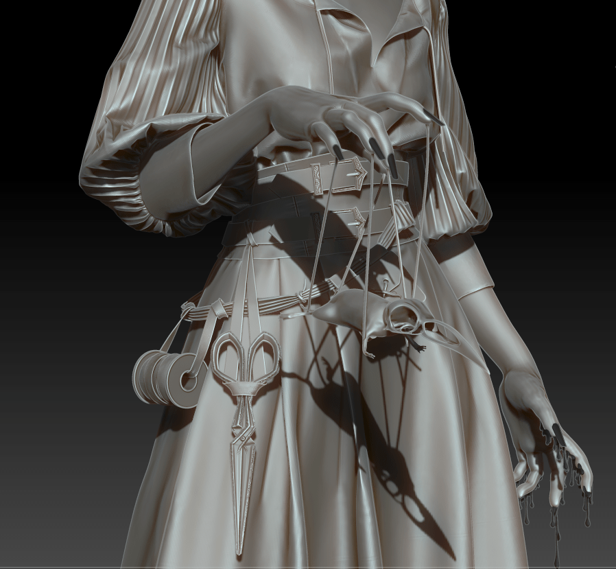
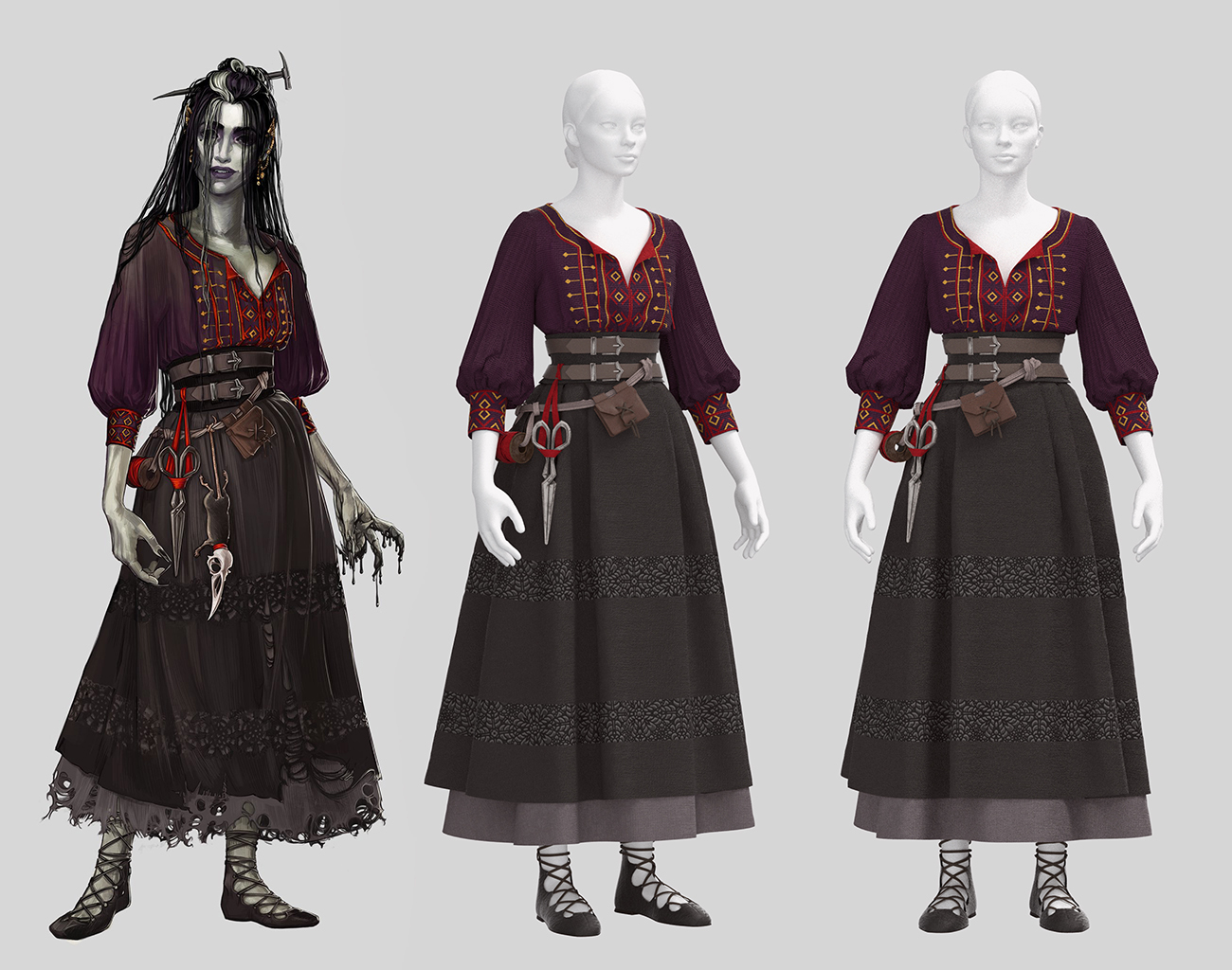
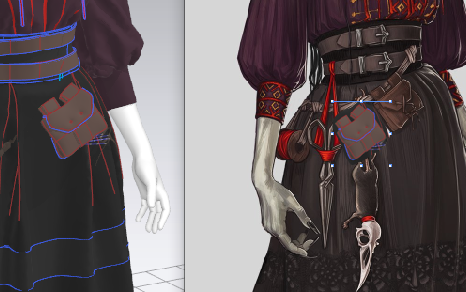
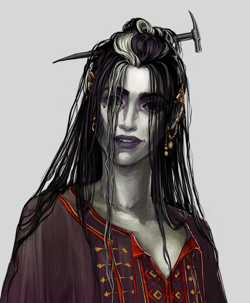
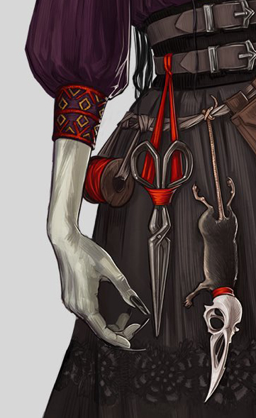
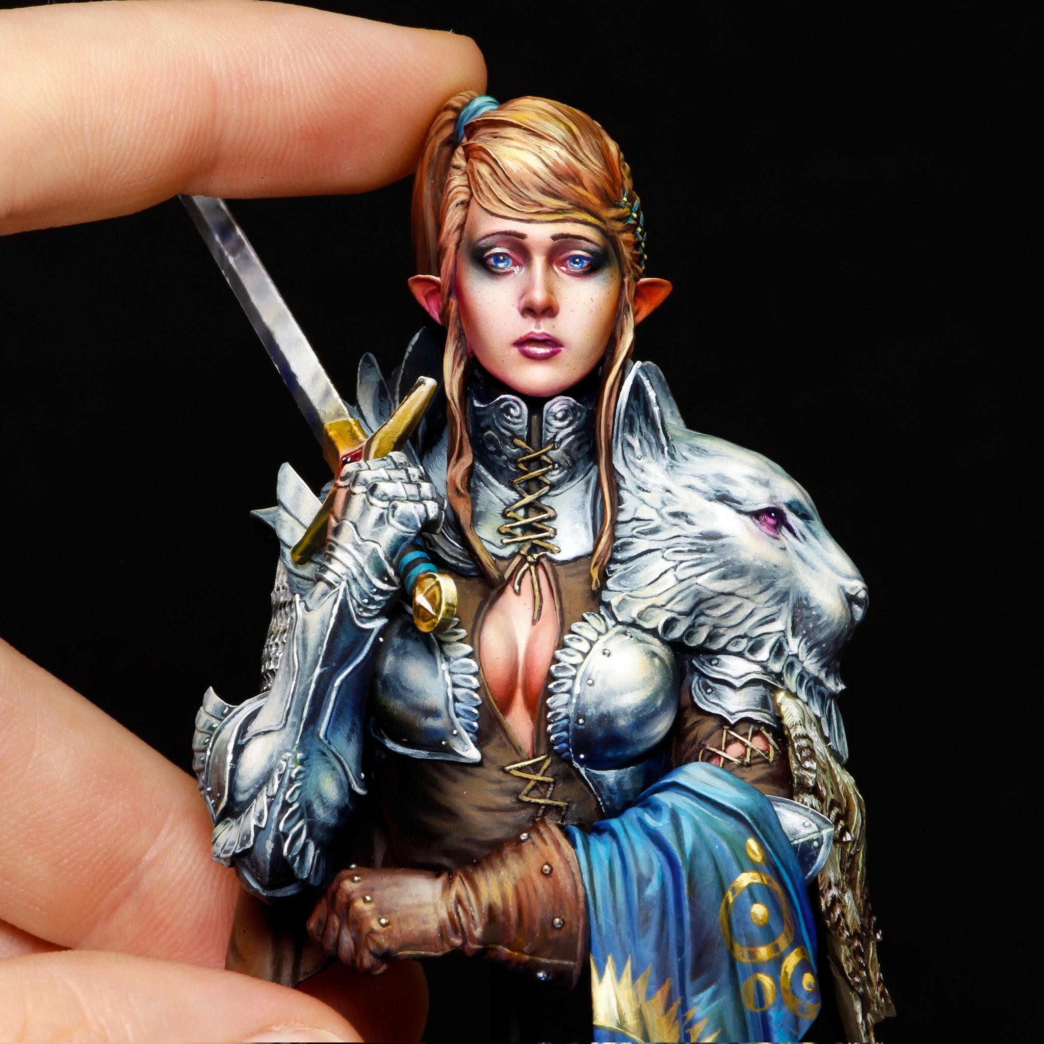
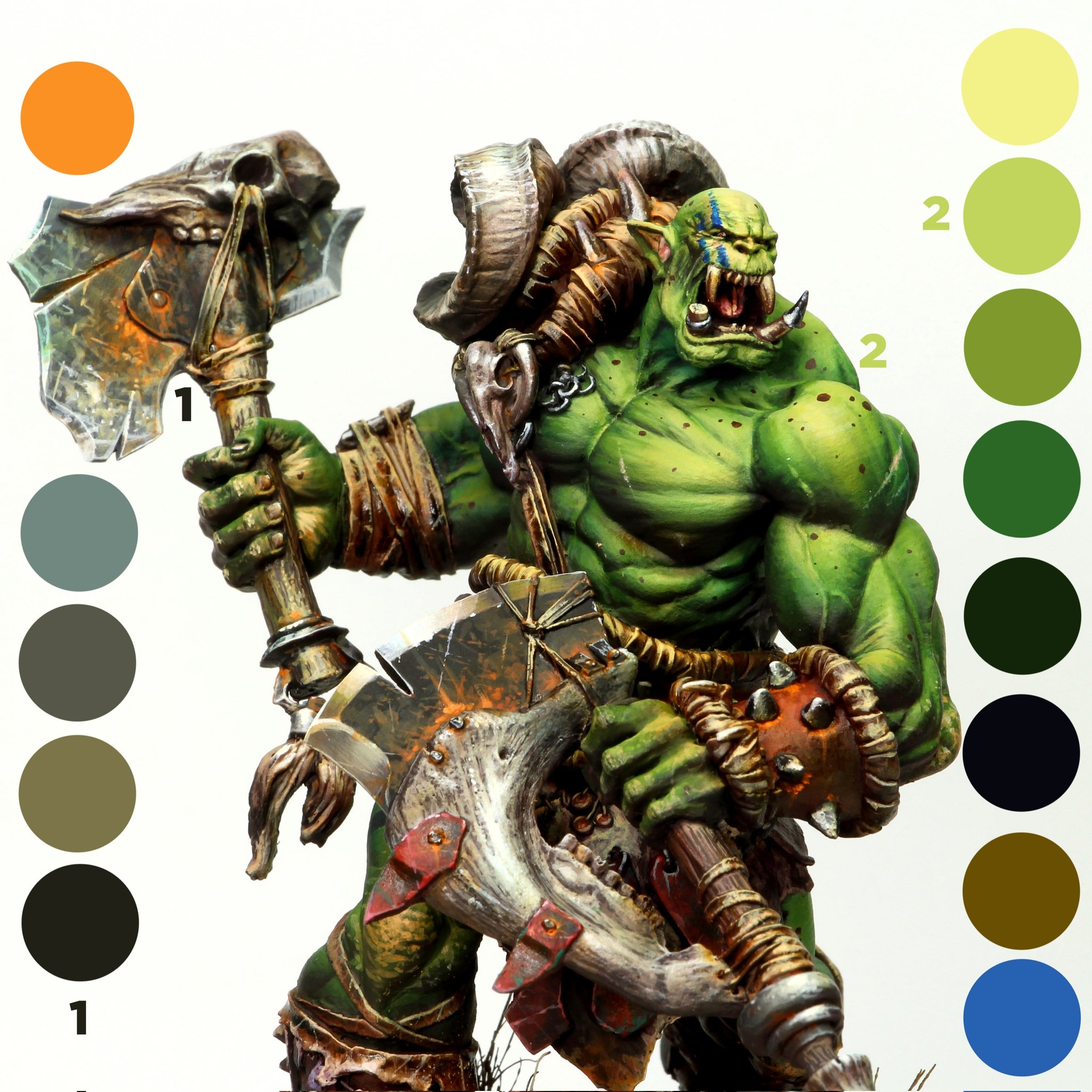
This paper seeks to codify methods for conveying character personality via specific visual elements of their design. It discusses the use of archetypes, such as the hero, villain, or trickster; pulling visuals associated with these categories is a simple way to assign specific traits to a character in the mind of the player. The authors explore the way changes in facial expression, eyeline direction, and body posture, as well as elements of traditional art such as line and silhouette, can affect character portrayal. This analysis could be expanded to break out of a reliance on stereotypes, as it does not delve into nuance, but is helpful to character artists in providing a starting framework with areas to focus on in initial design. It also made me more conscious of the impact of first impressions by the characters I create.

Pradantyo, R., Birk, M. and Bateman, S. (2021). ‘How the Visual Design of Video Game Antagonists Affects Perception of Morality’. Frontiers in Computer Science [Online]. 3(531713). Available at: https://doi.org/10.3389/fcomp.2021.531713 [Accessed: 20 October 2021].

Often, villains that are morally ambiguous lead to more nuanced and engaging interactions for the player. This article seeks to codify antagonist appearance and the message that it conveys about the character’s background and motivation. It found that most game villains were perceived as having more neutral morality (rather than classified as purely ‘evil’), and the more popular designs avoided stereotypes in favor of unexpected or even empathetic traits. It brings up several areas of note for villain design: focusing on mouth expressions, skin texture, and age were powerful tools to convey morality. These results are particularly useful for visual character designers, as they suggest specific strategies for conveying character personality and emphasize the benefits of creating morally grey characters for player engagement.

Skowronski, M., Busching, R. and Krahé, B. (2021). ‘The effects of sexualized video game characters and character personalization on women’s self-objectification and body satisfaction’. Journal of Experimental Social Psychology. [Online]. 92, p.104051. Available at: https://doi.org/10.1016/j.jesp.2020.104051 [Accessed: 19 November 2021].

This study explored the correlation between sexualized player characters in The Sims 4 and changes in the female participants’ body satisfaction, controlling for personalization, priming, and the Proteus effect. While exposure to sexualized, idealized imagery in other media has been clearly shown to shape self-image, the paper did not find such a correlation in the game studied, perhaps because advertisements and film depict an ‘other’ for comparison while games’ interactivity create a melding of identities, or that playing as a character with agency overcame feelings of objectification. It is significant in its lack of findings, particularly compared to its closest parallel study (on the online game Runescape) which found contradictory results. This suggests that perhaps the feelings of objectification exist primarily through interpersonal interactions with others and are less important in single-player games. Overall, this certainly challenged my preconceived notion that hyper-sexualized character design is inherently harmful.

Sparks, M. (2019). Metafocus: Avoiding the Uncanny Valley in VR & Serious Games. [Online]. Learning Solutions Magazine. Available at: https://learningsolutionsmag.com/articles/metafocus-avoiding-the-uncanny-valley-in-vr-serious-games [Accessed: 18 November 2021].

The uncanny valley is a well-understood phenomenon, but the clearest ways to avoid it often require high budget or complex technology, and the effects are exacerbated in VR or other full-experience mediums. The author seeks to examine what elements of character design may trigger feelings of unease and otherness in players of e-Learning or training games. The uncanny valley is encountered somewhere between heavily stylized and photo-realistic characters; while high realism is achievable, it requires more resources than stylized animation, which the article concludes is the recommended choice. Stylized design can be exaggerated or minimalist, with the former enabling more emotional connection and immersion. While this discussion is not specific to my field, taking note of this criteria is useful as I attempt to establish my personal artistic style for character design.

Stuart, K. (2014). The identity paradox: why game characters are not us, but should be. [Online]. The Guardian. Available at: https://www.theguardian.com/technology/2014/apr/24/the-identity-paradox-why-game-characters-are-not-but-should-be [Accessed: 1 December 2021].

This article examines the player-protagonist relationship in games. It argues that the interactivity means that player perception of the character lies more with their self and actions than it does with designer intent. This is strongest in first-person, where the player identifies with their character and only tenuously notices the existence of the PC. This is in contrast to third-person games, where the relationship may be seen as control or manipulation, or more positively, as co-operation. An uncanny valley exists between the character’s intentions and morality, and the player’s actions and narrative choices. I found the author’s feelings of disconnect with most characters thought-provoking, as I’ve personally had the opposite experience. The article’s attempt to categorize why this is – focusing on action more than character growth, creating un-empathetic personas, a lack of immersive technology – provides insight into how to make the player-character relationship impactful for a wider range of people.

Tosca, S. and Klastrup, L. (2009). ‘“Because it just looks cool!” – Fashion as character performance: The Case of WoW’. Journal For Virtual Worlds Research [Online]. 1(3). Available at: https://www.researchgate.net/publication/327326494_Because_it_just_looks_cool_-_Fashion_as_character_performance_The_Case_of_WoW [Accessed: 25 October 2021].

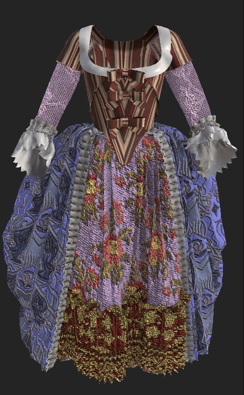
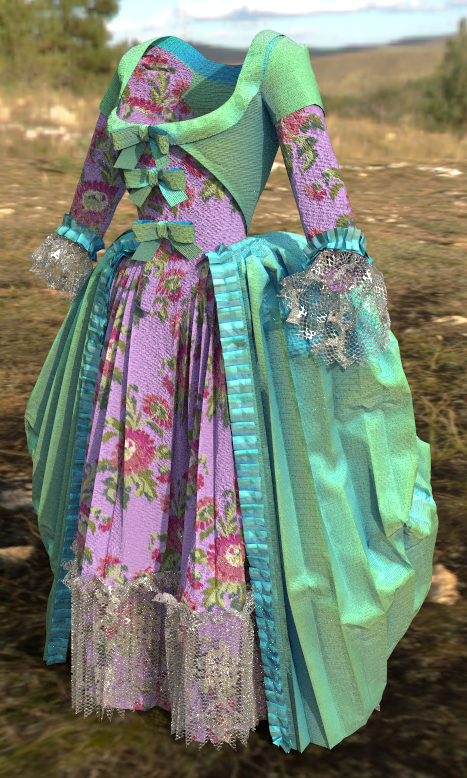
Appearance customization and equipment choices are a staple part of MMORPGs. This study polled a large group of World of Warcraft players to determine the importance and role that fashion plays in their interactions. It found that the majority were not only aware of other players’ appearances, but actively crafted their own aesthetic as a means of personal expression, achieving power and status, or even as a uniform to convey their chosen role. Although this is an older study, its conclusions remain applicable: while complexity and options for character customization have expanded, player interaction and messaging through visual appearance remains a staple of online multiplayer games. As an aspiring character designer, it’s important to provide a wide variety of costume customization, and to be conscious to scale appearance (greater aesthetic complexity and opulence) alongside equipment stats.

Practice 1: Development 1 – 3D Printing (D1 – 5)

Practice 1

Face Sculpt

I spent far too much time attempting to nail down my head sculpt for Laudna! The character has very unusual facial features, often described as ‘doll-like’ in her exaggerated eyes and mouth. My head anatomy is definitely improving as I create more of these, but I had to fight some of my instincts to get that slightly cartoon-y effect. Luckily, I think the final version straddles the uncanny valley in just the right place!

Head Retopo + XGen Prep

After experimenting with (read: banging my head against a wall) sculpted hair strands to very little success, I decided to create Laudna’s hair in XGen instead. Ultimately I’d like to create hair cards to make this character fully game-ready, but given my timeframe, I’ll need to settle for everything-but-the-hair in low-poly.

To prep my head for XGen, I first retopologized it by breaking up sections of my high-poly sculpt with polypaint and running groups-priority ZRemesher on it. A little manual tweaking later and I ended up with some decently good edgeloops, if potentially too high-poly geometry. I then subdivided my mesh a few times and projected the original high-poly mesh onto my low.

A single seam and a quick UV unwrap in Maya, and then a hairline density mask painted in ZBrush, and the head was ready for hair.

XGen Hair

I definitely struggled with the hair in all aspects this time around. I had some experience with XGen before, but not for so complex a hairstyle with a stringy, wet-look. I first started by breaking down sections of the hair on the concept art to decide how to divide up my descriptions. Going into XGen, I set up my descriptions and started creating the different sections of hair.

By far the most difficult part was experimenting with different strand modifiers to get that greasy effect. I ended up layering quite a few clumps and adding some curl and noise modifiers so that each strand twists around itself. I don’t plan to do my final render in Maya, but I did experiment with the shaders just to better visualize my overall shapes. XGen proved to be the right tool for the job, as being able to continually tweak individual strands made it far easier for me to lay out the hair than in my initial ZBrush sculpt.

Bibliography

Friederichs, H. (2021). Laudna Character Portrait – Critical Role. [Image]. Available at: https://critrole.com/hype-check-out-our-official-campaign-3-character-art-by-hannah-friederichs-and-jrusar-art-by-clara-daly [Accessed: 4 November 2021].

Reflection Final: Methodology

Reflection, Research and Enquiry

In creating such a number and variety of projects this semester, I’ve noticed some patterns in the way that I work as I attempt to establish my personal style and aspirational place in the games industry.

My approach to each project generally begins with visual research: reference images, mood boards, and investigations into others’ work. I keep computer folders of carefully-organized inspirational pieces (certain color schemes, painting styles, ways of using lighting, stylized elements..) as I encounter them on Artstation or Reddit, and often refer back when starting a new piece. I spend very little time sketching, because I have a picture in my head of the general outcome of a project but am not a strong traditional artist.

Instead, I prototype. If there is a technical aspect that I’m unfamiliar with, I start out with the parts that I’m most concerned about and do quick test projects to work out those processes; otherwise, I worry I’ll be panicking up against a deadline. Often, the most difficult research step is simply figuring out which terminology to search for (i.e. a uniquely-named operation in a software). I will look for tutorials on Youtube and forum posts for very general techniques, but tend to assume that experimentation is best for more specific tasks. I’m coming from a cosplay background where there’s never a set tutorial for the strange piece I’m trying to create and everything must be invented from scratch, and I’m still breaking out of that mindset.

Once I start sculpting, I’ll frequently pause and compare back to the original reference image(s) to do reality checks and avoid fixating on an inaccurate mental visualization of how a piece should look. I’ve found that generally I much prefer the stage where my sculpts are heavily mutable, as I struggle with being locked into a decision or finalizing one step of a piece. I enjoy being able to toggle between large overall shapes and small details, so my favorite tasks have been garment design in Marvelous Designer and early rough sculpting with ZBrush’s Dynamesh.

Originality and novelty are extremely important to me. I usually look at a potential idea, figure out what influences may have put it into my head, and try to find a unique twist to distance myself from others’ work; I dislike the idea of copying or feeling like my art is not unique. I also really enjoy discovering original techniques, and tend to introduce complexity or force the invention of a new way of doing something (often because I’m stubborn and refuse to accept that an outcome isn’t possible). On the downside, this means that I sometimes waste significant time and frustration when I could just compromise on my initial vision.

Many of the entries in my annotated bibliography were sources that I found organically through my weekly research, and relate to either conveying meaning through character design or elaborate on potential career specializations. I found that I was mainly searching for academic sources, as many of the non-peer-reviewed articles that I found were limited, one-sided, or heavily biased; I generally don’t seek out many ‘opinion’ pieces, rather focusing on technical walkthroughs or more substantiated sources. On a similar note, I tend to prefer experimentation over explicit tutorials, or at least creating small test pieces to prove that a technique is effective rather than simply trusting a source. My explorations this semester have confirmed my initial choice to pursue character art (as opposed to environment or VFX), but more importantly, have clarified my niche in costume, armor, and accessory modeling. These have easily been the projects that I’ve been most excited and motivated to work on, and from my research I feel confident that there is a space in the industry for that focus.

Practice 1: Development 1 – 3D Printing (D1 – 4)

Practice 1

Overskirt Hole Tests

One of the major things I’m still trying to resolve on this project is the holes in Laudna’s skirt hemline. Because I intend to both create the character digitally and 3D print her, they’ll need to be backed by geometry, but I’d also like to be able to bake a high-poly version with opacity onto my nicely-topologized low res model. Luckily, it seems to work fairly similarly with either a real hole or a simple indentation when it comes to baking, as long as I set the bake distance to a higher value.

Otherwise, I spent a bunch of time this week tweaking minor sections of Laudna’s clothing to better match the concept art. Her shirt and corset are sitting asymmetrically on her body, so I achieved this effect with loads of invisible tacks. For her skirt, I created a frozen plane (to be hidden later) and tacked the underlying petticoat to that, guaranteeing the perfect skirt flourish in every simulation.

Pâté and Posing

The character has an incredible in-game moment that inspired me to create a more dynamic pose for my sculpt: “About this time, you see rubber bands snap from each of Laudna’s tips that go to his head and each of his four limbs, and they kind of look like rubbery black sinew. She lifts him up and kind of starts puppeting him. ‘Oh, hello, I’m Pâté de Rolo, pleasure to meet you!'”

I also quickly whipped up her raven-headed-rat accessory in ZBrush and played around with posing in Marvelous. As per usual, I’m frustrated with the native posing tools, but after a LOT of time holding my hand up in a mirror, I think I like the general shapes she’s creating. I’m glad I decided to go with her marionette pose rather than the less striking pose from the concept art.

And that’s all of Laudna’s clothing and her main accessories finished!

Bibliography

Critical Role. (2021). Marisha Rays Dead Rat Pate Critical Role C3E2. Available at: https://youtu.be/H4O_nRVctxE [Accessed: 27 November 2021].

Friederichs, H. (2021). Laudna Character Portrait – Critical Role. [Image]. Available at: https://critrole.com/hype-check-out-our-official-campaign-3-character-art-by-hannah-friederichs-and-jrusar-art-by-clara-daly [Accessed: 4 November 2021].

Reflection: Posing Pipeline

Practice 1, Reflection, Research and Enquiry

When to pose a character?

I’ve been wrestling with a conundrum as I’m working on one of my final development projects, a character sculpt heavily featuring Marvelous Designer clothing. This piece is intended to be both a 3D printed figure (in a single pose) and a digitally rendered/painted piece (displayed in two separate poses as required by a competition I’m entering). I’m trying to decide at which stage of the pipeline I should put this character into her final pose(s): before exporting from Marvelous Designer to take advantage of its fabric simulation, or after exporting and detailing (sculpting her in a T-pose) at the end of the process.

Investigation

The issue is, there isn’t necessarily an authoritative answer to this question. In investigating this, I’ve consulted two lecturers, watched countless Youtube sculpting timelapses, and delved into 3D modeling forums; opinions are very split.


For example, this article by game artist James Hyun covers a full step-by-step method for sculpting a full stylized character. The artist does nearly all of the piece with the character in a T-pose, only giving her a final pose at the last step. This seems to be common for creating game- or animation-ready cartoon-y characters, as also demonstrated in this official Blender tutorial. However, these examples are of simplified characters with form-fitting or basic-planar clothing and little detail. My piece relies on complex, layered, draped clothing and will eventually have things like topstitching and embroidery details to contend with.


On the other hand, this CGSociety forum post is full of responses advising to sculpt in a dynamic pose in order to visualize overall composition and silhouette. One commenter mentions the downside of not being able to use symmetry tools in this scenario, but as my fabric patterns are inherently symmetrical and I’m working from a basemesh for the body, this is less of a concern. For detailing, the fabric has already been simulated asymmetrically even on a T-posed character, so symmetry doesn’t apply.

Analysis re: Laudna

Approaches seem to be very correlated with the background of the answerer, as they have different requirements. Those who focus on 3D printing, such as DnD miniature sculptors, would say to pose the character first, as it will only exist in that single pose and topology isn’t a concern. A similar approach is favored by artists coming from a traditional drawing or sculpting background, where the pose is a vital first decision for a piece. On the other hand, game artists who expect the character to be rigged, animated, and moved into a hundred poses would push for sculpting in a T-pose and then posing it in the final stage. So what should I, someone who’s using the same piece for both purposes, choose?

I have an additional complication added here: 70% of the content of my sculpt consists of draped fabric. I’ll need to sculpt the character’s face, hair, few accessories, and small portions of her arms and legs, but she’s mainly covered in meters of flowing clothing. The main pose I’m considering has one of her (long-puff-sleeve-adorned) arms bent upward, and her hip cocked to one side, altering the way that three layers of skirts fall. I’m very concerned with stretching the details in the fabric texture after the fact.

With this in mind, I’ve decided to opt for the pose-first route, with the more complex pose being the main one and the second pose manipulated from that. I don’t yet know how to set up fabric rigging so that it moves appropriately with the character, and I think animation generally will be outside of the scope of this course for me. If she had closer-fitting clothing or pieces that moved with her pose (e.g. armor pauldrons that remained static apart from positioning), then I would choose otherwise. This makes my character inherently not game-ready, but will allow me to focus on getting really clean topology in a dynamic pose and learning how to add stitching and texture details without worrying about distortion.

This is one of the lessons I’ve been trying to work on over this semester: not taking on too many brand new skills with each project. I’ve found that a slightly narrower focus allows me to explore each of those techniques in more depth and better understand how to apply them to other projects in the future.

Bibliography

Blender. (2019). Stylized Character Workflow with Blender. [Video]. Available at: https://youtu.be/f-mx-Jfx9lA [Accessed: 23 November 2021].

Friederichs, H. (2021). Laudna Character Portrait – Critical Role. [Image]. Available at: https://critrole.com/hype-check-out-our-official-campaign-3-character-art-by-hannah-friederichs-and-jrusar-art-by-clara-daly [Accessed: 4 November 2021].

Hyun, J. (2020). Complete Workflow for creating a Stylized 3D Female Action Character. [Online]. Discover | The Rookies. Available at: https://discover.therookies.co/2020/06/10/complete-workflow-for-creating-a-stylized-3d-female-action-character [Accessed: 20 November 2021].

rodfpv. (2014). On posing vs directly sculpting a pose. [online] CGTalk. Available at: http://forums.cgsociety.org/t/on-posing-vs-directly-sculpting-a-pose/1623674/2 [Accessed: 22 November 2021].

Practice 1: Development 1 – 3D Printing (D1 – 3)

Practice 1

Additional Accessories

This week, I mainly focused on creating more of and adjusting Laudna’s existing accessories. I tweaked the size of her belt pouch after doing a side-by-side reality check of my model next to the concept art; this was frustrating in that scaling required me to re-simulate the entire pouch, which I had carefully forced into place previously. I then built her belt buckle using nearly all the same techniques I had done for her pair of scissors: sculpting in ZBrush with the same filigree nanomesh design, and textured in Substance Painter.

She has a wooden spool holding some sort of fabric on her belt, which I sculpted quickly in ZBrush. However, because I wanted a good layout for the woodgrain texture, it was time to figure out manual UVing in Maya. This was a good starter project for the subject, as it only had a few seams. I was then able to pull it into Substance Painter, apply a woodgrain texture, and export the height map as a displacement map back into ZBrush; this is going to be extremely useful for applying fine details physically onto my sculpts, a necessity for 3D printing where the texture can’t do any of the work.

With a quick texture created in Substance, I pulled my accessories back into Marvelous so that I could simulate fabric interacting with them. I wrapped strips of fabric around the spool and created a ‘holder’ for the scissors. This is going to be an extremely useful thing to know in future if I ever need custom avatars or even want to sculpt solid supports for garments.

Finally, I went into Photoshop and actually sat down to create a texture for the embroidery design on the front of her shirt. This involved a lot of back-and-forth between Marvelous and PS, but I’ve managed to make a fairly accurate design that I can hopefully use to create raised embroidery with.

Putting it all together

Here’s where I’m at from this week! I’ve made major improvements to the overall silhouette and the piece is really starting to come together now that I can see the basic fabric textures.

Bibliography

Friederichs, H. (2021). Laudna Character Portrait – Critical Role. [Image]. Available at: https://critrole.com/hype-check-out-our-official-campaign-3-character-art-by-hannah-friederichs-and-jrusar-art-by-clara-daly [Accessed: 4 November 2021].

Reflection: Stylized Mini Painting

Practice 1, Reflection, Research and Enquiry

Observing Laudna

Looking forward on my Laudna figure, I’m starting to think about the overall style I’m going for. Since she’ll be 3D printed, all of her details will need to be physically sculpted into the mesh rather than simply painted on afterwards, meaning that this style is something that I’ll need to establish now.

I’d like to somewhat match her character art, partially for accuracy and partially because it’s stylized in a way that I’ve never attempted before. At a glance, she looks somewhat monochrome. However, a closer look reveals a fair amount of hue jitter and colorized shadows. There are also visible brushstroke lines and crosshatching while still having strong 3D shading, which straddles the line between flat 2D and dimensional 3D art. She isn’t too detailed (you can’t see individual threads or embroidery), but there’s a great deal of detail implied with the sharp highlights on specific areas (e.g. metallic jewelry in her hair). Finally, every part is outlined in black, which gives it a slight cel-shaded look; for my final (digital) render, I’m thinking of applying an outline filter to create that effect regardless of viewing direction.

Inspiration: Sergio Calvo Miniatures

As I have plans to produce Laudna as a 3D printed miniature, I started investigating expert mini painters. An instant spotlight I found is Sergio Calvo, a professional miniature painter for DnD minis and figures. Apart from being impressive purely in the amount of detail he manages to convey on such tiny pieces, he also demonstrates quite a few useful techniques in a similar style to Laudna’s concept art.

I’ve noticed that he tends to make heavy use of gradients, often between two different hues. This helps make his pieces much more dimensional and mimics the way light would hit much larger objects. He also uses visible, consistent brushstrokes rather than perfect blending in some areas to add texture. For metal parts, he uses a technique known as ‘NMM’ (non-metallic metal) painting where he manually adds in highlights, reflections, and worn edges without relying on an outside lighting source (as with real metallic paint). This is a technique that I often used when painting my own cosplay armor, where it won’t necessarily always be photographed in a way that brings out the cartoony video-game look, and so I’m glad to find that I do have some background that I can apply to this project.

My own cosplay paintjob (Orrian armor from Guild Wars 2)

I also admire his use of false (often colored) lighting, highlights, and shadows to make details pop; it’s clear he picks a light direction at the start and paints the entire mini with it in mind. This gives a sense of the character’s surroundings (are they outside? In a tavern? Near synthetic lighting like a control room?). With this, he tends to have a larger contrast between light and dark areas than would exist in reality (or with non-painted lighting), again adding more depth.

Many of the same styles and techniques apply to digital painting as well, especially since I’d like to maintain the crosshatched brush strokes, gradient highlighting, and tinted shadows present in the original concept artwork. Often, 3D sculpts are painted in a flat way and rely upon external colored lighting and filters to create this effect, but this ‘painted shading’ look is clear in some of my favorite painterly-style games such as Dishonored, Borderlands, and Life is Strange.

Traditional drawing and painting skills are some of my weakest areas – I’m quite insecure in my lack of sketching ability, and it’s something that I don’t often practice. I’m also very new to digital painting in general. Because of this, I find it helpful to break down other artists’ work into easily identifiable steps (base color, gradients, shadows, highlights, false lighting..) to make it more manageable. I plan to basically follow along with this sequence when I paint my Laudna figure in Substance.

Stylized Painting Tips + Procedural Adjustments

In anticipation of painting this piece, I’ve been generally collecting bookmarked articles that catch my eye as potentially containing useful techniques. I discovered a great writeup, ‘Character Art: Balancing Between Stylization and Realism‘ by Georgian Avasilcutei, character artist on 2/3 of the aforementioned stylized games. Beyond describing a useful pipeline for stylized painting, he reveals several creative ways of programmatically enhancing the painterly look.

Georgian Avasilcutei / 80Level

He starts out creating his characters fairly high-poly and realistic-looking, specifically mentioning material choices and fine details. This is something I’m more comfortable with than stylized, as I tend towards realism in my work. He then does some automated adjustments to the texture maps in Photoshop, such as adding a cutout filter to the green channel of his diffuse and normal maps, and tweaking the settings from there; this creates distinct brushstrokes without having to manually paint them in. He then adds more hand-painted details but with a HSB jitter on the stroke – this is a really smart way to get that nice color/lightness variation without having to continually go into the color palette.

As I said, I’m not the strongest digital painter, so I appreciate any ‘hacks’ I can find! Both of these are useful methods for ‘faking’ the way more practiced artists paint their pieces. I intend to take advantage of both, at least while I work out my own style. In general, I’ve found that I prefer more automated methods for creating art (filters, adjustment layers, shader creation..) because I’m not yet happy with my from-scratch skills.

Bibliography

Avasilcutei, G. (2021). Character Art: Balancing Between Stylization and Realism. [Online]. Medium. Available at: https://medium.com/@EightyLevel/character-art-balancing-between-stylization-and-realism-19ac2a8054a6 [Accessed: 21 November 2021].

Calvo, S. (2021). Sergio Calvo MiniaturesGallery. [Online]. Sergio Calvo Miniatures. Available at: https://sergiocalvominiatures.com [Accessed: 22 November 2021].

Friederichs, H. (2021). Laudna Character Portrait – Critical Role. [Image]. Available at: https://critrole.com/hype-check-out-our-official-campaign-3-character-art-by-hannah-friederichs-and-jrusar-art-by-clara-daly [Accessed: 4 November 2021].

Practice 1: Development 1 – 3D Printing (D1 – 2)

Practice 1

Clothes

Technically, I started working on Laudna’s clothing during the original 3D print week (I was excited to jump back into Marvelous!), but haven’t had a chance to gather up my progress photos until now. Laudna’s base garments were fairly straightforward, as her shirt and skirts aren’t particularly fitted, although I did have to work out how to force the shirt under the tight-fitting corset without adding too much bulk. Her shoes presented a bit of a challenge, as they’re something I’ve never patterned before, but I was able to reference basic ballet flats and tweak them from there.

For Laudna’s skirts, I made good use of my experimentation with manual pleating and created a few pleats rather than gathers to achieve that A-line silhouette. I’m still trying to decide how to flare out the side of the skirt to better match the concept art – perhaps with a stiffer material preset or a petticoat.

Overall, she still needs some proportion and silhouette tweaks, as the character has slightly in-human proportions, so I think my first task next week will be to adjust the avatar to match.

I started on the belt pouch as well. The basic shapes were very simple, but I ran into many problems trying to create the knot closure and overlapping seams along the bag edges. Eventually, through a lot of selective freezing and a bunch of invisible tacks, I managed to get the knot in place. For the seams, I played around quite a bit with setting the seam angle and offset so there wasn’t too much pressure on opposing pattern pieces.

I also started doing basic experimentation with texturing on exported UVs (the blue squiggly lines are, of course, a placeholder!). Marvelous has a neat system for applying textures generally over a surface, so I was able to play around with a few seamless height maps and torn fabric alphas. Eventually I’ll texture her properly by hand in Substance, but having a PBR system built-in is a nice feature.

Render Progress

This is where I’m at after this week! The first image was rendered using the built-in outline tool for that pattern-cover look, and the second was just rendered normally within the program.

Bibliography

Friederichs, H. (2021). Laudna Character Portrait – Critical Role. [Image]. Available at: https://critrole.com/hype-check-out-our-official-campaign-3-character-art-by-hannah-friederichs-and-jrusar-art-by-clara-daly [Accessed: 4 November 2021].