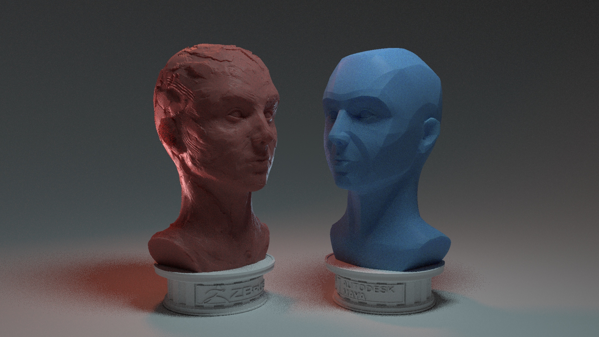
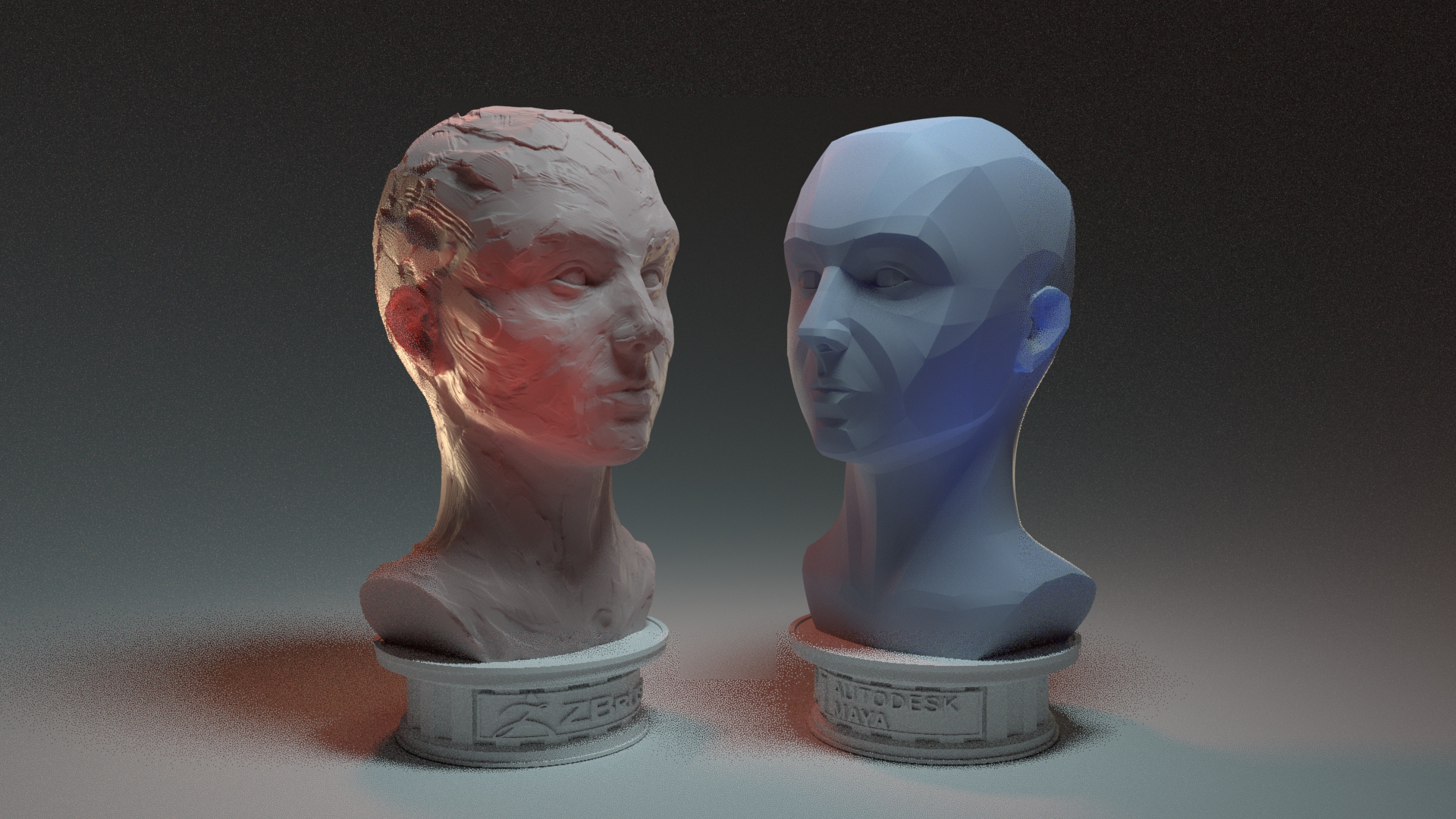
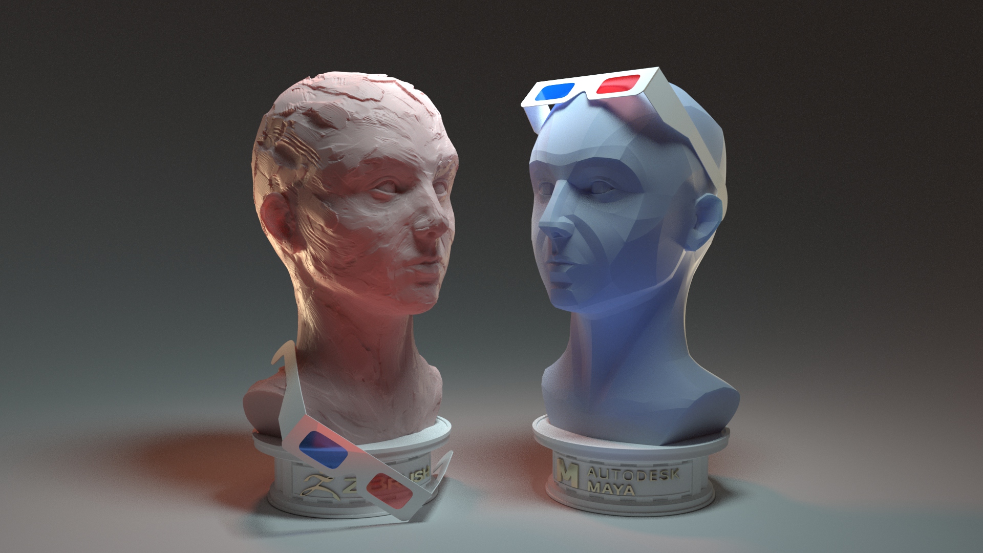
Practice 1: Places of the Mind (A2 – 1)

Practice 1

Skill Goals

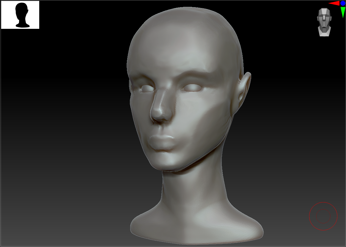
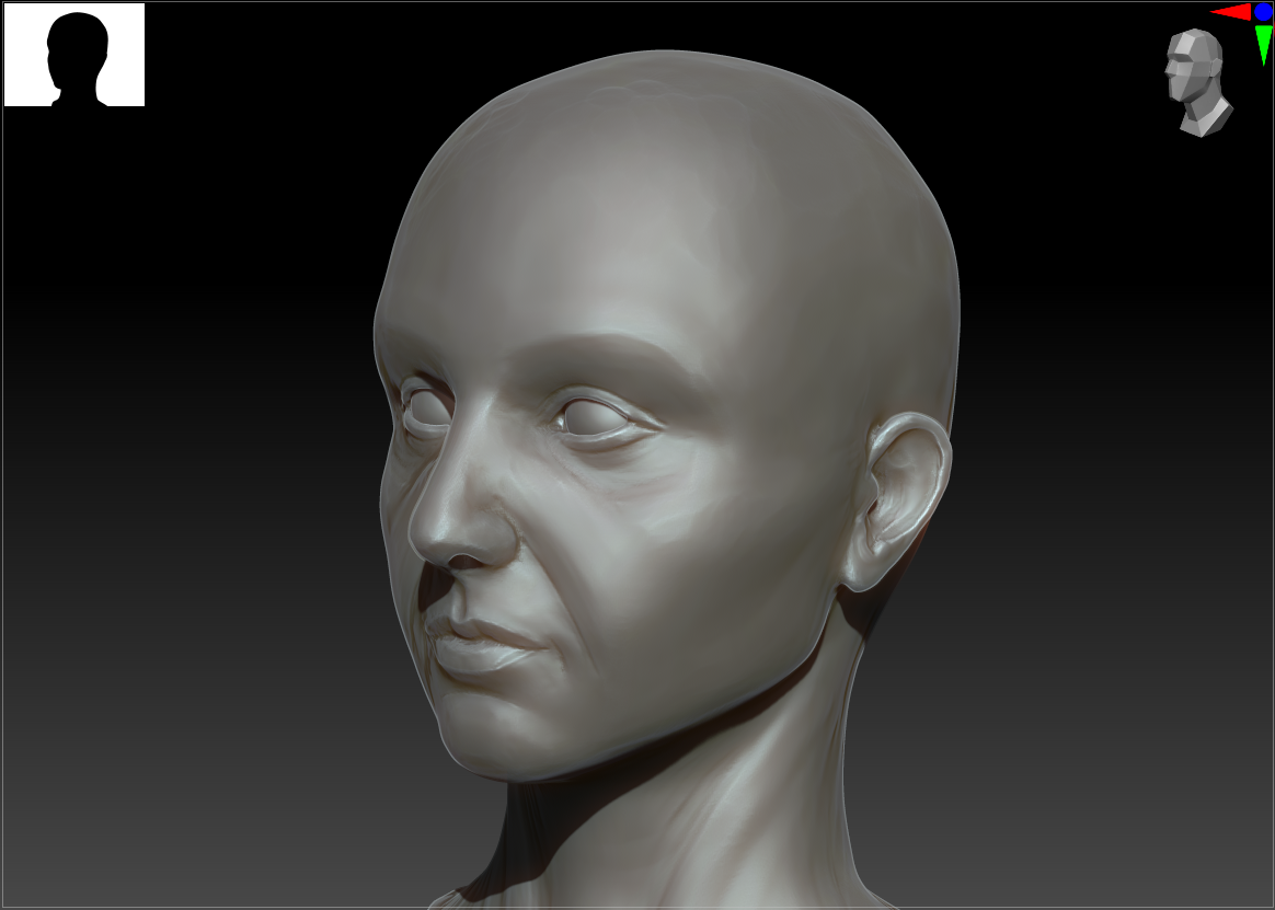
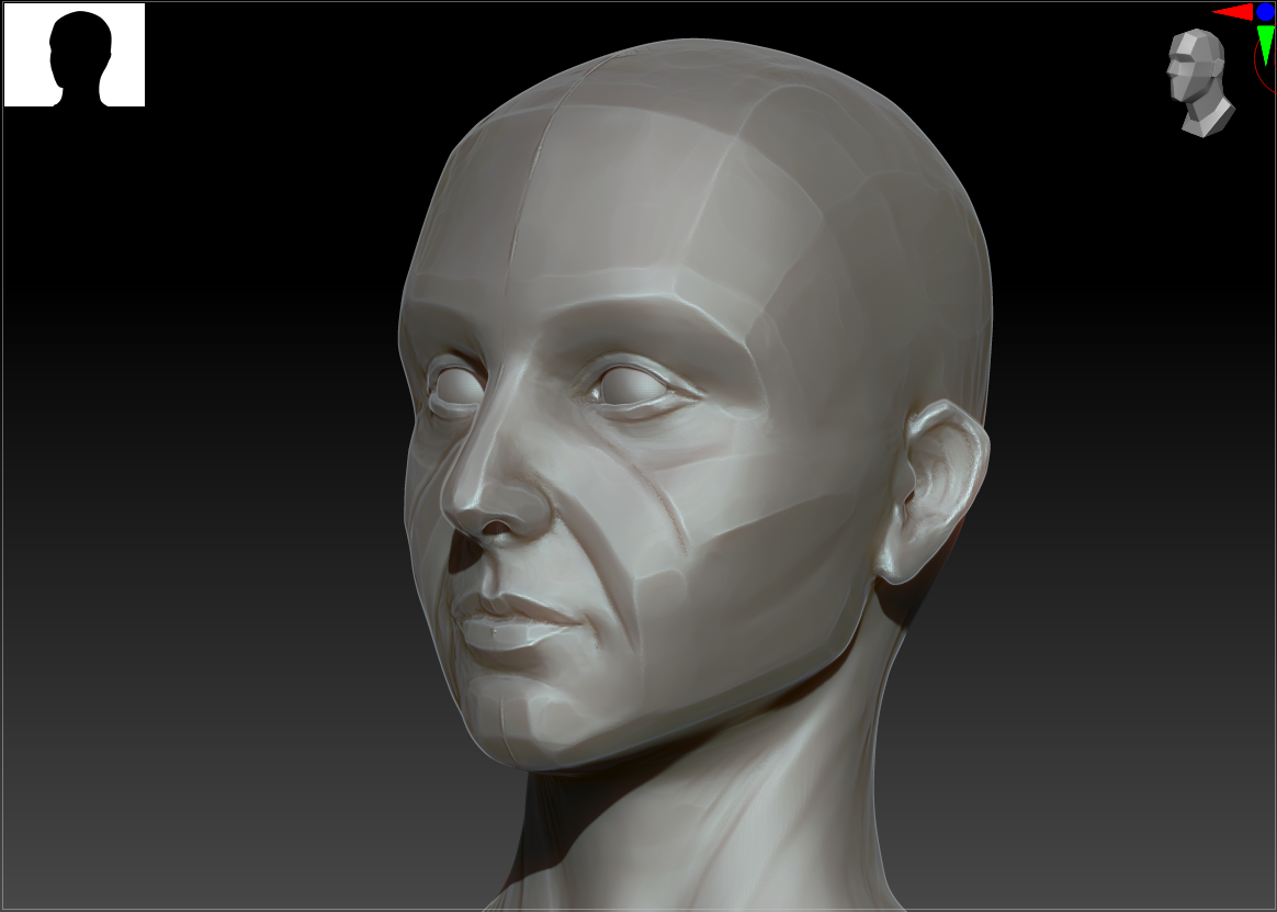
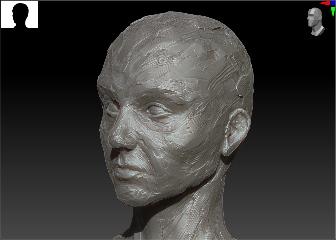
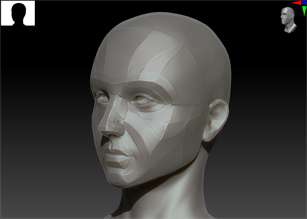
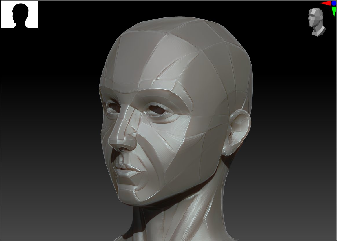
I’m going into this week with a set of learning objectives, mainly centered around figuring out the high-poly low-poly pipeline for games. I have only ever done extremely high poly models meant for rendering; previously I’ve used automated decimation tools to reduce the polycount to a few hundred thousand for 3D printing, but never to the level (or with the manual care) that’s necessary for real-time. As I ultimately want to be making (potentially very performance-focused, e.g. mobile or portable console) games, it’s vital that I understand the full process.

From skimming a few timelapse videos and chatting with friends with more experience in the industry, these seem to be the main steps:

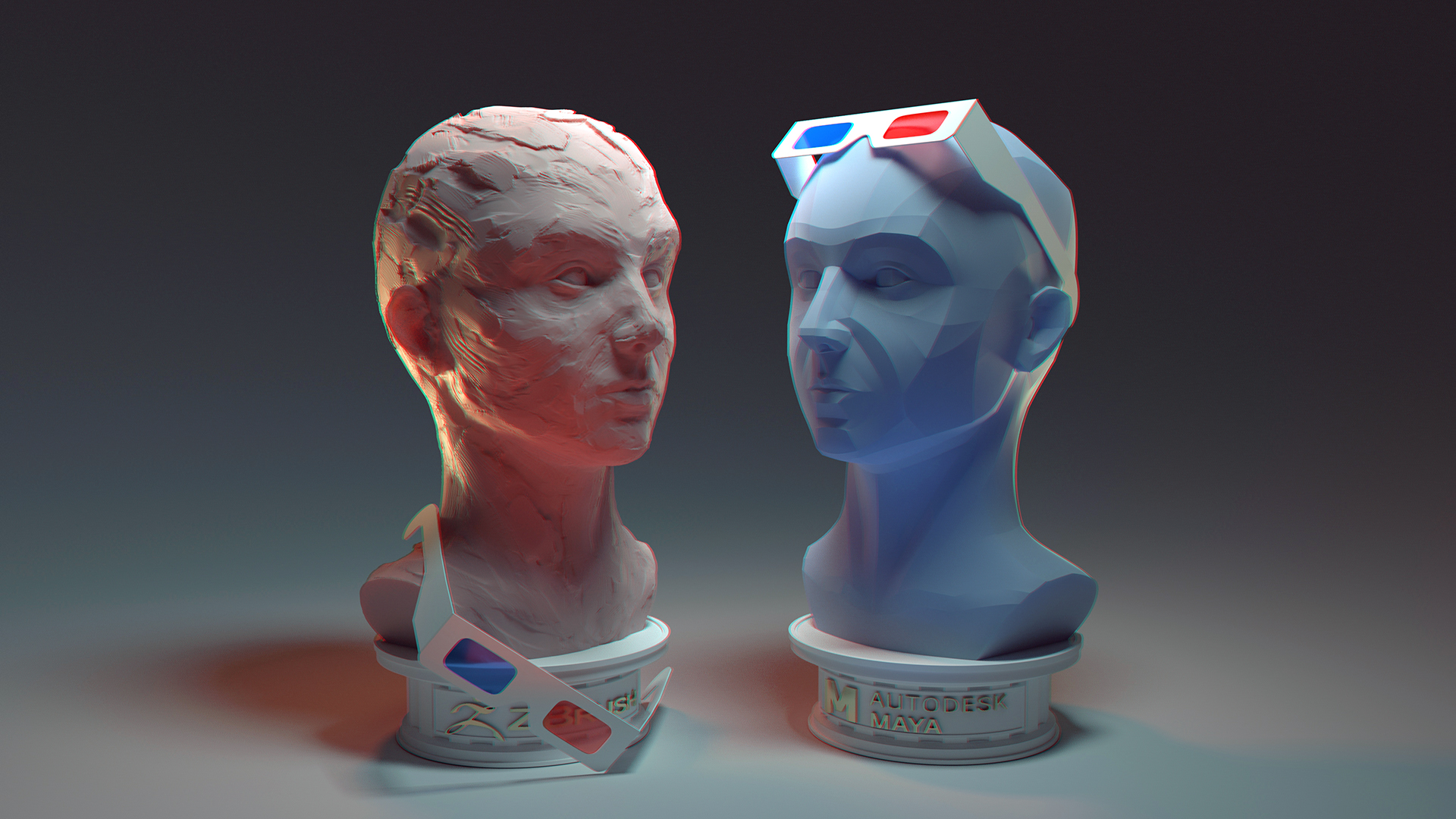
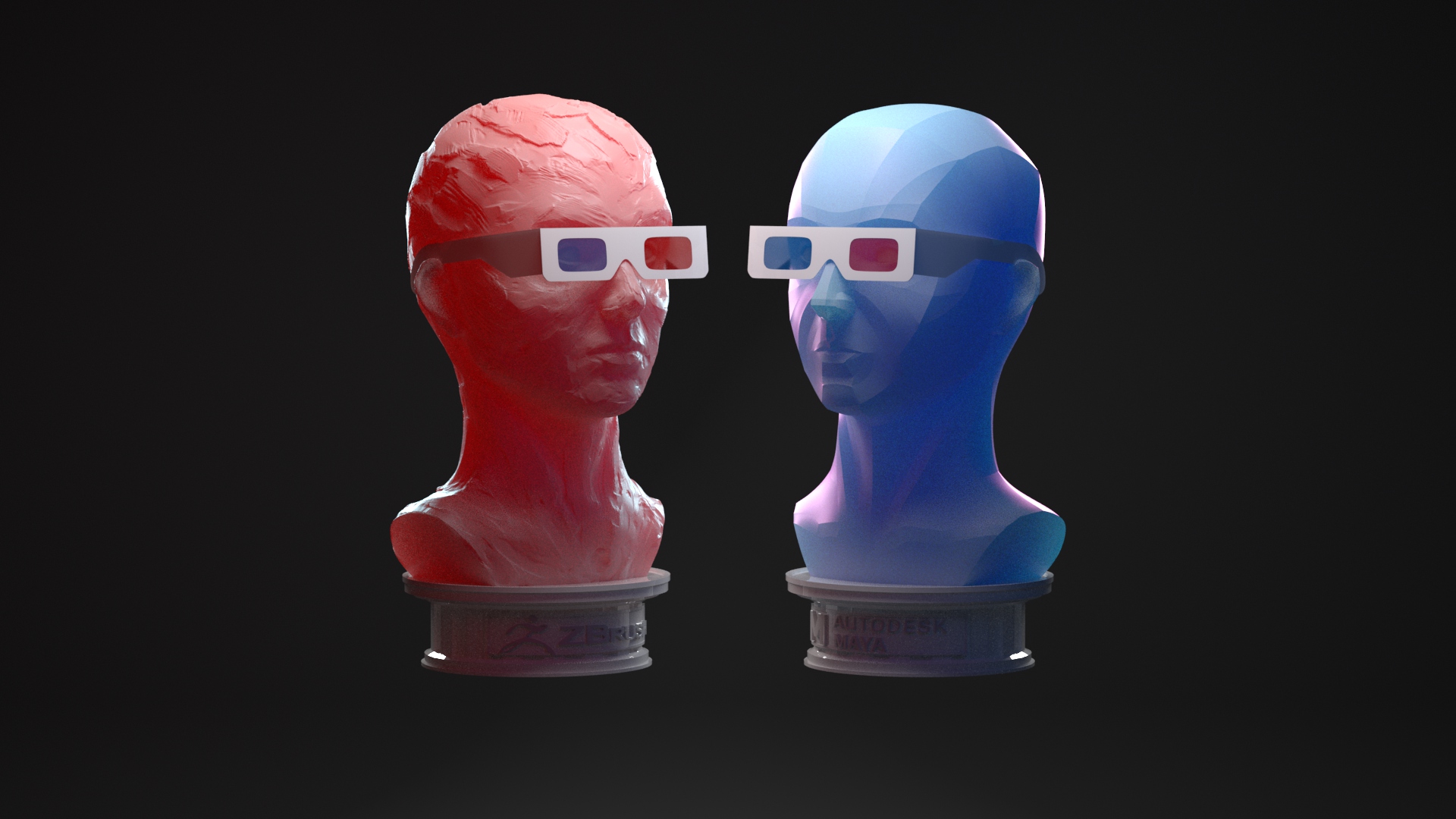
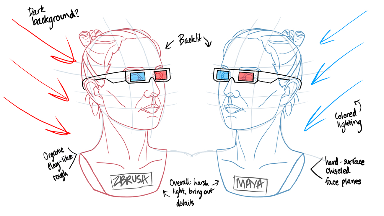
  • Low-poly base sculpt in ZBrush or Maya
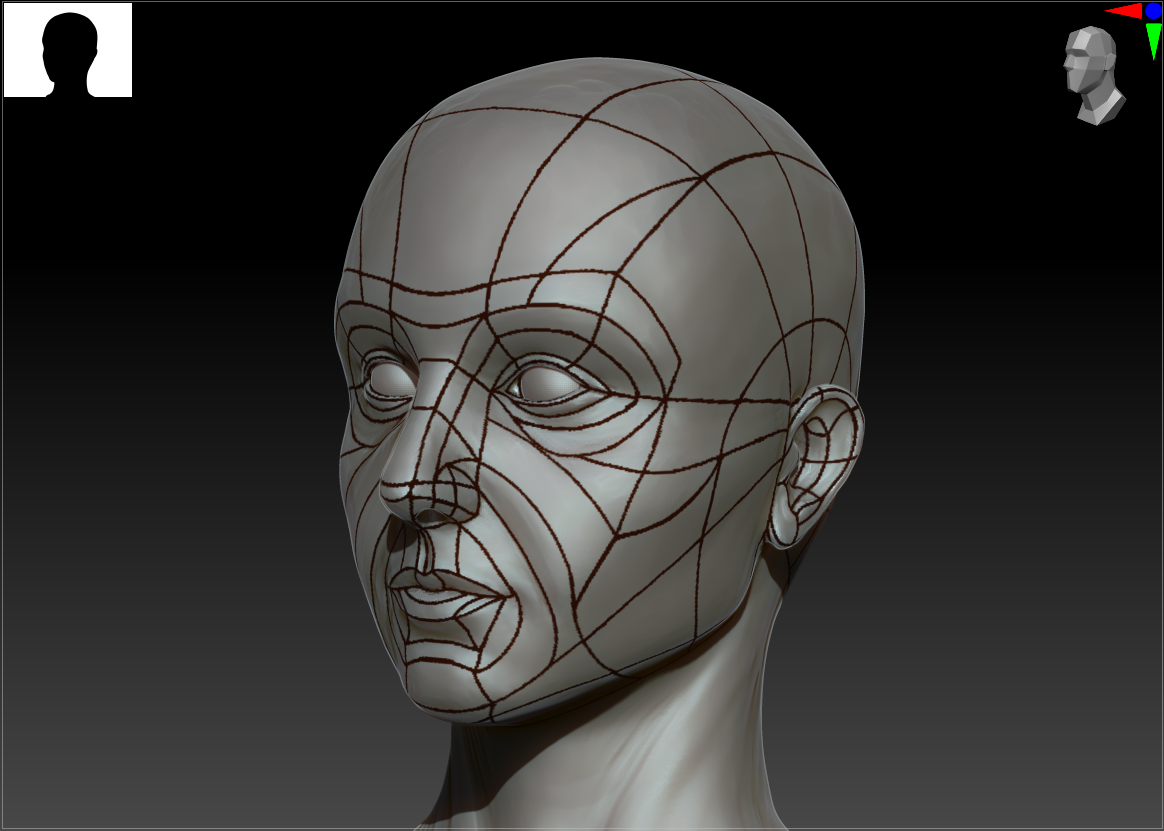
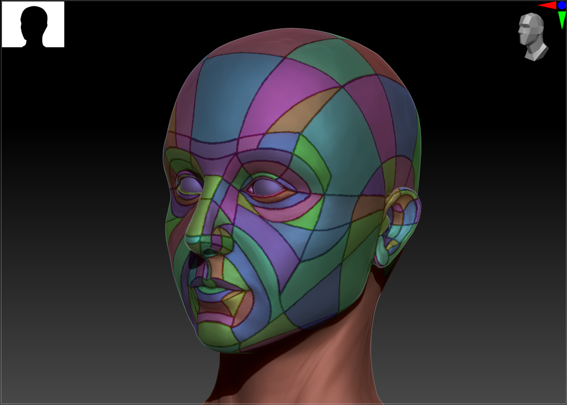
  • Pull into Maya to create UVs
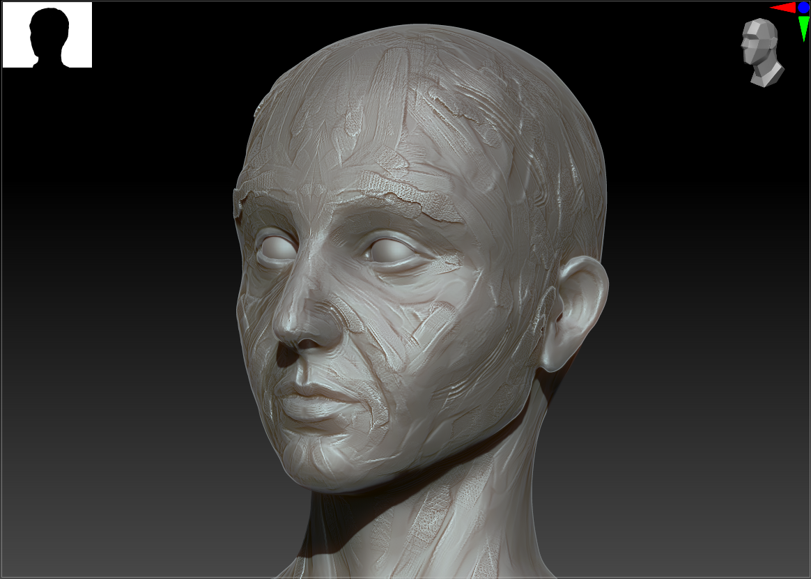
  • Back to ZBrush for the high-poly sculpt (added details, organic shapes)
  • Import low-poly into Substance Painter for texturing and bake maps using high-poly exported file
  • Export fully painted and textured piece to Unreal for real-time renderin
    (Obviously, there may be some changes if, say, the high-poly model needs to be retopologized or a character needs to be rigged, but I believe these are the basics).

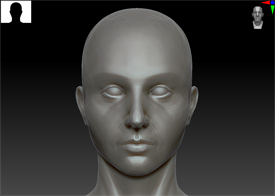
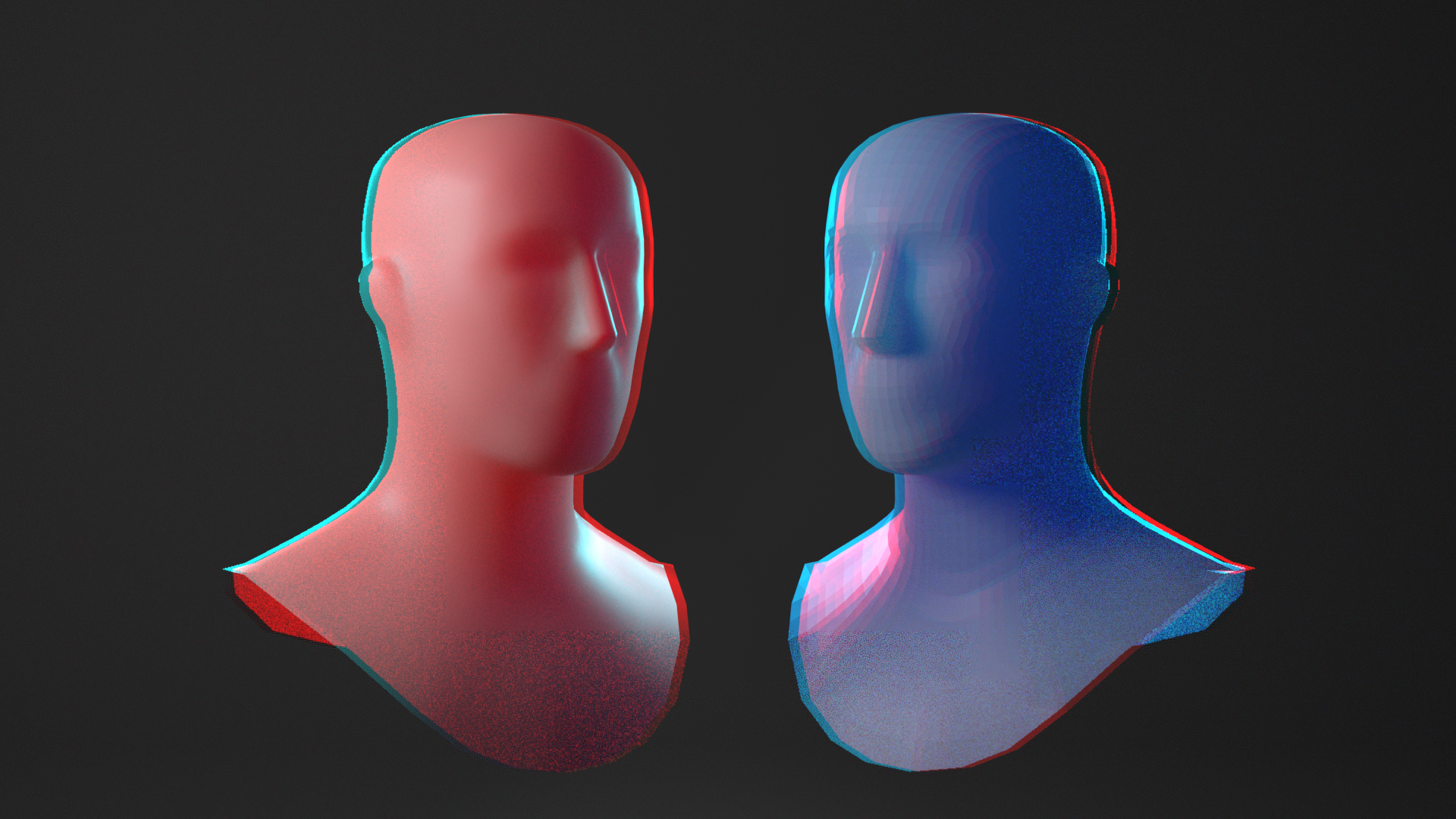
Thus far, I’m quite familiar with ZBrush and somewhat with Maya, and have never touched any of the other software. I’ve also been doing limited UV mapping in ZBrush but there’s a real lack of control (e.g. seamlines are specified with loose polypainting and it’s nearly impossible to rearrange islands on a map) and I suspect it won’t be precise enough for industry standards. I’m excited to play around with some more specific tools!

Initial Ideas

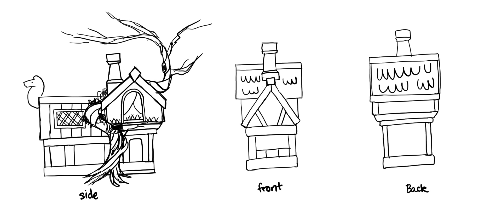
My initial idea for ‘places of the mind’ was of the concept of a ‘happy place’ – I think of sunny fields and idyllic cabins in the woods. I’ve been collecting concept art to potentially use for my final semester project, as I’d like to create a partial environment with a small hut in a clearing, and so already had this beautiful artwork by Daria Silbern in mind. While I’m not really an environment artist, I figured a simple base model would be my best bet for experimenting with so many new softwares. I’m also still trying to nail down my style, so what better than a painterly, brightly-colored, cartoon-distorted piece for inspiration? With that in mind, I started sketching an orthographic breakdown of the house, as I was working purely off a slight 3/4 view and need to wrap my head around the full 3D shapes.

However, since digital painting isn’t my strong suit (er, at least, it’s something I’ve barely practiced..), I’d rather not hand-paint my entire piece. Rather, I thought of the overlay effect from one of my absolute favorite scenes from The Witcher 3, where the protagonist enters a painting. The entire world is transformed into a swirling mass of colors and brushstrokes, and it’s one of the most visually striking effects I’ve ever experienced in a game. I’m sure that it wasn’t painted manually, as my character can run through the world in 3D as the paint strokes adjust with depth of field. If I can pull off a similar look through filters or effects in UE4, it would save a lot of time!

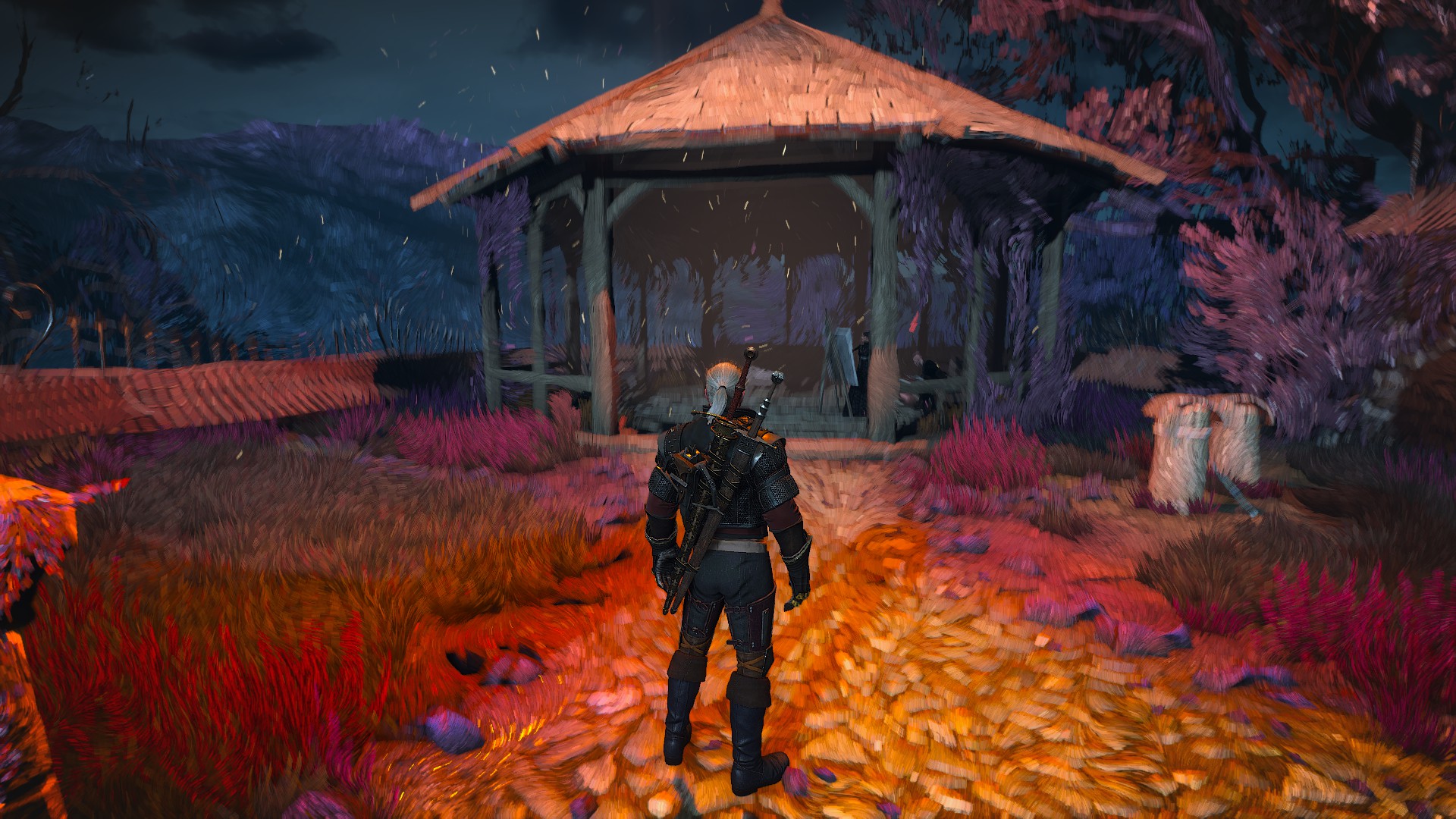
A quick google found that The Witcher developers did use their own proprietary engine, so I don’t necessarily have proof of concept that this is possible in UE4. After extensive research on Youtube and Artstation, I did however stumble upon this tutorial for something called a Kuwahara effect. From my understanding, this is a mathematical formula for creating something of a smoothing effect with harsh edges, similar to the ‘cut’ filter in Photoshop. This isn’t necessarily the exact effect I’m looking for, but it’s surprisingly close and likely the best I can do in my one-week timeframe. This tutorial also proved to be an invaluable resource for simply learning UE4, as I was able to follow the author’s navigation through the interface.

Bibliography

astralis3d. (2022). Witcher Painted World. [image] Available at: https://mobile.twitter.com/astralis3d/status/1332321435512164354 [Accessed 11 October 2021].

Silbern, D. (2022). Herbalist Hut. [image] Available at: https://www.behance.net/gallery/101147113/Herbalist-Hut [Accessed: 13 October 2021].

Verkuijlen, M. (2021). Unreal – Tutorial – Painterly Post Processing – Directional Kuwahara Filter. Available at: https://youtu.be/JJZBd7Zu0Ug [Accessed: 15 October 2021].

Reflection: Red vs. Blue & Speed Sculpting

Reflection, Research and Enquiry

Red vs. Blue Retrospective

For this first two-week project, I sculpted the busts of two heads representing two approaches to sculpting (and their corresponding softwares): organic, clay-like sculpts in ZBrush vs. hard-surface angular work in Maya. Overall, I’m quite pleased with my final piece, but there are definitely some changes I would make given more time. I tried to place the clay 3D glasses in a way that the logo text was still readable, but I don’t like how much it obscures the text. Although I think the final lighting setup shows off the texture of the sculpts well, it doesn’t have as much 10-ft impact as my original brightly-colored lighting setup. I struggled with adding colored lighting without losing some of the much-needed shadows, but that’s something I’ll experiment with in future. Finally, when I compare the two head sculpts to my references, I think I could make the differences even stronger (more divots and exaggerated shapes on the clay head, flatter and sharper planes on the hard-surface one). Part of this stems from a continued resistance to letting go of and distorting my original clean sculpt.

While many of the techniques I used were new to me – proper head anatomy, planar sculpting, rough clay brush creation, etc. – I did fall back on some skills that I was already comfortable with, namely in the final rendering. We were encouraged to pick up Unreal to show off the finished piece, but overwhelmed with this new assignment as I was, I chose to render in Maya to avoid last-minute panic. This is something I hope to remedy next week, as my idea fits well with UE4 integration.

This first assignment revealed a time management issue for me. I started on it immediately and spent many hours, but I struggle with two major things: making snap judgements and executing ideas quickly. My previous projects took at least a few months, and while my speed has improved between each project, this was an order of magnitude quicker than I’m used to. My usual approach to a task is to consider it from as many angles as possible, evaluate possible ideas, and pick the best one. In industry, as in this assignment, I won’t necessarily have that luxury. I was actually able to settle on a concept fairly quickly, and modified it somewhat after storyboarding/prototyping without too much deliberation. However, when it came to actually sculpting the pieces, I wanted to carefully perfect each element (for example, actually sculpt the skull from scratch before creating a detailed head, which meant researching head anatomy and proportions, trying out twenty brushes with different settings, and so on). I’m clearly still in the rut of wanting to experiment with many ideas first, and have a hard time committing to a final design.

Speed Sculpting

Many years ago, I read a story on Tumblr regarding the benefits of speed practice for artists. From memory, the parable goes something like this: a ceramics teacher tells his class that they will be divided into two groups for grading purposes. Half the students will be graded on the quantity of pots they produce by the end of the semester, while the other half will be graded on the quality of a single pot. By the end of the course, the students who had created a hundred pots without being concerned about their perfection ended up producing collectively higher quality pieces, while the ‘single perfect pot’ group was struggling with philosophizing about what defines a perfect artwork to the detriment of their skill.

Given concerns about my ability to keep up with these quick weekly projects, I decided to investigate this story and found an article by Austin Kleon explaining its background. It turns out that it was based on a real experiment by Professor Jerry Uelsmann at the University of Florida, albeit with photography students, not ceramics. The tale was modified by authors Bayles and Orland in their book Art & Fear in order to broaden the range of artistic mediums described in their examples.

This stuck with me for many years, despite assuming it was an exaggerated or simply invented story. It touches upon one of my frustrations with my own work: I’m very much in the quality over quantity camp, despite knowing that speed sculpting and rough practice is a more effective way to learn. I tend to want to perfect every stage of a project as I go along, and really struggle with establishing the larger, basic forms before focusing in on the details. Part of this stems from my background in 3D printing: my pieces have to be set in stone before being sent to the printer with no room for iteration later, and are based on existing concept artwork where accuracy is a major factor. I’m hoping that this semester’s weekly projects, with their lack of expectation for a finished or polished result, will be just what I need to adjust my workflow.

Bibliography

Bayles, D. and Orland, T. (1993). Art & fear. Santa Cruz, CA: Image Continuum Press.

Kleon, A. (2021). Quantity leads to quality (the origin of a parable). [Online]. Austin Kleon Blog. Available at: https://austinkleon.com/2020/12/10/quantity-leads-to-quality-the-origin-of-a-parable [Accessed: 9 October 2021].

Practice 1: Red vs. Blue (A1 – 3)

Practice 1

Rendering

After finalizing the clay and hard-surface busts in ZBrush, I whipped up a few additional models: two simple plinths emblazoned with the software logos (converted to vectors and extruded) and a pair of 3D glasses. I imported the models into my previously-created test lighting scene in Maya and, while I think the overall look pops, much of the topography and detail I had worked so hard on was lost. I also used this experiment to decide upon a combination of colored shaders and colored lighting rather than uniformly-colored objects.

I ended up creating a new scene and adding in lights one by one, especially focusing on partial backlighting to skim the surface of my models and emphasize their features. I decided quickly to keep the shaders more neutral in color overall, with intense subsurface coloring to further bring out the peaks and valleys and add more color variation.

It became apparent that the 3D glasses worn ‘normally’ were obscuring far too much of the faces. I agonized over the placement of them since the two figures have detail in different places and I didn’t want to cover too much. Eventually I settled on the final placement, which I hope further drives home the loose/realistic nature of the clay sculpt as opposed to the neat, controlled hard-surface one.

Final Render

My final piece: sculpted in ZBrush, composited and rendered in Maya with Arnold, and lightly post-processed in Photoshop (color tweaks and chromatic aberration effect).

Practice 1: Red vs. Blue (A1 – 2)

Practice 1

Portrait + Likeness

I first wanted this piece to be an exercise in facial/skull anatomy, so I started the face from scratch as a sphere in ZBrush. It’s roughly based on a set of turnaround images I found from a live-sculpting course (Adam Beane Industries, model Tessa) as I wanted to practice likeness as well. She wasn’t the best choice for a learning piece as she happens to somewhat look like me (and I’ve just finished a sculpt of my own head), but I did find that my second time through the sculpting process went exponentially quicker. I’m starting to grasp the basic muscles and proportions, and hopefully will be able to do a bunch more (diverse) speed sculpts in the future.

I did most of the sculpt by eye and comparison to the reference, but did dip my toes into my newly acquired Anatomy for Sculptors (Zarins and Kondrats, 2014) book to understand some of the more complex shapes. I’m currently struggling with losing some of my previous misconceptions when it comes to anatomy, especially in where features sit depth-wise (e.g. I always want to pull the eyes too far forward and on more of a curve around the skull rather than on almost a slice across the face).

Initial Stylization Tests

My next task was to lean into technical experimentation to achieve these two distinct looks. I started out testing out various brushes on basic spheres. It became quickly (and ironically) apparent that ZBrush wasn’t necessarily the best option for defining planes of the face as it doesn’t have strong retopology features, but I’m not familiar enough with Maya’s retopo yet – that’s something to work on for next time. Instead, I leaned into the trimDynamic and hPolish brushes to try and flatten out major areas. Since I’m not yet familiar with the defining lines of the face, I ended up removing too much material and creating haphazard curves; I later painted the lines on first and that helped enormously. For the clay sculpt, I made use of ZBrush’s new ThickSkin feature and started gouging out and layering on material, trying to emulate finger and sponge marks.

Based on feedback from my discussion with Leo Scazzocchio, I agreed that I wasn’t emphasizing the two styles nearly enough. From a distance and in silhouette, the two heads looked identical – I clearly had to be stronger with my stylization.

Clay Sculpts WIP

For my second attempt at achieving the clay effect, I made liberal use of the ThickSkin feature in ZBrush to be particularly destructive to the surface without distorting the underlying facial structure. Based on my earlier experiments, I mainly worked with the Fracture and ClayTrim brushes to emulate layers of knife strokes and smoothed clay.

However, the skin texture started out looking less like clay and more like a decaying or diseased corpse. Looking back at the real-world reference images, I noticed that they had larger areas of alternating rough and smooth detail (less uniform), larger indents (finger marks), and a sense of layering on additional material in the bulky areas. Keeping this in mind, I turned up my ThickSkin setting and alternated between layering and flattening brushes to better effect.

Hard-surface Planar WIP

It became clear from my initial attempt at the hard-surface sculpt that I needed a better plan for where to place the planes and their dividing lines on the head. I reverted back to my original clean sculpt and started painting the lines on, looking at my anatomy book for reference. I then ran a plugin to polygroup each section and turned my brush settings to isolate their effect to a single polygroup. This allowed me to flatten and smooth each plane separately without impacting the others.

I did several passes of flattening and then group polishing, occasionally adding additional material to high points for sharper, more defined edges. I ended up reducing the polycount several times to avoid sharp dropoffs between the various planes and doing some manual retopo to clean up the dividing lines.

Given more time, I would fully retopo this piece to achieve even flatter planes, but that’s a skill I’ve yet to pick up.

Bibliography

Beane, A., 2013. Sculpting the Portrait in Cx5 Workshop. [online] Adam Beane Industries. Available at: <https://beane51.rssing.com/chan-5278455/article29.html#c5278455a29&gt; [Accessed 9 October 2021].

Zarins, U. and Kondrats, S., 2014. Anatomy for Sculptors. Exonicus LLC.

Practice 1: Red vs. Blue (A1 – 1)

Practice 1

Initial Ideas

My immediate thought upon hearing the prompt “Red vs. Blue”, beyond the infamous machinima with the same name, was some kind of conflict between opposing groups. Many battle royale games feature bicolored teams; comic book battles are often depicted as opposing characters on red and blue backgrounds, gesturing across a dividing line. Therefore, I decided early on that I wanted to create two entities in a stand-off, and threw around a few ideas:

  • Red = fire/evil, blue = peaceful/ice, in an epic battle
  • Opposing characters rendered in two-color-palette challenges (often passed around art forums)
  • Vase-from-one-angle, woman-from-the-other style graphic designs where one color forms one image intertwined with another
  • Comic about red and blue flags creating arbitrary teams

I still wanted to tie my piece into some aspect of 3D, and the Extra Fabulous comic in particular had me considering what kinds of ‘teams’ 3D artists tend to form with very little basis, and I landed upon…

Main Concept

When thinking in the context of my artwork, I started visualizing icons for two major 3D modeling programs: ZBrush and Maya. The two programs tend to facilitate different approaches to working (ZBrush is better for organic sculpting whereas Maya lends itself to hard-surface sculpts). I’ve noticed that many of the 3D artists I’ve interacted with, myself included, tend to have a strong preference for one or the other; I happen to be a ZBrush devotee and struggle with Maya’s crashes and obfuscating UI. In investigating further, I realized that ZBrush’s logo is orange, not red, but I couldn’t shake such a meta idea (and I figured it was close enough!). So, that will be the basis of my first project: Red vs. Blue as the war of the 3D modeling philosophies.

Since my current learning objective is getting faster (and anatomically better) with character sculpts, I decided to create two busts representing the two programs. Both will be heavily stylized: the red (ZBrush) very organic and clay-like; the blue (Maya) done with a hard-surface, planar, almost low-poly look. I’ve been meaning to work on my anatomy skills, as well as try out techniques for creating both effects, so this is a great opportunity to investigate further. I’ve found them both to be visually easily identifiable, but I’m still unsure of how to actually emulate these real-world techniques digitally.

For the busts themselves, I drew my inspiration from real-world clay examples and from digital planar head sculpts. I’m trying to become more comfortable with creating artwork in rough, loose styles, and appreciate how both focus on capturing the main shapes and general likeness rather than getting lost in the details. The latter were mainly created for anatomy guidance, but I liked the larger flat areas and curved lines better than true low-poly pieces (they tend to be more uniform/blocky and lose the important defining lines of the head).

Finishing Touches

Since the concept of competing software is fairly abstract, I considered ways to tie it back to 3D, most iconically represented by a pair of (old-school) 3D glasses…which just so happen to contain red and blue lenses! I also thought of the visual effect of the glasses: shifted color channels (red and blue outlines). I wanted to incorporate both into my final piece, with characters wearing 3D glasses and a chromatic aberration effect added to the finished render in post. I had done a similar technique previously, but looked up a quick Photoshop tutorial for a refresher and it produced exactly what I wanted. I borrowed several default head sculpts from Maya’s Content Browser and started putting together the basics of my scene, which I can hopefully quickly replace with my own sculpts.

Bibliography

Benson, C., 2021. 3D Glasses. [image] Available at: <https://www.lifewire.com/why-doesnt-3d-work-for-some-people-1996&gt; [Accessed 1 October 2021].

Charbonnel, C., 2021. Persée I. [online] Available at: <http://www.lilleartfair.com/exposants/galerie-bayart/#inline_0&gt; [Accessed 1 October 2021].

Extra Fabulous Comics. 2021. 200. [online] Available at: <https://extrafabulouscomics.com/comic/200/&gt; [Accessed 1 October 2021].

Knowledge.autodesk.com. 2021. Content Browser | Maya 2016 | Autodesk Knowledge Network. [online] Available at: <https://knowledge.autodesk.com/support/maya/learn-explore/caas/CloudHelp/cloudhelp/2016/ENU/Maya/files/GUID-9221B2E8-7E68-4ECB-94DC-ABEB21E956BF-htm.html&gt; [Accessed 1 October 2021].

Koshelnikova, N., 2021. Vs cartoon background. Comic versus duel battle or team challenge concept with radial rays halftone effects lightning. Blue Vs Red vector Illustration Stock Vector Image & Art – Alamy. [online] Alamy.com. Available at: <https://www.alamy.com/vs-cartoon-background-comic-versus-duel-battle-or-team-challenge-concept-with-radial-rays-halftone-effects-lightning-blue-vs-red-vector-illustration-image367181821.html&gt; [Accessed 1 October 2021].

League of Legends Wiki. 2021. Jungling. [online] Available at: <https://leagueoflegends.fandom.com/wiki/Jungling&gt; [Accessed 1 October 2021].

RossDraws (2021). How to add Chromatic Aberration “Glitch” Effect in Photoshop, Procreate, and CSP. [online] Youtube.com. Available at: <https://www.youtube.com/watch?v=SmDPOkcFxss&gt; [Accessed 1 October 2021].

viktorg3d, 2021. Planes of the head – Female | 3D model. [online] CGTrader. Available at: <https://www.cgtrader.com/3d-models/character/anatomy/planes-of-the-head-female&gt; [Accessed 1 October 2021].

Zamit, S., 2021. [online] Suziezamit.co.uk. Available at: <https://www.suziezamit.co.uk/gallery/20/2.aspx&gt; [Accessed 1 October 2021].

Zarins, U. and Kondrats, S., 2014. Anatomy for Sculptors. Exonicus LLC.

Reflection: Introduction + Plans

Reflection, Research and Enquiry

Introduction

As a practitioner, I enjoy structure; I tend to want to look ahead at a larger picture or have some overarching threads within my work. Ultimately, I’d like to become a character artist for games, so I’ve been thinking about what kinds of major areas I should investigate and tailor my work towards. I’ve decided upon two: a study of stylization within character design, and looking forwards to my final (semester 3) project and the skills needed to complete it.

Current skillset

I’d consider myself still quite new to 3D art, although I do have a background in traditional sculpting and costume/prop construction. I’m very proud of the 3D pieces I’ve completed so far – mainly jewelry and accessories 3D printed for cosplay – but I believe that they are as polished as they are for two reasons that I won’t be able to carry over to this course: I was able to spend copious, unlimited time on them, and therefore was able to delve very deeply into (only) the specific skills that I needed to complete them. My current skillset is quite narrow – I’ve never done a full character sculpt, never touched Unreal/Substance Painter/Marvelous Designer/more than the surface of Maya, and am only gently familiar with the game-ready pipeline (retopology? rigging? UVs? high-poly-low-poly workflow? No clue!). I do pick up programs and skills quite readily – I often joke that my computer science degree was mainly useful in making me an expert on how to google a problem – but I’ll certainly have my work cut out for me with projects set on such a rapid timeframe. Speaking of, it’s going to be a big hurdle for my usual slow, methodical, perfectionist way of sculpting to have weekly projects, but I do think it’s exactly what I need to become successful.

Getting a Game Art Job

Looking forward to this course, it’s important to have an idea of where I’m heading. I started researching what my endgame skillset should look like for someone new the games industry. I discovered this GamesIndustry.biz article entitled ‘How to get a job in game art‘, quoting a dozen industry professionals about their best advice to entry-level practitioners.

Apart from basic technical and artistic skills, the article mentions a major sought-after trait in a character artist: the ability to adapt to many different styles according to the defining style of the studio. It emphasizes the importance of having an individual style for portfolio pieces, but often an artist entering a new company will need to match their artwork to a coherent look. This is something I plan to explore this semester, as I’ve generally focused on realistic and non-stylized pieces in the past. Many of the games I’m drawn to use stylized, cartoony, or pixellated characters, and generally artwork that makes unique use of color and lighting.

The consensus also seems to be to focus in on a specific niche rather than being a true generalist (excepting small-team indie work). I’m sure that I’d like to be a character artist, but I haven’t yet settled into exactly what specific area I’d like to become an expert in. I’m currently finding that anatomy and figure sculpting isn’t as interesting to me as clothing, armor, and prop design, which makes sense from my background in costuming. That said, there are huge realms that I haven’t yet explored and I’m hoping that this year will help me find my preferred space.

Final Project Musings

For my final project, I’d like to create a character-focused scene that covers as many 3D-skill bases as I can. My current (very early) plan is to digitally create my DnD character and her environment (a grandmotherly necromancer stepping out from an idyllic cottage, gently bandaging her decrepit-skeleton-familiar who was damaged in battle). This gives me an opportunity to create a character (including proportions, likeness, hair, clothing, texturing, and posing), a creature (skeletal and musculature anatomy study), simple architecture and prop modeling, environment design, the high-poly-low-poly pipeline, the basics of working within a game engine, and presentation of a scene. As my focus is on characters, I intend to keep most of the detail there, but I would like to have a fundamental understanding of environment and lighting. I’m still debating about the overarching style – currently, I tend towards high-detail semi-realism with painterly textures and dreamlike colors – but hopefully my exploration this semester will help me solidify the overall intended look.

Bibliography

Dealessandri, M. (2021). How to get a job in game art. [Online]. GamesIndustry.biz. Available at: https://www.gamesindustry.biz/articles/2020-02-26-how-to-get-a-job-in-game-art [Accessed: 30 September 2021].